Chart Canvas Charts
In v11.2, Logi Analytics introduced a new family of charting elements that offers a number of improvements over the legacy Static and Animated chart elements. The new Chart Canvas charts are discussed in this topic.
- About Chart Canvas Charts
- Chart Quick Start
- The Chart Canvas Element
- Chart Canvas Child Elements
- Default Colors
About Chart Canvas Charts
The Chart Canvas chart elements are based on a library written entirely in HTML5 and JavaScript, and work very well in all modern desktop and mobile device browsers. No client-side technology, such as Flash or Java, is required. These elements provide a wide range of features and the flexibility to customize them to your requirements. Many desirable features, including animations and quicktips, are enabled by default, making it very easy to create great-looking charts quickly. In addition, these charts are exportable in reports.
By default, Chart Canvas charts are rendered by the browser using SVG technology. For browsers that do not support SVG, primarily IE 7 & 8, charts are rendered with VML.
![]() The PDF export engine was changed to Gecko-based technology and Chart Canvas charts are now exported as SVG objects rather than as images. This results in Chart Canvas charts exported to PDF having extremely high resolution - they can be zoomed or printed with high-quality at any resolution.
The PDF export engine was changed to Gecko-based technology and Chart Canvas charts are now exported as SVG objects rather than as images. This results in Chart Canvas charts exported to PDF having extremely high resolution - they can be zoomed or printed with high-quality at any resolution.
The legacy Static and Animated charts available in earlier versions of Logi products remain available but will eventually be deprecated. Developers are advised to begin using Chart Canvas Charts for their new projects.
![]() Chart Canvas charts are used by default for Super Elements, such as the Analysis Grid, in all new applications started in v11.2.040 and later. Older Logi applications that are upgraded to v11.2.040+ will use the classic static charts for their Super Elements. To force upgraded apps to use Chart Canvas charts, add the constant rdFavorChartCanvas
= True
to your _Settings definition.
Chart Canvas charts are used by default for Super Elements, such as the Analysis Grid, in all new applications started in v11.2.040 and later. Older Logi applications that are upgraded to v11.2.040+ will use the classic static charts for their Super Elements. To force upgraded apps to use Chart Canvas charts, add the constant rdFavorChartCanvas
= True
to your _Settings definition.
Chart Geography
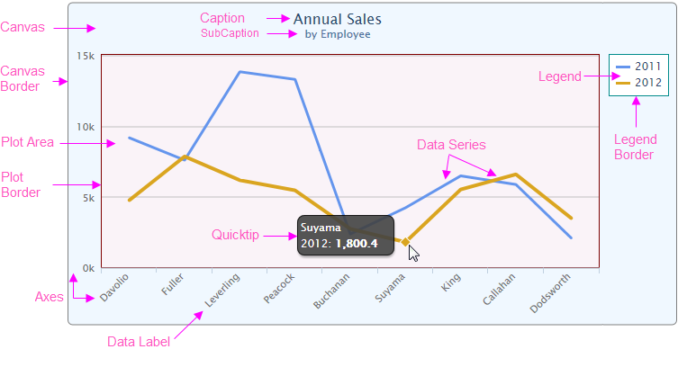
The following image explains many of the terms used to describe a typical Chart Canvas chart:

The background color, line properties, and transparency of the areas and lines shown can all be controlled by setting attributes. Additional major and minor tick marks, and grid lines can be added. The spacing, style, and format of all the items shown can also be configured.
Chart Quick Start
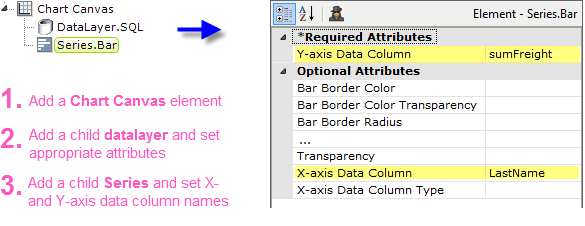
Chart Canvas charts are incredibly easy to use! All you need to do to create a chart is add two chart elements, set two attributes, and include a datalayer.

No other chart element attributes need be set - everything else will be done automatically for you.

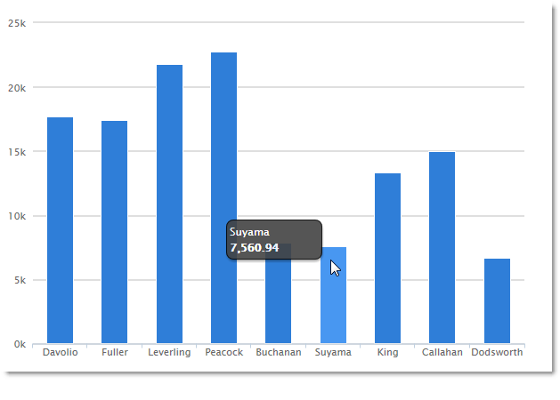
The resulting chart will be automatically-sized and styled, and will include hover-highlighting and quicktips, as shown above.
Now let's dig into the elements we used, and others in the Chart Canvas family.
The Chart Canvas Element
The Chart Canvas element is the parent, or "container", for all of the other elements used in these charts. As such, its attributes specify the size and appearance of the overall chart, the canvas, and the plot area. Here are its attributes:
| Attribute | Description |
| Animation Duration | Sets the duration of chart animations, in milliseconds. To disable animation, enter a 0 value. |
| Auto Quicktip | Enables the display of Quicktips, with automatically determined information, when the mouse is hovered over data points. To create customized Quicktips, add a Quicktip element under the Series element. |
| Background Color | Sets the canvas background color. Enter a color by name, decimal RGB value, or hex RGB value. Prefix hex values with the pound sign, e.g. #112233. |
| Background Color Transparency | Specifies the transparency of the canvas background color. The lowest value of 0 specifies that the background is opaque, with no transparency. At the other end of the scale, 15 specifies a completely transparent background. Use medium-level transparency to allow different chart layers to show through each other. |
| Border Color | Sets the canvas border line color. Enter a color by name, decimal RGB value, or hex RGB value. Prefix hex values with the pound sign, e.g. #112233. |
| Border Color Transparency | Specifies the transparency of the canvas border line color. The lowest value of 0 specifies that the border line is opaque, with no transparency. At the other end of the scale, 15 specifies a completely transparent line. Use medium-level transparency to allow different chart layers to show through each other. |
| Border Radius | Sets the amount of rounding for canvas border line corners, in pixels. |
| Border Thickness | Sets the canvas border line thickness, in pixels. The default value is 0, for no border. |
| Caption | Specifies the text for the chart main title. |
| Height | Specifies the height of the canvas, in pixels. If left blank, a height will be determined automatically. |
| No Data Caption | Specifies text to be shown in the plot area when no data is received in the chart's datalayers. |
| Orientation | Allows swapping of the X- and Y-axes. The default value is Vertical, meaning data points are plotted on the Y-axis and labels are listed across the X-axis. |
| Plot Background Color | Sets the plot area background color. Enter a color by name, decimal RGB value, or hex RGB value. Prefix hex values with the pound sign, e.g. #112233. |
| Plot Background Color Transparency | Specifies the transparency of the plot background area color. The lowest value of 0 specifies that the border line is opaque, with no transparency. At the other end of the scale, 15 specifies a completely transparent line. Use medium-level transparency to allow different chart layers to show through each other. |
| Plot Background Image | Specifies the complete URL of an image to be displayed in the chart plot area (a chart "background" image). Use CSS, rather than this attribute, to specify a background image for the entire canvas. |
| Plot Border Color | Sets the plot area border line color. Enter a color by name, decimal RGB value, or hex RGB value. Prefix hex values with the pound sign, e.g. #112233. |
| Plot Border Color Transparency | Specifies the transparency of the plot area border line color. The lowest value of 0 specifies that the border line is opaque, with no transparency. At the other end of the scale, 15 specifies a completely transparent line. Use medium-level transparency to allow different chart layers to show through each other. |
| Plot Border Thickness | Sets the plot area border line thickness, in pixels. The default value is 0, for no border. |
| Polar | Set to True to transform Cartesian charts (e.g. Area, Bar, Line, and Spline) into the Polar/Radial coordinate system. The default value is False. |
| Spacing Bottom | Sets the space between the bottom edge of the chart content (including the plot area and labels) and the bottom border of the chart, in pixels. The default value is 15 pixels. |
| Spacing Left | Sets the space between the left edge of the chart content (including the plot area and labels) and the left border of the chart, in pixels. The default value is 10 pixels. |
| Spacing Right | Sets the space between the right edge of the chart content (including the plot area and any labels) and the right border of the chart, in pixels. The default value is 10 pixels. |
| Spacing Top | Sets the space between the top edge of the chart content (including the plot area and any captions) and the top border of the chart, in pixels. The default value is 10 pixels. |
| SubCaption | Specifies a subcaption for the chart, which normally appears below the chart caption. |
| Width | Specifies the width of the canvas, in pixels. If left blank, a width will be determined automatically. |
It's recommended that you set a unique element ID for charts if there will be more than one chart in a definition.
Getting Data
The example shown earlier used a datalayer beneath the Chart Canvas element, which makes the data retrieved available to all of its other child elements.

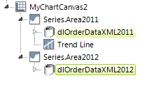
However, as shown above, instead of using a common datalayer, you can use individual datalayers beneath the child elements, where appropriate, to give them their own data.

As shown in the example above, when using Chart Canvas charts as the child of an element that has its own datalayer, such as a DataTable or Google Map, you must use @Chart tokens, not @Data tokens, in any elements used to condition the chart's datalayer.
Chart Canvas Child Elements
The Chart Canvas element also uses the following child elements to generate, control, and format the canvas and charts. Click the element link for more information.
| Element | Description |
| |
| |
| No Data Caption Style |  Specifies font-related properties for the No Data Caption. Specifies font-related properties for the No Data Caption. |
| With a Crosstab Filter |
|
| With Input Selection |
|
| Legend |
|
| Resizer |
|
| The Trend Line |
|
| The Zoom Control |
|
| |
| |
| |
| |
| |
| |
| Series.Bubble |
|
| Series.Funnel |  Adds this visualization to the canvas. Adds this visualization to the canvas. |
| Series.Heatmap |
|
| Series.Line |
|
| Series.Pie |
|
| Series.Pyramid |
|
| Series.Scatter |
|
| |
| Series.Waterfall |
|
| Series.Whiskers |
|
Default Colors
If no colors are specified for a Series and no theme has been applied, the following colors will be used, in left-to-right order:

#2F7ED8 | #0D233A | #8BBC21 | #910000 | #1AADCE | #492970 | #F28F43 | #77A1E5 | #C42525 | #A6C96A |
If more than ten colors are needed, colors will be re-used, starting from the left again.
 Specifies properties of axis lines, grid lines, tick marks, and label fonts.
 "Pivots" and groups the data for easier comparison.
 Provides the ability to select chart areas or points with the mouse.
 Adds "resizing handles" to the bottom and right sides of the canvas.
 Generates a line on the chart indicating the "trend" of the data.
 Allows the user to "zoom" into the canvas, magnifying a portion of it.
 Adds this data visualization to the canvas.
 Adds this data visualization to the canvas.
 Adds this data visualization to the canvas.
 Adds this data visualization to the canvas.
 Adds this data visualization to the canvas.
 Adds this data visualization to the canvas.
 Adds this data visualization to the canvas.
 Adds this visualization to the canvas.
 Adds this data visualization to the canvas.
 Adds this data visualization to the canvas.
 Adds this data visualization to the canvas.
 Adds this data visualization to the canvas.
 Adds this data visualization to the canvas.
 Adds this data visualization to the canvas.
 Adds this data visualization to the canvas.