Series.Bubble
The Chart Canvas element's Series child elements cause a data visualization (the chart) to be rendered in the canvas. This topic discusses the Series.Bubble element.
- About Series.Bubble
- Using Multiple Series
- Attributes
- Using the Data Labels Element
- Using the Marker Points Element
- Using the Quicktips Element
- Using Action Elements
- Using Input Selection
About Series.Bubble
The Series.Bubble element generates a Bubble chart, which is commonly used to present three values: two plotted along the X- and Y-axes and a third indicated by the size of the bubble symbol.
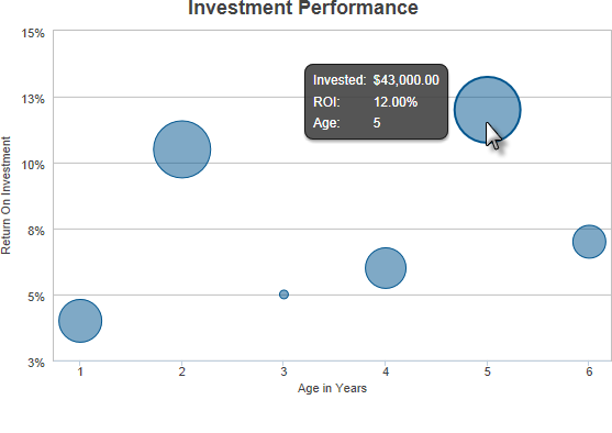
The example above shows a simple Bubble chart, presenting return on investment over time, and the size of each investment.

As shown above, the chart is created by adding Series.Bubble to the canvas, along with a datalayer. Very few attributes need to be set for the Series element in order to produce a basic chart.
![]() Note that a datalayer element can be used either beneath Series.Bubble, as shown above, or beneath Chart Canvas. If used as a child of Chart Canvas, its data is available to all child Series elements. This can improve performance if you have several series, all using the same data, beneath the same Chart Canvas element.
Note that a datalayer element can be used either beneath Series.Bubble, as shown above, or beneath Chart Canvas. If used as a child of Chart Canvas, its data is available to all child Series elements. This can improve performance if you have several series, all using the same data, beneath the same Chart Canvas element.

The properties of the X- and Y-axis, including captions, are set using the X-Axis and Y-Axis elements, as shown above.
Using Multiple Series
You can add additional series to the chart by adding additional Series elements:
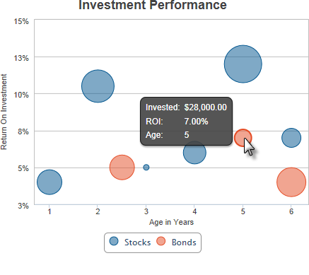
The example above shows two Series, one for each year, with a legend.
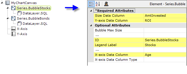
The example above shows the two Series elements, their datalayers, and X- and Y-Axis elements used to produce the previous chart. Should they overlap, you can adjust which bubbles appear "in front" of the others in the chart by changing the order of the Series elements in the definition. Setting the Series elements' Legend Label attribute will automatically cause the legend to be displayed.
![]() When using multiple series, you may be able to reduce the number of data queries and improve performance by using Local Data (see Introducing Datalayers) to read all of the data once and then link its datalayer (see Link Datalayers) to share it
to the series. At each Series element,
link its datalayer to the shared Local Data datalayer and filter the data to meet the needs of each individual series.
When using multiple series, you may be able to reduce the number of data queries and improve performance by using Local Data (see Introducing Datalayers) to read all of the data once and then link its datalayer (see Link Datalayers) to share it
to the series. At each Series element,
link its datalayer to the shared Local Data datalayer and filter the data to meet the needs of each individual series.
You can combine different types of Series elements, for example, Series.Bubble and Series.Line, to produce combinations of visualizations.
Attributes
The Series.Bubble element has the following attributes:
| Attribute | Description |
|---|---|
| Size Data Column | (Required) Specifies the name of a datalayer column that contains values for bubble sizes. |
| Y-Axis Data Column | (Required) Specifies the name of a datalayer column whose values will be plotted along the Y-axis. |
| Bubble Max Size | Sets the maximum bubble size, in pixels or a percentage. Bubbles will be automatically sized between the Bubble Min Size and Bubble Max Size to produce the size of each bubble. Indicate "pixels" by entering just a number, or a "percentage" of the lesser of the plot width and height by entering a number and the percent sign. The default value is 20%. |
| Bubble Min Size | Sets the minimum bubble size, in pixels or a percentage. Bubbles will be automatically sized between the Bubble Min Size and Bubble Max Size to produce the size of each bubble. Indicate "pixels" by entering just a number, or a "percentage" of the lesser of the plot width and height by entering a number and the percent sign. The default value is 20%. |
| Color | Sets the bubble color. Enter a color by name, decimal RGB value, or hex RGB value. Prefix hex values with the pound sign, e.g. #112233. |
| Combine With Series ID | Set this attribute to the element ID of another series to combine it with this series in the legend. When two series are combined, by default only the first one will appear in the legend but clicking the item in the legend toggles both series to appear and disappear. Or, the value Previous can be entered to combine this series with the previous series. |
| Disable Mouse Tracking | Disables mouse tracking for the series, when set to True. This affects
tooltips and click events on graphs and points. For large datasets, this may
improve performance. |
| Legend Label | Indicates text that will be shown for this series inside the chart legend. When a value is provided, automatically causes the legend to be displayed. |
| Linked to X-Axis ID | Specifies the ID of an X-Axis element that this series should be linked to when using multiple X-axes. |
| Linked to Y-Axis ID | Specifies the ID of a Y-Axis element that this series should be linked to when using multiple Y-axes. |
| Transparency | Specifies the transparency of the bubble color. The lowest value of 0 specifies that the background is opaque, with no transparency. At the other end of the scale, 15 specifies a completely transparent background. Use medium-level transparency to allow different chart layers to show through each other. |
| X-Axis Data Column | Specifies the name of a datalayer column whose values will be plotted along the X-axis. |
| X-Axis Data Column Type | Specifies the data type of the datalayer column named in the X-axis Data Column attribute. Options include Auto (the default), Text, Number, and DateTime. By default, X-axis data values that are DateTime type will be automatically distributed evenly across the time series. If you want to disable this behavior, set this attribute value to Text. |
Data Labels Element
A "data label" is text shown next to each data point that shows its value. When the Data Labels element is used as a child of Series.Bubble, text representing the data values can be configured to appear on the chart, either inside or outside the bubbles: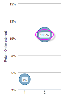
The Data Labels element has attributes that allow you to control the font family, color, size, and weight, the data format, border color, and positioning of the text.
![]() The Data Labels element's color-related attribute values can be set using @Chart tokens.
The Data Labels element's color-related attribute values can be set using @Chart tokens.
Marker Points Element
A "marker point" is a symbol that appears on the chart at each data point. These behave differently in a Bubble chart than in other types of charts: the marker point is the bubble itself. When the Marker Points element is used as a child of Series.Bubble, several properties can be configured.
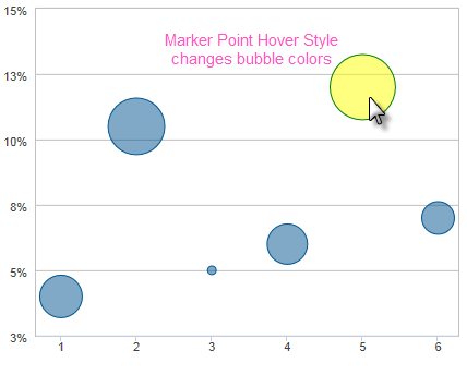
The default marker points are shown above. The Marker Points element allows you to control the bubble color, border color, and transparency. When the cursor hovers over it, a bubble's color can change - the Marker Points Hover Style child element lets you configure that behavior and other properties.
Quicktips Element
By default, a "quicktip" is displayed when the mouse hovers over a bubble:
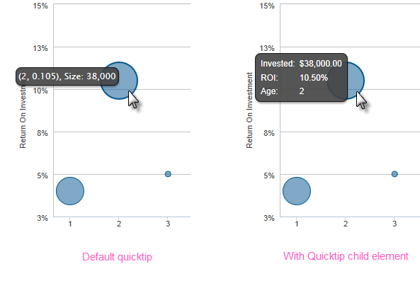
The automatically-generated quicktip displays information from the X- and Y-axes and the bubble size, as shown above, left. However, you may want to display other information or format it differently, perhaps as shown above, right, which can be done by adding a Quicktip child element beneath Series.Bubble and setting its attributes and child elements. Use @Chart tokens to include chart data in the quicktip.
![]() Intrinsic functions are supported in the Quicktip attributes.
Intrinsic functions are supported in the Quicktip attributes.
Action Elements
Action elements initiate processing of a report or process task definition, redirection to a link, or other processing when a data point in the series is clicked.

In the example above, an Action.Report element has been added as a child of the Series, along with its Target.Report and Link Parameters child elements. To reference chart data in parameters, use the @Chart token, as shown above.
A variety of Action elements are available for use with Series, including Action.Link, Action.Process, and Action.Refresh Element. Additional Action elements will be added in future releases.
Input Selection
This series can also be used with the Input Selection family of elements, which turn the chart into an input control. This allows users, at runtime, to select points or values on the chart with their mouse and your report can then take action using the selected data. This is very useful, for example, for drilling into the data.
For more information about this functionality, see Input Selection.