Heat Maps
The Heat Map charting element produces one of the most unusual charts found in Logi reporting products. Also known as a "treemap", its unique arrangement of rectangles represents data and relationships using color and size. This topic introduces heat maps and the Chart.Heat Map element.
- What is a "Heat Map"?
- Build a Heat Map
What is a "Heat Map"?
The Logi Analytics Heat Map chart is a descendant of the "treemap", first designed by Ben Shneiderman of the University of Maryland in 1991. He has an interesting treemap history page that describes his work and shows many interesting applications of treemaps. They're used today for analyzing data in a variety of fields, ranging from molecular biology to the stock market.
The term "Heat Map" is being used today in severaldifferentways. Some heat maps are geographic maps overlaid with transparent color zones depicting average daily temperatures, homeless population densities, real estate prices, etc. Others use transparent color zones overlaid on images of web pages to indicate where visitors focus their attention and mouse clicks. And there are still others.
These other uses do not apply to Logi Info and are not related to Ben Shneiderman's original treemap concept.
In Logi Info, a heat map is a chart, which looks like this:
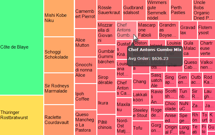
It's a rectangular arrangement of small rectangles that uses size and color to visualize complex data values and relationships.
Both the color intensity (shifting within a gradient) and size of the boxes indicate relative performance, helping you to easily spot trends or standouts in a quick overview. This type of chart is very useful for showing hidden trends and relationships.
In the example above, using data from the Northwind Foods sample database, the size of the rectangles (or cells) represents annual revenue from sales of each food item. The cell color represents the number of orders and ranges from red (low) to green (high). The relationship isn't linear but we can still see that items with small, red cells produced fewer sales and less revenue than items with large, green cells.
They can also be interactive; for example, they can be used with Hover Highlighting, Quicktip (shown above), and Group Drillthrough elements.
Heat Map Applet Deprecated
At one time, Logi Info included a Heat Map Applet element. This element was deprecated in v11.0.727. In v10.0.366, Chart.Heat Map was added to the "Create a Chart" wizard in Studio. This wizard is available in Studio in the Element Toolbox, and in the element tree's right-click context menu, under "Element Wizards".
Build a Heat Map
The remainder of this topic assumes you have created a Logi application with a connection to your datasource. The following examples use data from the Northwind database. As you will see, it's very easy to create a heat map.

- In the Workspace editor, add a Chart.Heat Map element to the Body of your report, as shown above.
- Set the element's attributes as shown above, right. For clarity, unused attributes are not shown. These are the key attributes:
Heat Map Color Data Column - The color of the chart squares will reflect product sales volume.
Heat Map Label Data Column - The label within each square will be the product name.
Heat Map Size Data Column - The size of the squares will also reflect product sales volume.
You can experiment later with some of the other attributes that control the borders and colors of the chart. Also, your choice of Theme will affect the colors used in the chart.

- Next, add a datalayer element beneath the Chart.Heat Map element. We've used a DataLayer.XML File element in this example.
In v10.1.59, a Zero Rows Message element was made available for use as a child of Chart.Heat Map. This element displays a message of your choice instead of the chart when no data is returned into the datalayer.
- Set the datalayer's attributes appropriately for the datasource. Note that it's often useful to limit the number of rows returned, using the Maximum Rows attribute, during development so that the heat map isn't too confusing at first.
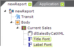
- Optionally, you can add elements, as shown above, that allow you to format and align the overall chart title, and format the labels inside the chart squares.
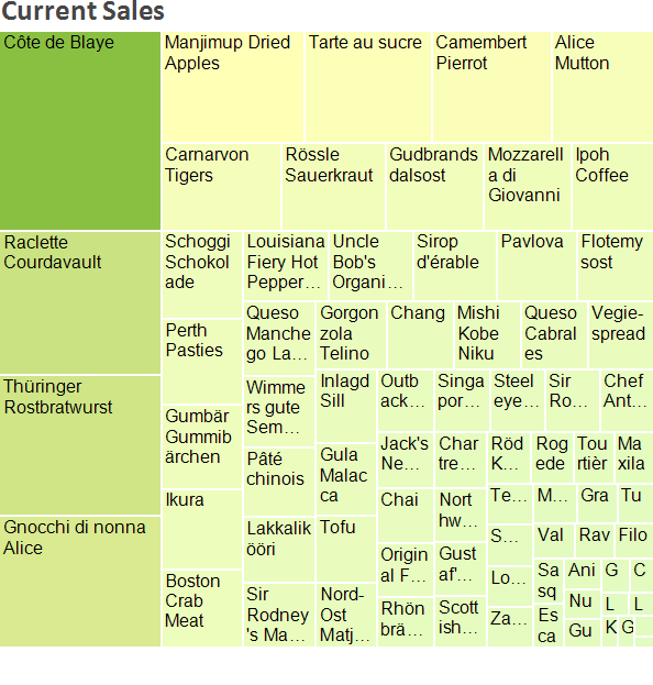
If you preview the chart at this point, you'll see something like the example shown above.

You can display additional data right inside the chart's cells by using a Heatmap Label element, as shown above,...
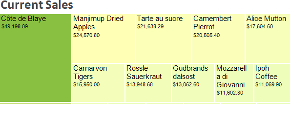
... which produces the effect shown above.
You can also add the Resizer element, if you like, which will give users the ability to resize the chart at runtime, or the Hover Highlight element, which lightens a cell's color to highlight it when the cursor is over it.
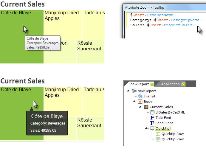
- You can also use the Chart.Heat Map element's Tooltip attribute to provide additional information when the mouse is hovered over a chart cell, as shown above. Note that @Chart tokens are used, and that placing them on different lines in the Attribute Zoom window causes them to appear on different lines in the tooltip popup. You can also use a Quicktip element, for a little different look, and get values on different rows in it using Quicktip Row elements.
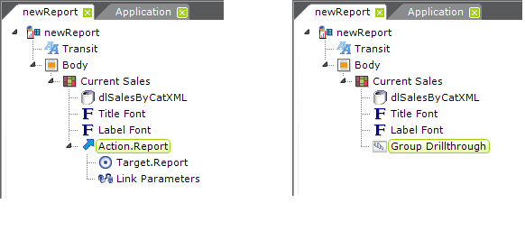
- In order to provide drill-down or drill-through functionality, you can add any of the Action or Group Drillthrough elements beneath the Chart.Heat Map element, as shown above. When passing parameters, remember to use @Chart tokens!

- Finally, you can add one or more levels of grouping to your heat map, by using Heatmap Group Column elements, as shown above...
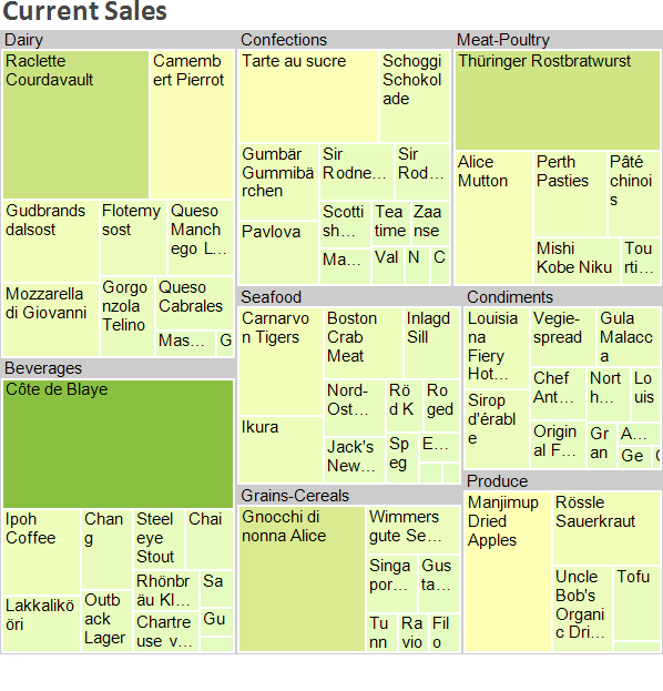
...and you can see the grouping effect in the example above. Tooltips and Action and Quicktip elements can also be used beneath the Heatmap Group Column element to provide drill-down and drill-through functionality when groups are clicked.
Now, see what interesting uses you can come up with for this unique chart!