Series.Area Spline
The Chart Canvas element's Series child elements cause a data visualization (the chart) to be rendered in the canvas. This topic discusses the Series.Area Spline element.
- About Series.Area Spline
- Multiple Series
- Attributes
- Data Labels Element
- Marker Points Element
- Quicktips Element
- Trend Line Element
- Action Elements
- Input Selection
About Series.Area Spline
The Series.Area Spline element generates an Area chart with the characteristic curves of a Spline chart, which is commonly used to represent aggregated totals, as numbers or
percentages, over time.
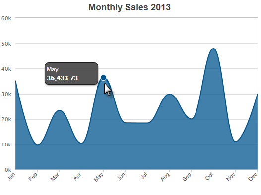
The example above shows a simple Area Spline chart, representing sales per month for a year. Notice that, unlike a regular Area chart, the data region border is smoothly curved.

As shown above, the chart is created by adding Series.Area Spline to the canvas, along with a datalayer and, typically, some child elements that may include Time Period Column elements, a Group Filter, and a Group Aggregate Column element. Very few attributes need to be set for the Series element in order to produce a basic chart.
![]() Note that a datalayer element can be used either beneath Series.Area Spline, as shown above, or beneath Chart Canvas. If used as a child of Chart Canvas, its data is available to all child Series elements. This can improve performance if you have several series, all using the same data, beneath the same Chart Canvas element.
Note that a datalayer element can be used either beneath Series.Area Spline, as shown above, or beneath Chart Canvas. If used as a child of Chart Canvas, its data is available to all child Series elements. This can improve performance if you have several series, all using the same data, beneath the same Chart Canvas element.

The properties of the X- and Y-axis, including captions, are set using the X-Axis and Y-Axis elements. For example, in order to angle the X-axis labels, add an X-Axis element beneath Chart Canvas (none of its attributes need to be set) and add its child Label Style element. Set the Label Style element's attribute as shown above.
Multiple Series
You can add additional series to the chart by adding additional Series elements:
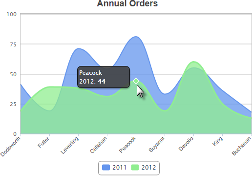
The example above shows two Series, one for each year. A legend can also be added very easily.
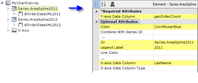
The example above shows the two Series elements, their datalayers, and an X-Axis element used to produce the previous chart. You can adjust which series appears "in front" of the other in the chart by changing the order of the Series elements in the definition. Setting the Series elements' Legend Label attribute will automatically cause the legend to be displayed.
![]() When using multiple series, you may be able to reduce the number of data queries and improve performance by using Local Data (see Introducing Datalayers) to read all of the data once and then link its datalayer (see Link Datalayers) to share it
to the series. At each Series element,
link its datalayer to the shared Local Data datalayer and filter the data to meet the needs of each individual series.
When using multiple series, you may be able to reduce the number of data queries and improve performance by using Local Data (see Introducing Datalayers) to read all of the data once and then link its datalayer (see Link Datalayers) to share it
to the series. At each Series element,
link its datalayer to the shared Local Data datalayer and filter the data to meet the needs of each individual series.
You can combine different types of Series elements, for example, Series.Area Spline and Series.Bar, to produce combinations of visualizations.
Attributes
The Series.Area Spline element has the following attributes:
| Attribute | Description |
|---|---|
| Y-Axis Data Column | (Required) Specifies the name of a datalayer column whose values will be plotted along the Y-axis. |
| Color | Sets the data region fill color. Enter a color by name, decimal RGB value, or hex RGB value. Prefix hex values with the pound sign, e.g. #112233. |
| Combine With Series ID | Set this attribute to the element ID of another series to combine it with this series in the legend. When two series are combined, by default only the first one will appear in the legend but clicking the item in the legend toggles both series to appear and disappear. Or, the value Previous can be entered to combine this series with the previous series. |
| Connect Nulls | Specifies if data rows with null or blank values are to be ignored, allowing adjacent values to be connected in the chart. The default value is False. |
| Disable Mouse Tracking | Disables mouse tracking for the series, when set to True. This affects
tooltips and click events on graphs and points. For large datasets, this may
improve performance. |
| Hover Line Thickness | Sets the thickness of the line, in pixels, when the mouse pointer is hovered over it. The default value is 1 pixel. |
| Legend Label | Indicates text that will be shown for this series inside the chart legend. When a value is provided, automatically causes the legend to be displayed. |
| Line Color | Sets the data region's border line color. Enter a color by name, decimal RGB value, or hex RGB value. Prefix hex values with the pound sign, e.g. #112233. |
| Line Color Transparency | Specifies the transparency of the data region border line color. The lowest value of 0 specifies that the background is opaque, with no transparency. At the other end of the scale, 15 specifies a completely transparent background. Use medium-level transparency to allow different chart layers to show through each other. |
| Line Style | Specifies the pattern of the data region's border line as either Solid or a combination of dashes and dots. |
| Line Thickness | Specifies the thickness of the data region's border line, in pixels. The default value is 1 pixel. |
| Linked to X-Axis ID | Specifies the ID of an X-Axis element that this series should be linked to when using multiple X-axes. |
| Linked to Y-Axis ID | Specifies the ID of a Y-Axis element that this series should be linked to when using multiple Y-axes. |
| Negative Color | Sets the color for negative values. Enter a color by name, decimal RGB value, or hex RGB value. Prefix hex values with the pound sign, e.g. #D5F484. The default value is Red. |
| Negative Color Transparency | Specifies the transparency of the Negative Color. The lowest value of 0 specifies that the background is opaque, with no transparency. At the other end of the scale, 15 specifies a completely transparent background. Use medium-level transparency to allow different chart layers to show through each other. |
| Negative Threshold | Sets the positive-negative value threshold, also called the "zero level" or "base level". The default value is 0. |
| Stack Group Name | Enables the grouping of multiple series in a stacked chart. Enter the same arbitrary string value in this attribute for each series to be stacked. |
| Stacking | Sets the stacking mode. Normal stacks series on top of each other, while Percent stacks series, then raises the levels to 100 percent, showing the percentage for each series' values. |
| Transparency | Specifies the transparency of the data region fill color. The lowest value of 0 specifies that the background is opaque, with no transparency. At the other end of the scale, 15 specifies a completely transparent background. Use medium-level transparency to allow different chart layers to show through each other. |
| X-Axis Data Column | Specifies the name of a datalayer column whose values will be plotted along the X-axis. |
| X-Axis Data Column Type | Specifies the data type of the datalayer column named in the X-axis Data Column attribute. Options include Auto (the default), Text, Number, and DateTime. By default, X-axis data values that are DateTime type will be automatically distributed evenly across the time series. If you want to disable this behavior, set this attribute value to Text. |
Data Labels Element
A "data label" is text shown next to each data point that shows its value. When the Data Labels element is used as a child of Series.Area Spline, text representing the data values will appear on the chart:
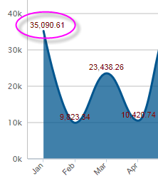
The Data Labels element has attributes that allow you to control the font family, color, size, and weight, the data format, border color, and positioning of the text.
![]() The Data Labels element's color-related attribute values can be set using @Chart tokens.
The Data Labels element's color-related attribute values can be set using @Chart tokens.
Marker Points Element
A "marker point" is a symbol that appears on the chart at each data point. When the Marker Points element is used as a child of Series.Area Spline, a small dot matching the color of the area will be displayed at each data point:
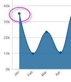
The default marker points are shown above. The Marker Points element allows you to select a different symbol for the marker point, and to control its size, color, border color, and transparency. When the cursor hovers over a marker point, it's automatically enlarged slightly.
Quicktips Element
By default, a "quicktip" is displayed when the mouse hovers near or over a data point:
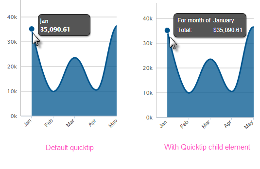
The automatically-generated quicktip displays information for the X- and Y-axis, as shown above, left. However, you may want to display other information or format it differently, perhaps as shown above, right, which can be done by adding a Quicktip child element beneath Series.Area Spline and setting its attributes and child elements. Use @Chart tokens to include chart data in the quicktip.
![]() Intrinsic functions are supported in the Quicktip attributes.
Intrinsic functions are supported in the Quicktip attributes.
Trend Line Element
The Trend Line element, added in v11.3, creates a line on the chart that indicates the "trend" of the data. The line connects a number of data points generated using a regression algorithm.
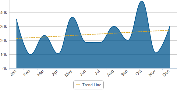
The Trend Line element is a child of the Series.Area Spline element and can be styled for color, line width, etc. When configured with a legend label, it will be represented by an item in the legend, as shown above.
Action Elements
Action elements initiate processing of a report or process task definition, redirection to a link, or other processing when a data point in the series is clicked.

In the example above, an Action.Report element has been added as a child of the Series, along with its Target.Report and Link Parameters child elements. To reference chart data in parameters, use the @Chart token, as shown above.
Input Selection
This series can also be used with the Input Selection family of elements, which turn the chart into an input control. This allows users, at runtime, to select points or values on the chart with their mouse and your report can then take action using the selected data. This is very useful, for example, for drilling into the data.
For more information about this functionality, see Input Selection.