Polar Charts
The Chart.Polar element produces a circular graph in which data is displayed in terms of values and angles. Also known as a "radar chart", this is an X-Y graph drawn on a circular grid, displaying value trends on the basis of angles. This topic introduces the Chart.Polar element.
- About Polar Charts
- Chart Types and Styles
- Attributes
- Supporting Elements
Polar charts were added to Logi Report in v10.1.59
About Polar Charts
In a traditional line chart values are plotted along the X and Yaxes, with their positions designated by the familiar Cartesian, or horizontal and vertical, coordinates. In a polar chart, data points are plotted using "polar" rather than Cartesian coordinates.
In a polar chart, the X-axis value is used to set the angle, based on the values around the perimeter of the chart, in degrees. The Y-axis value is plotted along a radius, with 0 at the center of the chart.
A slight style variation provides the "radar" or "spider" chart, which connects its tick marks with straight, rather than curved, lines yielding a spider web-like appearance.
Multiple data sets can be plotted simultaneously as layers, with transparency helping users to "see through" overlapping areas. This allows quick comparison and assessment of data.
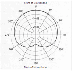 Polar charts are often very useful for present data that uses a natural cycle such as daily temperatures or annual rainfall. They're also frequently used in scientific and mathematic applications.
Consider the polar chart at the left. It shows the "sound pick-up pattern" for a particular type of microphone. The black line inside the chart plots how well the microphone picks up sound.
As you can see, the microphone is very good at collecting your voice if you stand directly in front of it.
As you move around to the side of the microphone, though, the sound pick-up capability starts to diminish and, if you stand at the back of the microphone, it's quite poor.
Which is good, as this is what the microphone was designed to do; on a stage with other musicians and with an audience out front, this microphone will focus fairly exclusively on a singer's voice. And the polar chart shows this quite clearly.
Chart Types and Styles
The following images illustrate the chart types and styles available in the Chart.Polar element. All of the examples, except the last two, have been plotted with the same polar-style and a single dataset:
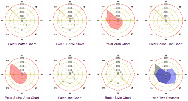
The last two examples show a "radar-style" chart and a polar-style area chart with two overlapping datasets (or layers). As you can see, Logi Studio provides a useful variety of styles with this new element. As with all Logi charting elements, special child elements are available to control the formatting of the borders, lines, areas, data labels, legends, and titles in polar charts.
Attributes
The Chart.Polar element has the following attributes:
| Attribute | Description |
|---|---|
| Background Color | Specifies the chart canvas background color. Enter a color by name, decimal RGB value, or hex RGB value. Prefix hex values with the pound sign, e.g. #112233. |
| Border Color | Specifies the chart canvas border line color. Enter a color by name, decimal RGB value, or hex RGB value. Prefix hex values with the pound sign, e.g. #112233. |
| Bottom Border | Specifies the distance, in pixels, between the bottom edge of the chart's image and the chart
itself. Use a border to leave room for labels or a
legend. |
| Chart Style | Specifies the style of Polar chart to be displayed Polar or Spider (Radar). The default style is Polar. |
| Chart Title | Specifies the title of the chart, which will appear at the top of the chart image. |
| Color | Specifies the chart color. Enter a color by name, decimal RGB value, or hex RGB value. Prefix hex values with the pound sign, e.g. #112233. |
| Data Column Y-axis | Specifies the name of a column in the datalayer that contains the value data. |
| Edge Color | Specifies the color of the line that borders filled areas. Enter a color by name, decimal RGB value, or hex RGB value. Prefix hex values with the pound sign, e.g. #112233. |
| Fill Color | Specifies the color of filled areas. Enter a color by name, decimal RGB value, or hex RGB value. Prefix hex values with the pound sign, e.g. #112233. |
| Grid Horizontal Color | Specifies the horizontal grid lines color. Enter a color by name, decimal RGB value, or hex RGB value. Prefix hex values with the pound sign, e.g. #112233. |
| Grid Vertical Color | Specifies the vertical grid lines color. Enter a color by name, decimal RGB value, or hex RGB value. Prefix hex values with the pound sign, e.g. #112233. |
| Height, Width | (Required) Size, in pixels, for the chart. |
| ID | Specifies a unique element ID. |
| Label Data Column | (Required) Specifies the name a column in the datalayer that contains angle data (in degrees). |
| Left Border | Specifies the distance, in pixels, between the left edge of the chart's image and the chart itself. Use a border to leave room for labels or a legend. |
| Legend Label | Specifies text that will be shown for this layer inside the chart legend. |
| Line Width | Specifies the width, in pixels, of the lines in the chart. |
| Maximum Label Length | Specifies the maximum number of characters that will be displayed for a label before the
text is automatically trimmed and the remainder replaced with an ellipsis (...). |
| Outer Border Color | Specifies the chart canvas border color. Enter a color by name, decimal RGB value, or hex RGB value. Prefix hex values with the pound sign, e.g. #112233. |
| Outside Border Rounding | Specifies the value, in pixels, of the radii of the four corners of the chart canvas. |
| Plot Area Background Color | Specifies the plot area background color. Enter a color by name, decimal RGB value, or hex RGB value. Prefix hex values with the pound sign, e.g. #112233. You may also use Transparent. |
| Polar Chart Type | (Required) Specifies the type of Polar chart. Options include: PolarLine, PolarScatter, PolarBubble, PolarArea, PolarSplineLine, and PolarSplineArea. |
| Polar Radius | Specifies the radius, or size from the center to the perimeter, of a Polar chart, in pixels. If left blank, size is determined automatically based on data. |
| Right Border | Specifies the distance, in pixels, between the right edge of the chart's image and the chart itself. Use a border to leave room for labels or a legend. |
| Security Right ID | When using Logi Security, specifies one or more Security Right IDs, separated by commas. Users with these Security Right IDs will be able to view the chart, while users without them will not. |
| Show Wait Icon | Specifies whether or not to show the "wait" icon. Some charts may take a significant time to run on the server and display in the browser. The wait icon shows a spinning image informing the user that chart content is being processed. The default is True; set to False to disable the wait icon. |
| Size | Specifies the size, in pixels, of chart symbols. The default size is 4 pixels. |
| Symbol | Specifies the symbol to be used to identify points in the chart. Options include: SymbolSquare, SymbolTriangle, SymbolX, SymbolCircle, SymbolCross, and SymbolDiamond. |
| Tooltip | Specifies text that will appear when the user hovers the mouse pointer over the |
| Top Border | Specifies the distance, in pixels, between the top edge of the chart's image and the chart itself. Use a border to leave room for labels or a legend. |
| Transparency | Specifies the transparency of the chart color. The lowest value of 0 specifies that the line is opaque, with no transparency. At the other end of the scale, 15 specifies a completely transparent line. Use medium-level transparency to allow different chart layers to show through each other. |
Supporting Elements
A number of elements make up the family used to create heat maps. Each element, its function, and its special attributes are discussed below:
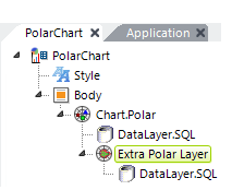
| Extra Polar Layer ElementAdds another "layer" (charted dataset) to the Polar chart, allowing multiple charts to be combined. Multiple layers in various chart styles (PolarArea, PolarLine, PolarSpline, etc.) are placed one on top of another in the same chart. The data for each layer comes from either columns in the main datalayer or from another datalayer beneath this element (shown). Attributes include: Data Column Y-axis- (Required) The name of the column in the associated datalayer that contains the value data for each record. Polar Chart Type - (Required) The type of Polar chart to be displayed: PolarLine, PolarScatter, PolarBubble, PolarArea, PolarSplineLine, or PolarSplineArea. Legend Label - Adds a label for this layer to the legend (if shown); a color-keyed symbol is automatically included. Transparency - Level of visual transparency for the plotted data in this layer. Values range from 0 (opaque) to 15 (completely transparent). Use medium-level transparency (8-10) to allow different chart layers to be seen through each other. Default value is 0. |
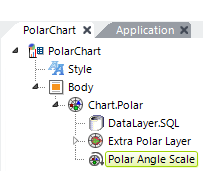
| Polar Angle Scale ElementThe element controls the angular axis scaling options. Attributes include: Fixed Scale Lower/Upper Bound - Sets the lower and upper bound, in degrees, of the circular scale. Numbers outside of range 0-360 are ignored. If left blank, automatic scaling occurs based on the data. If Lower Bound is specified, an Upper Bound must also be specified. Scaling Mode - Determines the way in which angle (X-axis) data is plotted. Standard scaling plots the data in an enumerated manner; each point (row) returned in the datalayer is evenly spaced. This works fine in many cases, especially when there are no missing data points. Linear scaling plots points based on an X-axis value; the X-axis is spread evenly end-to-end, even though the data points are not. Linear spacing works with either numeric or date/time values. Linear Tick Increment - When the Scaling Mode (previous attribute) is set to LinearNumber, this attribute controls how tick marks are created around the perimeter of the chart. Enter a number (in degrees) to specify the frequency with which tick marks will appear or, if working with date/time values, use one of the appropriate values such as Year or Week. Use Auto to automatically set an appropriate frequency based on the data. |
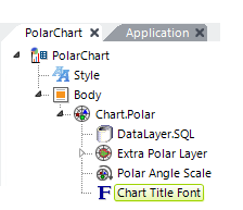
| Chart Title Font ElementThis optional element is available as a child to all chart elements. It controls the Font, Color, Size, and Angle (orientation) of the chart title. The title text itself is set in the Chart.Polar element. |
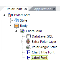
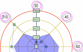
| Label Font ElementThis optional element is available as a child to all chart elements. In a polar chart, it controls the formatting (font, color, size, number of decimal points, and text orientation) of the angle (X-axis) data (shown circled in the image below).
If this element is omitted or the Color attribute is left blank, the data appears in Black. |
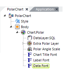
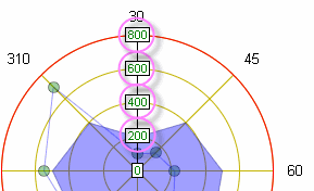
| Data Font ElementThis optional element is available as a child to all chart elements. In a polar chart, it controls the formatting (font, color, size, and text orientation) of the value (Y-axis) data (shown circled in the following image).
If this element is omitted or the Color attribute is left blank, the data appears in Black.
|
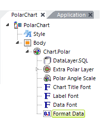
| Format Data ElementThis optional element is available as a child to all chart elements. It allows data values can be formatted for different decimal positions and European-style characters. |
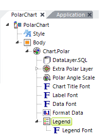
| Legend ElementThis optional element is available as a child to all chart elements. It displays a chart legend, in which each chart item is listed with a representative color and possible symbol. Attributes include top and left offset, border color, orientation, and background color. In a polar chart, the text for a legend entry must be set in the Chart.Polar and ExtraPolarLayer elements.
Legend Font ElementThis optional elements controls the formatting (font, color, size, and text orientation) of the text in the chart legend. |
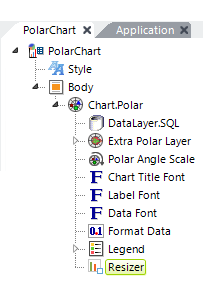
| Resizer Element
|
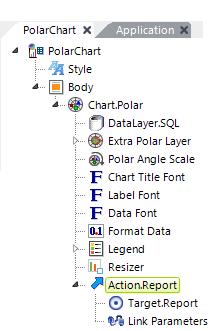
| Action ElementThis optional element provides click-event handling for the chart to allow a variety of actions such as redirection, process calls, etc. It works for the entire chart, not for individual data points. |
