Work with Classic Charts
From the beginning, Logi Info and Logi Report have offered a range of Chart and Gauge visualization elements, now collectively called "classic charting elements", that developers can include in their reports and applications. This topic discusses the use of those elements and provides guidance for implementing them. Sections include:
- About Classic Charts
- General Chart Appearance
- Data Retrieval and Appearance
- Title, Labels, and Legends
- Drill-Down and Drill-Through Capabilities
- Interactive Chart Configurations
- Working with Needle Gauges
- Default Color Sets
- Chart Release Notes
About Classic Charts
Logi charting elements provide numerous powerful features for creating charts and maps. The discussion below provides an overview of how to work with these elements but is not intended to be an exhaustive survey of all the elements and attributes available.
Additional documents, focused on individual chart types, are being added to the Developer Library to provide more detail. The information presented here is intended to allow developers to quickly gain an understanding of how Logi charting elements work and to rapidly create simple charts.
Note that, due to the varying nature of the elements, the attributes used in examples below are not all available for all charting elements. Attributes and child "helper" elements may be quite chart-style specific; developers need to apply common sense when implementing charts based on the examples shown here.
Developers unfamiliar with Logi classic charting elements are encouraged to read Introduction to Classic Charts & Gauges before proceeding.
In v11.2.040, we introduced a new set of charting elements collectively called "Chart Canvas" charts. This document does not discuss those charts. See Chart Canvas Charts for information about these new charts.
Logi Studio includes wizards that can assist you in adding and configuring charts for your application.
General Chart Appearance
When reports are generated, each charting element is rendered in an "image space" and the elements have attributes that allow developers to control the size and color of that space. The shape of the image space may not match the shape of the data portion of the chart.
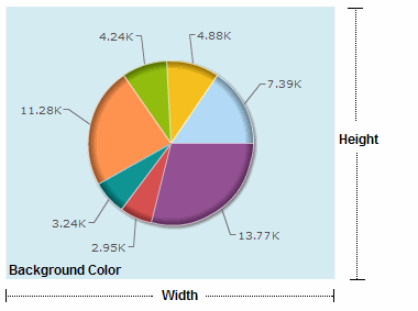
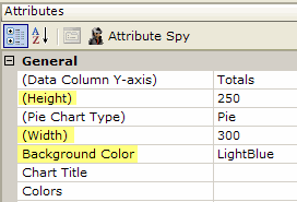
For example, as shown above, even though the chart is round, the Height, Width, and Background Color attributes refer to its rectangular image space. The Height and Width values use pixels as their unit of measurement and can be set using tokens.
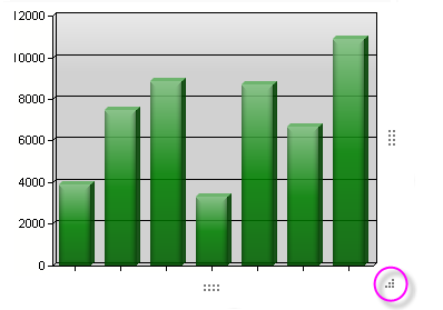
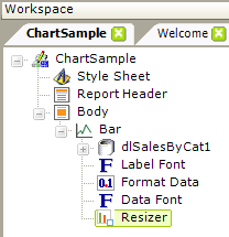
As of version 9.5, in Logi Info only, static charts can have a new child, the Resizer element. This element displays resizing "handles", as shown above, so that the chart can be dynamically resized by the user at runtime. Resizer changes are maintained within the Session, so every return visit to the report will maintain the size changes. Maximum and minimum sizes can be specified by the developer. In versions prior to 10.0.428, the appearance of the resizing handles was slightly
different, and in v10.2.424, they were changed to remain hidden until the mouse pointer hovers over them.
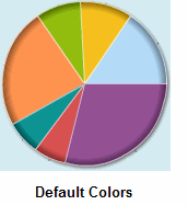
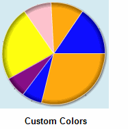
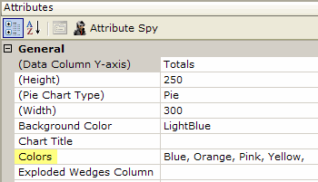
Many elements have a Colors attribute to set the colors for the data portions of the chart. If this attribute is left blank, a default color set is used, or a custom color set can be entered as a comma-separated list, as shown above.
Color values can be a name (LightBlue), a decimal RGB value (255,255,255) or a hex RGB value (#112233). In Studio, click the browse button next a color attribute value to open the Color Selector window and visually select colors. Color names can be followed by the word "Metallic" to produce a special effect; the word "Transparent" can also be entered as a value.
As of v10.0.227, two new attributes allow colors to be set using data. Chart.Pie and Chart.XY now include attributes that identify a column in the datalayer as the source for color information for static pie and bar charts.
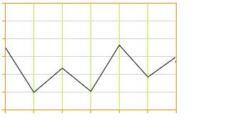
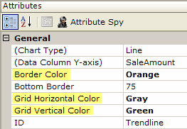
In Line, Area, Bar and other charts that use a background grid of lines to help the eye follow values, as shown above, the color of the grid lines can be controlled. The same properties are available for the border around of the edge of the canvas.
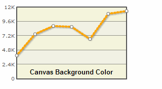
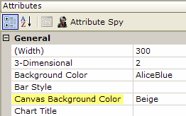
The data portions of Animated Chart.XY charts are rendered on a "canvas", which can have its own background color, as shown above, which is set using the Canvas Background Color attribute. A compatible color is automatically generated for alternating values.
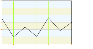
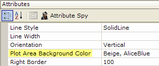
In static Line charts, as shown above, the attribute that controls the canvas color is the Plot Area Background Color. Different colors for alternating values can be shown by entering a comma-separate list of values.
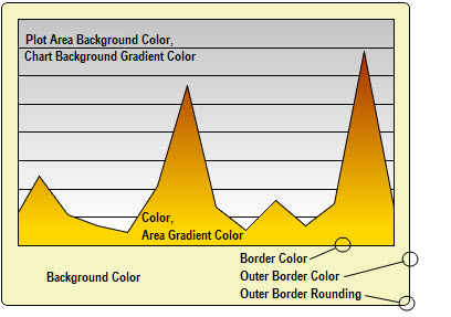
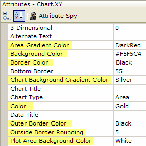
In staticChart.XY charts (Area, Bar, Line) individual attributes control the colors of the data, plotting area background, and borders. Version 9.2 and later includes attributes for applying color gradient effects and for rounding outer border corners.
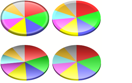
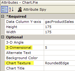
As of v9.5, static Chart.Pie includes a Chart Texture attribute which can be used to apply different appearances to the chart surface. 3-D depth and 3-D angle can also be configured.
In v10.1.46, the Chart Texture attribute was provided for the Chart.Heatmap element, as well.
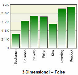
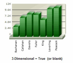
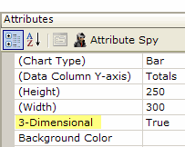
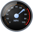
Many charts also have a 3-Dimensional attribute which controls rendering in 2-D or 3-D, as shown above. The 3-D rendering process affects not only the data portions of the chart but the canvas, too. In the case of Gauge.Needle, the Needle Gauge Enclosure attribute can even add a very realistic-looking "glass cover" over the face of the gauge.
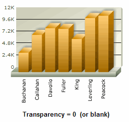
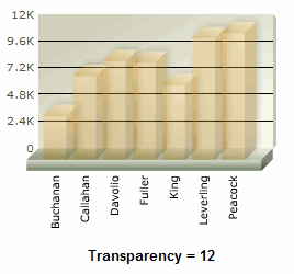
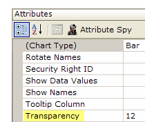
As shown above, many charts also have a Transparency attribute, which can be useful for letting different chart layers show through each other. The lowest value for this attribute is 0 (or blank), which makes the chart opaque, and the highest is 15, which makes the chart completely transparent. Note that this does not affect the canvas itself.
All charts can be saved as image files by right-clicking them and selecting Save from the popup menu. Animated Pie charts have additional runtime features available via their popup menu, including Rotation and Slicing (clicking a slice to explode it out from the pie).
Data Retrieval and Appearance
Data is generally introduced into charts by adding a datalayer as a child of the charting element. The datalayer retrieves the data to be charted and supplies it, record by record, to the chart for plotting. The datalayer can make use of grouping, filtering, and all the other modifier elements generally available to datalayers in order to shape the data it retrieves. The Formatted Column element can be particularly useful in getting data in the datalayer formatted correctly for use in charts.
Animated Gauges can draw their data from a child datalayer or from external data, such as Local Data, Session, and Request tokens. However, they're not designed to be used in a report page where there are multiple gauges, each with its own child datalayer. In this case, all of the gauges will draw data only from the first child datalayer. If you have a multi-gauge page such as this in mind, design your report to use Local Data to retrieve all of the data needed for all of the gauges, then use tokens to provide the data to the gauges.
Beginning in v10.0.299, an animated "loading" image is displayed if there's a delay in retrieving data for the chart. In v10.2.314, a new attribute, Show Wait Icon, was added. This attribute defaults to True, but you can set it to False if you do not want the animated icon to appear.
Beginning in v10.1.18, chart processing became multi-threaded and asynchronous so, for example, charts in multiple dashboard panels could be retrieved simultaneously. On web servers with multiple cores or multiple processors, chart generation tasks will be spread across them for even better performance.
What if no data is returned to the datalayer? Instead of displaying the chart, animated charts will automatically generate a "No data to display message". As of v10.0.85, the Zero Rows Message element can used to display the message of your choice in similar circumstances when using static charts.
Values from the datalayer can be used to draw the boundaries of graphics in the chart (the height of a bar, the size of a pie slice, etc.) and to supply text that appears in tooltips, legends, and chart labels.
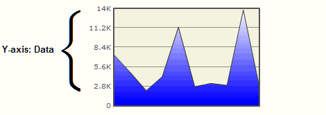
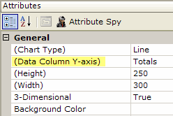
The chart element's Data Column Y-axis attribute value is set to the name of a column from the chart's datalayer, causing its value for each record to be charted. This adds one data series to the chart.
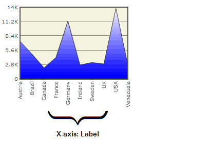
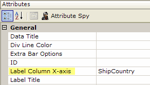
Labels along the X-axis, based on the data, are created using the chart element's Label Column X-axis attribute, which is set to the name of another column in the datalayer.
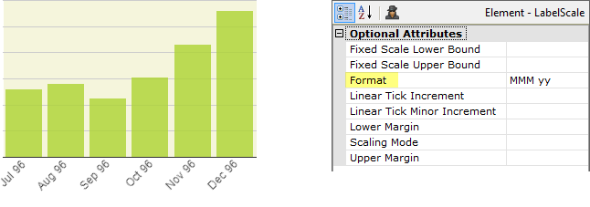
Data and Label values can be formatted for presentation, using several child elements, such as Format Data and Format Label. In v10.2.424, these two elements were deprecated for static charts, except Chart.Pie and Chart.Polar, but in v11.0.519 Format Data was reinstated for Chart.XY. At the same time, a new Format attribute was added to the Data Scale and Label Scale elements, providing the same functionality, as shown above.
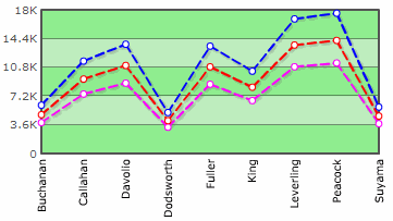
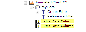
In the example above, three data series are shown on a line chart. The basic chart will display one data series; to add additional series, Extra Data Column elements are added below the chart element. Each of these elements has an attribute that's set to the name of another column in the datalayer.
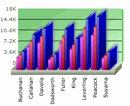
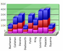
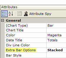
In the example above, the chart type has been changed to a Bar Chart. On the left, the three data series appear as side-by-side bars, and on the right, as stacked bars. This behavior is controlled by the chart's Extra Bar Options attribute, shown above right.
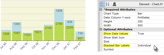
You can show the data values inside stacked bars in a Static Bar Chart by setting the chart's Stacked Bar Labels attribute to Individual, as shown above. The default option, Aggregate, displays a single, combined value above the top of each stack.
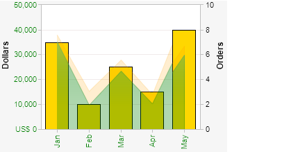
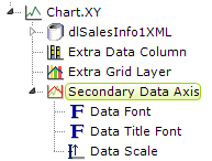
Static Chart.XY charts can have two Y-axes. The Secondary Data Axis element controls a secondary axis, normally appearing on the right side of a grid. In the example shown above, this is the "Orders" axis. This other axis represents data for an Extra Grid Layer, and has its own independent scale. Child elements, including those shown above can be used to format that data and axis appearance.

The tick marks displayed just outside the axis borders in Static Chart.XY charts can be shown or hidden, by setting the Tick Marks attribute in the Data Font and Label Font elements.
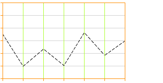
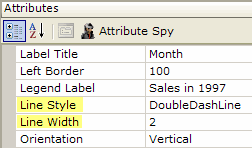
The style and width of the lines representing data in Line charts can be formatted using the Line Style and Line Width attributes, as shown above. Solid, and a variety of dotted and dashed, line styles are available. New attributes in v9.5.55 allow the Line Style and Line Color to be set from a data column.
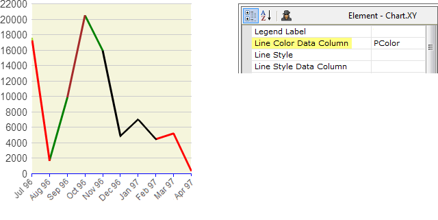
The appearance of static line charts can also be data-driven by setting the Line Color Data Column and Line Style Data Column attributes. This allows you to have different colors for different line segments, as shown above.
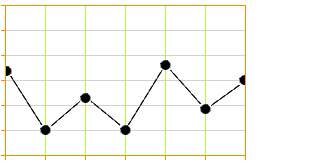
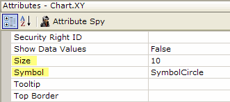
As of v9.5.55, in Line and Scatter charts, the data points can be emphasized with symbols, as shown above. The size of the symbol, in pixels, can be set and symbols choices include Circle, Cross, Diamond, Glass Sphere, Solid Sphere, Square, Triangle, X and others. In v10.0.337, the ability to enter a comma-separated list of symbols as the Symbol attribute value was added for Line and Spline-types of Chart.XY. This allows a different symbol to be used for each data series.
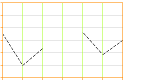
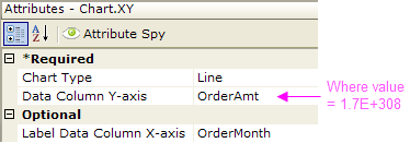
Line chart lines can be made discontinuous by replacing null data values with the value 1.7E+308, producing "broken" lines.
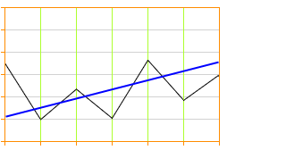
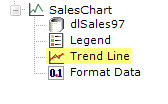
A "trend line" can be added to static reports to give a general impression of the trend of the data. The blue trend line in the example above was included by adding a Trend Line element as a child of the chart element. The calculation involved in determining the trend line angle occurs automatically; line width and color can be set through attributes.
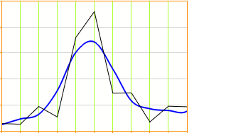

The Lowess Curve Line element, available with release 9.5.78, creates a
trend line (in blue, above) that fits a curve through a static Chart.XY's data
points using the Lowess Curve Fitting algorithm.

Static and Animated Pie charts can be configured so that one or more of their pie wedges are displayed as "exploded", as shown above. This is done using the Exploded Wedges Column attribute, which specifies a datalayer column whose values determine wedge state. Non-zero values in that column will cause the wedge for the corresponding X-axis value to be exploded. Typically, the developer will add a Calculated Column to the datalayer, with a formula that evaluates to 1 or 0, and specify that column in the Exploded Wedges Column attribute.
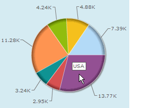
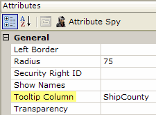
Tooltips can be also added to charts, by setting the Tooltip Column (animated charts) or Tooltip (static charts) attribute. This causes identifying data from the datalayer to be displayed as a tooltip, as shown above, when the mouse hovers over a portion of the chart. The Tooltip Column requires only the name of a column from the datalayer, while the Tooltip attribute requires the use of an @Chart token to display data. For animated charts, a Tooltip Font element is available for formatting the tooltip.
Beginning in v10.1.46, certain charts can include a feature called Quicktips:
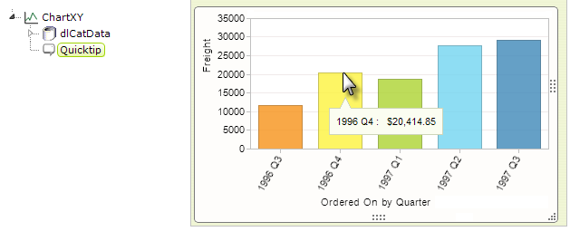
The Quicktip element, shown above left, is added as a child of the chart element and provides a small, popup "balloon" at the cursor location. The Quicktip allows the balloon to have a title and one or more rows of text. Data values can be shown by configuring the Quicktip element with the @Chart token.
In summary, data is retrieved for use in a chart by a datalayer. Typically, a chart on its own will display one data series but, with the addition of other helper elements, it can be made to show additional data series.
Refresh Animated Chart.XY in Realtime
In v11.1.033, the Realtime Update element was introduced. It transforms an Animated Chart.XY into a chart that updates itself periodically, by adding new data values at its right side and scrolling the X-axis horizontally.
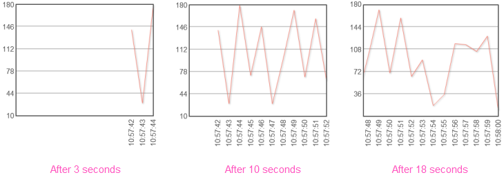
The example above shows a Line chart displaying a value as it changes, once per second. The Realtime Update element uses AJAX technology to automatically refresh its Animated Chart parent element, based on an interval set in seconds. It works by re-running just that portion of the report that retrieves the chart data and passing it back to the browser to update the chart. The data is accumulated internally and re-processed each time the chart is displayed.
If Extra Data Column elements are used, they're displayed as additional lines in Line charts, and as stacked values in Area and Bar charts.

As shown above, the Realtime Update element is used by adding it beneath the Animated Chart.XY element. Its only attribute is the required Refresh Interval attribute, which is specifies, in seconds, how frequently to refresh the chart.
![]() Note that the Realtime Update element cannot be used with a chart whose datalayer has a Crosstab Filter applied to it.
Note that the Realtime Update element cannot be used with a chart whose datalayer has a Crosstab Filter applied to it.
Title, Labels, and Legends
Logi charting elements include numerous attributes and supporting elements that can be used to tailor their chart titles, labels, and legends. These help developers get the right "look" for their charts, thereby helping users understand what they're seeing.
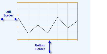
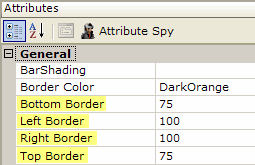
Space for titles is automatically allocated for all charts. For static charts in pre-v9.5 releases, or if the developer desires to do it manually, this can be done, as shown above, using the Top, Bottom, Left, and RightBorder attributes.
These indicate, in pixels, the distance on each side from the chart canvas to the edge of the chart image space. The overall vertical size of the chart is therefore calculated
as the sum of the Top Border + Height + Bottom Border. The horizontal size calculation is Left Border + Width + Right
Border.
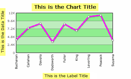
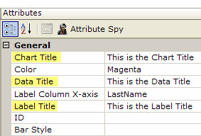
Titles for the chart, data, and labels can be set using the Chart Title, Data Title and Label Title attributes as shown above.
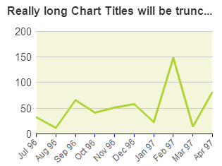
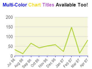
Static Chart titles that are longer than the width of the chart itself are automatically truncated and have an ellipsis ("...") appended to them, as shown above left. In Animated Charts, they wrap.
Static Charts can also use the Chart Title Font child element to set the title font, color, size, angle, and alignment.
Static Chart titles can also be rendered in multiple colors, as shown above right, by using CDML tags directly in the Chart Title attribute value to specify different font colors, sizes, etc. Find out more about CDML in Advanced Chart Title Formatting. The example shown above was produced using this value:
<*color=0000FF*>Multi-Color <*color=FFD700*>Chart <*color=BA55D3*>Titles <*color=000000*>Available Too!
All charts include a Max Label Length attribute, which specifies the maximum number of characters that will be displayed for a label before the text is trimmed and the remainder replaced with an ellipsis (...). This truncation is also applied to Legend labels for Chart.Pie, if a Legend is in use (it is not applied to legends for other types of charts).
Static XY and Pie charts include a Label Column Data Type attribute, which can be used to set the way in which the charting engine will interpret the data specified in the column named in Label Data Column X-axis. This can be useful, for example, when you want dates in the data to be presented as text in the chart's X-axis labels.
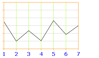
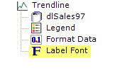
As shown above, labels can be formatted by adding a Label Font element, providing control over font family, size, color, angle, and decimal point appearance. Font angle is only configurable for static charts, not for animated charts.
A Label Scale element is also available for controlling the appearance, size, and frequency of tick marks along the scales. One of its modes is LinearTime, which plots points evenly end-to-end according to an x-axis value, for use with line and area charts.
Labels can also be formatted using the CDML formatting language mentioned earlier.
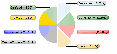
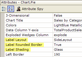
In version 9.2 and later, attributes of the static Pie chart allow the position, shape, and shading of pie chart labels to be set.
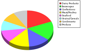

Legends provide an explanation of some of the visual information in a chart, often color-related. In the example above, the legend associates products with colors. In Static Charts, two elements, Legend and Legend Font, provide control of the location, size, font, border, orientation, and background color of legends. In some Animated Charts, providing a value for their Legend Title attribute automatically generates the legend. The association between the colors and the
data is generated automatically.

When the Legend element's Legend Filter attribute has been set to True, it becomes possible to dynamically filter the data in some Static Charts, including Pie, Line, Area, Bar, and Polar charts, by clicking items in the Legend, as shown above.
Drill-Down and Drill-Through Capabilities
Users frequently want to be able to get detailed information about the data shown in charts. Developers can provide this "drill-down" functionality in Logi applications by including Action elements in report definitions.
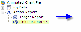

For example, adding an Action.Report and Target.Report element as children of the Animated Chart.Pie element will cause each wedge in a Pie chart to become a link to the target report.
![]() Note that, when a chart uses its own datalayer element to retrieve data, that data is accessed with an @Chart token, not the @Data token that's used with data tables.
Note that, when a chart uses its own datalayer element to retrieve data, that data is accessed with an @Chart token, not the @Data token that's used with data tables.
Data specific to each pie wedge can be passed to the target report using Link Parameters and an @Chart token. The target report can then take action, such as filtering its own data, based on an @Request token representing the Link Parameter value.
Automatic Drill-Through Report
Charts often use grouping to aggregate data for a consolidated view. There are times, however, when it's useful to be able to examine the detail data that was used to create that view. The Group Drillthrough element was introduced for this purpose, in Logi Info, v10.0.385. Feature not available in Logi Report.
Group Drillthrough works with Chart.XY, Chart.Pie, Chart.Heatmap, and Chart.Scatter.
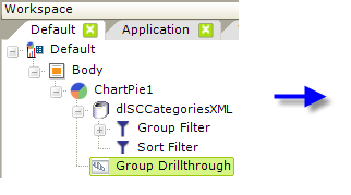
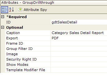
In the example shown above, a Group Drillthrough element has been added beneath a Chart.Pie element. All of the element's attributes, other than ID, are optional but the example shows that a custom caption and an export button selection have been entered. More information about the attributes can be found in the element's Element
Reference page.
The resulting pie chart looks no different than usual, but when one of its wedges is clicked,
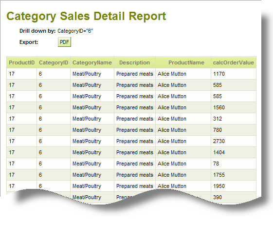
a detail report, like the example shown above, is automatically generated, containing all of the relevant detail data.
![]() Note that the Group Drillthrough element is designed to work charts with datalayers that have a Group Filter, Crosstab Filter, or Relevance Filter child element. This has implications if you want to use Group Drillthrough and you're working with DataLayer.SQL; for example, you'll have to use a Group Filter element instead of doing the grouping in your query.
Note that the Group Drillthrough element is designed to work charts with datalayers that have a Group Filter, Crosstab Filter, or Relevance Filter child element. This has implications if you want to use Group Drillthrough and you're working with DataLayer.SQL; for example, you'll have to use a Group Filter element instead of doing the grouping in your query.
The Group Drillthrough element's attributes allow you to customize certain aspects of the detail report. You can also include Drillthrough Column elements beneath the Group Drillthrough element; they allow you to set the number columns that will appear in the report and to customize their appearance.
Interactive Chart Configurations
All of the charting elements' attributes can be "tokenized"; that is, you can use tokens in them as values. This allows charts to be highly-interactive and dynamically customizable.
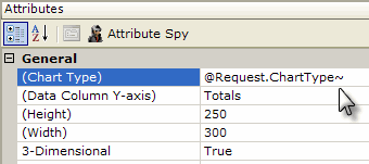
For example, a report page could include an Input Select element that presents the user with a choice of chart types: Bar, Line, Area. When the user makes a selection, the report is refreshed and their selection is passed as a Link Parameter. The resulting @Request token is used in the Animated Chart.XY element's Chart Type attribute, as shown above, to dynamically set the chart type. Other examples:
- Through the use of cookies and @Cookie tokens, chart configurations can be "personalized" for individual users and the settings retained between sessions.
- Charts can be included in reports as child elements of tables and have a "data-driven" configuration, using @Data tokens to provide values for chart attributes.
The chart configuration flexibility available through the use of tokens is quite extensive, providing opportunities for user-customizable chart size, colors, type, content, and more.
Hover Highlight
The Hover Highlight child element causes chart features, such as bars and lines, to be highlighted
when the mouse pointer is hovered over them, making it easier for users to visualize the
item under the pointer. The element is available for use with static Pie, Bar, Line, Area, and Scatter charts.
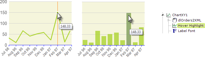
The element's attributes enable customization of the highlight overlays. The Fill Color attribute applies to Pie and Bar charts, the Border Color and Border Width attributes to Line, Area, and Scatter charts, and Line Color applies to Line and Area charts.
![]() Note that attempts to use the ThemeAlignCenter class, or other CSS classes that use text-align, on a container such as a DIV in order to center a chart that includes Hover Highlight are likely to fail. Hover Highlight is not a simple HTML entity, like text or an image, that other content can flow around; it's wrapped in its own
DIV
and no longer behaves like block content. One possible alternate approach is to use an HTML table instead of a DIV as the container. Due to its non-standard behavior, this kind of centering will work with IE 9 only.
Note that attempts to use the ThemeAlignCenter class, or other CSS classes that use text-align, on a container such as a DIV in order to center a chart that includes Hover Highlight are likely to fail. Hover Highlight is not a simple HTML entity, like text or an image, that other content can flow around; it's wrapped in its own
DIV
and no longer behaves like block content. One possible alternate approach is to use an HTML table instead of a DIV as the container. Due to its non-standard behavior, this kind of centering will work with IE 9 only.
Zoom Chart
Introduced in Logi Info v10.2.424, the Zoom Chart element provides users with the ability to "zoom" into a chart's data by selecting an area on the chart. The Zoom Chart is available for use with static Chart.XY and Chart.Scatter elements.
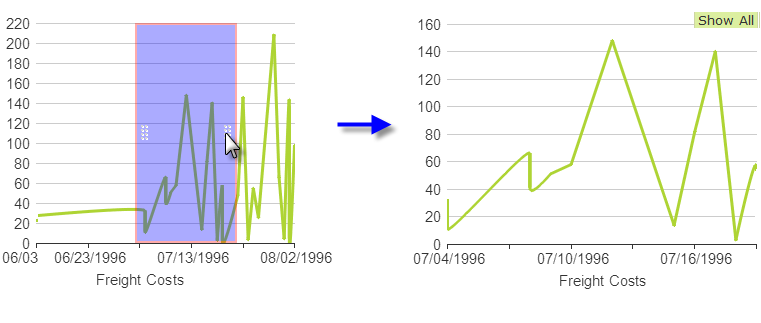
There are two configurations of the Zoom Chart. In the first, shown above left, the "selection area" appears right over the parent chart. Resizing handles allow its size to be adjusted and it can also be dragged horizontally. When the mouse button is released, the parent chart zooms in or out to include just the data within the selection area, as shown above right. Successive selections can be made on the zoomed chart. The "Show All" button returns the view to encompass all of the
original data.
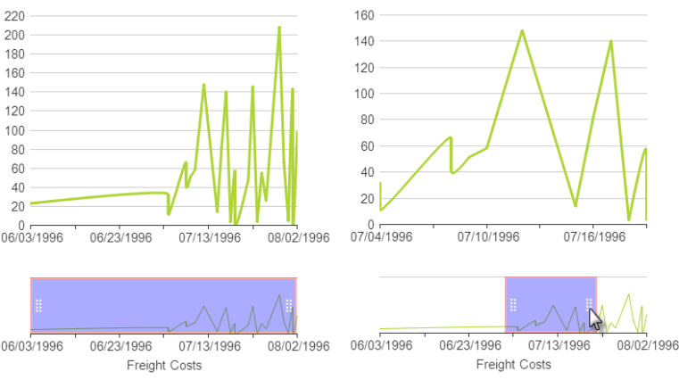
In the second configuration of the Zoom Chart, a smaller version of the parent chart, with selection area, appears below the parent chart. Changes to the selection area cause the view of the data in the parent chart to change correspondingly.

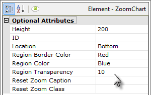
As shown above, the Zoom Chart element is added as a child of the parent chart and its attributes allow you to customize the selection area and chart. The Location attribute is set to None to display the selection area over the parent chart; setting it to Bottom displays the small selection chart beneath it.

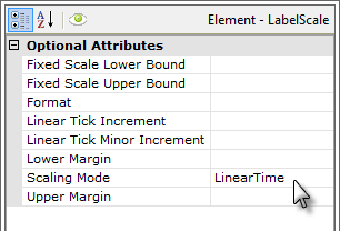
A Label Scale element is also required, as shown above, with a Scaling Mode set to one of the Linear options (based on your X-axis data type).
InputChart.List and InputChart.Range
Two new elements were added in v11 that allow users to work with charts as user input elements. Users can select data values on a chart and pass them, in manner similar to other user input elements, through Request tokens to other definitions. Both InputChart.List and InputChart.Range are added as the parent element to a static chart element.
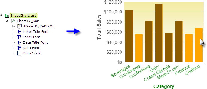
As shown above, InputChart.List works with static Bar and Pie charts. At runtime, chart bars (or wedges) can be clicked to select them. When the report page is submitted, the X-axis values are submitted to the next definition as a Request token that includes the chart ID, whose value is comma-separated list. For example:
@Request.ChartXY_Bar~ = "Condiments,Produce,Seafood"
would result from submitting the example above. The element includes attributes common to user input elements and attributes for specifying the colors of selected and unselected bars or wedges. Standard, unrelated Action elements (not shown) are required to submit the page.
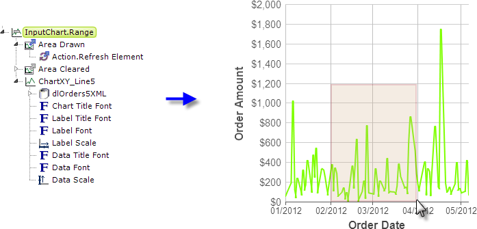
As shown above, InputChart.Range works with static Line, Spline, and Scatter charts. At runtime, a "selection area" can be "drawn" (by dragging the mouse) onto the chart plotting area to select values. When the report page is submitted, the maximum and minimum X-axis and Y-axis values are submitted to the next definition as individual Request tokens. For example:
@Request.minX_value~ = "2/20/2012"
@Request.maxX_value~ = "3/31/2012"
@Request.minY_value~ = "0"
@Request.maxY_value~ = "1200"
would result from submitting the example above. Clicking outside of the selection area will clear it. The element includes attributes for specifying the names of the request variables to be associated with the value range and the colors of the selection area. Two special child event handler elements, Area Drawn and Area Cleared, can be used to fire standard Action elements, as shown, when the selection area is drawn or cleared, refreshing or submitting the page. In addition, or instead, standard,
unrelated Action elements (not shown) can also be used to submit the page.
More information is available in our document Introduction to User Input Elements.
Working with Needle Gauges
Static needle gauges look like speedometers: they have a needle pointer that swings through an arc and indicates a data value on a scale. Gauge shapes include half-round, quarter-round, and rectangular.
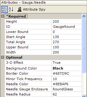
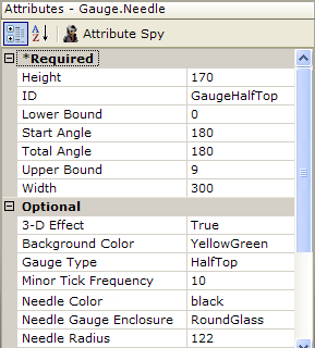
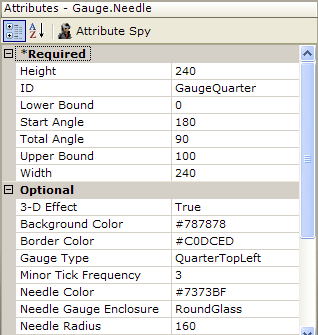
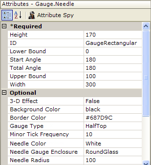
The Start Angle and Total Angle attributes of the Gauge.Needle element govern the possible positions of the needle pointer. This table provides information about configuring these gauges. Attributes left blank have been removed from the images.
Gauge Shape | Description |
| Round gauge; Start Angle value minimum = 0, Total Angle maximum = 360.
|
 | Half-round gauge; type can be:
|
| Quarter-round gauge: type can be
|
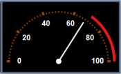 | Rectangular gauge; type set to HalfTop.
|
Default Color Sets
If you're using one of the standard Logi themes, the theme will set the default colors. These colors can be identified by looking at the theme's Template Modifier file: <your app folder>\rdTemplate\rdTheme\<theme name>\ThemeModifier.xml
If you're not using a theme and do not specify a color set, the following default color set will be applied.
Static Charts
|
|
|
|
List continues with other colors not shown here.
Animated Charts
|
|
|
Colors are repeated again after 23 colors are applied.
Chart Release Notes
The following enhancements to chart elements have been introduced:
| Release | Enhancements |
|---|---|
| 11.1.033 |
|
| 11.0.727 |
|
| 11.0.519 |
|
| 11.0.416 |
|
| 11.0.43 |
|
| 10.2.424 |
|
| 10.2.314 |
|
| 10.2.224 |
|
| 10.1.46 |
|
| 10.1.18 |
|
| 10.0.428 |
|
| 10.0.385 |
|
| 10.0.366 |
|
| 10.0.299 |
|
| 10.0.227 |
|
10.0.189 |
|
| 10.0.151 |
|
10.0.117 |
|
10.0.101 |
|
10.0.85 |
|
10.0.31 |
|
| 9.5 |
|
| 9.2 |
|
| 9.1 |
|
