Series.Pyramid
The Chart Canvas element's Series child elements cause a data visualization (the chart) to be rendered in the canvas. This topic discusses the Series.Pyramid element.
- About Series.Pyramid
- Use Multiple Series
- Attributes
- Add Data Labels
- Use the Quicktips Element
- Use Action Elements
- Use Input Selection
About Series.Pyramid
The Series.Pyramid element generates a Pyramid chart, which displays values as progressively increasing proportions. The size of each pyramid segment is determined as a percentage of the total of all values.
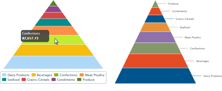
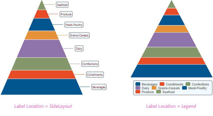
The example above shows Pyramid charts, with a legend and with side labels.
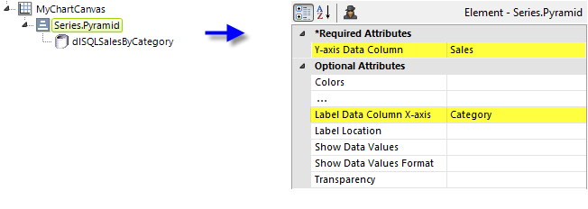
As shown above, the chart is created by adding Series.Pyramid to the canvas, along with a datalayer. Very few attributes need to be set for the Series element in order to produce a basic chart.
![]() Note that a datalayer element can be used either beneath Series.Pyramid, as shown above, or beneath Chart Canvas. If used as a child of Chart Canvas, its data is available to all child Series elements. This can improve performance if you have several series, all using the same data, beneath the same Chart Canvas element.
Note that a datalayer element can be used either beneath Series.Pyramid, as shown above, or beneath Chart Canvas. If used as a child of Chart Canvas, its data is available to all child Series elements. This can improve performance if you have several series, all using the same data, beneath the same Chart Canvas element.

When the Label Location attribute has been set to SideLayout, as in the example, the labels can be styled using the Side Label Style element, as shown above.
Multiple Series
Pyramid charts do not generally lend themselves to use with other series types, but it is possible. You can add additional series to the chart by adding additional Series elements:
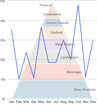
The example above shows Series.Pyramid with Series.Line. The Pyramid's transparency has been set to allow the grid and data lines to show through it. In addition, the Pyramid's connector lines have been hidden and its labels offset to overlay the pyramid segments.
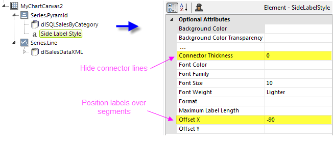
The example above shows the two Series elements and their datalayers, used to produce the previous chart. You can adjust which series appears "in front" of the other in the chart by changing the order of the Series elements in the definition. The Pyramid's Transparency attribute has been set to allow the grid and data lines to show through it.
![]() When using multiple series, you may be able to reduce the number of data queries and improve performance by using Local Data (see Introducing Datalayers) to read all of the data once and then link its datalayer (see Link Datalayers) to share it
to the series. At each Series element,
link its datalayer to the shared Local Data datalayer and filter the data to meet the needs of each individual series.
When using multiple series, you may be able to reduce the number of data queries and improve performance by using Local Data (see Introducing Datalayers) to read all of the data once and then link its datalayer (see Link Datalayers) to share it
to the series. At each Series element,
link its datalayer to the shared Local Data datalayer and filter the data to meet the needs of each individual series.
Attributes
The Series.Pyramid element has the following attributes:
| Attribute | Description |
|---|---|
| Y-Axis Data Column | (Required) Specifies the name of a datalayer column whose values determine the height of each pyramid segment. |
| Colors | Sets the colors of the pyramid segments, which should be entered as a comma-separated list. Enter a color by name, decimal RGB value, or hex RGB value. Prefix hex values with the pound sign, e.g. #112233. When there are more segments than colors specified, the listed colors are used again from the beginning. A default set of colors is used if this is left blank and no theme has been applied. For more information, see the Default Colors section of Chart Canvas Charts. |
| Disable Mouse Tracking | Disables mouse tracking for the series, when set to True. This affects tooltips and click events. For large datasets, this may improve performance. The default value is False. |
| Hover Brightness | Specifies the change in a pyramid segment's brightness when the mouse pointer hovers over it. Values can be 0 (no change) through 15 (lighter). The default value is 2. |
| Label Data Column X-axis | Specifies the name of a datalayer column whose values be represented by pyramid segments. |
| Label Location | Specifies where pyramid segment labels will appear. Options include: SideLayout - (the default) labels will appear to the right, with lines connecting them to segments.Legend - segments to be identified in a legend. The legend items can be clicked to toggle the visibility of individual segments. NoLabels - labels will not be shown. |
| Show Data Values | Specifies if the value of each data point, rather than the data label, should be shown on the chart. Depending on the value of the Label Location attribute, they may be shown alone or with the label values. The default value is False. |
| Show Data Values Format | Specifies formatting characteristics for data values. For dates, the non-specific formats, such as General Date, Short Time, etc., are converted according to the browser's international settings. For very large reports, the non-specific formats perform better. Special formats include: < and > - change strings to lower and upper case. qq - returns the number of the quarter when the value being formatted represents a date. To return the year and quarter together like "2010 Q1", set the format to yyyy Qqq. |
| Transparency | Specifies the transparency of the pyramid segments. The lowest value of 0 specifies that the background is opaque, with no transparency. At the other end of the scale, 15 specifies a completely transparent background. Use medium-level transparency to allow different series to show through each other. |
Add Data Labels
A "data label" is text that can be shown adjacent to each pyramid segment, that shows its X-axis data value. This is controlled using the Label Location attribute.
As shown above, labels can be placed beside the segments, or in a legend, or not shown at all.
When the legend option is selected, "legend filtering" is active: clicking a segment's entry in the legend will toggle its appearance in the chart. For more information about legends, see Legend.
![]() When working with labels beside the pyramid, you may need to adjust the Chart Canvas element's Spacing Left and Spacing Right attributes to "fit" all of the label text inside the canvas.
When working with labels beside the pyramid, you may need to adjust the Chart Canvas element's Spacing Left and Spacing Right attributes to "fit" all of the label text inside the canvas.
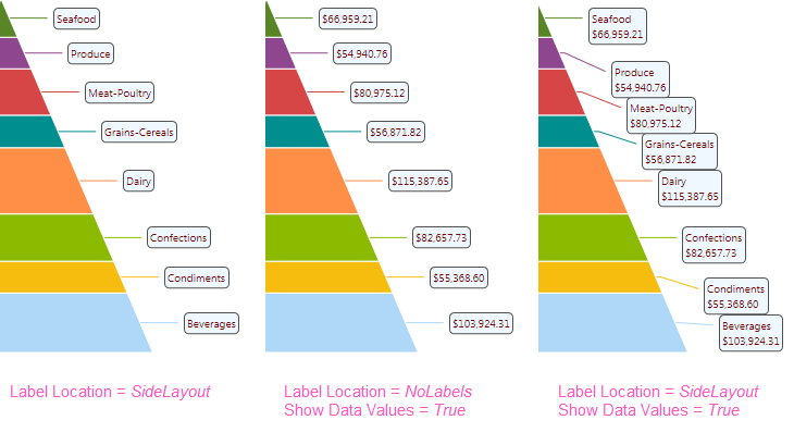
If you want to show the data values instead of, or with, the data labels near each pyramid segment, as shown above, use the Series.Pyramid element's Label Location, Show Data Values, and Show Data Values Format attributes.
The values displayed can also be styled using the Side Label Style element. Its attributes allow you to control the font family, color, size, and weight, the data format, background color, border color, connecting lines and more. The side labels in the image above have been styled.
The Side Label Style element's Maximum Label Length attribute lets you specify the maximum number of characters that will be displayed for a label before the text is truncated and ellipsis (...) is appended.
Quicktips Element
By default, a "quicktip" is displayed when the mouse hovers over a Pyramid segment:
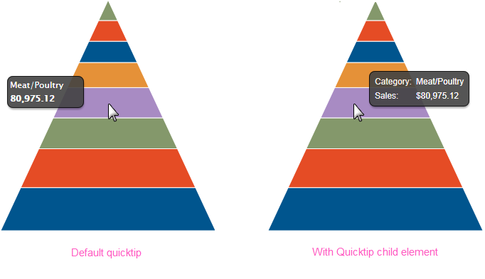
The automatically-generated quicktip displays information for the X- and Y-axis, as shown above, left. However, you may want to display other information or format it differently, perhaps as shown above, right, which can be done by adding a Quicktip child element beneath Series.Pyramid and setting its attributes and child elements. Use @Chart tokens to include chart data in the quicktip. Intrinsic functions are supported in the Quicktip attributes.
Action Elements
Action elements initiate processing of a report or process task definition, redirection to a link, or other processing when a segment in the pyramid is clicked.

In the example above, an Action.Report element has been added as a child of the Series, along with its Target.Report and Link Parameters child elements. To reference chart data in parameters, use the @Chart token, as shown above.
A variety of Action elements are available for use with Series, including Action.Link, Action.Process, and Action.Refresh Element. Additional Action elements will be added in future releases.
Input Selection
This series can also be used with the Input Selection family of elements, which turn the chart into an input control. This allows users, at runtime, to select points or values on the chart with their mouse and your report can then take action using the selected data. This is very useful, for example, for drilling into the data.
For more information about this functionality, see Input Selection.