Legend
The Chart Canvas element's Series child elements cause a data visualization (the chart) to be rendered in the canvas. Series elements include a Legend Label attribute that let you specify the text that appears within the chart legend for this data. If one or more Series elements has a value in this attribute, a horizontal legend will be displayed; otherwise no legend is displayed.
- About the Legend
- Legend Filtering
- Attributes
- Styling the Legend Caption
- Styling the Legend Items
- Styling the Legend Navigation Arrows
About the Legend
Chart legends provide visual clarity when multiple series are used. The Legend element can be used to control many aspects of the legend display.
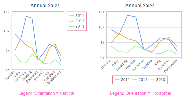
In the example above, legends are shown in Vertical and Horizontal orientations, which is set using Legend element's Orientation attribute. Note that the plot area is automatically scaled to accommodate the inclusion of the legend within the canvas area.
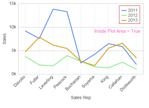
In the example shown above, the Legend element's Inside Plot Area attribute has been set to True, moving the legend inside the plot area. Additional fine positioning has been done using the element's Offset X and Offset Y attributes.
The Legend element has a variety of attributes that can be used to customize its border, background, positioning, symbols, and more. These are described in detail in a following section.
![]() Even if the Legend element is included, the legend will not be displayed if there is no data to be charted.
Even if the Legend element is included, the legend will not be displayed if there is no data to be charted.
Legend Filtering
Legend "filtering" allows users to toggle the display of series at runtime, by clicking on legend items:
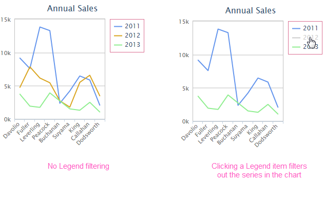
In the example above, the 2012 series is hidden by clicking its legend item. Clicking again will redisplay the series. Legend filtering is a standard feature that's always enabled.
Legend Item Order
The top-to-bottom order of the items in the legend, by default, is the same as the order of the Series elements in the report definition. This order can be reversed by setting the Legend element's Reversed Item Order attribute to True.
Attributes
The Legend element has the following attributes:
| Attribute | Description |
|---|---|
| Alignment Horizontal | Sets the horizontal alignment of the legend at the Left, Center, or Right, of the plot area. The default value is Right. |
| Alignment Vertical | Sets the vertical alignment of the legend at the Top, Middle, or Bottom, of the plot area. The default value is Top. |
| Background Color | Sets the legend background color. Enter a color by name, decimal RGB value, or hex RGB value. Prefix hex values with the pound sign, e.g. #112233. |
| Background Color Transparency | Specifies the transparency of the legend background color. The lowest value of 0 specifies that the background is opaque, with no transparency. At the other end of the scale, 15 specifies a completely transparent background. Use medium-level transparency to allow different chart layers to show through each other. |
| Border Color | Sets the legend border line color. Enter a color by name, decimal RGB value, or hex RGB value. Prefix hex values with the pound sign, e.g. #112233. |
| Border Color Transparency | Specifies the transparency of the legend border line color. The lowest value of 0 specifies that the border line is opaque, with no transparency. At the other end of the scale, 15 specifies a completely transparent line. Use medium-level transparency to allow different chart layers to show through each other. |
| Border Radius | Sets the amount of rounding for legend border line corners, in pixels. The default value is 4 pixels. |
| Border Thickness | Sets the canvas border line thickness, in pixels. The default value is 0, for no border. |
| Caption | Specifies the text of a caption that will appear at the top of the legend. |
| Format | Specifies a format for the legend items, i.e. the data or text from the Series element's Legend Label attribute. |
| Inside Plot Area | Specifies whether space in the canvas will be reserved for the legend (False) or whether it will overlap other content (True). The default value is False. |
| Legend Orientation | Specifies whether the legend will be displayed in a Horizontal format at the center-bottom of the canvas (the default) or a Vertical format at the top-right of the canvas. |
| Maximum Height | Specifies the maximum height, in pixels, of the legend. If the number of legend items causes the height of the legend to exceed this value, scroll arrows will be displayed to allow scrolling of the items. |
| Offset X | Sets the horizontal position offset of the legend relative to the chosen horizontal alignment, in pixels. |
| Offset Y | Sets the vertical position offset of the legend relative to the chosen vertical alignment, in pixels. |
| Reversed Item Order | Set to True to reverse the order of legend items. The default value is False. |
| Spacing | Sets the space, in pixels, between the legend and chart plot area. The default value is 10 pixels. |
| Symbol Width | Sets the width, in pixels, of the symbol preceding legend items. The default value is 16 pixels. |
| Width | Sets the width, in pixels, of the legend. If left blank, a width will be automatically determined. |
Style the Legend Caption
The Legend's Caption attribute can be set to place a caption inside the Legend:
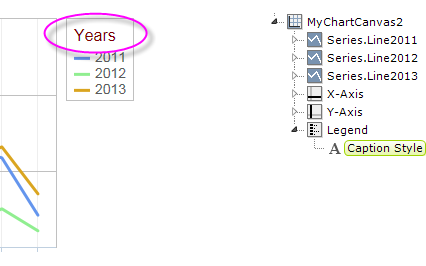
As shown above, the Caption Style element can be added to configure the caption's font family, color, size, and weight.
Styling the Legend Items
The text of the legend items can be styled using the Label Style element:
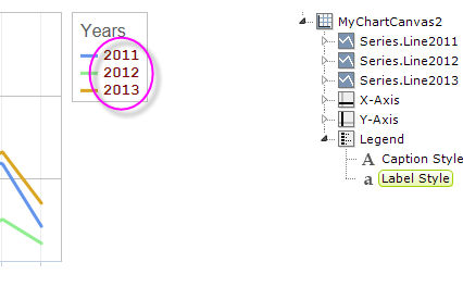
As shown in the example above, this element can be added to configure the legend items' font family, color, size, and weight.
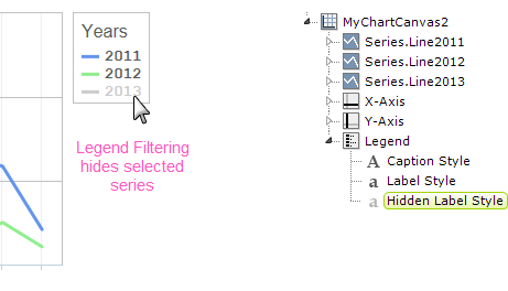
A related element, the Hidden Label Style element, is used to configure of the font family, color, size, and weight that's used when a legend item is clicked to engage Legend Filtering, as shown above. The color affects both the item symbol and the item text and, without the element, defaults to light gray, as shown above.
Style the Legend Navigation Arrows
It's possible for your legend to include so many items that it exceeds the height of the legend (as set by either the height of the canvas or the legend's Maximum Height attribute).
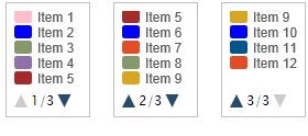
In this case, as shown above, the legend items will automatically be placed in a scrolling list within the legend, and up-down navigation arrows and a "page counter" will appear. The Legend Navigation Style element can be added beneath the Legend element to control the color and size of the navigation arrows.