Series.Bar
The Chart Canvas element's Series child elements cause a data visualization (the chart) to be rendered in the canvas. This topic discusses the Series.Bar element.
- About Series.Bar
- Use Multiple Series
- Attributes
- Use the Data Labels Element
- Use the Quicktips Element
- Use the Trend Line Element
- Use Action Elements
- Use Input Selection
About Series.Bar
The Series.Bar element generates a Bar chart, which uses either vertical or horizontal bars to show comparisons among categories.
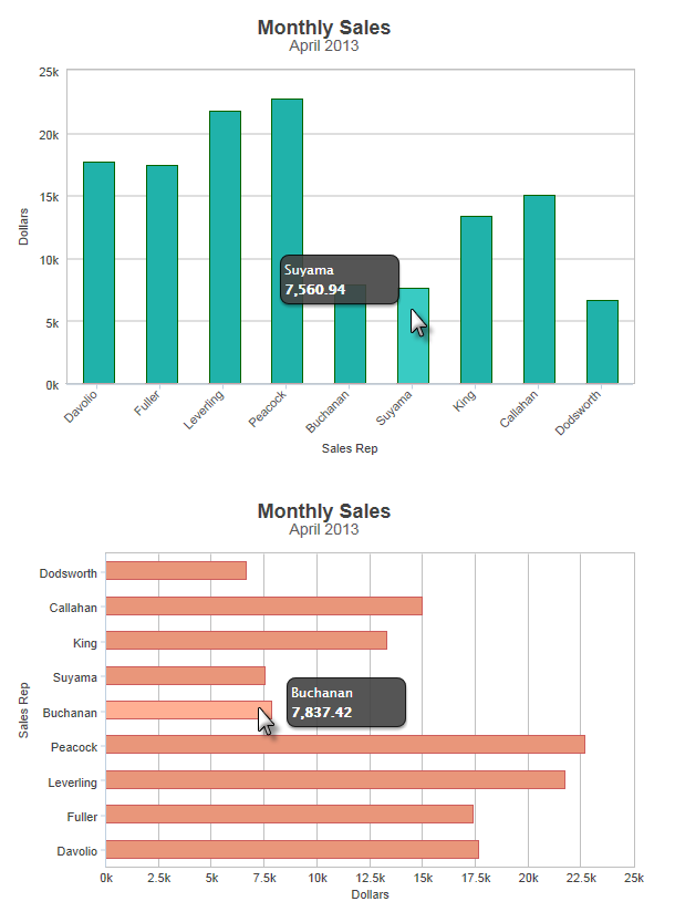
The example above shows a simple Bar chart, representing sales per month by sales rep, in both vertical and horizontal orientations.
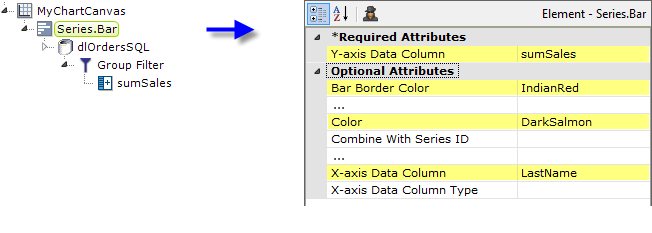
As shown above, the chart is created by adding Series.Bar to the canvas, along with a datalayer and, typically, some child elements that may include a Group Filter, and a Group Aggregate Column element. Very few attributes need to be set for the Series element in order to produce a basic chart.
![]() Note that a datalayer element can be used either beneath Series.Bar, as shown above, or beneath Chart Canvas. If used as a child of Chart Canvas, its data is available to all child Series elements. This can improve performance if you have several series, all using the same data, beneath the same Chart Canvas element.
Note that a datalayer element can be used either beneath Series.Bar, as shown above, or beneath Chart Canvas. If used as a child of Chart Canvas, its data is available to all child Series elements. This can improve performance if you have several series, all using the same data, beneath the same Chart Canvas element.

The properties of the X- and Y-axis, including captions, are set using the X-Axis and Y-Axis elements. For example, in order to angle the X-axis labels, add an X-Axis element beneath Chart Canvas (none of its attributes need to be set) and add its child Label Style element. Set the Label Style element's attribute as shown above.
Use Multiple Series
You can add additional series to the chart by adding additional Series elements:
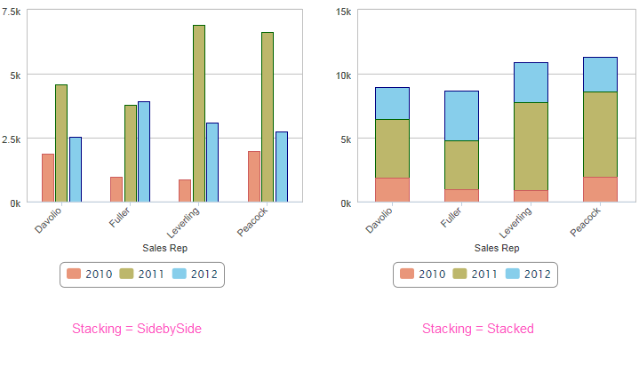
The example above uses three Series, one for each year, and two different "stacking modes" are shown, along with a legend. Overlay and StackedPercentage stacking modes are also available. Combinations of stacking modes are also possible, for example, two years stacked, and one year beside them. Note that the scaling of the data axis may change depending on the stacking mode.
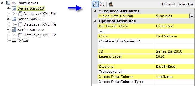
The example above shows the two Series elements, their datalayers, and an X-Axis element used to produce the previous chart. You can adjust the order of the series in the chart and the legend by changing the order of the Series elements in the definition. Setting the Series elements' Legend Label attribute will automatically cause the legend to be displayed.
![]() When using multiple series, you may be able to reduce the number of data queries and improve performance by using Local Data (see Introducing Datalayers) to read all of the data once and then link its datalayer (see Link Datalayers) to share it
to the series. At each Series element,
link its datalayer to the shared Local Data datalayer and filter the data to meet the needs of each individual series.
When using multiple series, you may be able to reduce the number of data queries and improve performance by using Local Data (see Introducing Datalayers) to read all of the data once and then link its datalayer (see Link Datalayers) to share it
to the series. At each Series element,
link its datalayer to the shared Local Data datalayer and filter the data to meet the needs of each individual series.
You can combine different types of Series elements, for example, Series.Bar and Series.Line, to produce combinations of visualizations. A good example of this is when you wish to use forecasting.
Forecasting
Forecasting elements use a variety of techniques to produce projected values by analyzing existing values. The future values they "predict" are, in most cases, added as rows or columns to a datalayer so the data can be displayed along with the existing data. When using Chart Canvas charts, the forecast data is typically displayed using a Series.Line element, in conjunction with other series elements.
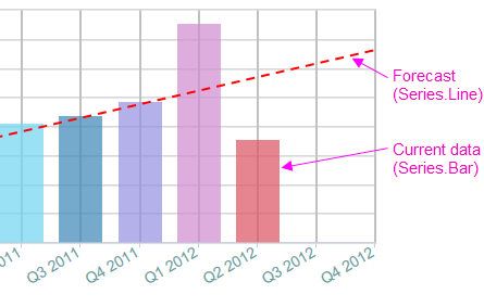
Forecasting elements add a "forecast value" column to the datalayer, and this column is used as the series' Y-axis data column. For more information about using elements, see Logi Info Element Gallery.
Attributes
The Series.Bar element has the following attributes:
| Attribute | Description |
|---|---|
| Y-Axis Data Column | (Required) Specifies the name of a datalayer column whose values will be plotted along the Y-axis. |
| Bar Border Color | Sets the color of the thin border line around each bar. Enter a color by name, decimal RGB value, or hex RGB value. Prefix hex values with the pound sign, e.g. #112233. |
| Bar Border Color Transparency | Specifies the transparency of the thin border line around each bar. The lowest value of 0 specifies that the background is opaque, with no transparency. At the other end of the scale, 15 specifies a completely transparent background. Use medium-level transparency to allow different chart layers to show through each other. |
| Bar Border Radius | Sets the amount of rounding for bar corners, in pixels. The default value is 0 pixels, which produces square corners. |
| Bar Border Thickness | Sets the thickness of the bar border lines, in pixels, when the related Bar Border Color attribute has a value. The default value is 1 pixel. |
| Bar Thickness | Sets the width of the bar in pixels. If left blank, the width will be determined automatically. |
| Color | Sets the bar fill color. Enter a color by name, decimal RGB value, or hex RGB value. Prefix hex values with the pound sign, e.g. #112233. |
| Combine With Series ID | Set this attribute to the element ID of another series to combine it with this series in the legend. When two series are combined, by default only the first one will appear in the legend but clicking the item in the legend toggles both series to appear and disappear. Or, the value Previous can be entered to combine this series with the previous series. |
| Disable Mouse Tracking | Disables mouse tracking for the series, when set to True. This affects
tooltips and click events on graphs and points. For large datasets, this may
improve performance. |
| Hover Brightness | Specifies the amount to change a bar's color when the mouse pointer is hovered over it. Values can be between 0 (no change) and 15 (lighter). The default value is 2. |
| Legend Label | Indicates text that will be shown for this series inside the chart legend. When a value is provided, it automatically causes the legend to be displayed. |
| Linked to X-Axis ID | Specifies the ID of an X-Axis element that this series should be linked to when using multiple X-axes. |
| Linked to Y-Axis ID | Specifies the ID of a Y-Axis element that this series should be linked to when using multiple Y-axes. |
| Negative Color | Sets the color for negative values. Enter a color by name, decimal RGB value, or hex RGB value. Prefix hex values with the pound sign, e.g. #D5F484. The default value is Red. |
| Negative Color Transparency | Specifies the transparency of the Negative Color. The lowest value of 0 specifies that the background is opaque, with no transparency. At the other end of the scale, 15 specifies a completely transparent background. Use medium-level transparency to allow different chart layers to show through each other. |
| Negative Threshold | Sets the positive-negative value threshold, also called the "zero level" or "base level". The default value is 0. |
| Stack Group Name | Enables the grouping of multiple series in a stacked chart. Enter the same arbitrary string value in this attribute for each series to be stacked. |
| Stacking | Sets the bar stacking mode. SideBySide arranges the bars beside each other, Stacked stacks the series one above the other in a single bar, while StackedPercentage stacks the series, then raises the levels to 100 percent, showing the percentage for each series' value. Overlay draws the bars on top of each other (use Transparency to let them show through). All series don't have to use the same stacking mode - they can be mixed to provide hybrid arrangements, such as two stacked and one beside them. Leave blank for no stacking. |
| Transparency | Specifies the transparency of the data region fill color. The lowest value of 0 specifies that the background is opaque, with no transparency. At the other end of the scale, 15 specifies a completely transparent background. Use medium-level transparency to allow different chart layers to show through each other. |
| X-Axis Data Column | Specifies the name of a datalayer column whose values will be plotted along the X-axis. |
| X-Axis Data Column Type | Specifies the data type of the datalayer column named in the X-axis Data Column attribute. Options include Auto (the default), Text, Number, and DateTime. By default, X-axis data values that are DateTime type will be automatically distributed evenly across the time series. If you want to disable this behavior, set this attribute value to Text.
Since a Bar Chart does not have a correlation between points, using DateTime data as text will not impact your results and you can still format the X-axis to meet your desired layout. |
Use the Data Labels Element
A "data label" is text shown near each data point that shows its value. When the Data Labels element is used as a child of Series.Bar, text representing the data values will appear on the chart: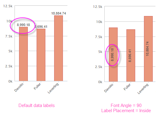
By default, with a single data series, the data labels will appear outside the bar, as shown above, left. The Data Labels element has attributes that allow you to control the font family, color, size, and weight, the data format, border color, and positioning of the text. The example above, right, shows data labels placed inside the bars and rotated 90-degrees. When series stacking is being used, the default is for data labels to appear inside the bars.
![]() The Data Labels element's color-related attribute values can be set using @Chart tokens.
The Data Labels element's color-related attribute values can be set using @Chart tokens.
Use the Quicktips Element
By default, a "quicktip" is displayed when the mouse hovers near or over a data point:
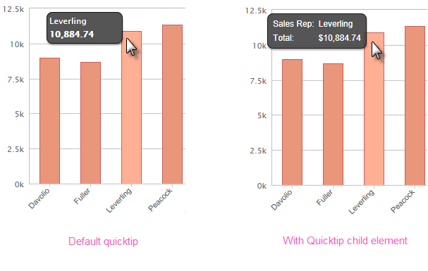
The automatically-generated quicktip displays information for the X- and Y-axis, as shown above, left. However, you may want to display other information or format it differently, perhaps as shown above, right, which can be done by adding a Quicktip child element beneath Series.Bar and setting its attributes and child elements. Use @Chart tokens to include chart data in the quicktip.
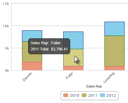
When using stacked series, if each series has its own Quicktips child element, the data shown in the quicktip will vary depending on which stacked segment the cursor hovers over, as shown above.
![]() Intrinsic functions are supported in the Quicktip attributes.
Intrinsic functions are supported in the Quicktip attributes.
Use the Trend Line Element
The Trend Line element, added in v11.3, creates a line on the chart that indicates the "trend" of the data. The line connects a number of data points generated using a regression algorithm.
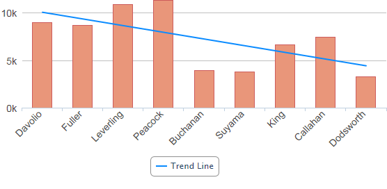
The Trend Line element is a child of the Series.Bar element and can be styled for color, line width, etc. When configured with a legend label, it will be represented by an item in the legend, as shown above.
Use Action Elements
Action elements initiate processing of a report or process task definition, redirection to a link, or other processing when a data point in the series is clicked.

In the example above, an Action.Report element has been added as a child of the Series, along with its Target.Report and Link Parameters child elements. To reference chart data in parameters, use the @Chart token, as shown above.
A variety of Action elements are available for use with Series, including Action.Link, Action.Process, and Action.Refresh Element. Additional Action elements will be added in future releases.
Use Input Selection
This series can also be used with the Input Selection family of elements, which turn the chart into an input control. This allows users, at runtime, to select points or values on the chart with their mouse and your report can then take action using the selected data. This is very useful, for example, for drilling into the data.
For more information about this functionality, see Input Selection.