Series.Heatmap
The Chart Canvas element's Series child elements cause a data visualization (the chart) to be rendered in the canvas. This topic discusses the Series.Heatmap element.
- About Series.Heatmap
- Attributes
- Grouping Heatmap Cells
- Use the Heatmap Label Style Element
- Use the Quicktips Element
- Use Action Elements
About Series.Heatmap
The Series.Heatmap element generates a Heatmap chart, sometimes called a "tree map", which uses a unique arrangement of rectangles to represent data and relationships, using color and size.
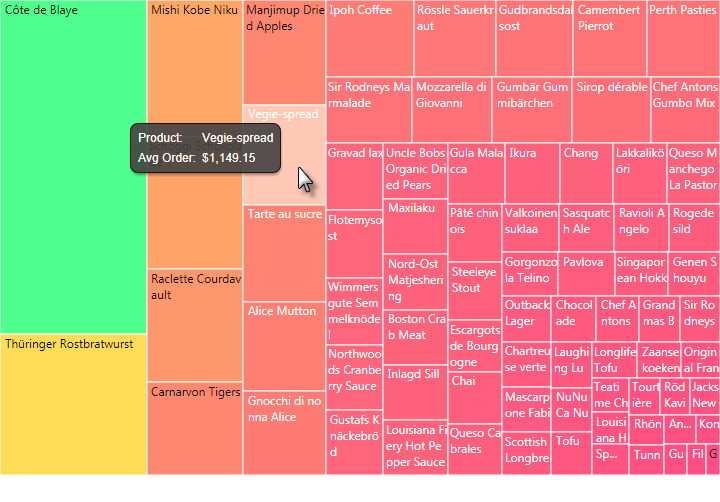
Both the color intensity (shifting within a range) and the size of the rectangles indicate relative performance, helping you to easily spot trends with a glance. This type of chart is very useful for showing hidden trends and relationships.
In the example above, the rectangle's (or cell's) size represents the average order value for each food item. The cell color also represents the average order value, ranked from red (low) to green (high). The relationship isn't linear but we can still see that items with small, red cells produced fewer orders and less revenue than items with large, green cells.
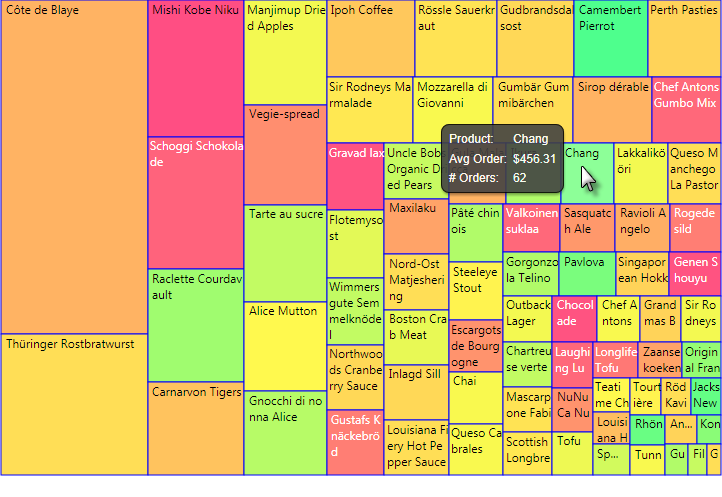
The example above is the same data but now the cell color reflects the number of orders. "Greener" cells have a higher number of orders. This allows us to compare an item's popularity (size) to its average order value (color).
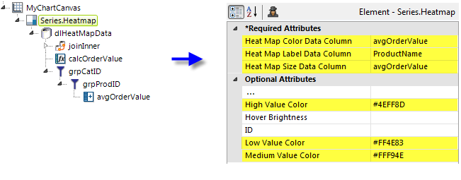
As shown above, the chart is created by adding Series.Heatmap to the canvas, along with a datalayer and, typically, some child elements that may include a Group Filter, and a Group Aggregate Column element. Very few attributes need to be set for the Series element in order to produce a basic chart.
![]() Note that a datalayer element can be used either beneath Series.Heatmap, as shown above, or beneath Chart Canvas. If used as a child of Chart Canvas, its data is available to all child Series elements. This can improve performance if you have several series, all using the same data, beneath the same Chart Canvas element.
Note that a datalayer element can be used either beneath Series.Heatmap, as shown above, or beneath Chart Canvas. If used as a child of Chart Canvas, its data is available to all child Series elements. This can improve performance if you have several series, all using the same data, beneath the same Chart Canvas element.
Attributes
The Series.Heatmap element has the following attributes:
| Attribute | Description |
|---|---|
| Heat Map Color Data Column | (Required) Specifies the name of a datalayer column whose values will determine the color of the cells, using a high-to-low gradient based on the three Value Color attributes. |
| Heat Map Label Data Column | (Required) Specifies the name of a datalayer column whose values will be used as labels inside the cells. |
| Heat Map Size Data Column | (Required) Specifies the name of a datalayer column whose values will determine the size of the cells. |
| Cell Border Color | Sets the color of the cell borders. Enter a color by name, decimal RGB value, or hex RGB value. Prefix hex values with the pound sign, e.g. #112233. |
| Cell Border Color Transparency | Specifies the transparency of the Cell Border Color. The lowest value of 0 specifies that the background is opaque, with no transparency. At the other end of the scale, 15 specifies a completely transparent background. Use medium-level transparency to allow different chart layers to show through each other. |
| Cell Border Thickness | Sets the thickness of the cell border lines, in pixels, when the related Cell Border Color attribute has a value. The default value is 1 pixel. |
| Disable Mouse Tracking | Disables mouse tracking for the series, when set to True. This affects
tooltips and click events on cells. For large datasets, this may
improve performance. |
| High Value Color | Specifies the color for the highest data value. Enter a color by name, decimal RGB value, or hex RGB value. Prefix hex values with the pound sign, e.g. #D5F484. |
| Hover Brightness | Specifies the amount to change a cell's color when the mouse pointer is hovered over it. Values can be between 0 (no change) and 15 (lighter). The default value is 2. |
| ID | Specifies the unique element ID. |
| Low Value Color | Specifies the color for the lowest data value. Enter a color by name, decimal RGB value, or hex RGB value. Prefix hex values with the pound sign, e.g. #D5F484. |
| Medium Value Color | Specifies the color for the data values in the middle of the dataset. Enter a color by name, decimal RGB value, or hex RGB value. Prefix hex values with the pound sign, e.g. #D5F484. |
Group Heatmap Cells
You can also group cells in a Heatmap using the Heatmap Group element:
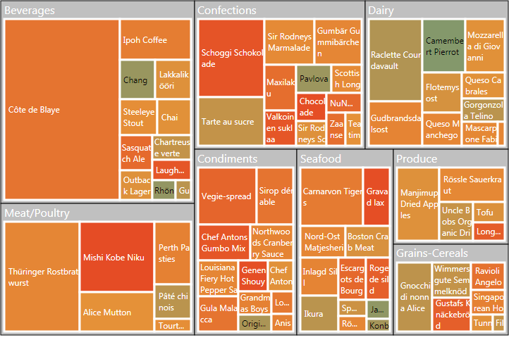
In the example above, the products have grouped by category. In order to use grouping, you must ensure that your datalayer includes the appropriate data. The Heatmap Group element allows you to control the appearance of the group title font, title alignment, borders, and background color.
Heatmap Label Style Element
The Heatmap Label Style element can be used to control the appearance of the label text that displayed inside the cells:
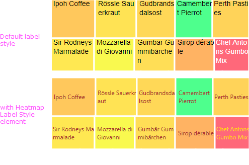
By default, labels will appear at the top of the cell, as shown above, top. The Heatmap Label Style element has attributes that allow you to control the font family, color, size, and weight, and positioning of the text. You can also specify different font colors for cells with light and dark backgrounds.
Quicktips Element
By default, a "quicktip" is displayed when the mouse hovers near or over a data point:
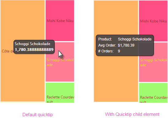
The automatically-generated quicktip displays information from the label and size data columns, as shown above, left. However, you may want to display other information or format it differently, perhaps as shown above, right, which can be done by adding a Quicktip child element beneath Series.Heatmap and setting its attributes and child elements. Use @Chart tokens to include chart data in the quicktip. Intrinsic functions are supported in the Quicktip attributes.
A default quicktip is also displayed when a Heatmap Group element is used. To customize it, the Quicktip element can also be a child of Heatmap Group.
Action Elements
Action elements initiate processing of a report or process task definition, redirection to a link, or other processing when a data point in the series is clicked.

In the example above, an Action.Report element has been added as a child of the Series, along with its Target.Report and Link Parameters child elements. To reference chart data in parameters, use the @Chart token, as shown above.
A variety of Action elements are available for use with the Series, including Action.Link, Action.Process, and Action.Refresh Element. Additional Action elements will be added in future releases.
Action elements can be also used beneath the Heatmap Group element to provide drill-down and drill-through functionality when group titles are clicked.