Series.Waterfall
The Chart Canvas element's Series child elements cause a data visualization (the chart) to be rendered in the canvas. This topic discusses the Series.Waterfall element.
- About Series.Waterfall
- Using Multiple Series
- Attributes
- Using the Data Labels Element
- Using the Quicktips Element
- Using Action Elements
- Using Input Selection
About Series.Waterfall
The Series.Waterfall element generates a Waterfall chart, which helps in understanding the cumulative effect of sequentially introduced positive or negative values.
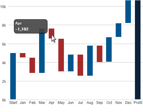
The example above shows a Waterfall chart, with negative values shown in red. A special "total bar", labeled Profit above, is automatically generated from the sum of all other values. It appears as the last bar on the right or, at the top, if the axes are swapped. Its generation can be controlled in the Series attributes.
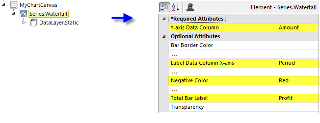
As shown above, the chart is created by adding Series.Waterfall to the canvas, along with a datalayer. Very few attributes need to be set for the Series element in order to produce a basic chart.
![]() Note that a datalayer element can be used either beneath Series.Waterfall, as shown above, or beneath Chart Canvas. If used as a child of Chart Canvas, its data is available to all child Series elements. This can improve performance if you have several series, all using the same data, beneath the same Chart Canvas element.
Note that a datalayer element can be used either beneath Series.Waterfall, as shown above, or beneath Chart Canvas. If used as a child of Chart Canvas, its data is available to all child Series elements. This can improve performance if you have several series, all using the same data, beneath the same Chart Canvas element.
UseMultiple Series
Waterfall charts do not generally lend themselves to use with other series types, but it is possible. You can add additional series to the chart by adding additional Series elements:
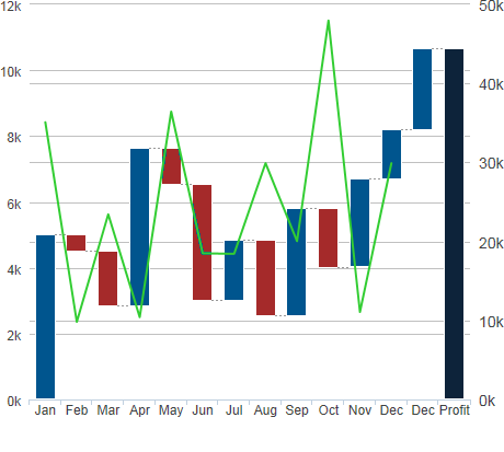
The example above shows Series.Waterfall with Series.Line. The series have been linked to two separate Y-axis elements to provide two separate scales.
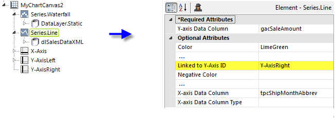
The example above shows the two Series elements and their datalayers, used to produce the previous chart. You can adjust which series appears "in front" of the other in the chart by changing the order of the Series elements in the definition. The Line series has been linked to one of the two Y-Axis elements, creating a secondary scale on the right-hand side.
![]() When using multiple series, you may be able to reduce the number of data queries and improve performance by using Local Data (see Introducing Datalayers) to read all of the data once and then link its datalayer (see Link Datalayers) to share it
to the series. At each Series element,
link its datalayer to the shared Local Data datalayer and filter the data to meet the needs of each individual series.
When using multiple series, you may be able to reduce the number of data queries and improve performance by using Local Data (see Introducing Datalayers) to read all of the data once and then link its datalayer (see Link Datalayers) to share it
to the series. At each Series element,
link its datalayer to the shared Local Data datalayer and filter the data to meet the needs of each individual series.
Attributes
The Series.Waterfall element has the following attributes:
| Attribute | Description |
|---|---|
| Y-Axis Data Column | (Required) Specifies the name of a datalayer column whose values determine the height of each bar. |
| Bar Border Color | Sets the color of the thin border line around each bar. Enter a color by name, decimal RGB value, or hex RGB value. Prefix hex values with the pound sign, e.g. #112233. |
| Bar Border Color Transparency | Specifies the transparency of the thin border line around each bar. The lowest value of 0 specifies that the background is opaque, with no transparency. At the other end of the scale, 15 specifies a completely transparent background. Use medium-level transparency to allow different chart layers to show through each other. |
| Bar Border Radius | Sets the amount of rounding for bar corners, in pixels. The default value is 0 pixels, which produces square corners. |
| Bar Border Thickness | Sets the thickness of the bar border lines, in pixels, when the related Bar Border Color attribute has a value. The default value is 1 pixel. |
| Bar Thickness | Sets the width of the bar in pixels. If left blank, the width will be determined automatically. |
| Color | Sets the bar fill color. Enter a color by name, decimal RGB value, or hex RGB value. Prefix hex values with the pound sign, e.g. #112233. |
| Combine With Series ID | Set this attribute to the element ID of another series to combine it with this series in the legend. When two series are combined, by default only the first one will appear in the legend but clicking the item in the legend toggles both series to appear and disappear. Or, the value Previous can be entered to combine this series with the previous series. |
| Disable Mouse Tracking | Disables mouse tracking for the series, when set to True. This affects tooltips and click events. For large datasets, this may improve performance. The default value is False. |
| Hover Brightness | Specifies the change in a bar's brightness when the mouse pointer hovers over it. Values can be 0 (no change) through 15 (lighter). The default value is 2. |
| Intermediate Sum Bar Color | Sets the fill color of the Intermediate Sum bar. Enter a color by name, decimal RGB value, or hex RGB value. Prefix hex values with the pound sign, e.g. #112233. |
| Intermediate Sum Bar Color Transparency | Specifies the transparency of the thin border line around the Intermediate Sum bar. The lowest value of 0 specifies that the background is opaque, with no transparency. At the other end of the scale, 15 specifies a completely transparent background. Use medium-level transparency to allow different chart layers to show through each other. |
| Intermediate Sum Column | Controls the display of an "Intermediate Sum" bar, which is an extra bar in the chart showing the sum of data values, beginning with the first value, up to a specific point on the X-axis. To show an intermediate sum, configure the datalayer so it includes a "special" row inserted at the point of the desired intermediate sum. In this row, include a column with a value of True. Specify the name of that column in this attribute. Any other data values in this special row are ignored. You can add multiple Intermediate Sum bars by adding additional special rows in the desired places in the datalayer; just duplicate the first special row where desired. However, when calculating each intermediate sum, the previous special row resets the summarization to zero. For example: A special row in the datalayer at record 10 will produce a sum of the values for rows 1-9. A second special row at record 15 will produce a sum of the values for rows 11-14. There is no cumulative or running total effect for all rows. |
| Label Data Column X-axis | Specifies the name of a datalayer column whose values be represented by the bars. |
| Legend Label | Indicates text that will be shown for this series inside the chart legend. When a value is provided, it automatically causes the legend to be displayed. |
| Linked to X-Axis ID | Specifies the ID of an X-Axis element that this series should be linked to when using multiple X-axes. |
| Linked to Y-Axis ID | Specifies the ID of a Y-Axis element that this series should be linked to when using multiple Y-axes. |
| Negative Color | Sets the color for negative values. Enter a color by name, decimal RGB value, or hex RGB value. Prefix hex values with the pound sign, e.g. #D5F484. |
| Negative Color Transparency | Specifies the transparency of the Negative Color. The lowest value of 0 specifies that the background is opaque, with no transparency. At the other end of the scale, 15 specifies a completely transparent background. Use medium-level transparency to allow different chart layers to show through each other. |
| Total Bar Color | Sets the color for the automatically-generated "total bar" at the right side of the chart. Enter a color by name, decimal RGB value, or hex RGB value. Prefix hex values with the pound sign, e.g. #D5F484. |
| Total Bar Color Transparency | Specifies the transparency of the Total Bar Color. The lowest value of 0 specifies that the background is opaque, with no transparency. At the other end of the scale, 15 specifies a completely transparent background. Use medium-level transparency to allow different chart layers to show through each other. |
| Total Bar Label | Specifies the label text for the total bar. When set to None, the total bar will not be generated. The default value is Total. |
| Transparency | Specifies the transparency of the general chart bars. The lowest value of 0 specifies that the background is opaque, with no transparency. At the other end of the scale, 15 specifies a completely transparent background. Use medium-level transparency to allow different series to show through each other. |
Data Labels Element
A "data label" is text shown near each data point that shows its value. When the Data Labels element is used as a child of Series.Waterfall, text representing the data values will appear on the bars:
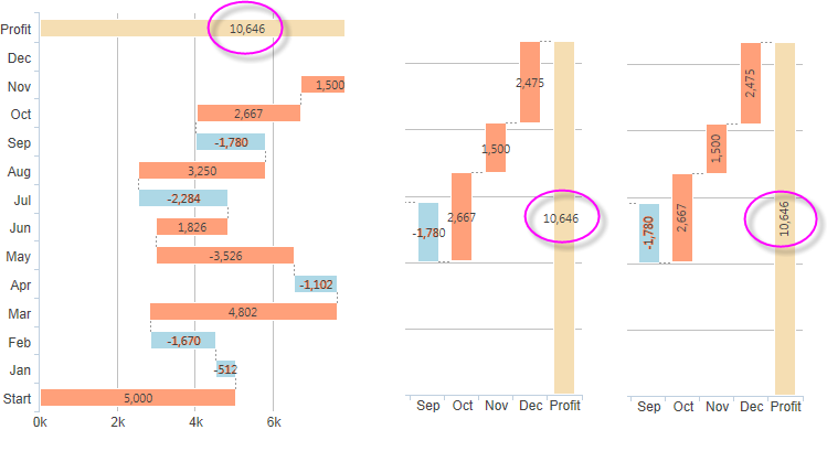
The Data Labels element has attributes that allow you to control the font family, color, size, and weight, the data format, border color, and positioning of the text. The example above, right, shows data labels placed inside the bars and rotated 90-degrees.
The Data Labels element's color-related attribute values can be set using @Chart tokens.
Quicktips Element
By default, a "quicktip" is displayed when the mouse hovers over a bar:
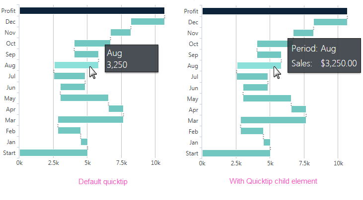
The automatically-generated quicktip displays information for the X- and Y-axis, as shown above, left. However, you may want to display other information or format it differently, perhaps as shown above, right. This can be done by adding a Quicktip child element beneath Series.Waterfall and setting its attributes and child elements. Use @Chart tokens to include chart data in the quicktip. Intrinsic functions are supported in the Quicktip attributes.
Action Elements
Action elements initiate processing of a report or process task definition, redirection to a link, or other processing when a bar is clicked.

In the example above, an Action.Report element has been added as a child of the Series, along with its Target.Report and Link Parameters child elements. To reference chart data in parameters, use the @Chart token, as shown above.
A variety of Action elements are available for use with Series, including Action.Link, Action.Process, and Action.Refresh Element. Additional Action elements will be added in future releases.
Input Selection
This series can also be used with the Input Selection family of elements, which turn the chart into an input control. This allows users, at runtime, to select points or values on the chart with their mouse and your report can then take action using the selected data. This is very useful, for example, for drilling into the data.
For more information about this functionality, see Input Selection.