X-Axix and Y-Axis Elements
When the Chart Canvas element renders charts that use Cartesian coordinates, an X-axis and a Y-axis are drawn on the chart. This topic discuss how these axes can be configured.
- About the Axis Elements
- Axis Element Attributes
- Style the Axis Caption
- Style the Axis Labels
- Add a Marker Line
- Add a Marker Band
- Configure Major Ticks and Grid Lines
- Configure Minor Ticks and Grid Lines
- Show Totals for Stacked Series
- Add Multiple Axes
About the Axis Elements
When a chart uses Cartesian coordinates, the X- and Y-axes provide the two references used by the eye to compare data values. Though they can be reversed, we generally think of the X-axis as the "label" and the Y-axis as the "data value."
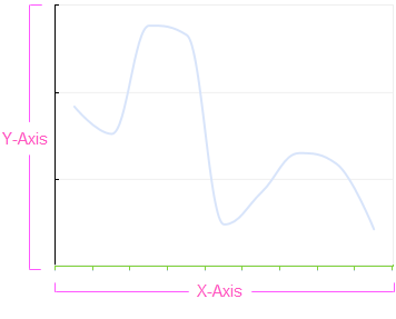
You can think of them as an "overlay" on the canvas, providing the reference points over which the data values will be drawn. The X-Axis and Y-Axis elements are children of the Chart Canvas and can be used to control a variety of visual elements in the chart associated with the axes.
Note that Chart Canvas element will draw an X- and Y-axis by default; the X-Axis and Y-Axis elements are only needed if you want to customize the axes.
Axis Element Attributes
The X-Axis and Y-Axis elements have the same attributes, except as noted:
| Attribute | Description |
|---|---|
| Axis Padding Left | (X-Axis only) When the X-axis presents Numeric or DateTime data, sets the padding between the edge of the plot area and the first data value, as a percentage of the axis length. This is useful for preventing the first data value from appearing at the very edge of the plot area. Set to 0 to remove all padding. The default value is 1. |
| Axis Padding Right | (X-Axis only) When the X-axis presents Numeric or DateTime data, sets the padding between the edge of the plot area and the last data value, as a percentage of the axis length. This is useful for preventing the last data value from appearing at the very edge of the plot area. Set to 0 to remove all padding. The default value is 1. |
| Axis Padding Top | (Y-Axis only) Sets the padding between the edge of the plot area and the highest data value, in pixels. This is useful for preventing the highest data value from appearing right at the edge of the plot area. The default value is 5 pixels. |
| Axis Type | Sets the scaling for the axis. This can be a "smooth" scale, consistent with a stream of numbers or dates/times or, when working with the X-Axis element, it can also be a category (e.g. Apples, Oranges) which are often visualized using Bar and Pie charts. The default value varies based on the axis column data type: Text = Category, DateTime = DateTimeLinear, Numeric = NumericLinear or NumericLogarithmic. |
| Caption | Specifies the text of the axis caption. |
| Fixed Scale Lower Bound | Sets the lower bound of the axis. Set this value to a number, or leave it blank for automatic scaling. If you specify a lower bound, then you must also specify an upper bound. |
| Fixed Scale Upper Bound | Sets the upper bound of the axis. Set this value to a number, or leave it blank for automatic scaling. If you specify an upper bound, then you must also specify a lower bound. |
| Hide Axis | |
| Hide First Label | Hides the first tick mark label. The default value is False. |
| Hide Last Label | Hides the last tick mark label. The default value is False. |
| Line Color | Sets the axis line color. Enter a color by name, decimal RGB value, or hex RGB value. Prefix hex values with the pound sign, e.g. #112233. |
| Line Color Transparency | Specifies the transparency of the axis line color. The lowest value of 0 specifies that the background is opaque, with no transparency. At the other end of the scale, 15 specifies a completely transparent background. Use medium-level transparency to allow different chart layers to show through each other. |
| Line Thickness | Specifies the thickness of the axis line, in pixels. The default value is 1 pixel. |
| Opposite Side | Specifies that the axis be displayed on the opposite side from its normal position, or Left for vertical axes and Bottom for horizontal axes. The default value is False. |
| Reverse Axis | |
| Spacing | Sets the space, in pixels, between the legend and chart plot area. The default value is 10 pixels. |
Style the Axis Caption
The axis caption, set in the X-Axis and Y-Axis element's Caption attribute, can be styled by adding a child Caption Style element.
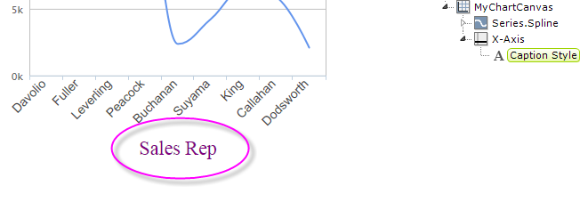
The Caption Style element has an AlignmentHorizontal attribute for positioning the caption along the axis. For an X-axis, the options are Left, Center (the default), and Right. For a Y-axis, the options are the same but apply vertically, where Left = Bottom, and Right = Top.
The Caption Spacing attribute allows you to adjust the space between the caption and its axis, in pixels.
Caption Style also has a set of font-related attributes that allow you to specify font family, color, size, etc.
Style the Axis Labels
The axis labels can be styled using the Label Style child element. For example, Label Style has a set of font-related attributes that allow you to specify font family, color, size, angle, etc.

In the example above, the labels have been styled to have a 45-degree font angle and a Blue font color.
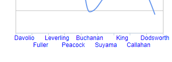
Labels can also be arranged into multiple rows, using the element's Stagger Labels attribute, as shown above.
This element also has Offset X and Offset Y attributes that allow you to shift the entire set of labels in any direction and a Format attribute that allows you to format the label data, using standard Logi formatting options. For more information, see Format Data.
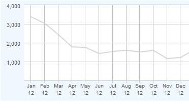
If you want to "stack" the labels into two lines, as shown above, it's easy to do:
First, concatenate the text "<br>" into your label data at the point where you want to insert the line break. Here's an example SQL query:
SELECT LEFT(DATENAME(m, start_date), 3) + '<br>' + RIGHT(DATEPART(yy, start_date), 2) AS StartDate...
Then, set the Label Style element's Format attribute to HTML. Finally, use (for this example) StartDate as the series' X-Axis Data Column.
![]() The Label Style element's Maximum Label Length attribute lets you specify the maximum number of characters that will be displayed for a label before the
text is truncated and ellipsis (...) is appended.
The Label Style element's Maximum Label Length attribute lets you specify the maximum number of characters that will be displayed for a label before the
text is truncated and ellipsis (...) is appended.
![]() When used beneath a Y-Axis element, the Label Style element's Format attribute can include ####;(###) to display negative numbers within parentheses.
When used beneath a Y-Axis element, the Label Style element's Format attribute can include ####;(###) to display negative numbers within parentheses.
Add a Marker Line
The Marker Line child element allows you to add a value-based line to the chart, independent of the series:
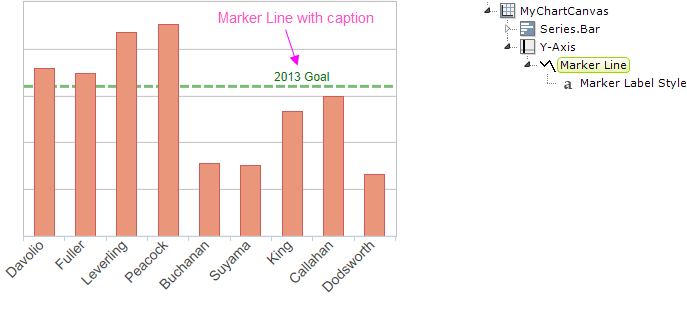
A marker line is shown in the example above. The Marker Line element has attributes that allow you to set the properties of the line, such as color, thickness, and line style, and to set its caption and value. Its Value attribute accepts tokens and can be set from data.
The Marker Line element has a child element, the Marker Label Style element, which allows you to style the optional caption, by specifying its font properties, format, positioning, and alignment.
Adding a Marker Band
The Marker Band child element allows you to add a value-based band to the chart, independent of the series:
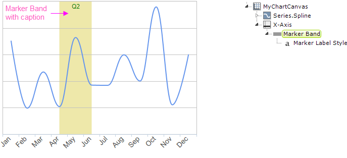
A marker band is shown in the example above. The Marker Band element has attributes that allow you to set the properties of the band, such as color and transparency, and to set its caption and values. Its From Value and To Value attributes accept tokens and can be set from data.
The Marker Band element has a child element, the Marker Label Style element, which allows you to style the optional caption, by specifying its font properties, format, positioning, and alignment.
Configuring Major Ticks and Grid Lines
Tick marks and grid lines help associate the labels with the axis and provide visual reference points inside the plot area. "Major" tick marks and grid lines generally reference the labels and data, "minor" marks and lines are between them. Major tick marks and grid lines can be configured using the Ticks and Grid child element.
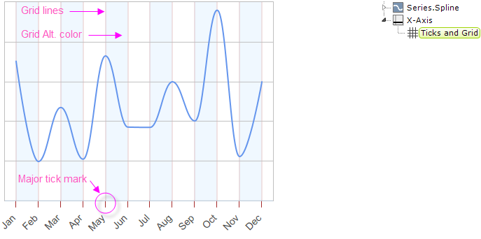
Grid lines and the space in between them can be customized, as shown above, in a number of ways, including color, width, and transparency. Tick marks can be customized similarly and their length, position and interval can also be set.
By default, charts are drawn without any X-axis (vertical) grid lines; you must add an X-Axis element with a Ticks and Grid child element beneath it to draw them.
By default, charts are drawn with Y-axis (horizontal) grid lines; you must add a Y-Axis element with a Ticks and Grid child element beneath it, then set the Ticks and Grid element's Grid Line Thickness attribute to 0 to suppress this.
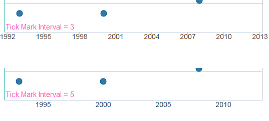
As shown above, setting the Ticks and Grid element's Tick Interval attribute allows you to determine how many labels, tick marks, and grid lines will be shown for the axis.
The Tick Interval is sensitive to the axis data type. For DateTime data, you can select standard values including Years, Weeks,Hours and more. For Numeric data, you should enter a numeric value such as 100 or 1000. The default value, Auto, automatically calculates the Tick Interval based on the data values.
![]() Setting the Tick Interval for numeric data to an unrealistically small value will cause an error when the chart is rendered. For example, using a value of 2 for a chart whose data values range from 0 to 50,000 will cause the Logi engine to time-out after attempting to render 25,000 tick marks and labels.
Setting the Tick Interval for numeric data to an unrealistically small value will cause an error when the chart is rendered. For example, using a value of 2 for a chart whose data values range from 0 to 50,000 will cause the Logi engine to time-out after attempting to render 25,000 tick marks and labels.
Configuring Minor Ticks and Grid Lines
"Minor" tick marks and grid lines are drawn in between major tick marks and grid lines. Adding them provides an additional visual reference without adding additional axis labels. Minor tick marks and grid lines can be configured using the Minor Ticks and Grid child element.
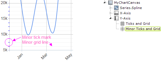
In the example shown above, the Minor Ticks and Grid element's Tick Interval attribute has been set to 1,250. Minor grid lines can be customized in a number of ways, including color, width, and transparency. Tick marks can be customized similarly and their length, position and interval can also be set.
The Tick Interval is sensitive to the axis data type. For DateTime data, you can select standard values including Years, Weeks,Hours and more. For Numeric data, you should enter a numeric value, such as 100 or 1000. The default value, Auto, automatically calculates the Tick Interval based on the data values.
If used with a linear axis and the standard value, Auto, is selected, the minor Tick Interval will be calculated as one fifth of the Major Tick Interval value.
![]() Setting the Tick Interval for numeric data to an unrealistically small value will cause an error when the chart is rendered. For example, using a value of 2 for the chart above will cause the Logi engine to time-out after attempting to render 25,000 tick marks and labels.
Setting the Tick Interval for numeric data to an unrealistically small value will cause an error when the chart is rendered. For example, using a value of 2 for the chart above will cause the Logi engine to time-out after attempting to render 25,000 tick marks and labels.
Showing Totals for Stacked Series
When multiple Series are used and stacked, the Data Labels element can be used to display the individual data values. However, what if you want to display a total of the stacked values?
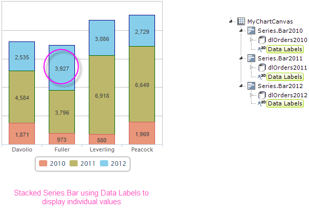
The examples above illustrates the first scenario: Data Labels elements used beneath its Series.Bar elements, resulting in individual values being displayed within the bars.
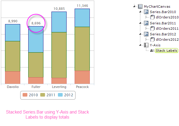
However, if you don't use Data Labels but instead use a Y-Axis element and its Stack Labels child element, the stacked values will be totaled and displayed above the bars, as shown above. The Stack Labels element allows you to configure the font-related, format, and positioning attributes of the total text.
Adding Multiple Axes
It's not unusual to need to produce a chart that has multiple series, requiring a secondary axis. Here's an example:
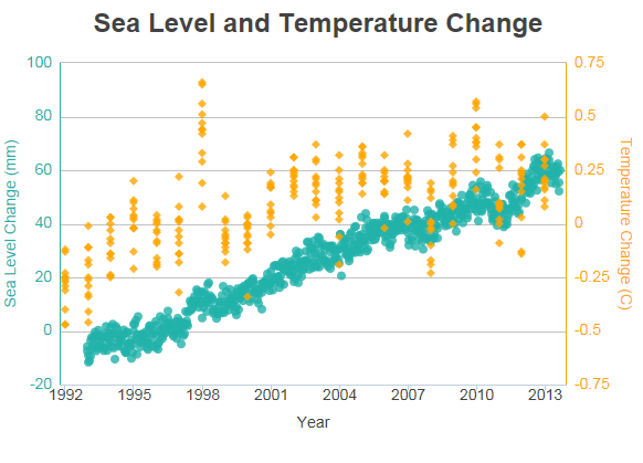
The example above shows two Series but, because they have different data value scales, a secondary Y-axis has been added on the right side. Many charts that compare multiple data series over time can use the same data scale for all series, but that's not the case here, so a secondary Y-axis is necessary. It's easy to add a secondary axis to a chart.
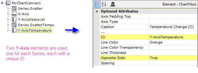
To add a second Y-axis to the chart, add a second Y-Axis element to the definition, as shown above. Set its Opposite Side attribute to True and give both Y-Axis elements a unique element ID. This creates the secondary Y-axis, on the right side of the chart.
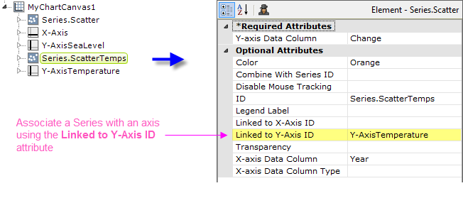
But which Series will use which Y-axis? You associate a Series with a Y-Axis element by setting the Series' Linked to Y-Axis ID attribute, as shown above, to the element ID of the desired Y-Axis element. Do this for each Series element.