Series.Whiskers
The Chart Canvas element's Series child elements cause a data visualization (the chart) to be rendered in the canvas. This topic discusses the Series.Whiskers element.
- About Series.Whiskers
- Attributes
- Using the Quicktips Element
- Using Action Elements
About Series.Whiskers
The Series.Whiskers element, introduced in Logi Info v11.4.046 generates graphics which, when used with other Series (usually Series.Bar Range), represents the variability of the data. It's most often used to indicate the uncertainty or the "margin of error" in the data.

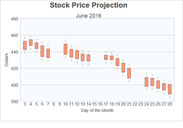
The example above shows a Bar Range chart, representing projected stock prices for a month, with "whiskers" showing the margin of error in the projections.

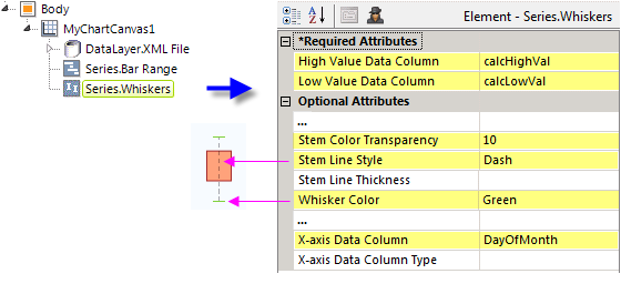
As shown above, the chart is created by adding Series.Bar Range and Series.Whiskers to the canvas, along with a datalayer and, typically, some datalayer child elements that may include a Group Filter, and a Group Aggregate Column element. Very few attributes need to be set for the Series element in order to produce a basic chart.
![]() Note that a datalayer element must be used beneath the Chart Canvas element because, unlike other Series elements, Series.Whiskers cannot have its own child datalayer. Both series will then use this datalayer.
Note that a datalayer element must be used beneath the Chart Canvas element because, unlike other Series elements, Series.Whiskers cannot have its own child datalayer. Both series will then use this datalayer.
Attributes
The Series.Whiskers element has the following attributes:
| Attribute | Description |
|---|---|
| High Value Data Column | (Required) Specifies the name of a datalayer column whose values will be plotted as the highest possible value. |
| Low Value Data Column | (Required) Specifies the name of a datalayer column whose values will be plotted as the lowest possible value. |
| Combine With Series ID | Set this attribute to the element ID of another series to combine it with this series in the legend. When two series are combined, by default only the first one will appear in the legend but clicking the item in the legend toggles both series to appear and disappear. Or, the value Previous can be entered to combine this series with the previous series. |
| Disable Mouse Tracking | Disables mouse tracking for the series, when set to True. This affects
tooltips and click events on graphs and points. For large datasets, this may
improve performance. |
| ID | Specifies a unique identifier for this element. |
| Linked to X-Axis ID | Specifies the ID of an X-Axis element that this series should be linked to when using multiple X-axes. |
| Linked to Y-Axis ID | Specifies the ID of a Y-Axis element that this series should be linked to when using multiple Y-axes. |
| Stem Color | Specifies the color of the "stem", the vertical line extending from the bar graphic to the whiskers. Enter a color by name, decimal RGB value, or hex RGB value. Prefix hex values with the pound sign, e.g. #D5F484. The default value is Black. |
| Stem Color Transparency | Specifies the transparency of the Stem Color. The lowest value of 0 specifies that the stem line is opaque, with no transparency. At the other end of the scale, 15 specifies a completely transparent stem line. Use medium-level transparency to allow different chart layers to show through each other. |
| Stem Line Style | Specifies the pattern of the stem line as either Solid or as a combination of dashes and dots. The default value is Solid |
| Stem Line Thickness | Sets the thickness of the stem line, in pixels. The default value is 1 pixel. |
| Whisker Color | Specifies the color of the "whiskers", the horizontal lines marking the high and low values. Enter a color by name, decimal RGB value, or hex RGB value. Prefix hex values with the pound sign, e.g. #D5F484. The default value is Black. |
| Whisker Color Transparency | Specifies the transparency of the Whisker Color. The lowest value of 0 specifies that the whisker lines are opaque, with no transparency. At the other end of the scale, 15 specifies completely transparent whisker lines. Use medium-level transparency to allow different chart layers to show through each other. |
| Whisker Line Thickness | Sets the thickness of the whisker lines, in pixels. The default value is 1 pixel. |
| Whisker Width | Sets the horizontal width of the whisker lines, in pixels. The default value is 33 pixels. |
| X-Axis Data Column | Specifies the name of a datalayer column whose values are being plotted along the X-axis. |
| X-Axis Data Column Type | Specifies the data type of the datalayer column named in the X-axis Data Column attribute. Options include Auto (the default), Text, Number, and DateTime. By default, X-axis data values that are DateTime type will be automatically distributed evenly across the time series. If you want to disable this behavior, set this attribute value to Text. |
Quicktips Element
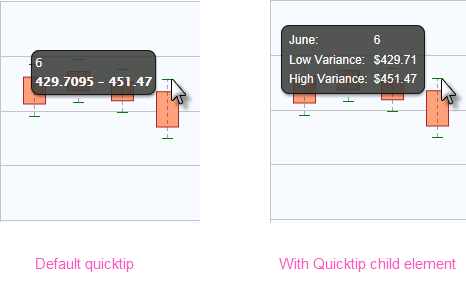
By default, a "quicktip" is displayed when the mouse hovers near or over a stem or whisker line. This is separate from the quicktips which are displayed for the chart bars.

The automatically-generated quicktip displays information for the low and high values, as shown above, left. However, you may want to display other information or format it differently, perhaps as shown above, right, which can be done by adding a Quicktip child element beneath Series.Whiskers and setting its attributes and child elements. Use @Chart tokens to include chart data in the quicktip and intrinsic functions are supported in the Quicktip element attributes.
Action Elements
Action elements initiate processing of a report or process task definition, redirection to a link, or other processing when the stem or whisker line is clicked.

In the example above, an Action.Report element has been added as a child of Series.Whiskers, along with its Target.Report and Link Parameters child elements. To reference chart data in parameters, use the @Chart token, as shown above.
A variety of Action elements are available for use with Series, including Action.Link, Action.Process, Action.Refresh Element and more.