Series.Pie
The Chart Canvas element's Series child elements cause a data visualization (the chart) to be rendered in the canvas. This topic discusses the Series.Pie element, and topics include:
- About Series.Pie
- Shaping the Pie
- Use Multiple Series
- Attributes
- Add Data Labels
- Use the Quicktips Element
- Use Action Elements
- Use Input Selection
About Series.Pie
The Series.Pie element generates a Pie chart, which is a circular chart divided into sectors, illustrating numerical proportion.
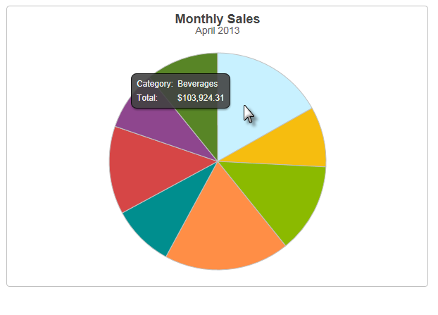
The example above shows a simple Pie chart, presenting one month's sales of different product categories.
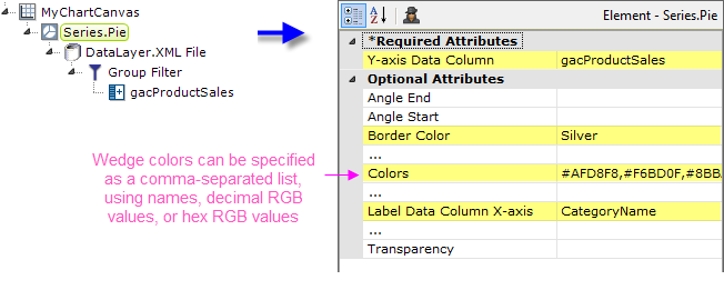
As shown above, the chart is created by adding Series.Pie to the canvas, along with a datalayer and, typically, some child elements that may include Time Period Column elements, a Group Filter, and a Group Aggregate Column element. Very few attributes need to be set for the Series element in order to produce a basic chart. In the example, a list of custom wedge colors was provided.
![]() Note that a datalayer element can be used either beneath Series.Pie, as shown above, or beneath Chart Canvas. If used as a child of Chart Canvas, its data is available to all child Series elements. This can improve performance if you have several series, all using the same data, beneath the same Chart Canvas element.
Note that a datalayer element can be used either beneath Series.Pie, as shown above, or beneath Chart Canvas. If used as a child of Chart Canvas, its data is available to all child Series elements. This can improve performance if you have several series, all using the same data, beneath the same Chart Canvas element.

The properties of the X- and Y-axis, including captions, are set using the X-Axis and Y-Axis elements. For example, in order to angle the X-axis labels, add an X-Axis element beneath Chart Canvas (none of its attributes need to be set) and add its child Label Style element. Set the Label Style element's attribute as shown above.
Shape the Pie
You can control the shape of the Pie chart in several ways.
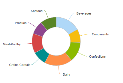
The example above shows a Pie chart with a "donut hole" in its middle. This is controlled by setting the Series.Pie element's Donut Hole Size attribute to a value, in pixels, equal to the diameter of the hole.
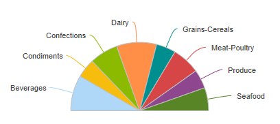
The example above shows a Pie chart that only fills part of the usual 360-degree pie space. This is created by using the Series.Pie element's Angle Start and Angle End attributes. The example uses Angle Start = 270 degrees and Angle End = 450 degrees. How do we come up with those numbers?
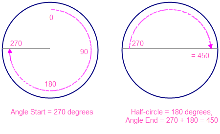
Assume we want a Pie chart that's a half-circle, above the equator, like our previous example. To find the starting angle, we navigate clockwise around a circle to the starting point, as shown above left, to 270. Then to find the ending angle, we add the number of degrees in a half-circle (180) to the starting angle, or 270 + 180, which equals 450, as shown above, right. Using this method, you can create a Pie chart that's any portion of a complete circle.
Use Multiple Series
Just as it is with other Series, it's possible to add multiple Pie charts to one Chart Canvas.
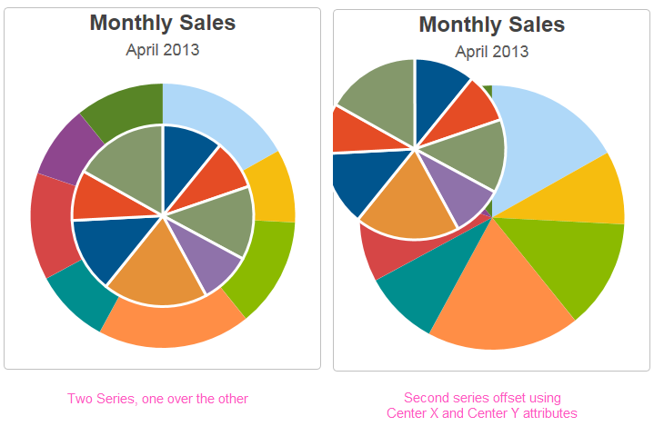
Overlaying Pie charts can produce "visual clutter" that's hard to decipher (and that's without any data labels displayed), as you can see in the example above, left. In the example above, right, however, the second Series has been configured so that it's off center, using its Center X and Center Y attributes, which provides a little more clarity.
![]() When using multiple series, you may be able to reduce the number of data queries and improve performance by using Local Data (see Introducing Datalayers) to read all of the data once and then link its datalayer (see Link Datalayers) to share it
to the series. At each Series element,
link its datalayer to the shared Local Data datalayer and filter the data to meet the needs of each individual series.
When using multiple series, you may be able to reduce the number of data queries and improve performance by using Local Data (see Introducing Datalayers) to read all of the data once and then link its datalayer (see Link Datalayers) to share it
to the series. At each Series element,
link its datalayer to the shared Local Data datalayer and filter the data to meet the needs of each individual series.
You can combine different types of Series elements, for example, Series.Pie and Series.Line, to produce combinations of visualizations.
Attributes
The Series.Pie element has the following attributes:
| Attribute | Description |
|---|---|
| Y-Axis Data Column | (Required) Specifies the name of a datalayer column whose values will be plotted along the Y-axis, dictating how large each pie slice is. |
| Angle End | Sets the ending angle of the Pie chart's last slice, in degrees. For example, to create a Pie chart which has 180 degrees total, facing upwards, set these attributes: Angle Start = 270, Angle End = 450 |
| Angle Start | Sets the starting angle of the Pie chart's first slice, in degrees. The default value of 0 starts the first slice at the 12 o'clock position and a value of 90 is the 3 o'clock position. |
| Border Color | Sets the color of the border line around the pie and around each slice. Enter a color by name, decimal RGB value, or hex RGB value. Prefix hex values with the pound sign, like #112233. |
| Border Color Transparency | Specifies the transparency of the border line. The lowest value of 0 specifies that the background is opaque, with no transparency. At the other end of the scale, 15 specifies a completely transparent background. Use medium-level transparency to allow different chart layers to show through each other. |
| Border Thickness | The thickness of border line around the pie and around each slice, in pixels. The default is value is 1 pixel. |
| Center X | Sets the horizontal center point of the Pie chart, in pixels, within the canvas. |
| Center Y | Sets the vertical center point of the Pie chart, in pixels, within the canvas. |
| Colors | Sets the colors of the pie slices, which should be entered as a comma-separated list. Enter a color by name, decimal RGB value, or hex RGB value. Prefix hex values with the pound sign, e.g. #112233. When there are more slices than colors specified, the listed colors are used again from the beginning. A default set of colors is used if this is left blank and no theme has been applied. For more information, see the Default Colors section of Chart Canvas Charts. |
| Disable Mouse Tracking | Disables mouse tracking for the series, when set to True. This affects
tooltips and click events on graphs and points. For large datasets, this may
improve performance. |
| Donut Hole Size | Sets the size of the inner diameter of the Pie chart, in pixels. Any size greater than 0 renders a "doughnut" style chart. The default value is 0 pixels. |
| Hover Brightness | Specifies the amount to change a pie slice's color when the mouse pointer is hovered over it. Values can be between 0 (no change) and 15 (lighter). The default value is 2. |
| Label Data Column X-Axis | Set this to a column returned from the DataLayer. It represents the "name", or x-axis value, of each pie slice. |
Label Location | Specifies how Pie chart slice labels will appear. Select: |
| Min Radius | Sets the minimum acceptable size of the pie chart, in pixels. During rendering, the pie radius will try to shrink automatically, if necessary, to accommodate any exterior slice labels and still fit the canvas, but it can be no smaller than this size. |
Pie Label Style | Specifies how Pie chart slice labels will appear. Select: |
| Radius | Determines the size, by setting the radius, of a Pie chart, in pixels. If left blank, the chart size is determined automatically. |
Show Data Values | Specifies if the value of each data point should be shown on the pie chart. Depending on the value of the Label Location attribute, they may be shown alone or with the label values. The default value is False. |
Show Data Values Format | Specifies formatting characteristics for data values. For dates, the non-specific formats, such as General Date, Short Time, etc., are converted according to the browser's international settings. For very large reports, the non-specific formats perform better. Special formats include: < and > - change strings to lower and upper case. qq - returns the number of the quarter when the value being formatted represents a date. To return the year and quarter together like "2010 Q1", set the format to yyyy Qqq. |
| Transparency | Specifies the transparency of the pie slice color. The lowest value of 0 specifies that the background is opaque, with no transparency. At the other end of the scale, 15 specifies a completely transparent background. Use medium-level transparency to allow different chart layers to show through each other. |
Add Data Labels
A "data label" is text that can be shown adjacent to each pie slice that shows its X-axis data value. This is controlled using the Label Location attribute (the Pie Label Style attribute in v11.2).
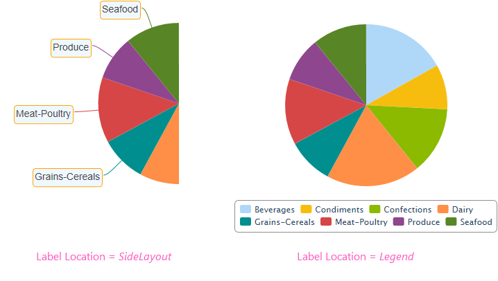
As shown above, labels can be placed beside the slices, or in a legend, or not shown at all.
![]() The Data Labels element's color-related attribute values can be set using @Chart tokens.
The Data Labels element's color-related attribute values can be set using @Chart tokens.
When the legend option is selected, "legend filtering" is active: clicking a slice's entry in the legend will toggle its appearance in the chart. For more information about legends, see Legend.
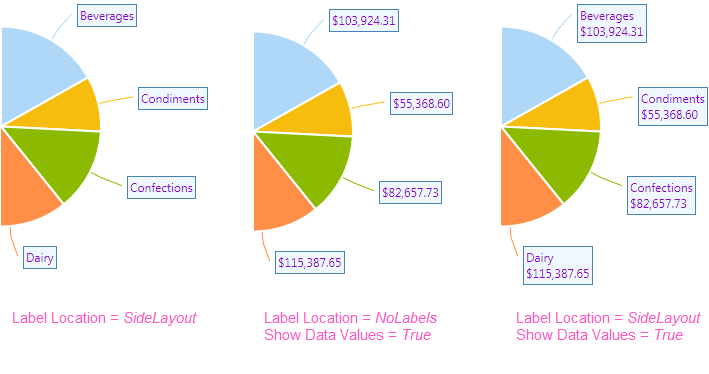
![]() If you want to show the data values instead of, or with, the data labels near each pie slice, as shown above, use the Series.Pie element's Label Location, Show Data Values, and Show Data Values Format attributes.
If you want to show the data values instead of, or with, the data labels near each pie slice, as shown above, use the Series.Pie element's Label Location, Show Data Values, and Show Data Values Format attributes.
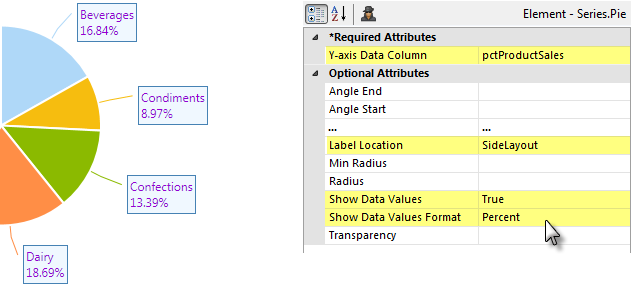
![]() In the example shown above, the data values are displayed as percentages. This is done by adding a Percent of Total Column element to your datalayer and using it as the chart's Y-axis Data Column. The Show Data Values and Show Data Values Format attributes are then set as shown.
In the example shown above, the data values are displayed as percentages. This is done by adding a Percent of Total Column element to your datalayer and using it as the chart's Y-axis Data Column. The Show Data Values and Show Data Values Format attributes are then set as shown.
The values displayed can also be styled using the Side Label Style element. Its attributes allow you to control the font family, color, size, and weight, the data format, background color, border color, connecting lines and more. The side labels in the image above have been styled.
![]() The Side Label Style element's Maximum Label Length attribute lets you specify the maximum number of characters that will be displayed for a label before the text is truncated and ellipsis (...) is appended.
The Side Label Style element's Maximum Label Length attribute lets you specify the maximum number of characters that will be displayed for a label before the text is truncated and ellipsis (...) is appended.
Quicktips Element
By default, a "quicktip" is displayed when the mouse hovers near or over a pie slice:
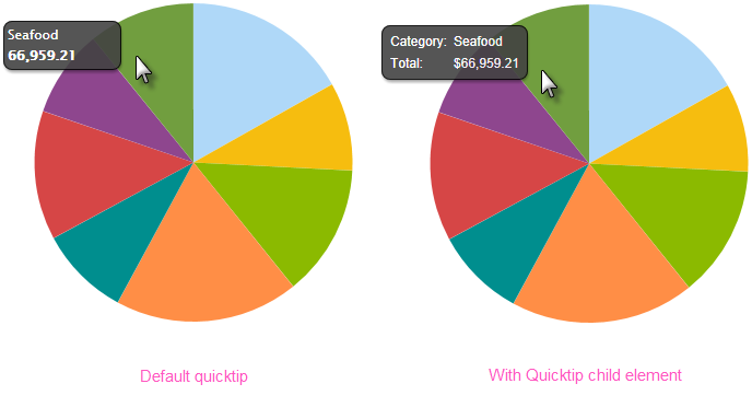
The automatically-generated quicktip displays information for the X- and Y-axis, as shown above, left. However, you may want to display other information or format it differently, perhaps as shown above, right. This "custom" Quicktip is created by adding a Quicktip child element beneath Series.Pie and setting its attributes and, optionally, using its Quicktip Row child element. Use @Chart tokens to include chart data in the Quicktip.

The example above shows another custom Quicktip in use and this time the chart data values are displayed in the Quicktip as percentages. This is done by adding a Percent of Total Column element to your datalayer and using its @Chart token in a Quicktip Row element's Value attribute. The Quicktip Row element's Format attribute is then set to Percent, as shown.
![]() Intrinsic functions are supported in the Quicktip attributes.
Intrinsic functions are supported in the Quicktip attributes.
Action Elements
Action elements initiate processing of a report or process task definition, redirection to a link, or other processing when a pie slice is clicked.

In the example above, an Action.Report element has been added as a child of the Series, along with its Target.Report and Link Parameters child elements. To reference chart data in parameters, use the @Chart token, as shown above.
A variety of Action elements are available for use with Series, including Action.Link, Action.Process, and Action.Refresh Element. Additional Action elements will be added in future releases.
Input Selection
This series can also be used with the Input Selection family of elements, which turn the chart into an input control. This allows users, at runtime, to select points or values on the chart with their mouse and your report can then take action using the selected data. This is very useful, for example, for drilling into the data.
For more information about this functionality, see Input Selection.