Introduction to Classic Charts & Gauges
Logi managed reporting tools offer developers a rich selection of charts for data visualization. This topic enumerates the types of charts and gauges available, describes them in general, and provides links to additional detailed information.
- About the Classic Charting Elements
- Gallery of Classic Chart and Gauge Elements
About the Classic Charting Elements
In v11.2.040, we introduced a new set of charting elements collectively called "Chart Canvas" charts. The container or root element for each chart is the Chart Canvas element. These charts are based on HTML5 and JavaScript. For more information, see Chart Canvas Charts.
We now refer to charts and gauges that were previously available as our "Classic" charts and gauges. They fall into two categories: Static and Animated, depending on whether they can draw themselves with animation.
Animated Charts
Prior to v11.0.416, classic animated charts and gauges used Flash technology exclusively to render data-driven charts. Users must have Adobe's free Flash browser add-in installed in order to see these charts, and these charts are not exportable as part of a report page. They can be right-clicked and the context menu that appears offers multiple choices for saving or printing the chart itself.
Starting with v11.0.416, classic animated charts and gauges can use either HTML5 features and JavaScript, orFlash to render animated visualizations. By default they use Flash, but HTML5 can be enabled by including the constant rdAnimatedChartRenderStyle = JavaScript in the application's _Settings definition. Regardless of the rendering technology used, these charts are still not exportable.
Note that the upgraded visualizations in v11.0.416+ look different, in varying degrees by chart type, than the previous versions, regardless of rendering style used.
Static Charts
Static charts and gauges are rendered on the report page as an image, so they do not require any special browser add-ins to be viewed and they areexportable.
Some individual charting elements are capable of producing several different types of charts. For example, Chart.XY produces Line, Bar, Area, and Spline charts. The charting elements give you the ability to adjust many aspects of your charts and, as a result, multi-type chart elements have a lot of attributes, but some of them only apply to a particular chart type and not others.
Developers just beginning to work with Logi chart elements will find that it's a very iterative process and there will be many small changes to be made until your charts are "just right". This is inherent in having the level of flexibility that our customers demand. Logi Studio includes several wizards that can help you get started creating charts and gauges.
Additional information that will allow developers to quickly get started creating charts is available in Work with Classic Charts.
Gallery of Classic Chart and Gauge Elements
The following table describes the charts that are available. The Element Name is a link to the DevNet Element Reference page for that element.
| Chart | Description |
|---|---|
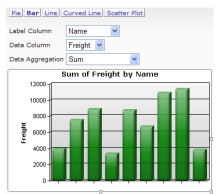
| Element name: Analysis Chart The Analysis Chart is a dynamic chart set that offers users interactive data analysis capabilities. While viewing a report in their browser, users can select chart types and chart data. Chart options include: Pie, Bar, Line, Spline, and Scatter. |
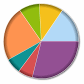
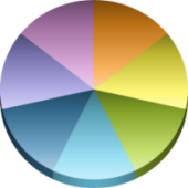
| Element name: Animated Chart.Pie This Flash-based chart "draws itself" when the page is displayed or refreshed. A pie chart (or circle graph) is a circular chart divided into sectors, illustrating relative magnitudes, frequencies, or percentages. It's named for its resemblance to a pie which has been sliced. Alternate visual styles of this chart include exploded pie wedges and the Doughnut shape. |
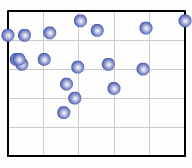
| Element name: Animated Chart.Scatter This Flash-based chart "draws itself" when the page is first displayed. A scatter chart uses Cartesian coordinates to display values
for two variables from a dataset.
The data is displayed as a collection of points, each having the value of one
variable determining the position on the horizontal axis and the value of the
other variable determining the position on the vertical axis. |
| Element name: Animated Chart.XY This Flash-based chart "draws itself" when the page is first displayed and is capable of producing Line, Bar, and Area charts. Cartesian coordinates are used to display values for two variables from a dataset and plot them as points on the chart. These points are used to create the visual representation of the data. Alternate visual styles of this chart include Bar, Area, and 3-Dimensional renderings. |
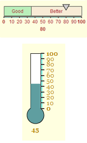
| Element name: Animated Gauge.Bar This Flash-based chart "draws itself" when the page is first displayed. A single data value is plotted along a either a Horizontal Bar or a Vertical Thermometer scale, providing a quick at-a-glance indication of its value. |
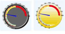
| Element name: Animated Gauge.Needle This Flash-based chart "draws itself" when the page is first displayed. This chart resembles an automotive speedometer or tachometer and provides an eye-catching data visualization. Alternate visual styles of this chart include Bevel and Lens. |
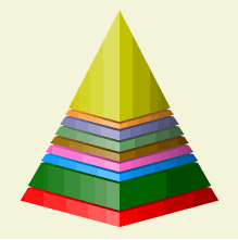
| Element name: Animated Gauge.Pyramid This Flash-based chart "draws itself" when the page is first displayed. This chart provides a striking comparison of data, using the thickness of its layers to denote relative values. An alternate visual style for this chart is the Funnel shape. |
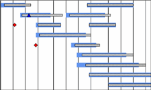
| Element name: Chart.Gantt A Gantt chart is a popular type of bar chart that illustrates a project schedule. Gantt charts illustrate the start and finish dates of the terminal elements and summary elements of a project. Terminal elements and summary elements comprise the work breakdown structure of the project. Chart.Gantt is limited to 1,000 data rows and only supports one Extra Gantt Column child element. |
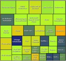
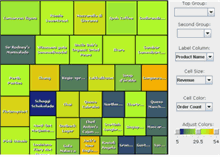
| Element name: Chart.Heat Map This element produces one of the most unusual charts found in Logi reporting products, with a unique arrangement of rectangles representing data and relationships using color and size. It produces an image-based chart that can be exported. See also Heat Map Applet, below. (v10.0.366+) |
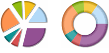
| Element name: Chart.Pie A pie chart (or circle graph) is a circular chart divided into sectors, illustrating relative magnitudes, frequencies, or percentages. It is named for its resemblance to a pie which has been sliced. Alternate visual styles of this chart include 2-Dimensional, exploded pie wedges, and 2-D and 3-D doughnuts. |
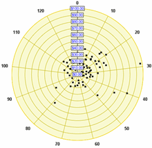
| Element name: Chart.Polar This a circular graph in which data is displayed in terms of values and angles. Also known as a "radar chart", this is an X-Y graph drawn on a circular grid, displaying value trends on the basis of angles. Alternate visual styles of this chart include Area,Spline Area, Scatter, Bubble, Spline Line, Line, and Radar. |
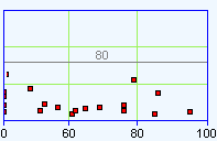
| Element name: Chart.Scatter A scatter chart uses Cartesian coordinates to display values for two variables from a dataset. The data is displayed as a collection of points, each having the value of one variable determining the position on the horizontal axis and the value of the other variable determining the position on the vertical axis. Alternate visual styles of this chart includes point symbols that are circles, crosses, diamonds, triangles, or "X"s. |
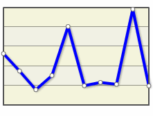
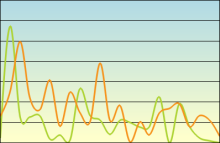
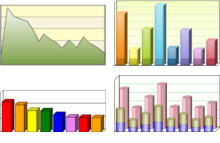
| Element name: Chart.XY This multi-faceted element can be used to product a wide variety of charts. Cartesian coordinates are used to display values for two variables from a dataset and plot them as points on the chart. In a Line chart, a line connects these points to create the visual representation of the data. Multiple datasets can be combined in one chart, using the same or different visual representations. Alternate visual styles of this chart include Area, Bar, Spline, Stacked, and 3-Dimensional. |
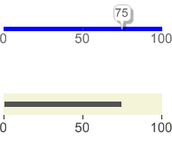
| Element name: Gauge.Balloon Bar and Gauge.Bullet Bar Balloon Bar gauges show a value inside a prominent balloon box, with a pointer going into the bar. Bullet Bar gauges show a bar within a bar. These are especially good for presenting key values in an easy-to-read image. |
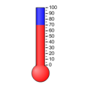
| Element name: Gauge.Bar A single data value is plotted along a vertical thermometer scale, providing a quick at-a-glance indication of its value. Alternate visual styles of this chart include Horizontal Thermometer, Vertical Bar, and Horizontal Bar. |
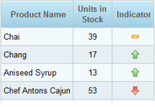
| Element name: Gauge.Indicator This chart provides multi-colored signals associated with a single dataset, providing a quick at-a-glance indication of value. Alternate visual styles of this chart include a choice of standard signal images (Rectangle, Circle, Up Triangle, or Down Triangle) or your own custom images. |
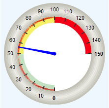
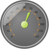
| Element name: Gauge.Needle This chart resembles an automotive speedometer or tachometer and provides an eye-catching data visualization, plotting a single data value on its perimeter. Round, half-round, quarter-round, and rectangular formats are available. |
| Element name: Heat Map Applet This element produces one of the most unusual charts found in Logi reporting products, with a unique arrangement of rectangles representing data and relationships using color and size. The Heat Map Applet is a Java-based applet with controls that can be used at runtime to customize the chart, but which cannot be exported. |
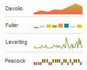
| Element name: Sparkline.Area, .Bar,
.Line, .WinLoss Sparklines are tiny charts appropriate for showing many trends at once, as a set of small timelines. They are typically drawn without axes or gridlines and are often shown inside data tables, alongside labels. |
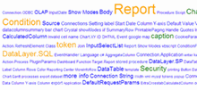
| Element name: Text Cloud This chart creates unique visual depiction of the relative weightings of words and phrases. Greater weightings or frequencies can be denoted through color and font size. |
