Logi Info v14.2 Enhancements
This topic introduces the significant features of Logi Info in this release:
SSRM/AG - Customizable Sliding Date Options
You can now customize your Sliding Date options when filtering an analysis by date/time. This features also includes a time picker that enables you to specify a logic that suits your business needs. Previously, you were limited to the cadences listed in the drop-down menu. With this enhancement, you have the flexibility to create business-specific sliding date filter options, enabling you to have total control over the end-user experience.
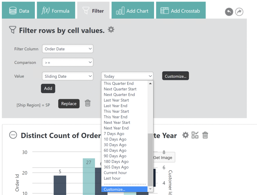
Selecting the Customize... button, or choosing Customize... from the drop-down menu generates additional fields, with default values, where you can manipulate the data:

If you choose any value other than "Hour" in the drop-down list, the value "On" will be added to the Start/End drop-down list. The time picker only displays when Start, End, or On is chosen.

Specify a time by selecting the time picker:

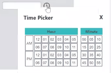
The filtered results reflect the sliding date and specified time.
For more information, see Analysis Grid - Filtering Rows or InfoGo - Filtering Rows.
Customizable @Date Tokens
As a report developer, you can now specify a particular date using customized @Date tokens. Previously, you could only use the built-in tokens available in the list. Now, you can customize the @Date token to retrieve relative dates for reports and report scheduling.
To utilize this feature, double- click the Customize… option in the token value list:
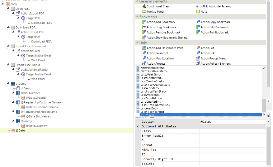
The Customize Date Token dialog displays, shown below. Enter a number in the first field. Then, use the drop-downs to select a Date Section (Hour, Day, Week, Month, Quarter, Year FiscalQuarter, FiscalYear), Direction (Ago, Later), and Edge (Start, End, On). Select the check box in the last field to enable time input (HH:mm). ![]() Depending on your selections, some options may not be available in other drop-downs. Similarly, the time input may be disabled.
Depending on your selections, some options may not be available in other drop-downs. Similarly, the time input may be disabled.
When finished, select OK:

The @Date token value automatically populates, like below:

You can also customize the @Date token by entering the value directly. This value is case sensitive.
This feature is available anywhere that you use existing @Date tokens.
For more information, see @Date Tokens.
Default DIV Output Tag
As a report developer, you now have the ability to specify the Output HTML DIV Tag attribute for all elements that are not set manually at the application level. This enhancement provides additional flexibility, while reducing the effort required to set individual element wrapping. The existing Output HTML DIV Tag attribute in the Division element has two possible values: True or False. If you select True, <div> is the wrapper tag for your element. If you select False, or if the attribute is blank/undefined, <span> is the wrapper tag for your element. The new global constant, rdOutputHtmlDivTagDefault, specifies the default rendering results when the Output HTML DIV Tag of the Division element is not set explicitly. The default value for this constant is blank, or False. When set to True, the default rendering result is <div>.
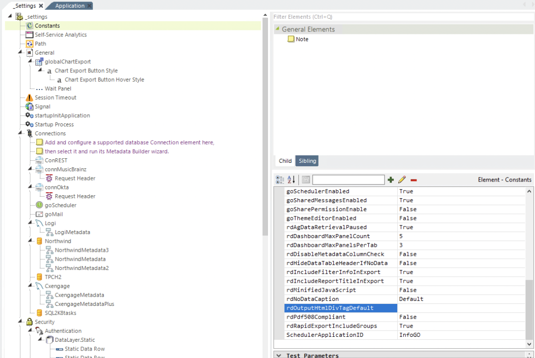
The table below describes the relationship between the new constant and the existing attribute:
| rdOutputHtmlDivTagDefault Constant Value | Output HTML Div Tag Attribute Value | Rendered As | Existing Tags | New Tags |
|---|---|---|---|---|
| True | True | <div> | X | |
| True | Blank/Undefined (default) | <div> | X | |
| True | False | <span> | X | |
| True | <div> | X | ||
| True | False | <span> | X | |
| Blank/Undefined (default) | True | <div> | X | |
| Blank/Undefined (default) | Blank/Undefined (default) | <span> | X | |
| Blank/Undefined (default) | False | <span> | X | |
| Blank/Undefined (default) | <span> | X | ||
| Blank/Undefined (default) | True | <div> | X |
For more information, see Configuring InfoGo Constants and Divisions.
Dashboard Panel/Tab Max Count
This developer-oriented enhancement allows you to control how many panels are in the entire Dashboard, as well as the number of Dashboard panels per tab. Limiting the number of panels helps simplify the Dashboard and provide an overall better user experience.
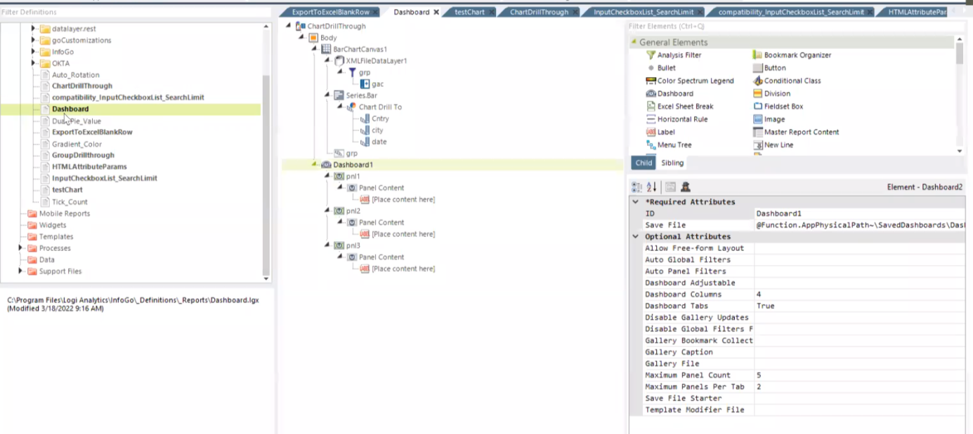
These limitations are supported by the new Super Element attributes 'Maximum Panel Count' and 'Maximum Panels Per Tab'. If the attributes are not set, the value is less than one, or the value is invalid, the system works as before.
In the example below, the Dashboard is restricted to five panels and three panels per tab:
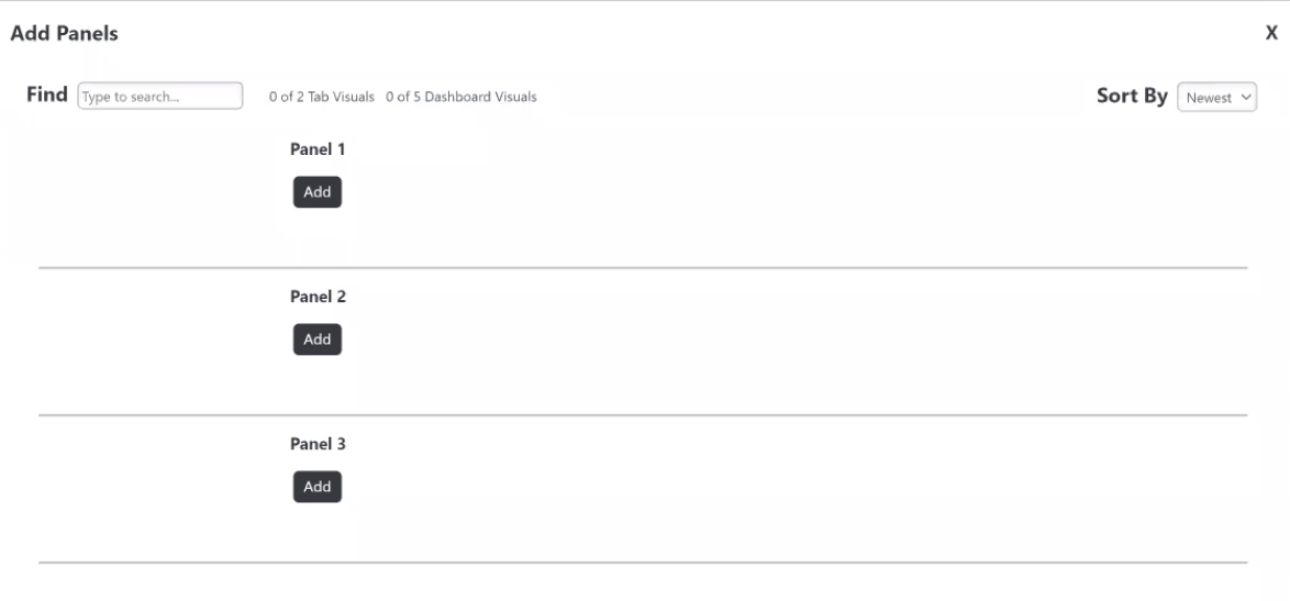
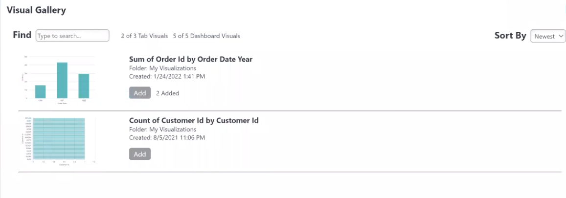
Limitations are conveyed to end-users when they view the 'Add Panels' dialog, shown below:
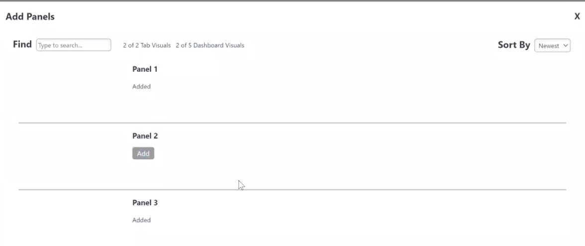
Once they reach the maximum panel allowance, the 'Add' button will be grayed out, prohibiting them from adding more panels to the Dashboard:
![]() This enhancement will not break any existing Dashboard configurations. To add a new Dashboard or Tab Visual, the user must first remove existing panels/tabs that are exceeding the count, based on the new limitation.
This enhancement will not break any existing Dashboard configurations. To add a new Dashboard or Tab Visual, the user must first remove existing panels/tabs that are exceeding the count, based on the new limitation.
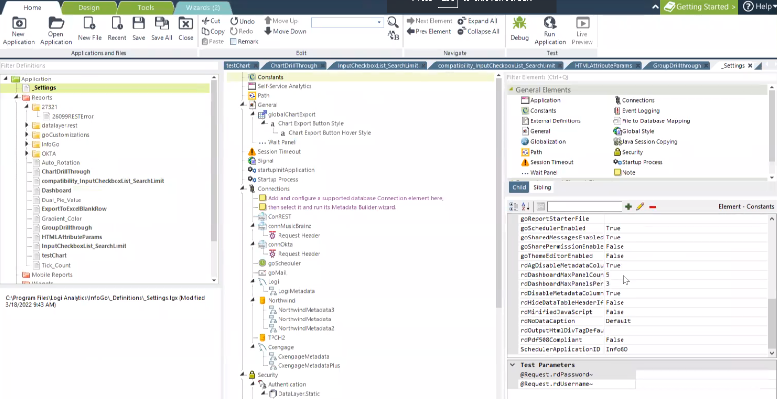
For SSRM, this enhancement is defined by system-level constants rdDashboardMaxPanelCount and rdDashboardMaxPanelsPerTab. If the constant is not set, the value is less than one, or the value is invalid, the system works as before.
In the example below, the Dashboard is restricted to five panels, and three panels per tab:
![]() Super Element attributes have a higher priority than system-level constants.
Super Element attributes have a higher priority than system-level constants.
Limitations are conveyed to end-users when they view their Visual Gallery, shown below:
For more information, see Configuring InfoGo Constants, Working with Dashboard Tabs, and Managing Dashboard Panels.
Data Table Lazy Loading
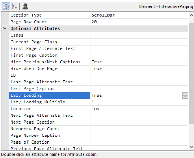
Info v14.1 introduced the "Scrollbar" value to the Caption Type attribute, enabling users to scroll through their Data Table results. This release extends the Scrollbar functionality to incorporate lazy loading. Lazy loading improves performance by intercepting scrolling prior to fetching the next set of data. This way, you're not waiting for data to load before the first page of results displays.
To support this new feature, the Interactive Paging element offers two additional attributes: Lazy Loading and Lazy Loading Multiple. The default value for Lazy Loading is False, all data loads at one time. When set to True, loading begins when the scrollbar reaches the bottom of the page. When Lazy Loading is enabled, the Lazy Loading Multiple attribute allows you to set the amount of data to fetch on the next load. The default value is empty, or 1. To enable this attribute, enter a number to determine the amount of data that loads. For example, if set to 3, the next load fetches 3x the page count row data.
![]()
Lazy Loading is only available when the Caption Type attribute is set to Scrollbar.
Depending on your data results, lazy loading may expand your table width while scrolling. Once you reach the bottom of your results the table width is final.
For more information, see Interactive Paging Element Attributes.
Remove Empty Grouped Rows
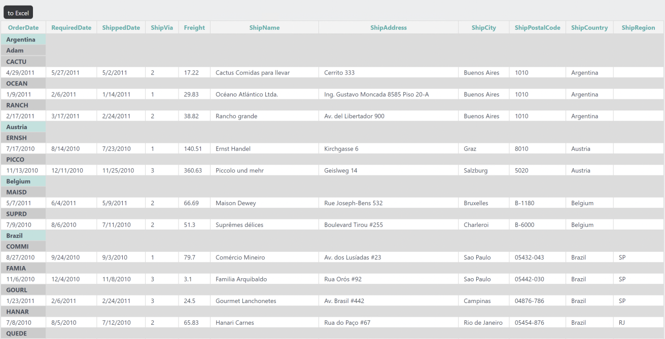
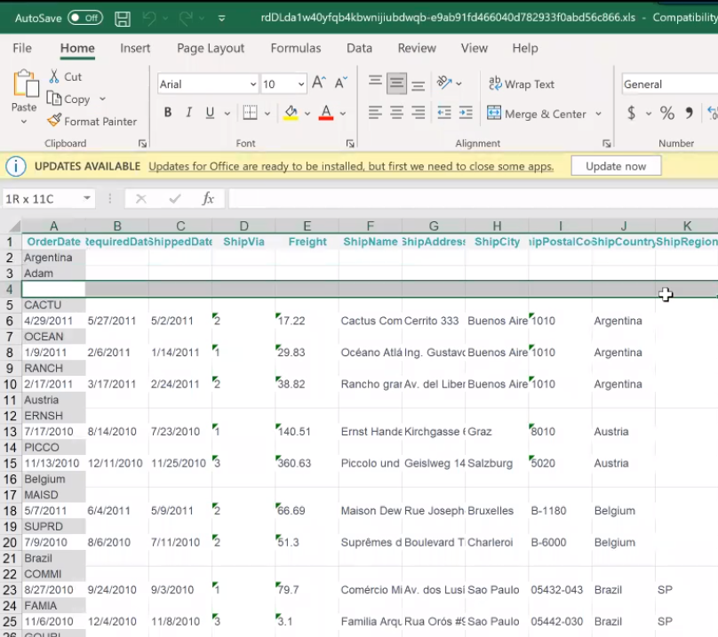
The Target.NativeExcel element has a new attribute, Remove Empty Group Row, that allows you to remove blank rows from your Excel output when there is no detail data under a particular group. The default value for this attribute is empty (False).
Below is an example of the report in Info:
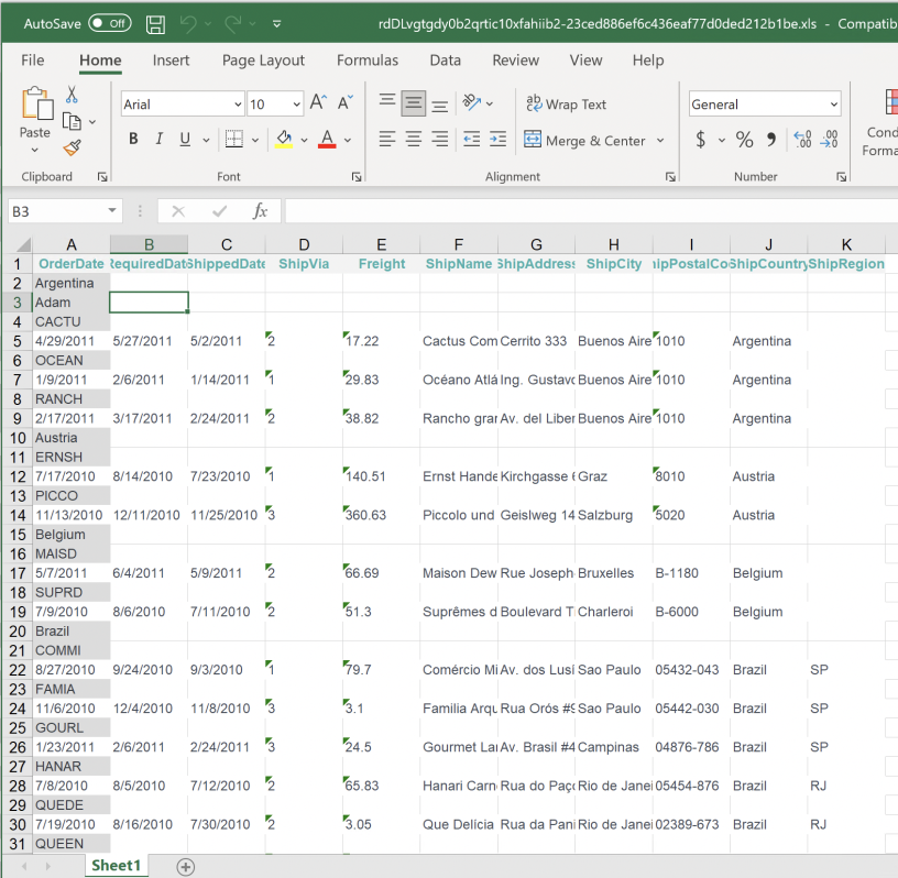
Once exported to Excel, the blank row from the grouping in Info is retained in the output, shown below:
To remove the blank row(s), set the Remove Empty Group Row attribute to True:
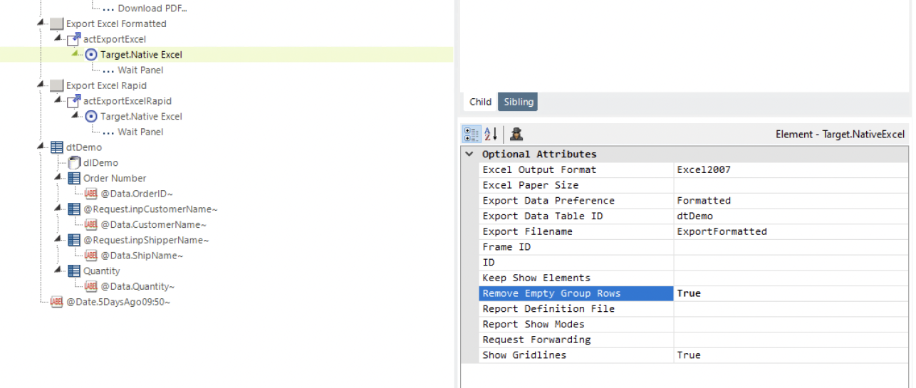
Below is an example of the Excel output once the empty row is removed:
![]() This enhancement only affects the Native Excel format.
This enhancement only affects the Native Excel format.
For more information, see Exporting To Native Excel and Excel - Exporting a Report Manually.
InfoGo - Rapid Excel/CSV Export Grouping
Developers can now elect to include group or summary information in Rapid Excel and Rapid CSV exports. The existing behavior only displays a detailed table in your output. Now, all your grouping definitions or aggregations display in the final result.
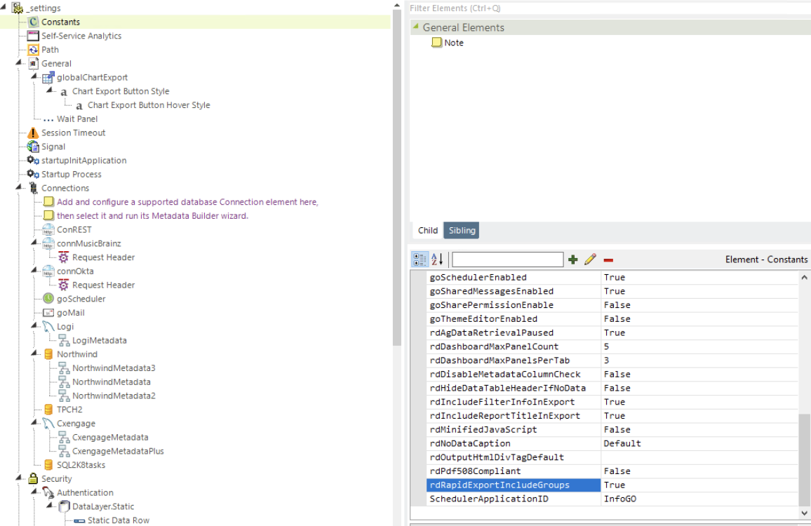
This ability is controlled by a new global constant, rdRapidExportIncludeGroups. By default, the value for this constant is False.
To display Group or Summary information in the Excel/CSV result, set this constant to True:
Below is an example of a grouped table in Info:
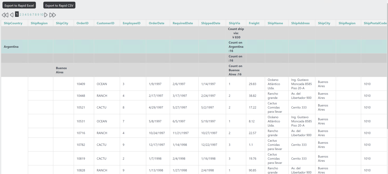
To view the output, select Export to Rapid Excel or Export to Rapid CSV.
Below is an example of the output:
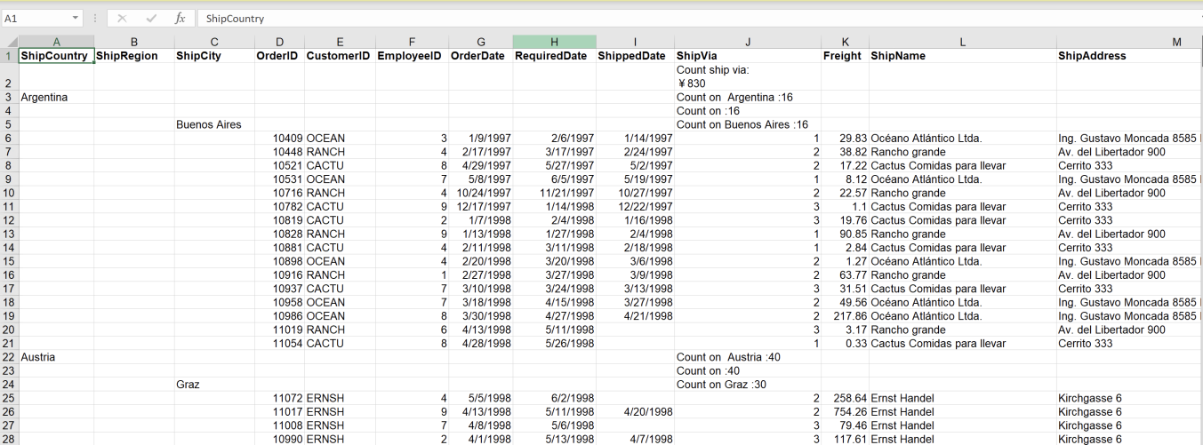
![]() This enhancement extends to Native Excel exports, but not Native CSV.
This enhancement extends to Native Excel exports, but not Native CSV.
For more information, see Configuring InfoGo Constants, and the respective native or rapid export topics.
AG - Pause Data Retrieval Globally
An existing Analysis Grid element, Allow Pause Data Retrieval, and SSRM constant, goAllowPauseDataRetrieval, control the display of an extra button on the Analysis Grid. When clicked, the Pause Data Retrieval feature temporarily halts data retrieval from the server. Info now offers a global constant, rdAgDataRetrievalPaused, to control the initial status of the Pause Data Retrieval button. This feature allows end-users to edit the bookmark format or filters without waiting for the data retrieval, enabling faster updates and improving performance, especially when working with large data sets.
By default, rdAgDataRetrievalPaused is False, and the system refers to the existing Analysis Grid element and SSRM constant configuration to determine Pause Data Retrieval availability.

When rdAgDataRetrievalPaused is True, data retrieval is automatically paused. With data retrieval paused, users can make changes, then select the Resume button to resume retrieval.

![]() The new constant does not control the new Analysis Grid creation process in the Studio wizard.
The new constant does not control the new Analysis Grid creation process in the Studio wizard.
For more information, see Configuring InfoGo Constants, Analysis Grid Developers - Analysis Grid Attributes, and The Analysis Grid for End Users.
AG - Table Enhancements
This release provides additional flexibility to customize your Analysis Grid table, adding new configuration options to allow conditional grouping on aggregate rows, interactive paging improvements, conditional styling, ability to reset the Analysis Grid, re-arrange sorting and grouping, and extending data formatting options. These enhancements enable you to perform advanced, in-depth analysis of the underlying data without leaving the application.
Decimal Time Column Formatting
With this enhancement, you have the option to customize the decimal place for the "Percentage" and "Percentage of Total" formatting options by selecting Percent Decimal Places.
Both a number string value and an empty value is considered valid input. If the value is not a number, it will be ignored. An "empty" value will remove the setting, and decimal places will return to the default value, zero or two. When the Percent format is set in the Metadata manager (SSRM) or Studio (Managed Report), the default decimal places is two.
![]() This setting is column-specific, meaning different columns with different percentage values can be customized to display different decimal places.
This setting is column-specific, meaning different columns with different percentage values can be customized to display different decimal places.
For more information, see Analysis Grid - Formatting Data and InfoGo - Formatting Data.
Include Report Title and Filter Information in Export
You can now include the report title and filter information in the export result so that you don't have to compromise context when viewing the report in PDF or Excel. This capability applies to Crosstabs and Tables and can be used with the following export types: Native PDF, Native and Rapid Excel, and Rapid CSV.
This enhancement is supported by the new constants, rdIncludeReportTitleInExport and rdIncludeFilterInfoInExport. The default value for these constants are False.
To utilize this feature, set the global constants rdIncludeReportTitleInExport and rdIncludeFilterInfoInExport to True:
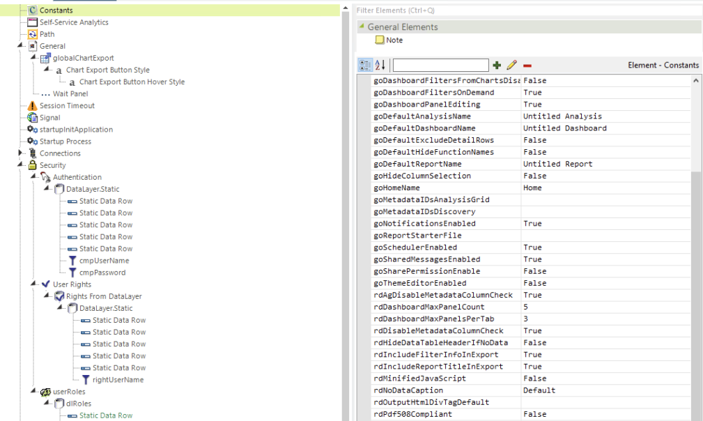
Apply a filter to your report:
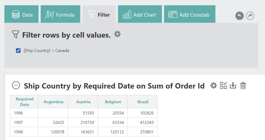
Then, select the export icon and choose your export preference:
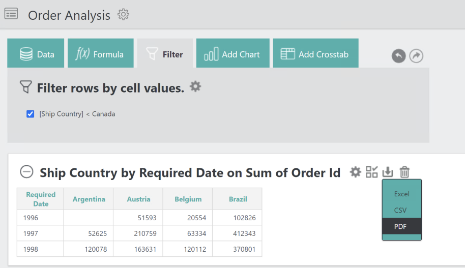
Once exported, the filter information displays in your report, shown below:
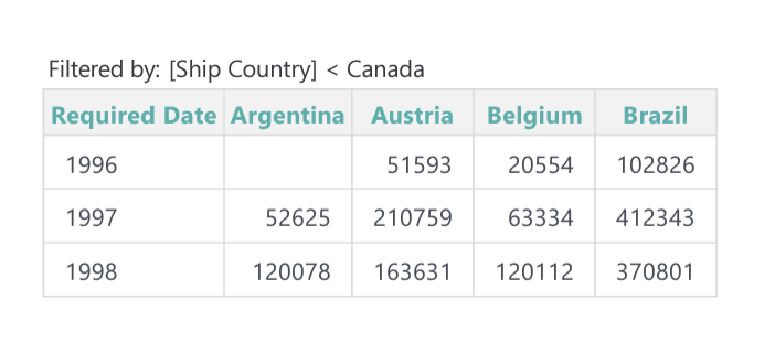
For more information, see Configuring InfoGo Constants, Analysis Grid Developers - Exporting Data, Analysis Grid - Exporting Data, InfoGo - Exporting Analysis Data, and the related file export topics.
PDF Disposition
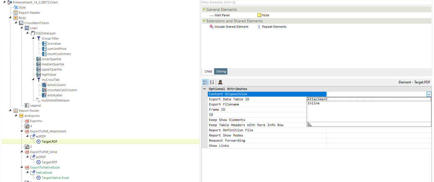
At present, all major browsers have built-in PDF readers that are used to open PDFs. This enhancement enables you to decide whether all PDFs are opened or downloaded in the browser (by the built-in PDF reader) through the settings (on the browser). To support this feature, a new attribute, Content Disposition, was added to Target.PDF element. The values for this optional attribute are: Empty (default), Attachment, and Inline. By default, the PDFs use browser settings. When the attribute is set to "Attachment", you are prompted to download the PDF. When the attribute is set to "Inline", you are prompted to display the PDF inside the Web page.
To utilize this feature, set the Content Disposition value to Attachment or Inline:
![]()
If the browser does not have built-in PDF readers, "download" or "open" is determined by the browser settings.
If using Content Disposition and the browser doesn't support it, "download" or "open" is determined by the browser settings.
For more information, see PDF - Exporting a Report Manually, and Creating Printable Reports.
Dynamically Set Min/Max Goals on Gauges
This release offers the ability to use percentage values and absolute values to set intervals for your gauge chart. In previous versions, you could only use static values to set color thresholds for Min, Max, and Goals, as shown below:
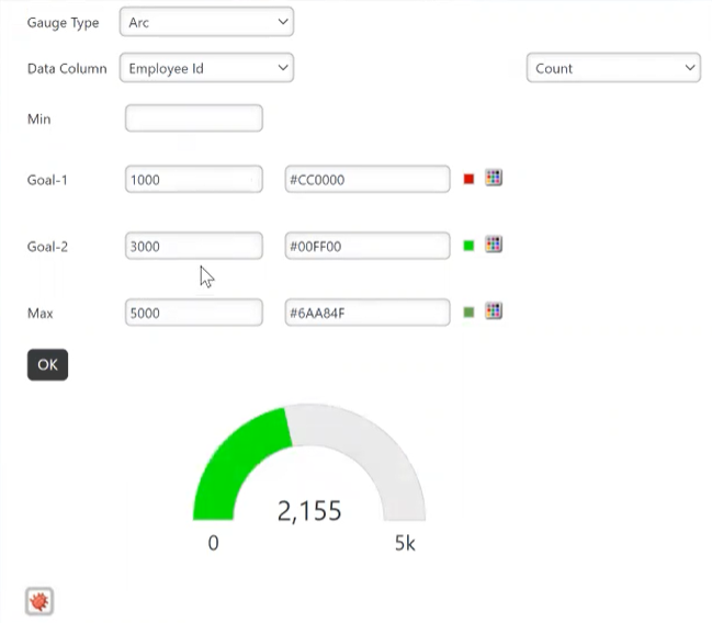
Now, you can use percentages in your Goals to compare to the Min/Max value, as shown below. By allowing you to specify a relative range, this enhancement provides an effortless, more flexible, way to change your target. For example, if you want your visualization to display 90% of your goal, you no longer have to manually calculate that percentage and convert it to a static number.
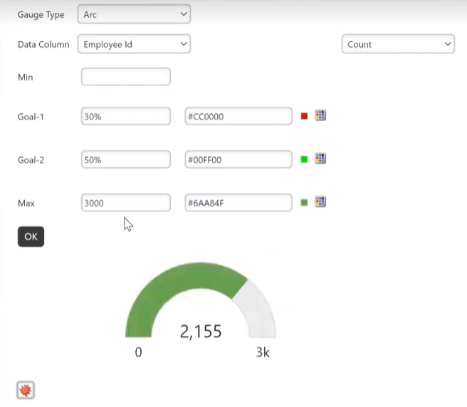
When using percentage values, the following rules apply:
If percentage-value is used, the value cannot exceed 100% (and/or less than 0%).
If the percentage-value and absolute-value are mixed in Goal-1/2, Max, or GuageRange-elements, the maximum value of all absolute-values is the maximum value. For example, if your settings are 10, 90%, 60, 70% and 80 respectively, the maximum value is 80, and the final range is ~ 10 ~ 56 (70%) ~ 60 ~ 72 (90%) ~ 80.
If ONLY percentage-value is used, the automatically-calculated-maximum-value will be taken as the maximum value. For example, if your settings are 10%, 90%, 60%, 70%, 80%, the automatically-calculated-maximum-value is 1000, and the final range is ~ 100 (10%) ~ 600 (60%) ~ 700 (70%) ~ 800 (80%) ~ 900 (90%).
![]()
The goal will be invalid if out of range.
If you do not set a Max value, Info automatically applies a Max value to your chart.
For more information, see InfoGo - Creating Charts and Gauges and Analysis Grid - Creating Charts and Gauges.
SSRM - Scheduler Last Day of the Month(s)
Scheduler now supports running tasks on the "Last day of the month(s)" when operating on a monthly cadence.
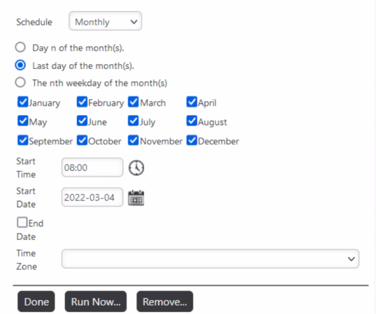
For more information about scheduling reports, see InfoGo - Reporting Scheduling Details.
SSRM - Specify Components for Scheduled Reports
A new configuration option is available in SSRM's Report Author that allows you to exclude objects from scheduled tasks. The "Include in Schedule" check box enables you to select the tables, charts, texts, or images that you want to include in the final scheduled output. This enhancement improves the overall usability of the Self-Service Module by minimizing the need to create duplicate or redundant reports to produce different output formats, resulting in better bookmark management and reduced Home page load time. The following Report Author elements are supported with this configuration: visual, text, image, link, spaces, PDF link and Excel link. Currently, all scheduling formats (PDF, Excel, and Web Mail) are supported.
To utilize this feature, access the Report Design mode and select the gear icon:
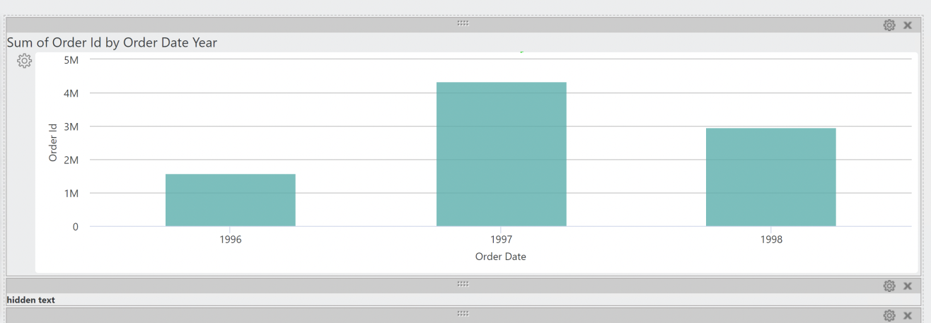
Then, un-check the Include in Schedule check box and select Set:
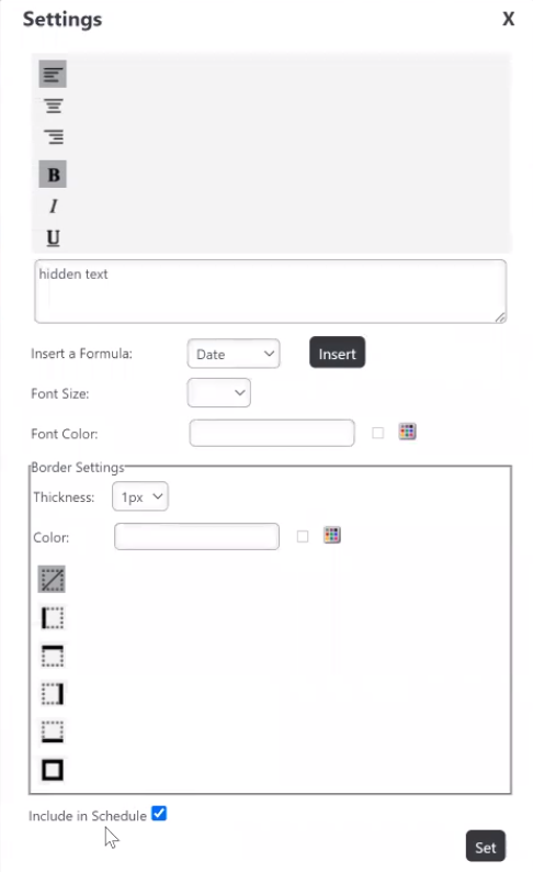
![]() By default, the check box is checked and all report components are included in the scheduled report.
By default, the check box is checked and all report components are included in the scheduled report.
Repeat this process for any additional components you wish to remove from the scheduled report.
For more information, see Report Author and Component Settings.
SSRM - Match Boolean Format with Conditional Colors
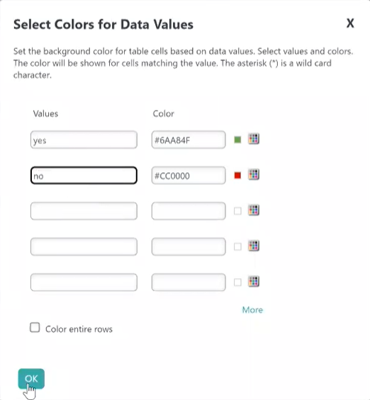
The filter logic for conditional colors was enhanced to consider the boolean format. Until now, you were only able to use "0/1" or "True/False" in the Values field, despite the format set by your admin. Now, you can customize the Values field to match the boolean format.
In the example below, the admin set the boolean type format to Yes/No, making it an applicable Value for conditional colors:
For more information, see InfoGo - Formatting Data or Analysis Grid - Formatting Data.
Configure Data Values in Tooltip
You now have the ability to configure the tooltip to display values for any available column in the datalayer. Before this, the tooltip would only display the X- and Y-axis values. To use this feature with DataLayer.ActiveSQL, please make sure the keep Grouped Rows attribute of the SqlGroup element is set to False.
To utilize this feature, add a Quicktip Row element below the Quicktip. Then, enter a token representing the data column in the Value attribute.
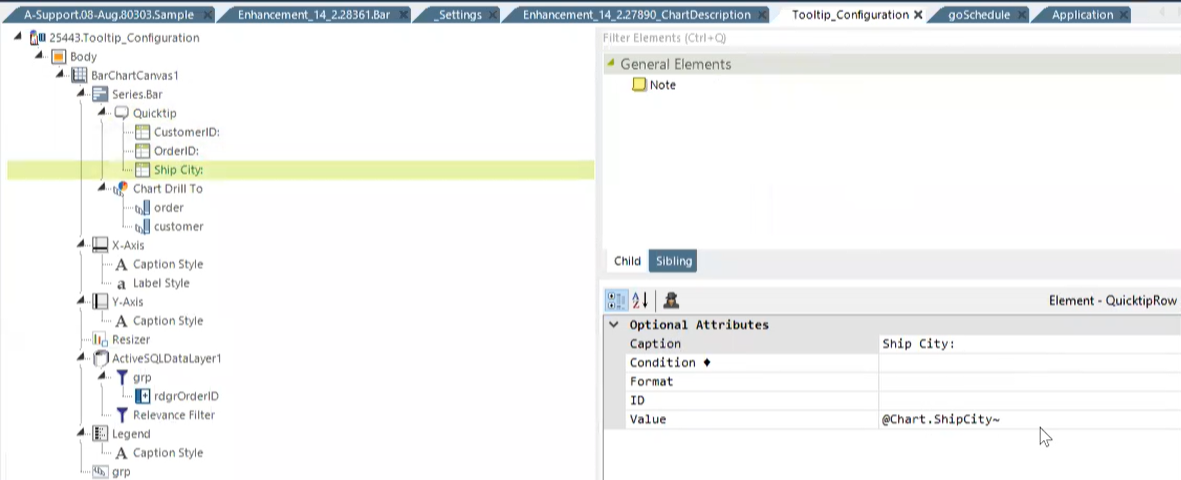
Below is an example of a bar chart before and after the data value for ShipCity was configured to display in the tooltip:
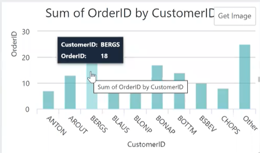
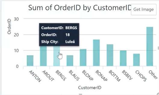
For more information, see Quicktip Element and any Series charts that use the Quicktip element.
Input Check Box List Item Count Search
You can now dynamically control the Input Check Box List search box visibility based on the current item count. Prior to this enhancement, the Input Check Box List search box could only be set to on or off. Now, the 'Enable Search' attribute is no longer static, allowing you to specify the threshold to turn the search box on or off. The default value of the attribute is True, a search box displays. If the value is a valid integer, the search box will be visible if the item count is equal to or greater than the value. Any invalid input will be treated as True, the search box displays.
To utilize this feature, enter a minimum item count as the value in the Enable Search attribute:

In the example above, the search box is visible when there are seven, or more, results.
For more information, see Input Check Box List.
SSRM/AG - Display Values for Additional Columns
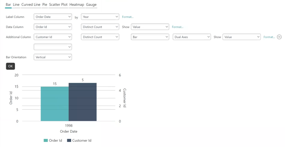
Charts that utilize an Additional Column can now display their value on the chart. Prior to this enhancement, you could only choose to display the Data Column's value on the chart. With this enhancement, any chart with both a Data Column and an Additional Column now have the same rendering style.
To utilize this feature, add an Additional Column in your chart. Then, select the Show drop-down and select Value:
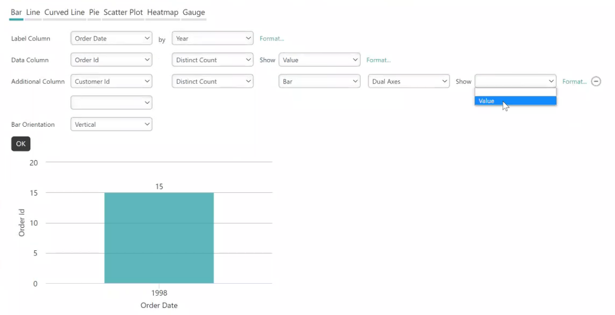
Once you select OK, Info refreshes your chart to display the column's value:
For more information, see Analysis Grid - Creating Charts and Gauges, InfoGo - Creating Charts and Gauges, and Adding a Second Series.
Enhanced Charting Capabilities
This release offers enhanced functionality of the latest charting library, new attributes, options, and modules to customize charts' behavior. These enhancements minimize the need to write custom code, reducing development effort and improving the maintainability of custom analytics applications.
Chart Drill To Breadcrumb Trail
The Chart Drill To element enhances charts by exposing the data "behind" the chart. Currently, both SSRM and Managed Dashboards support the Drill To function; however, the breadcrumb trail is only available in SSRM. This enhancement bridges the gap in functionality between the two by implementing the breadcrumb trail on charts created using Info. The ability to utilize the Drill To breadcrumb trail enables Studio users to select previously drilled levels, or clear the Drill To data altogether.
This feature is supported by the new Chart Canvas attribute, Show DrillTo Breadcrumb. The default value for this attribute is False, the breadcrumb trail does not display.
To enable the trail, set the Show DrillTo Breadcrumb attribute to True:
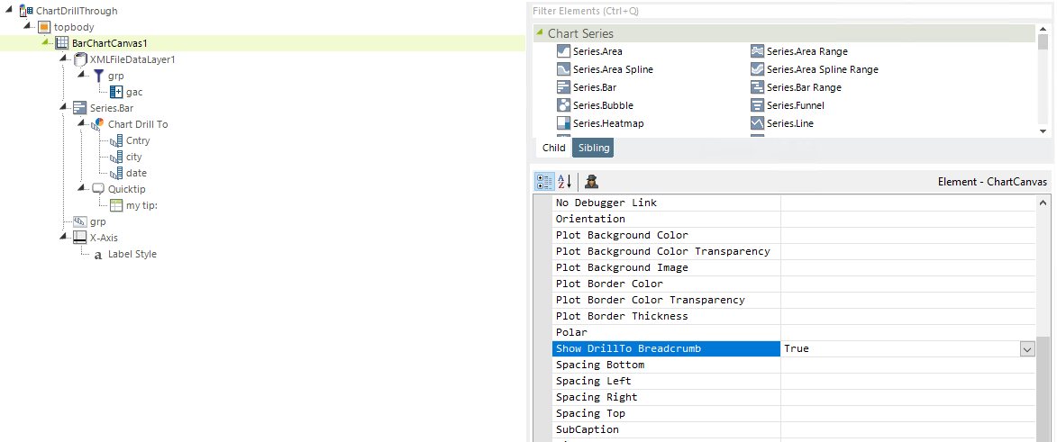
As a result, the chart now displays a breadcrumb trail, as shown below:
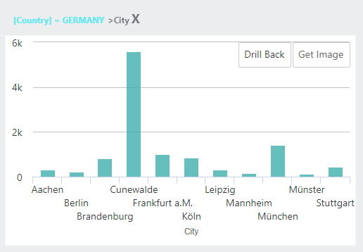
This feature is available for all Chart Canvas Charts that support the Drill To action.
For more information, see The Chart Canvas Element, Series.Bar - Using the Chart Drill To Element, Series.Heatmap - Using the Chart Drill to Element, and Series.Pie - Using the Chart Drill to Element.
Group/Chart Drillthrough Function
The Group Drillthrough function is now seamlessly integrated with the Drill To feature. The Chart Canvas element's Group Drillthrough child element adds grouped data point links which, when clicked, display a basic drill-through report showing the detail data used to create the group. In previous versions, no matter what Group Drillthrough you applied, it would only drillthrough one level. Now, after applying a Drill To filter, you can use Group Drillthrough to drill down to different layers for deeper insight.
For more information, see Group Drillthrough.
X-Axis and Legend Label Display
You now have the flexibility to show the series name as the Data Label, instead of the actual number. This enhancement allows you to specify not only the y-axis label as the show value inside the bar graph, but also the x-axis label or legend label.
To utilize this feature in SSRM/AG, select Name from the Data Column's Show drop-down menu:
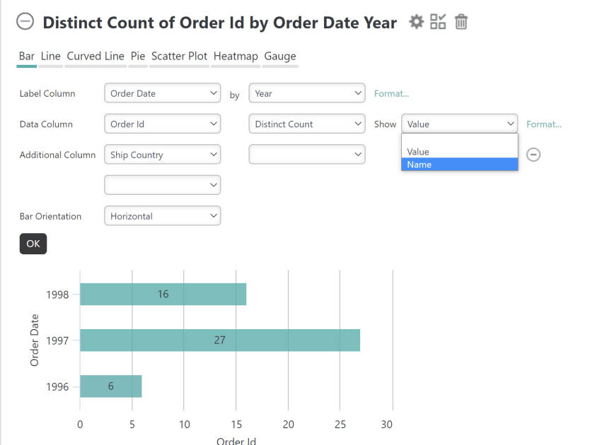
Once selected, the caption of the Data Label will match the legend/x-axis label.
In Managed Report (Studio), this feature is supported by the new DataLabels attribute, Series Name as Caption. The default value for this optional attribute is blank, the system behaves as it did before. When the value is set to True, the caption of the Data Label will be the same as the legend/x-axis label.
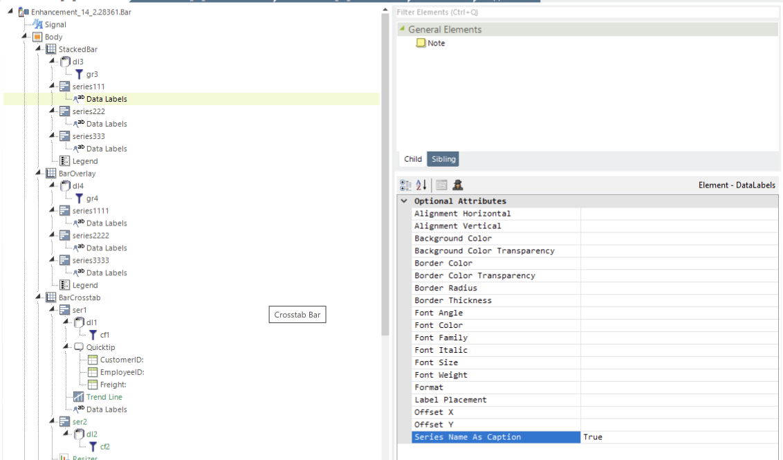
Below is an example of a chart before and after enabling the Series Name as Caption attribute:


![]() If the Legend Label is not set in the Series element, the chart displays the value of the Caption attribute in the X-axis element. If the X-axis element's Caption attribute value is empty, 'Series N' displays.
If the Legend Label is not set in the Series element, the chart displays the value of the Caption attribute in the X-axis element. If the X-axis element's Caption attribute value is empty, 'Series N' displays.
For more information, see Analysis Grid - Creating Charts and Gauges, InfoGo - Creating Charts and Gauges, Showing Totals for Stacked Series, and any Series chart that uses the Data Labels element.
Chart Description
Chart Canvas Charts now support chart descriptions. Prior to this enhancement, you had the ability to add a caption or subcaption to your chart. Now, you can include additional information below the chart's contents that support responsiveness and display when exporting charts.
To support this new feature, the Chart Canvas Chart element has a new optional attribute, Chart Description. The default value for this attribute is empty. Enter a description to enable this feature, like below:
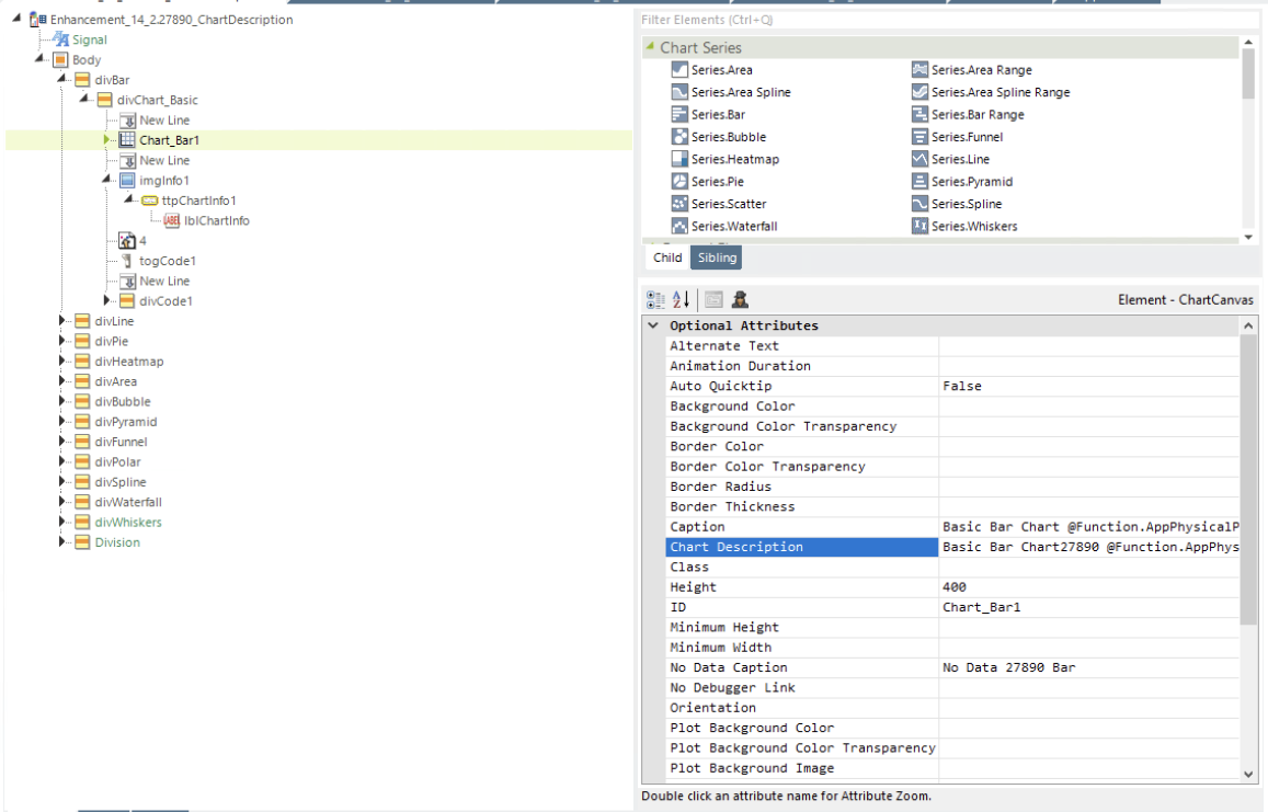
![]() This attribute is also available in the following classic chart elements: Gauge.Arc, Gauge.Number, Gauge.Angular, Gauge.BulletBar, and Gauge.BalloonBar.
This attribute is also available in the following classic chart elements: Gauge.Arc, Gauge.Number, Gauge.Angular, Gauge.BulletBar, and Gauge.BalloonBar.
A new child element, Description Style, specifies Chart Description font-related and positioning attributes, similar to the Caption Style child element.
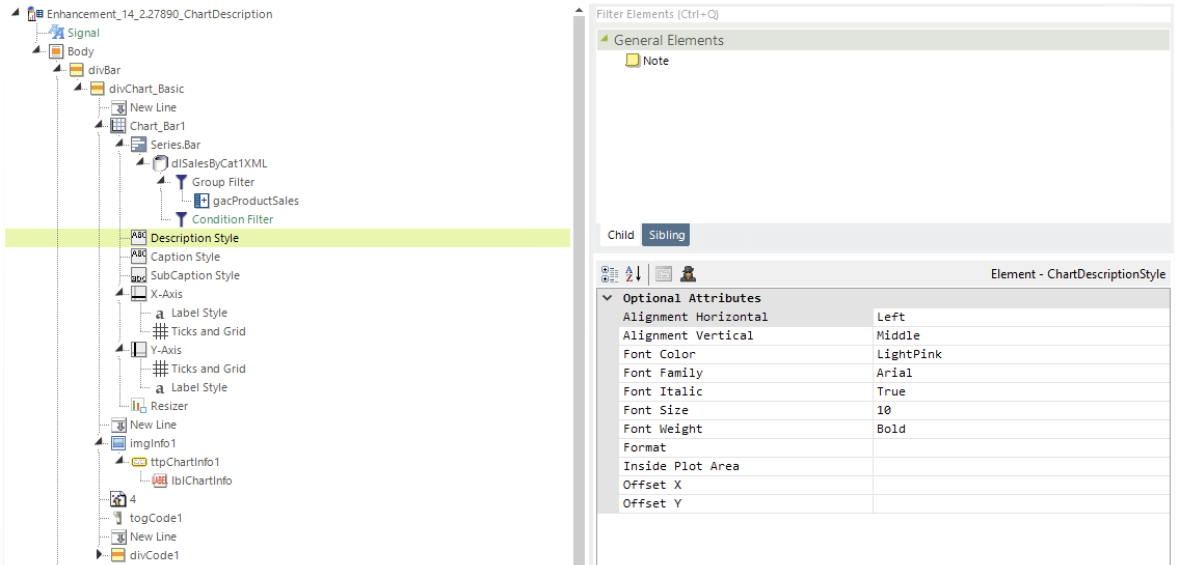
![]() This child element is also available for the following classic charts: Gauge.Arc, Gauge.Number, Gauge.Angular, Gauge.BulletBar, and Gauge.BalloonBar.
This child element is also available for the following classic charts: Gauge.Arc, Gauge.Number, Gauge.Angular, Gauge.BulletBar, and Gauge.BalloonBar.
Below is an example of a chart with the following description: Bar charts show data in X-and Y-axes. Typically, the X-axis represents categorized data, such as "apples", "oranges", etc. Sometimes dates are represented with bars, when they're grouped together into Years, Quarts, etc.
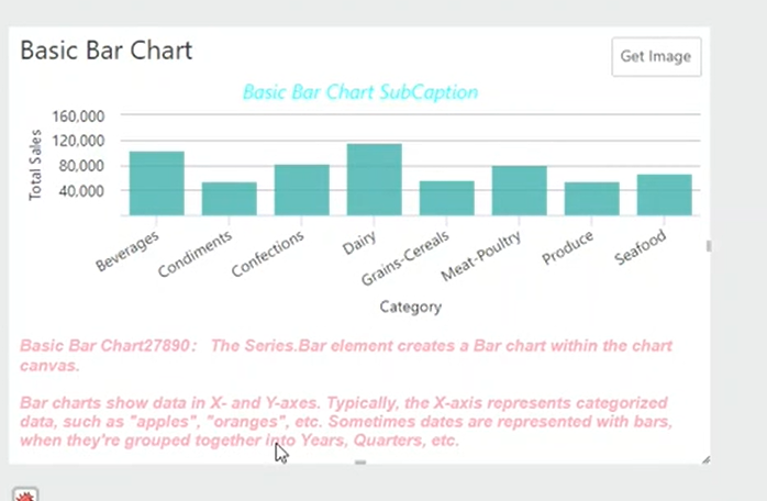
For more information, see The Chart Canvas Element, The Chart Canvas Child Elements, Chart Description Style, and Gallery of Classic Chart and Gauge Elements.
Tooltip Split
This release introduces a new capability that allows you to split a chart's tooltip into one label per series. Before this enhancement, hovering over a chart with multiple series only exposed the value for one segment. Once enabled, the tooltip now displays all the values for a series, without having to move your mouse over the chart. In support of this feature, the ChartCanvas element has a new attribute, Tooltip Split. The default value for this attribute is False.
Below is an example of what the tooltip looks like when it displays the value for one segment (Freight3):

To utilize this feature, set Tooltip Split to True:
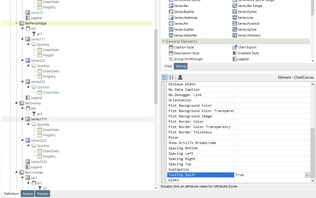
Now, the tooltip displays the value for the entire series (Freight, Freight2, and Freight3), shown below:

![]()
The following charts do not possess this capability: Gauge, Pie, Funnel, Pyramid, and Heatmap. Furthermore, when the Chart Orientation attribute is set to Swap Axes, and the Polar attribute is set to True, this feature will not work.
This method is recommended over shared tooltips for charts with multiple line series, and as such, takes precedence over tooltip.shared.
For more information, see The Chart Canvas Element, Adding Tooltips, and any Series charts that use the multiple series or aggregations.