Quicktip Element
The Quicktip element is almost as easy to use as the Tooltip attribute, but provides a tooltip with a little different look. It can used beneath static Chart, Gauge, Division, and Heatmap Group Column elements. The Quicktip element automatically provides tooltips for the charts found within the Analysis Chart and Analysis Grid super-elements, as well as all Chart Canvas charts.


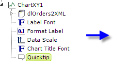
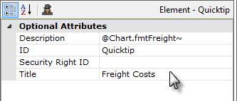
In the example above, we see the Quicktip element beneath a
Chart.XY element, and its attributes are also shown. The resulting
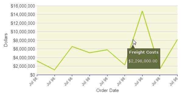
tooltip that appears when the mouse hovers over the chart line
looks like this:

Visually, this is more complex than basic tooltips. The pop-up panel has space for both a title and a description and includes a small, angular protrusion that points to the cursor, and its color and fonts can be controlled by assigning a theme, in this case Professional Green, to the application.
Tokens can be used in both the Title and Description attributes. The Quicktip element has a Security Right ID attribute, so its appearance can be dynamic, based on security roles. Because the Quicktip is displayed based on the onMouseOver DHTML event, you can't put anything inside the Quicktip itself that a user could click, such as a link.
If you're using Quicktips with a chart that includes Extra Grid Layers and the primary chart datalayer is reduced to zero rows at runtime, for example, because of filtering, then Info will not display the Quicktips, not even for the Extra Grid Layer plots.
![]() Quicktips should not be used inside Data Tables.
Quicktips should not be used inside Data Tables.
![]() The Quicktip is limited to text only and, as the text gets
longer, the panel will get wider and wider until, at some point, the text
will automatically wrap to another line. But you can't force it to
wrap and the point at which it will wrap is based on font family and size
(in the example shown above, it will wrap at 90 characters, so it can get
pretty wide before it wraps).
The Quicktip is limited to text only and, as the text gets
longer, the panel will get wider and wider until, at some point, the text
will automatically wrap to another line. But you can't force it to
wrap and the point at which it will wrap is based on font family and size
(in the example shown above, it will wrap at 90 characters, so it can get
pretty wide before it wraps).
However, you can deliberately add additional lines by adding child Quicktip Row elements beneath the Quicktip, one for each additional line of text you want to include.
 New for 14.2 You can also configure the tooltip to display values for any available column in the datalayer. To do so, enter a token representing the data column in the Value attribute of the Quicktip Row element.
![]() To use this feature with DataLayer.ActiveSQL, please make sure the keep Grouped Rows attribute of the SqlGroup element is set to False.
To use this feature with DataLayer.ActiveSQL, please make sure the keep Grouped Rows attribute of the SqlGroup element is set to False.
The Quicktip Row element has been made context-sensitive with the addition of a Condition attribute.