Logi Info v14.1 Enhancements
This topic introduces the significant features of Logi Info in this release:
- Bookmark Confirmation
- SSRM - Batch Duplicate Bookmarks
- DataLayer.REST Support Pagination
- REST Call Response
- Datalayer Error Tokens
- Data Table Enhancements
- Enhanced Charting Capabilities
- SSRM - Characters in Email Addresses
- SSRM/AG - Edit Labels and Captions in Charts
- SSRM - Crosstab Grouping
- AG - Cell Colors for Group Aggregate Values
- Chart Canvas Series.Pie Custom Data Values
- HTML Attribute Params
- Performance Improvements
- SSRM - Sharing Permissions
- What's Fixed?
Bookmark Confirmation
As a report consumer, you are now notified that a bookmark you are removing has an existing schedule. Upon selecting the trash can icon, Info generates a confirmation dialog box that lists the time and date the bookmark is set to run and asks if you still want to delete the bookmark:
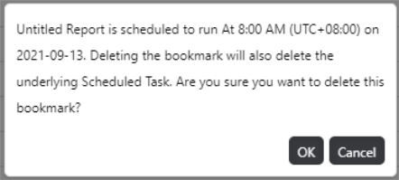
To proceed, select OK. Otherwise, select Cancel.
For more information, see InfoGo- Schedule Report Delivery.
To change the confirmation message that displays when you delete a bookmark, see the Delete Bookmarks section in Creating a Bookmark Manager.
SSRM - Batch Duplicate Bookmarks
If your application has been configured for it, you can now batch duplicate SSRM bookmarks in their original folder. Prior to this enhancement, bookmarks could only be duplicated individually. Now, you have the ability to select multiple bookmarks, or select all bookmarks in a folder to produce batch copies. To enable this feature, set goAllowBatchBookmarkDuplication to "True". By default this constant is "False" and your screen will look like the following:

![]() You are still able to duplicate individual bookmarks and batch delete bookmarks when goAllowBatchBookmarkDuplication is set to "False". For more information about configuring InfoGo, see Configuring InfoGo Constants.
You are still able to duplicate individual bookmarks and batch delete bookmarks when goAllowBatchBookmarkDuplication is set to "False". For more information about configuring InfoGo, see Configuring InfoGo Constants.
Once this feature has been enabled, choose which bookmarks to copy by selecting the corresponding check box, or select all bookmarks in a folder by checking the check box at the top of the list:

Then, select the duplicate icon:

![]() Batch duplicating shared bookmarks stores them in the "My Items" folder.
Batch duplicating shared bookmarks stores them in the "My Items" folder.
For more information, see Duplicating Bookmarks.
DataLayer.REST Support Pagination
Info now supports pagination from a restful data source, allowing you to handle large amounts of data results with ease. Typically, when you send the first query to the data vendor they return the first page of data with a link to the next page, rather that providing the whole data set. With this enhancement, DataLayer.REST automatically detects the link without any additional configuration, as long as that data source has that pagination mechanism and follows the standard RFC5988. We assemble all of the pages into a single data set and the engine consumes that data set to generate results.
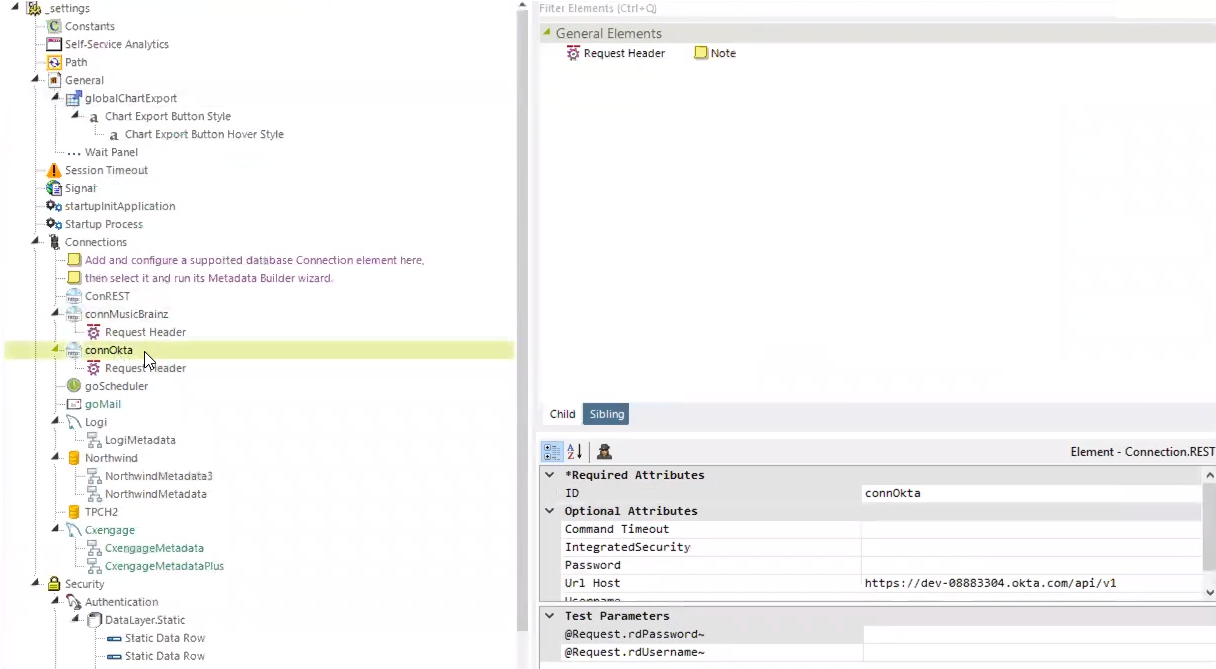
Specify the page size by setting the limit in the URL Path in the datalayer, or, defer to the default page size (200):
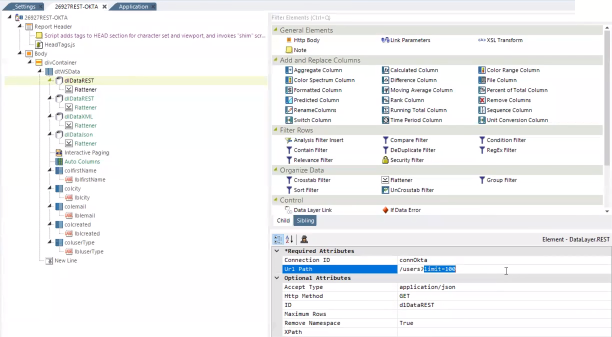
Limit the number of data rows received by entering a number in the 'Maximum Rows' field.
This feature is also compatible with DataLayer.JSON, without any interaction with the data source. Your results only return the number of records defined by the limit set in the JSON file/URL, and they do not include a link to additional pages.
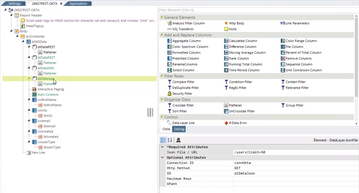
For more information, see DataLayer.REST - Working with DataLayer.REST and DataLayer.JSON - Working with DataLayer.JSON.
REST Call Response
Report developers now have the ability to expose detailed error information from the response content of the REST call. Prior to this enhancement, an error code and general error message was the only information that displayed with the REST call.
Add the token @Procedure.idof Restprocess.rdhttpResponseBodyContent~ to the BodyContent field in your session parameters:
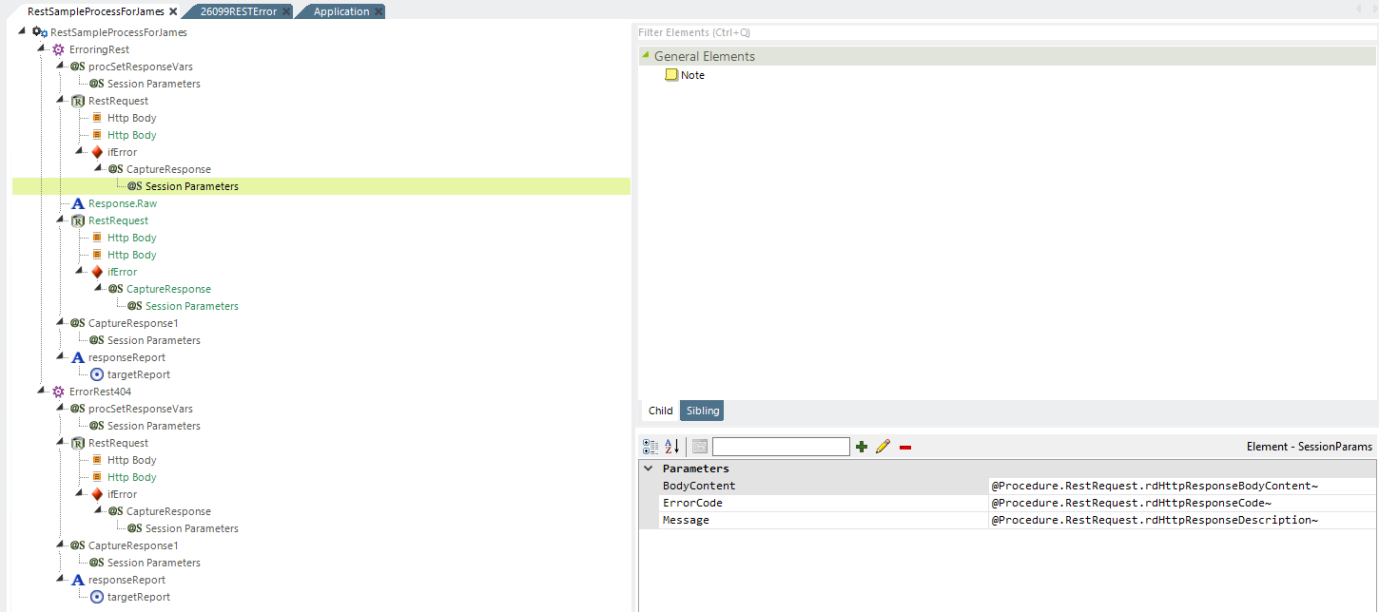
Upon saving and running the procedure, the full details of the error message display:


For more information, see Error Handling in Tasks.
DataLayer Error Tokens
Developers can now retrieve Data Table and chart error messages using the 'If Data Error' element and capture all of the error information in the new token element, @DataLayerError.
Prior to this enhancement, if your data source had difficulty connecting to the internet or, if you entered a URL or token wrong, you would see a standard Logi error page, like below:

To utilize this feature, add the 'If Data Error' element to your datalayer and configure the @DataLayerError token using your datalayer ID:
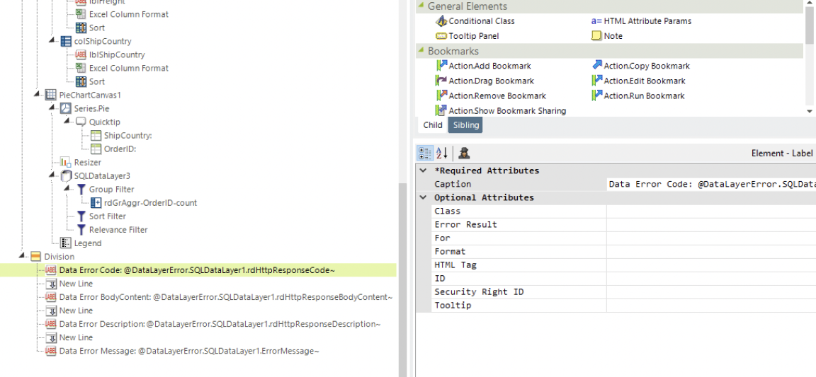
Depending on the information you want to display on the page, you can choose from the following tokens:
ErrorMessage~
Restful data source only: rdHttpResponseBodyContent~
Restful data source only: rdHttpResponseBodyCode~
Restful data source only: rdHttpResponseDescription~
As a result, your error page will resemble the following:

![]() Use divisions to customize the error message to include images, buttons, and links.
Use divisions to customize the error message to include images, buttons, and links.
For more information, see Datalayer Error Handling.
Data Table Enhancements
No Data Caption
Data Table introduces a new attribute, 'No Data Caption', and sub-element, 'No Data Caption Style', that assign a specific text and style to indicate that there is no data available for a given Data Table. This feature mirrors the existing functionality for Chart Canvas Charts that return no data from the datalayer, streamlining the process across standard Data Tables, standard Crosstab Tables, and Analysis Grid Tables.
The Data Table/Crosstab Table attribute 'No Data Caption' specifies which no data message displays:
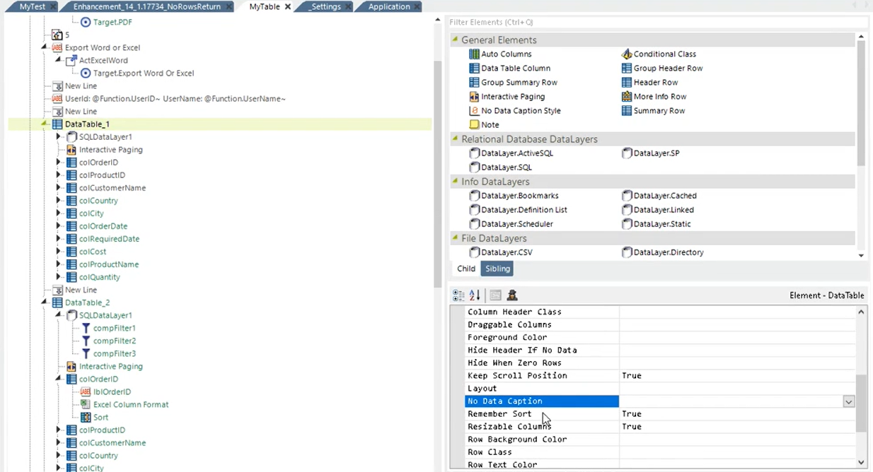
To specify the caption for all Data Tables on an application level, set the InfoGo constant 'rdNoDataCaption'. The default value for this constant is 'None', no message displays. Enter a custom message as the value for this constant, or, enter 'Default' and users will receive the message "No data to display". For more information, see Configuring InfoGo Constants.
The Data Table/Crosstab Table element 'No Data Caption Style' specifies which style is applied to the no data message:
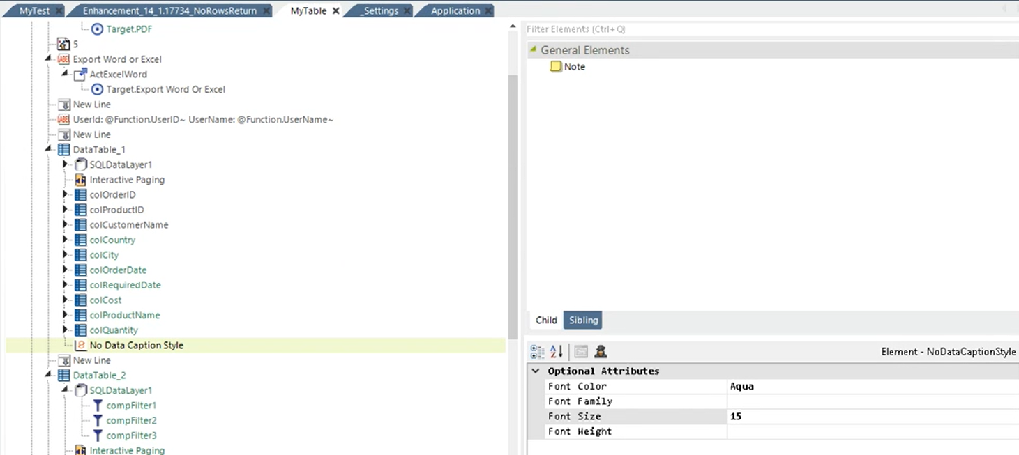
The default style can be defined in the class 'ThemeDataTableNoData'.
![]()
If you do not set the attribute 'No Data Caption', the default message "No data to display" displays.
If you do not add the element 'No Data Caption Style' to specify the style of the message, the default style applied to the message displays, like below:

Control whether your message includes table headers (like the image above) when there is no data to display by setting the new attribute 'Hide Header If No Data' to "True":
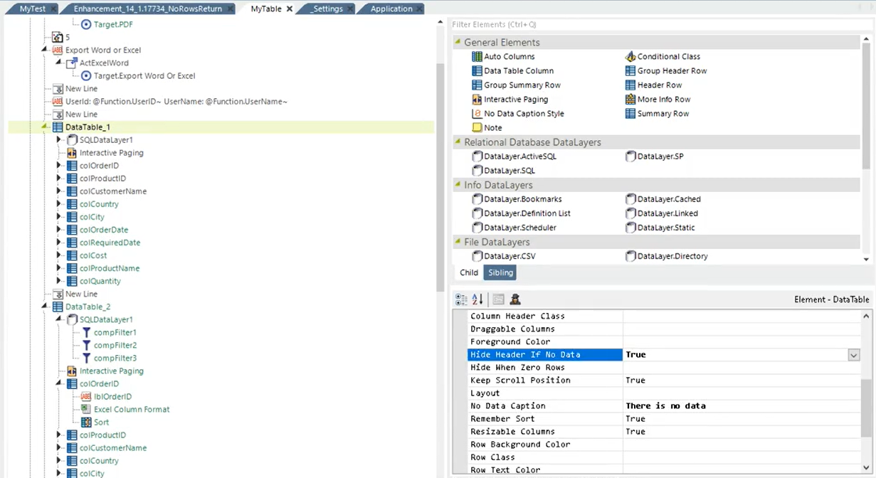
As a result, your message will look like this:

To control the header display for all Data Tables on an application level, set the InfoGo constant 'rdHideDatatableHeaderIfNoData' to "True". By default, this constant is "False". For more information, see Configuring InfoGo Constants.
![]()
For managed Data Tables/Crosstabs, the 'Hide Header If No Data' attribute overrides the 'rdHideDatatableHeaderIfNoData' constant, while AG/SSRM Data Tables/Crosstabs take the constant value.
By default, the values for both the attribute and the constant is "False" and "Default", respectively.
Data Table Scrolling Option
A new value, Scrollbar, was added to the Caption Type attribute, enabling users to scroll through their Data Table results. The Page Row Count attribute is then used to determine the Data Table height in Scrollbar mode. Once this is set by the developer, it will automatically be configured to lock the column headers when scrolling in a Data Table.
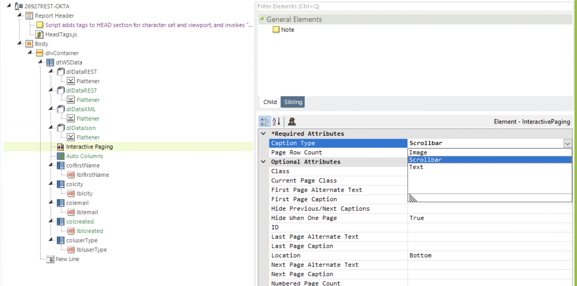
For more information about configuring this attribute, see Interactive Paging Element Attributes.
Once enabled, your Data Table functions like the following:
![]()
You have the option to choose Interactive Paging OR Scrollbar when setting your Caption Type. You cannot use both features on one Data Table, simultaneously.
Exporting reports that utilize the Scrollbar capability still display all data in one table, similar to exporting reports that use Interactive Paging.
For more ways to use Interactive Paging, see Pagination Usage Examples.
Enhanced Charting Capabilities
Gradient Fill Support (CSS)
This release, we offer the ability to customize your Chart Canvas to add gradient fills using the new Gradient Style element and @Gradient token. Prior to this enhancement, you could only choose a color to present your charts. Now, you have the ability to incorporate gradients, shadows, and pattern fills in your visualization.
To utilize this feature add the Gradient Style element to your chart:

Choose between a Linear Gradient or Radial Gradient. Some gradients may work better than others, depending on the chart type. For example, a Radial Gradient works best for Pie charts.
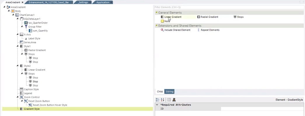
Next, enter values between 0-1 (1=100, .5=50%) for the required attributes. The attributes are dependent on the type of gradient you choose and act as intercepts to calculate the distance between the coordinates in your chart. Linear Gradient's required attributes are x1, x2, y1, y2. Note that the 'x1' and 'y1' attributes are both reflective of the starting point, while 'x2' and 'y2' are both reflective of the gradient's end point.

Radial Gradient's required attributes are cx, cy, and r. Note that when the 'r' attribute is set to 1, the gradient covers the entire circle.

Once you've entered the required attributes, add the @Chart token to the chart's Color attribute and choose the Style you want to reference:

Lastly, specify how many stops you want to appear on the chart and use the Stop Flag attribute to set the gradient fill number from 0-1 (1=100, .5=50%) to separate the stops.

For example, if you want your chart to display a Linear Gradient style and you add three stops, you must then add three colors to represent those stops. In the example below, the Linear Gradient's stops are denoted in green, yellow, and red.

![]() The chart's legend is indicative of the style, color, and fill of the gradient.
The chart's legend is indicative of the style, color, and fill of the gradient.
You can add as many styles as you want under the Chart Canvas. Using these styles, you can add the gradient fill and color to Legend, Zoom Control, and other elements in your Chart Canvas.
For more information, see New for 14.1Gradient Style.
Tick Count
As a report developer, you can now specify how many ticks are rendered on your chart axes. The new Chart Canvas axis attribute, Tick Count, allows you to not only customize the look and feel of your chart, but make the axes align properly. By default, the value for this attribute is "undefined".
To utilize this feature, enter a numeric value in the Tick Count attribute:
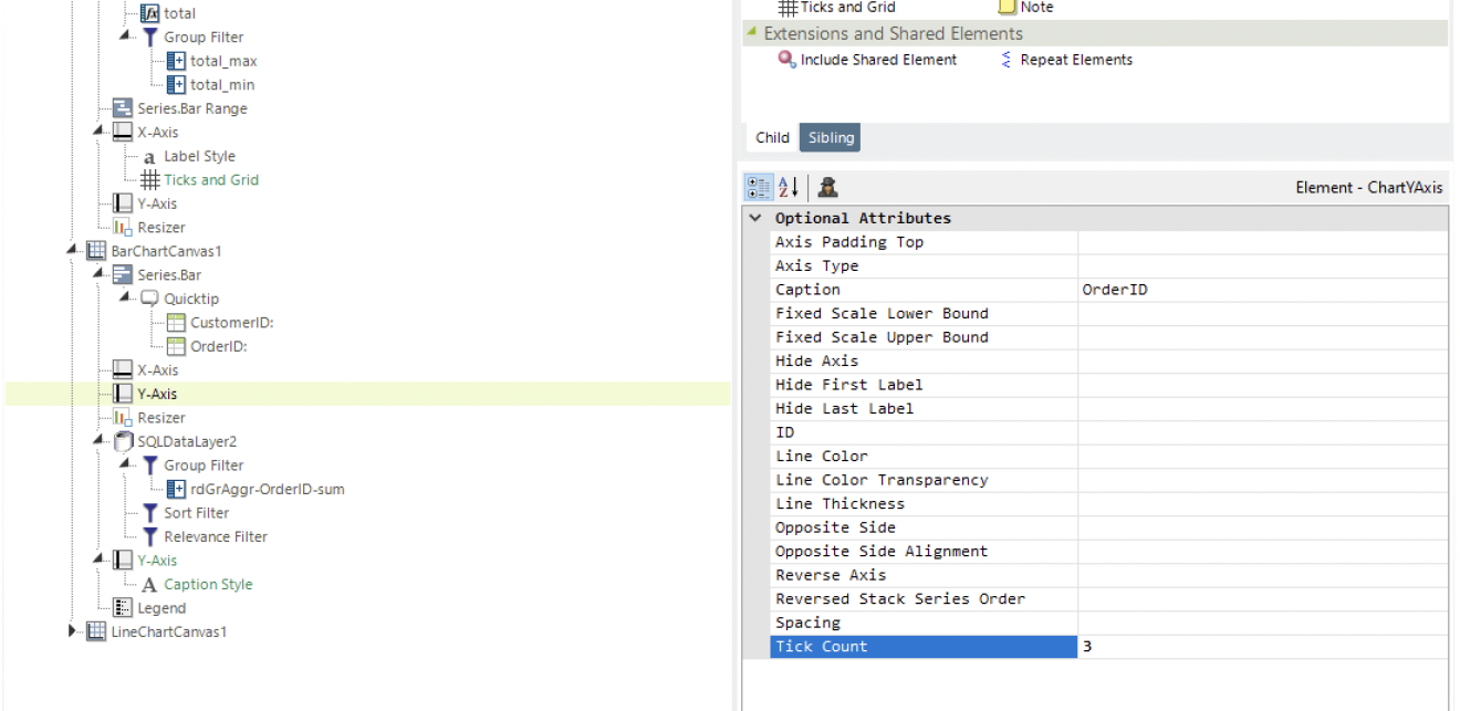
For more information about configuring your chart axes, see Axis Element Attributes.
Below is an example of a Linear Chart before and after we changed the Tick Count to 3:
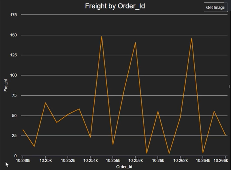
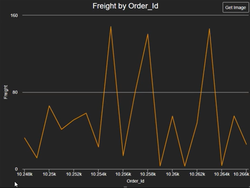
![]()
Tick Count overrides the tickPixelInterval attribute.
Tick Count must be greater than 2.
Tick Count can only be used with Linear axes. DateTime, Logarithmic, and Category axes are not affected.
For more information, see Configuring Major Ticks and Grid Lines.
Tick Auto Rotation
As a report developer, you can now enable auto rotation to prevent overlapping labels on your horizontal axis. The new Chart Canvas axis attribute, Auto Rotation Degrees, automatically adjusts the chart's horizontal axis when the data points become crowded. By default, the value for this attribute is "undefined" and labels will word-wrap, when possible. When undefined, the top and bottom axes default to a -45 degree rotation. To utilize this feature, enter a numeric value between 0-90 in the Auto Rotation Degrees attribute. For more information about configuring your chart axes, see Axis Element Attributes.
As you can see, when there is enough space on the axis, the labels do not rotate. As the chart gets narrower, it begins rotating the labels -45 degrees, then removes every second label, and tries again with rotations 0 and -45.
For more information, see Styling the Axis Labels.
SSRM - Characters in Email Addresses
Scheduler now supports email addresses following RFC 5322 when scheduling an email in SSRM. Below is a full list of the characters accepted in the local part of the email address in scheduler:
!
#
$
%
&
'
+
-
^
`
~
For more information, see InfoGo - Reporting Scheduling Details.
SSRM/AG - Edit Labels and Captions in Charts
You can now customize the label format and edit captions for the X and Y axis associated with your Analysis Grid or SSRM charts. Prior to this enhancement, the Analysis Grid Canvas Chart set the format for the labels in the axis automatically. Now, every SSRM chart has the ability to format captions and labels for your Label Column, Data Column, and Additional Column(s) in some capacity.
To access this feature, select Format... in your chart:
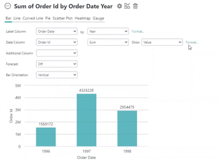
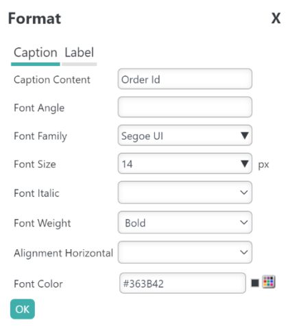
A Format dialog window appears.
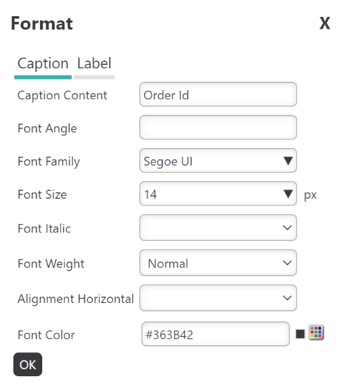
For this example, we're going to change the 'Order Id' caption's size, weight, and color using the drop-down menus.
To save your configurations, select OK:
You chart automatically reflects the changes, shown below:
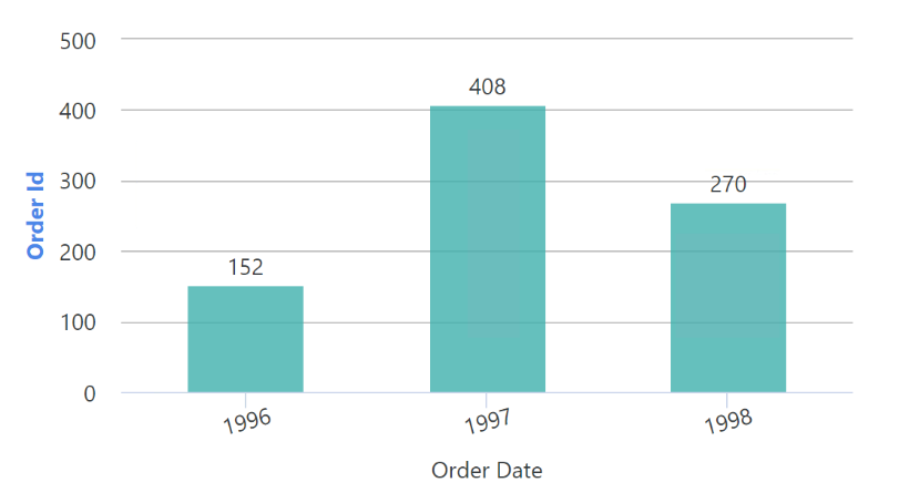
Since we edited the 'caption', our changes only applied to the words 'Order Id' (in this example). To change the format of the values represented in the Y axis (5M, 4M, 3M in this example), select the Format... link next to the Data Column and select the Label tab to edit the label.
![]() Changing the chart type resets all formatting; however, changing the value in the Label, Data, or Additional Column does not reset formatting.
Changing the chart type resets all formatting; however, changing the value in the Label, Data, or Additional Column does not reset formatting.
For more information, see New for 14.1 Analysis Grid - Editing Chart Labels and Captions and New for 14.1 InfoGo - Editing Chart Labels and Captions.
SSRM - Crosstab Grouping
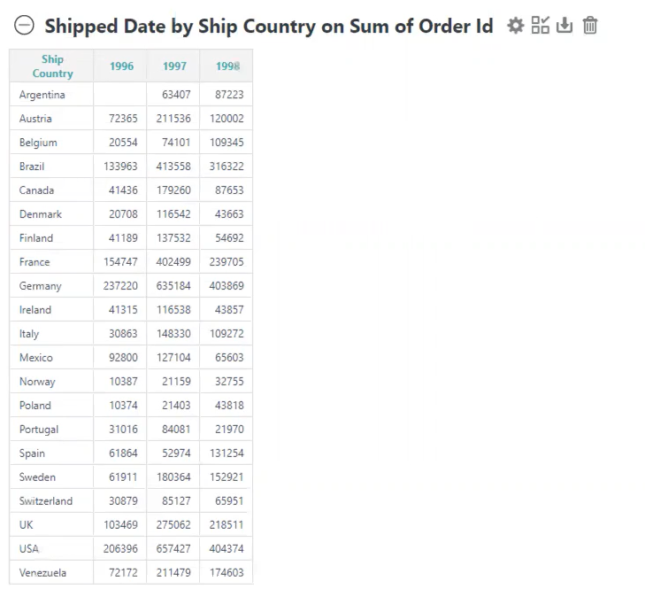
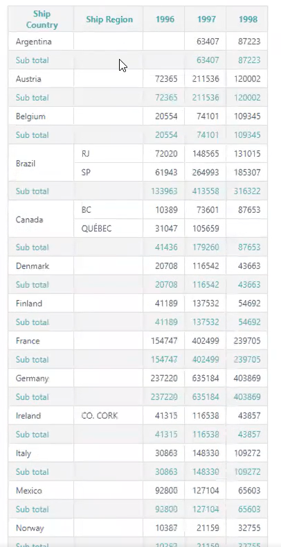
SSRM now supports multiple grouping on Crosstabs via the Secondary Label Column. Prior to this enhancement, you had to use a table with repeat elements to simulate a similar functionality. Now, you can group Value Columns and Label Columns by adding the new Secondary Label Column to your Crosstab Table. The Secondary Crosstab Label Column element is a new attribute that acts like the Extra Crosstab Label Column, but it allows the columns to be grouped. This feature can be utilized in an Analysis, Report, Dashboard, and Crosstab Wizard.
Below is a before and after example of the Crosstab grouping feature:
This feature also works together with the existing filter. Below is a before and after example:
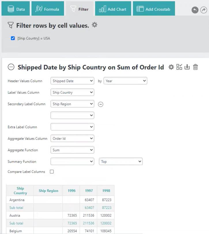
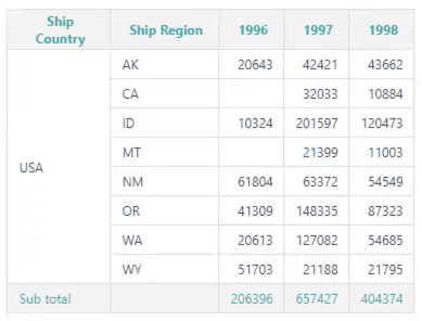
You can add as many Secondary Label Columns as you desire.
For more information, see InfoGo - Pivoting and Summarizing Data.
AG - Cell Colors for Group Aggregate Values
The Analysis Grid expanded current functionality to include the ability to format cell colors at the group level. Previously, you could only specify the cell color at the record level. To accommodate this enhancement, we added a tab called 'Group Level' where you can format conditional colors for groups. This feature is particularly useful if you want to customize the color for calculating grand total and sub total rows.
To utilize this new feature, select the column you want to apply the conditional formatting to:
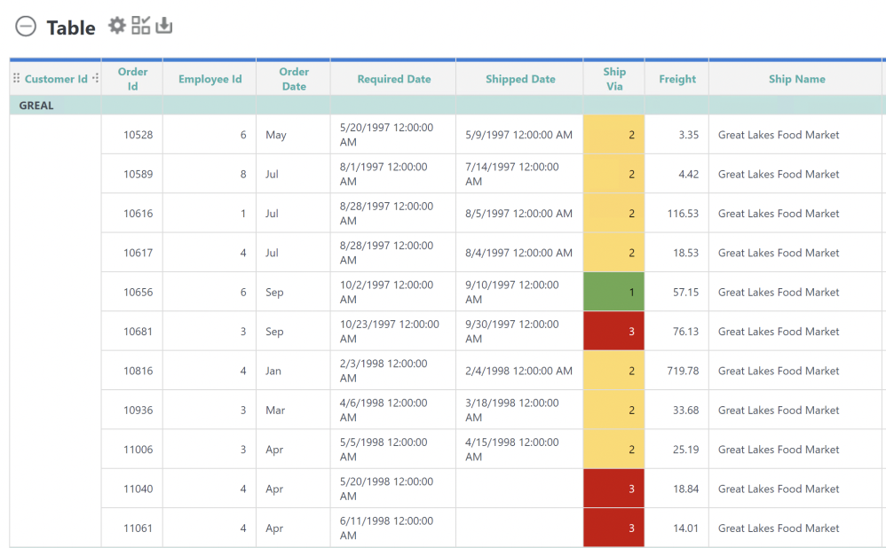
Then, select Format from the drop-down list and then select Cell Colors:
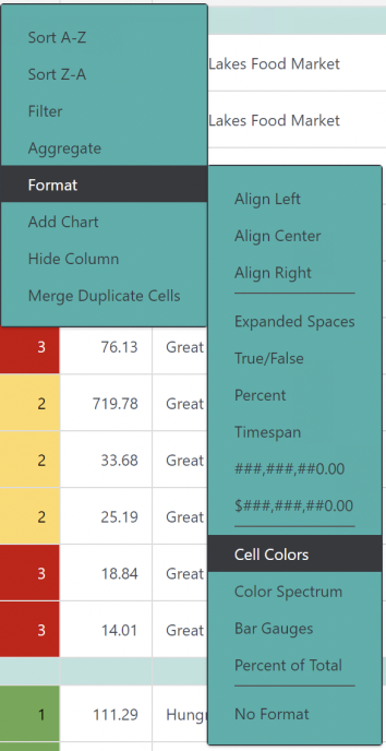
Info displays a 'Select Colors for Data Values' dialog box.
Select the Group Level tab:
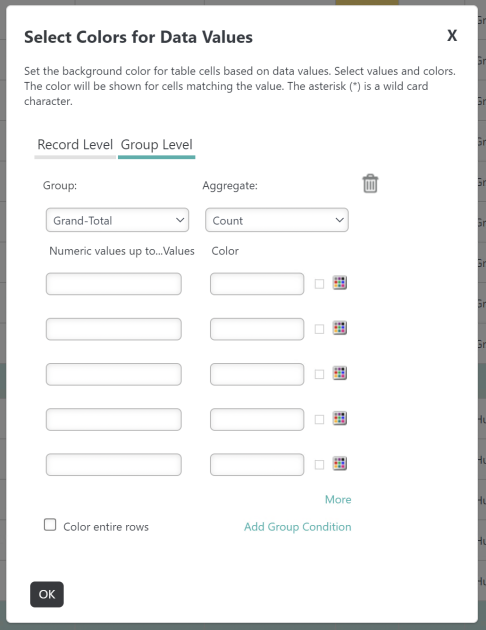
Previously established grouping is available in the Group drop-down menu. Choose your Group and Aggregate using the drop-down menus.
Enter a numeric value in the field on the left and assign a color to the Count by entering a Hex code or using the Color Picker:
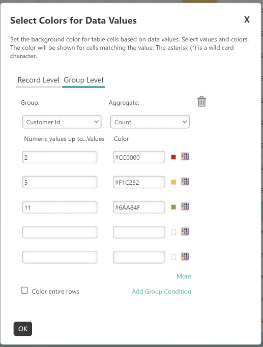
Select OK to apply your changes.
Your Analysis Grid reflects the conditional colors applied to the cells, like below:
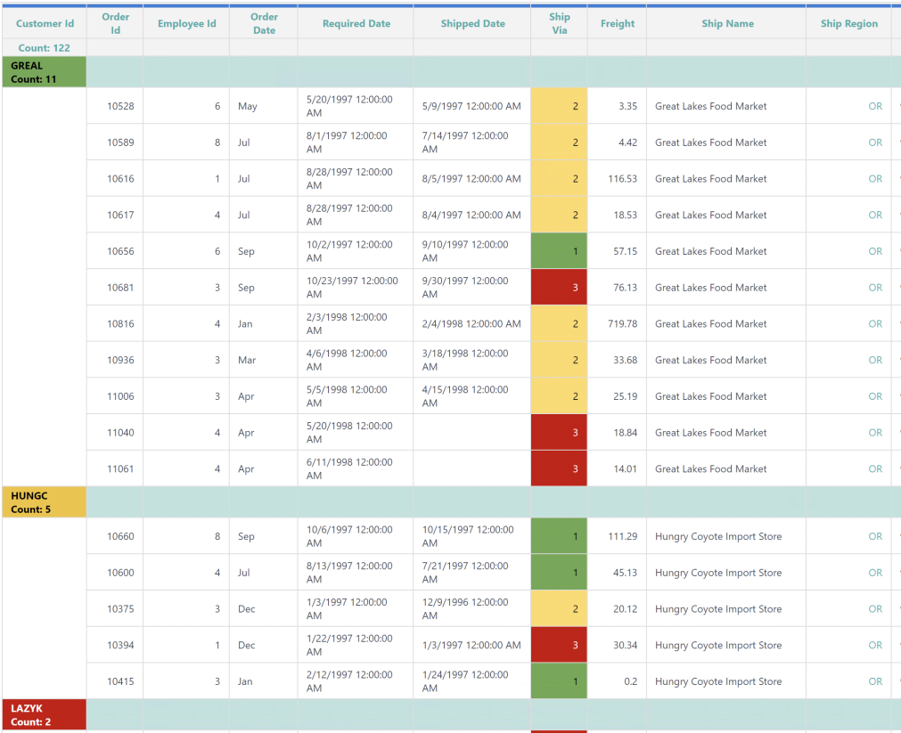
![]() To utilize this feature you must have an aggregation defined at the group level.
To utilize this feature you must have an aggregation defined at the group level.
For more information, see Analysis Grid - Formatting Data.
Chart Canvas Series.Pie Custom Data Values
Chart Canvas Series.Pie now includes two additional attributes, Show Second Data Value and Show Second Data Values Format, to customize your Series.Pie chart appearance. Prior to this enhancement, you only had the option to display one data label at a time.
To utilize this feature, set the 'Show Second Data Values' attribute to "True" and select a format from the 'show Second Data Values Format' attribute drop-down menu, like below:
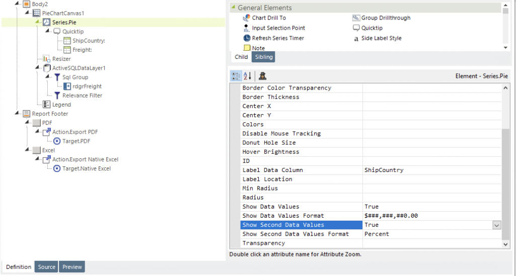
As a result, your Pie chart will look like this:
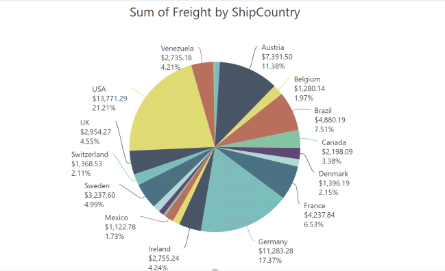
For more information, see Series.Pie - Adding Data Labels.
HTML Attributes Params
As a report developer, you can now add "HTML Attribute Params" to Crosstab, Data Table, Data Table Columns, and User Input elements. Last release we added this capability to the Division, Label, and Image elements. This enhancement expands functionality to include almost all general elements, allowing complete customization of parameters and attribute values. HTML Attribute Params act as a bridge to carry over information, such as user name or price, to your application to work with other frameworks or libraries easier.
Depending on the element you add the HTML Attribute Params to, there are additional parameters for you to specify:
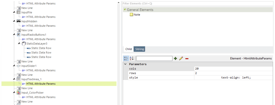
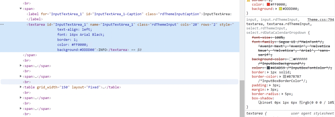
After applying the HTML Attribute Params, the source code looks like the following:
![]()
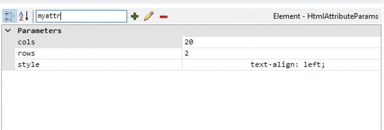
Define your own parameter by adding it to the field and selecting the plus icon:
If an attribute was set in both Element and HTML Attribute Params, the one set in the HTML Attribute Params will be ignored.
You cannot add HTML Attribute Params to Data Table cell-level elements because the cell is data driven.
For more information, see Creating a Data Table Manually, Creating Crosstab Tables Manually, Using Responsive Rows and Columns, and User Input Elements.
Performance Improvements
Bookmark Loading Performance
We updated the work flow to only retrieve the required columns, reducing bookmark load time when opening the Home page (MySQL only).
Global Filter Loading Performance
Load time improved when applying a Global Filter to a Dashboard with numerous panels, cutting the load time in half in certain scenarios.
Dashboard Loading Performance
Info prepares numerous metrics to support individual filters on Dashboard panels. Even if you are not currently using filters, Info still collects filter information to generate the user interface, which can lengthen Dashboard loading times. InfoGo's new constant, goDashboardFiltersOnDemand, can be set so that filter queries only happen when you select a filter, as opposed to every time you open your Dashboard. To reduce load time, set the constant to "True". By default, this constant is "False".
![]() Using the goDashboardFiltersOnDemand constant in conjunction with the following constants provides a major difference in Dashboard load time:
Using the goDashboardFiltersOnDemand constant in conjunction with the following constants provides a major difference in Dashboard load time:
goDashboardFilters
goDashboardFiltersFromCharts
goDashboardPanelEditing
For more information, see Configuring InfoGo Constants.
Metadata Caching Mechanism
This enhancement introduces a new metadata caching mechanism so that visualizations using the same metadata can be verified by a single shared and cached metadata, no matter how many visualizations you have in the Dashboard. InfoGo's new constant, rdDisableUrlMetadataCache, acts as a switch by providing a set of controls for the cache life cycle to reduce the memory footprint risk. The cache will close if the constant value is "True". Unless specified, the cache is open.
![]() Only URL metadata can be cached.
Only URL metadata can be cached.
What's Fixed?
For information on bug fixes, please see this page.