Component Settings
When other components are dropped on the canvas, their Settings panel is displayed. You can also edit the settings by clicking the component's "gear" icon.
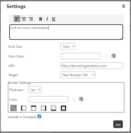
As you'd expect, the settings will be different for different components. The settings for the Link component are shown below:

 New for 14.2 Un-check the "Include in Schedule" check box to remove an object from the final scheduled output.
The Text component has a similar Settings panel. However, for quick, text-only changes, users can edit the text "in place". They just hover their mouse over the right end of the component, as shown above, to see its special "pencil" icon, then click it to edit the text.

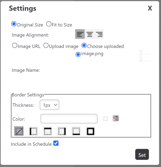
The Image component Settings panel, shown below, lets users include images using a URL or by uploading them. They can also select them from a list of uploaded images stored in a designated folder.

The PDF Link component's Settings panel (not shown) includes a Java AutoFit control. Set it to False when exporting to PDF in Java applications in order to turn off AutoFit and center align text.
 New for 14.2 Un-check the "Include in Schedule" check box to remove an object from the final scheduled output.