InfoGo - Creating Charts and Gauges
This topic introduces how to create charts and gauges in InfoGo.
The following sections are covered in this topic:
Creating Charts
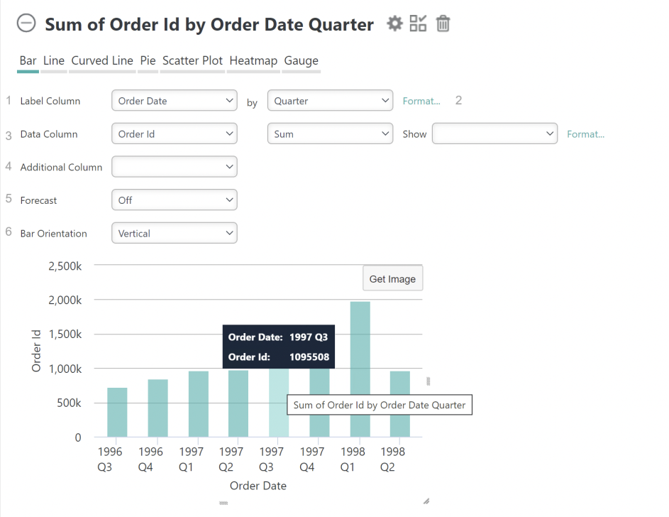
Click the Add Chart tab to use the feature that lets you create charts and gauges. A separate Chart panel with its own configuration area will be displayed:

Here's how to use this feature:
- Assuming a Bar chart was selected, select the Label Column. This provides data for the X-axis of the chart. If the column selected is a date-type column, an interval control (Year, Quarter, Month, Day, Hour, Minute) will be displayed. For text type columns, you can select the Label data sort order, A-Z or Z-A, in a sort control.
 New for 14.1 The Format... option, shown next to the Label Column and Data Column, allows you to format captions and labels for your charts. If you add an Additional Column(s), this option will also be available.
- Select the Data Column (Y-axis data, the "height" of each bar). You'll see that the options are grouped and color-coded to make it easier for you to identify them. If you created any Formula columns, they appear in this column, too. You can also choose to show the actual data values on the chart.
- The Additional Column specifies a second data series that
will be
charted along with the Data Column values for comparison. Depending on
the chart type, other controls will appear for use configuring a second
series, including aggregation options and charting types.
 New for 14.2 You can also choose to show the actual data value on the chart.
 - Data Forecasting is available for Bar, Line, Curved Line, and Scatter Plot charts that use Date/Time columns. See the section below for more information.
- If your chart uses text-type columns, the Relevance option replaces Forecast. Relevance allows you to tune the data shown by Automatic, Rank, and Percentage.
- Bar Orientation allows you to choose whether the bars are vertical or horizontal arrangements for Bar charts.
Depending on how your application is configured, you may see an "OK" button that applies all of your selection changes to the chart at once. Otherwise, your chart will be redrawn immediately as you make individual changes.
Hide the chart configuration area by clicking the gear icon, or delete the chart entirely by clicking the trash can icon.
Charts are displayed in their own panels, so you can expand and collapse them using their "+" and "-" icons. You can also rearrange the order of chart and table panels by clicking with your mouse near the top of a panel, and dragging it up or down.
Charts will automatically include Quicktips, which appear when you hover your mouse over a data value, as shown above. In addition, "resizing handles" will appear when the mouse is over the chart, allowing you to resize the chart by dragging them.
Unlike the chart shown above, Bar charts that are not time-oriented will automatically be shown in a horizontal format. This allows greater clarity in reading the "X-axis" label text.
Creating Gauges
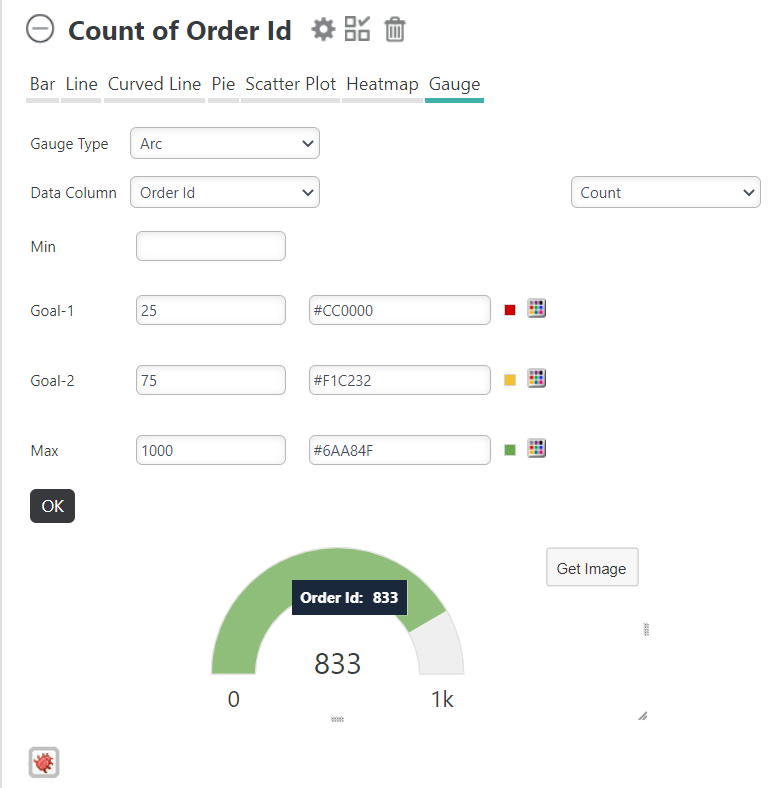
Click the Add Chart tab to use the feature that lets you create charts and gauges. Then, select Gauge from list of available charts. A separate Chart panel with its own configuration area will be displayed:

Here's how to use this feature:
Choose a Gauge Type. Options include: Arc, Balloon Bar, Bullet Bar, and Number.
- Select the Data Column. The options are grouped and color-coded to make it easier for you to identify them. If you created any Formula columns, they appear in this column, too.
- Enter a Min value. If you do not enter a Min value, Info automatically applies Min value of 0.
- Set up to two Goals.
 New for 14.2 Your goals can be set using static values, or dynamically driven by percentages. The goal will be invalid if out of range. Set color thresholds for your goals by selecting the color picker and choosing a color. When using percentages, the following rules apply:
If percentage-value is used, the value cannot exceed 100% (and/or less than 0%).
If the percentage-value and absolute-value are mixed in Goal-1/2, Max, or GuageRange-elements, the maximum value of all absolute-values is the maximum value. For example, if your settings are 10, 90%, 60, 70% and 80 respectively, the maximum value is 80, and the final range is ~ 10 ~ 56 (70%) ~ 60 ~ 72 (90%) ~ 80.
If ONLY percentage-value is used, the automatically-calculated-maximum-value will be taken as the maximum value. For example, if your settings are 10%, 90%, 60%, 70%, 80%, the automatically-calculated-maximum-value is 1000, and the final range is ~ 100 (10%) ~ 600 (60%) ~ 700 (70%) ~ 800 (80%) ~ 900 (90%).
- Enter a Max value. If you do not enter a Max value, Info automatically applies a Max value to your chart. The color of the arc (in this example) is determined by which range contains the value. Set a color threshold for your Max value by selecting the color picker and choosing a color.
Depending on how your application is configured, you may see an "OK" button that applies all of your selection changes to the chart at once. Otherwise, your chart will be redrawn immediately as you make individual changes.
Hide the chart configuration area by clicking the gear icon, or delete the chart entirely by clicking the trash can icon.
Charts are displayed in their own panels, so you can expand and collapse them using their "+" and "-" icons. You can also rearrange the order of chart and table panels by clicking with your mouse near the top of a panel, and dragging it up or down.
Charts will automatically include Quicktips, which appear when you hover your mouse over a data value, as shown above. In addition, "resizing handles" (circled above) will appear when the mouse is over the chart, allowing you to resize the chart by dragging them.
Data Forecasting
Data Forecasting, if included by your application developer, is available for Bar, Line, Curved Line, and Scatter charts.

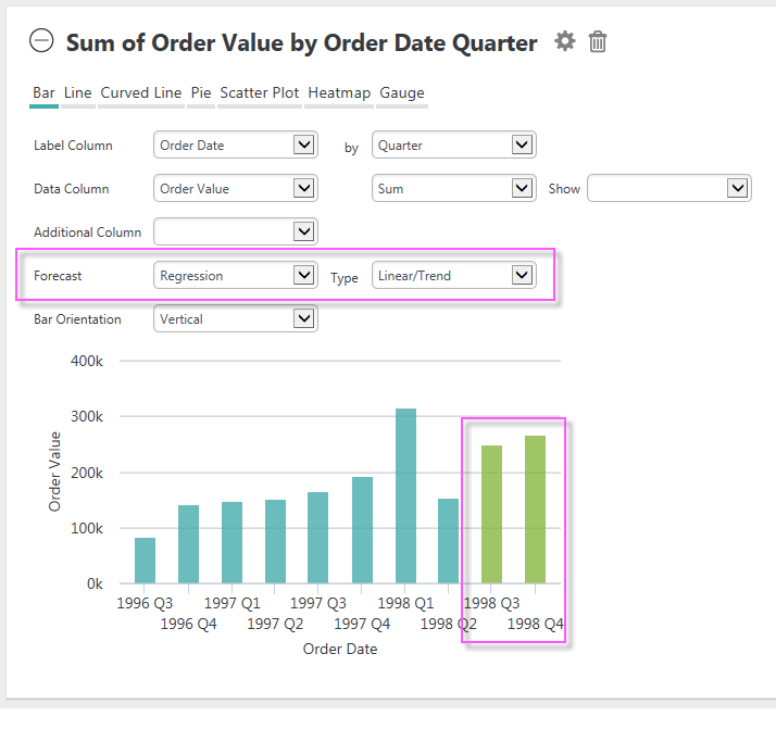
If it's available, extra controls for it will appear in the Chart configuration panel, as shown above.
Data forecasting is the process of generating values based on events that have not yet occurred. "Prediction" is a similar but more general term. Forecasting refers to formal, statistical methods that use time series, cross-sectional, or longitudinal data to produce predicted data. Typically, forecasts are displayed most effectively on charts.
Forecasting analysis options, which may vary by chart, include:
- Time Series (Time Series Decomposition), consisting of data in a natural, time-related order with a strong interval, where the Label Column data is of DateTime-type and the Data Column is a number.
- Regression, using one of several regression analysis functions. Regression
analysis is recommended when the focus is on a relationship between a
dependent value and one or more independent values. Available analysis functions include:
- Linear - used to calculate predictive values based on a trend line.
- Autoregressive
- used when attempting to predict an output of a system based on
previous outputs. The estimation technique used is based on "Burg's"
method.
Click the gear icon to hide the configuration area.
More information about forecasting in InfoGo can be found in Forecast Methodologies.