Develop with Analysis Grids - v11.3 +
This topic introduces Logi Info developers to one of the "super-elements", the Analysis Grid. Like all super-elements, the Analysis Grid has its own built-in user interface and functionality. The Analysis Grid is a dynamic analysis tool that allows users to manipulate data, create charts, change table layouts, and much more, at runtime.
- About the Analysis Grid
- Analysis Grid Element Family
- Attributes
- Retrieve and Use Data
- Special Formatting
- Control Column Availability
- Change Column Order and Width
- Set Filtering Popup Values
- Use a More Info Row
- Control Feature Access
- Set Pagination Options
- Export Considerations
- Configure Add-to-Dashboard
- Configure for Report Author
- Save and Load Analysis Grids
- Special Query String Parameters
- Customize Analysis Grid Appearance
The Analysis Grid was given additional functionality in Logi Info v11.3. If you're using an earlier version, see Work with Analysis Grids.
Information about using an Analysis Grid, intended for end-users, is available in Use the Analysis Grid - v11.3+.
About the Analysis Grid
The Analysis Grid element provides a complete package of data analysis capabilities in a single element, letting developers provide their users with a lot of functionality, while saving development time and effort.
The Analysis Grid UI consists of separate panels for controls, tables, and visualizations. At runtime, users can manipulate the controls, creating data analyses and visualizations on the fly. Logi Info provides developers complete control over the content and layout of Analysis Grids, and the ability to restrict the UI controls available to users.
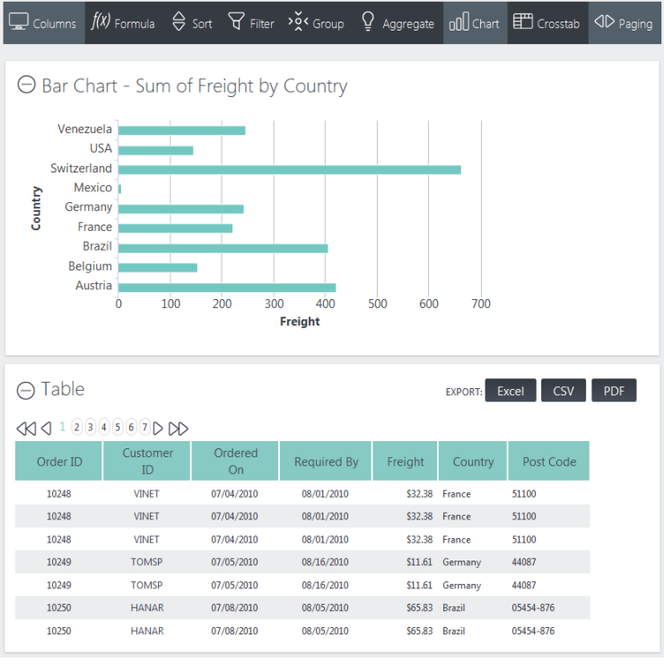
In the example Analysis Grid shown above, both a table and a chart are displayed. The Signal theme is being used.
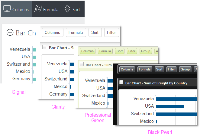
As you can see in the examples above, the Analysis Grid can look quite different depending on the theme being used.
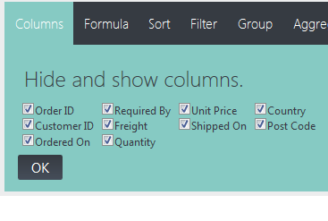
The Analysis Grid consists of a set of panels. The Controls Panel, at the top, includes a set of tabs or buttons that allow the user to manipulate the data and visualizations at runtime. The visibility of the controls is configured by the developer and they can be individually shown or hidden.
When a tab or button is clicked, a configuration panel for that feature appears, as shown above. Clicking it again hides the panel. If a change was made in the panel, the tab or button will indicate this visually.
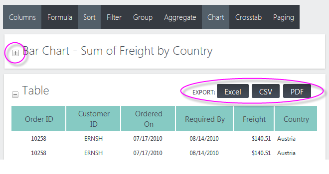
Visualization Panels contain either a data table, crosstab table, or chart. Panels can be collapsed or expanded using the "+" and "-" icons. Panels can also be rearranged by dragging their title bar area to a new position.
Tables can be sorted by clicking their column headers, and columns can be dragged to rearrange their order or adjust their widths. Charts can be resized by dragging "resizing handles" which appear when the mouse is hovered over the chart.
Panels containing tables can display buttons for exporting them to Excel, CSV, or PDF. The visibility of the export buttons is under developer control and they can be individually shown or hidden.
SubReport Restriction
![]() Do not use a SubReport element configured for Embedded mode to embed report definitions containing an Analysis Grid. Internal component naming and session variable conflicts will arise and the super-element will not work correctly. You must use IncludeFrame mode instead.
Do not use a SubReport element configured for Embedded mode to embed report definitions containing an Analysis Grid. Internal component naming and session variable conflicts will arise and the super-element will not work correctly. You must use IncludeFrame mode instead.
Retain User Settings
With all its configuration possibilities, it may be important for users to be able to save their Analysis Grid settings between sessions. Traditionally, this has been done using a Process Task, saving user settings on the web server and making them available during the next session (this is discussed in more detail in another section).
![]() The Auto Bookmark element, introduced in v11.4.046, will automatically save all changes made by the user in bookmarks, which can be used later to reproduce the report with settings intact. See for more information.
The Auto Bookmark element, introduced in v11.4.046, will automatically save all changes made by the user in bookmarks, which can be used later to reproduce the report with settings intact. See for more information.
Passing Parameters
![]() Do not send critical information to a page for use with an Analysis Grid via request parameters such as LinkParams. When an Analysis Grid's configuration is changed by the user at runtime and the element refreshes itself, request parameters may become unreliable. We recommend that any information that needs to be passed to a page for use with an Analysis Grid be sent using Session variables.
Do not send critical information to a page for use with an Analysis Grid via request parameters such as LinkParams. When an Analysis Grid's configuration is changed by the user at runtime and the element refreshes itself, request parameters may become unreliable. We recommend that any information that needs to be passed to a page for use with an Analysis Grid be sent using Session variables.
Refresh using AJAX
Action.Refresh Element uses AJAX technology to refresh portions of a report page, which produces a smooth update. However, we do not recommend that you use this element to refresh a Division which contains a "super-element", such as an Analysis Grid. Because the super-elements incorporate AJAX themselves, unexpected results can occur when AJAX calls are "nested" in this scenario.
Analysis Grid Element Family
You can always manually add an Analysis Grid (AG) element to your definition. However, Logi Studio includes an "Analysis Grid Wizard" that can make the process easier. Select the Body or similar container element in the element tree, click the main menu's Wizards tab, and click the Analysis Grid item. Then follow the prompts.
- An Analysis Grid element. Only one may be used per report definition and it should not be used within Dashboards or Tabbed Panels.
- A DataLayer or Active Query Builder element, to retrieve the data used in tables and charts.
- One or more Analysis Grid Column elements, to display data that will be available for analysis.
- One or more Data Table Column elements, to display data that willnot be available for further analysis.
- An optional Crosstab Comparison element which displays column value differences in crosstab tables.
The example above shows a typical set of Analysis Grid elements. A few other special purpose child elements are also available.

Why two kinds of table columns? Analysis Grid Columns are used to display data and work with the grid's analysis features. However, your ability to customize them is limited. Data Table Column elements, on the other hand, are also available to display data and they allow customization, but their data can't be used for analysis. Using the two types of column elements together in an AG is common practice.
To add an Analysis Grid Column:
- As shown above, select the parent Analysis Grid element and add an Analysis Grid Column element beneath it.
- Set the Column Header and ID attributes. The Column Header value is the text that appears above each column.
- Set the Data Column attribute to the name of a column returned by the data layer. Do not use tokens when the attribute name includes the word "column"; just provide the actual column name.
- Set the Data Type attribute to Text, Number, or Date. Tokens can be used here to set the data type.
Dynamic Visibility
When a regular Data Table Column element is used in an Analysis Grid, its visibility can be controlled dynamically by setting its Condition or Show Modes attributes. However, the Analysis Grid Column element doesn't have those attributes, so its visibility can't be controlled dynamically. Its visibility can only be controlled with Security Rights when using Logi Security.
Attributes
The Analysis Grid element has the following attributes:
| Attribute | Description |
|---|---|
| ID | (Required) Specifies a unique element ID. |
| AJAX Paging and Sorting | Enables AJAX-style table paging and sorting. When the user moves to another table page, or
sorts a column, only the table is updated. This method
prevents the web page from flickering or losing the scroll position. This
alters the behavior of the browser's "Back" button because the page history does
not get updated with AJAX Paging. The default value is False. |
| Alternating Row Class | Specifies a CSS class to be used for every other row of the table. If you're using a Theme, the class ThemeAlternatingRow should be used. |
| Caption | Specifies the title that will appear above the Analysis Grid. |
| Class | Specifies the CSS class to be used by the element. When set, this class will also be used by all child elements that don't have their own class. Generally not used if a Theme is being used. |
| Current Page Class | When paging is being used for a table, specifies the CSS class to be used by the "current page number" indicator. |
| Disable Replace Confirmation | Specifies whether pop-up confirmation prompts will appear when replacing Formula Columns, Filters, and Sort Orders. Set to True to disable the prompts. The default value is False. |
| Disable Show All Rows | Specifies whether the "Show all rows" option will appear in the Paging controls at runtime. If your users work with very large datasets, you may not want them to be able to use this option. Set to True to hide the option. The default value is False. |
| Draggable Panels | Specifies whether the panels that visualizations appear in can be rearranged at runtime by dragging them. The default value is True. |
| Filter Case Sensitivity | Specifies if runtime Filters will be case-sensitive or case-insensitive. If set to Insensitive, values are compared without regard to upper and lower case. When set to Sensitive, case must match exactly. The default value is blank. In this case, the "Starts With" and "Contains" comparisons are case-insensitive, and the other comparisons are case-sensitive. This attribute is ignored when using DataLayer.ActiveSQL with a SQL Server database and filters are always treated as Insensitive. |
| Hide Aggregates | Specifies whether the Aggregate tab or button in the Controls panel will be hidden from view. The default value is False. |
| Hide Charts | Specifies whether the Chart tab or button in the Controls panel will be hidden from view. The default value is False. |
| Hide Crosstabs | Specifies whether the Crosstab tab or button in the Controls panel will be hidden from view. The default value is False. |
| Hide Exports | Specifies whether or not the Export button will be visible in table panels. The default value is False. |
| Hide Filters | Specifies whether the Filter tab or button in the Controls panel will be hidden from view. The default value is False. |
| Hide Formulas | Specifies whether the Formula tab or button in the Controls panel will be hidden from view. The default value is False. |
| Hide Grouping | Specifies whether the Group tab or button in the Controls panel will be hidden from view. The default value is False. |
| Hide Layout | Specifies whether the Columns tab or button in the Controls panel will be hidden from view. The default value is False. |
| Hide Menu | Specifies whether the Controls panel itself will be hidden from view. The default value is False. |
| Hide Paging | Specifies whether the Paging tab or button in the Controls panel will be hidden from view. The default value is False. |
| Hide Sort Order | Specifies whether the Sort tab or button in the Controls panel will be hidden from view. The default value is False. |
| Max Rows Export | Specifies a limit for the number of rows that will be exported and whether exporting is enabled. When working with very large data sets, exports may not be practical. If standard datalayers are being used, exports will only be enabled if the number of rows in the Analysis Grid's table does not exceed this limit. The default is 100,000 rows. |
| Numbered Page Count | Specifies how many number links will appear as paging controls when the Show Page Number attribute is set to Numbered. The default value is 10. |
| Page Row Count | Specifies how many rows of data will be shown in each "page" of the table. |
| Saved Analysis Grid Folder | Specifies the name of a folder where users' Analysis Grid options can be saved using the Procedure.Save Analysis Grid element. For more information, refer to the sections in this topic that discus saving and customizing Analysis Grids. |
| Security Right ID | When using Logi Security, specifies one or more Security Right IDs, separated by commas. Users with these Security Right IDs will be able to view the Analysis Grid, users without them will not. |
| Show Page Number | Specifies whether, and in what format, paging controls will appear. Options include: True - Displays page number in the format "Page 1 of N". Users can navigate pages by clicking buttons/links or by
typing in a page number. False - No paging controls will be shown. |
| Sort Arrows | Enables sort direction indicators (arrows) shown in table column headers when the user sort a column by clicking its column header. The default value is False. |
| Template Modifier File | Specifies the name, with file extension, of a Template Modifier Files to be applied to the Analysis Grid at runtime. This is an XML file that can be used to change the underlying template used to create the Analysis Grid. Template Modifier files can be in any folder accessible to the application; if a folder isn't specified, the _SupportFiles folder is assumed. |
| Width | Specifies the width of the Analysis Grid, in units set in the Width Scale attribute. |
| Width Scale | Specifies the width units of the Width attribute, either px for pixels or % for percent. |
Retrieve and Use Data
The Analysis Grid works with a standard datalayer to retrieve and cache its data. In many use-cases, this provides adequate performance.
However, two other special data retrieval elements are available for use with Oracle, MySQL, Microsoft SQL Server 2005+, or PostgreSQL database servers.
DataLayer.ActiveSQL
If you're working with large data sets, you can use a special-purpose datalayer, DataLayer.ActiveSQL, for better performance.
This datalayer provides the basic SQL query needed to retrieve data but doesn't initially retrieve and cache all of the result set, like a standard datalayer does. Instead, in response to runtime manipulations of the Analysis Grid interface, it dynamically modifies its own SQL query and retrieves the minimum required amount of data with each request. This increases the number and frequency of SQL queries the database server must handle (and, generally, isn't a burden on it) but improves performance for the user.
Active Query Builder
Typically, when the Analysis Grid is configured with a SQL datalayer, it retrieves data based on a SQL query hard-coded by the developer. The query determines the dataset that will be available to users for analysis.
The Active Query Builder element, available with the Self-Service Reporting Module (see Introduction to Add-on Modules), extends our ActiveSQL technology. It provides a different approach for Analysis Grid queries: when used instead of a datalayer, it allows users to have more choice about what data to work with, by giving them a way to interactively select tables, views, columns, and joins, at runtime.
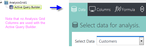
When added as a child of an Analysis Grid, the Active Query Builder element causes a special "Data" tab or button to appear in the Analysis Grid, as shown above. In it, users can select the tables, views, columns, and joins they want to work with. Like DataLayer.ActiveSQL, the Active Query Builder creates SQL queries on-the-fly based on Analysis Grid UI manipulations.
The developer, however, still ultimately controls which tables, views, columns, and joins are available in this tab. This is done by building a "metadata file", associated with a Connection element, which enumerates all of the database objects that will be available to users for selection in the Analysis Grid.
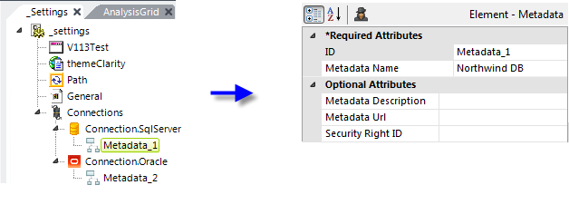
The Metadata element, available with the Self-Service Reporting Module (see Introduction to Add-on Modules) and shown above, provides a tool, the Metadata Builder wizard, which is used during development to create the metadata file. Multiple metadata files can be associated with a single Connection element. You can add Metadata elements and build the files by selecting the Connection element and running the wizard. More information about the wizard is provide in Use the Metadata Builder Wizard.
 Metadata can be retrieved instead from a REST-style web service by specifying the service's URL in the Metadata element's Metadata Url attribute.
Unless otherwise configured, the Active Query Builder will automatically include the metadata from all existing Metadata elements in the Data tab. If this is not desired, its Metadata IDs attribute can be used to list specific Metadata elements (and their files) to be used.
Analysis Grid Column elements are not used with the Active Query Builder. You'll see an error is you do include any.
The Data tab panel normally includes checkboxes so that users can individually select columns for analysis. However, these can be hidden by setting the Active Query Builder element's Hide Column Selection attribute to True, in which case all columns will be available for use.
Special Formatting
Data shown in an Analysis Grid Column element can be formatted using the element's Format attribute. Two special formatting values are available, Bars and BackgroundColorSlider.
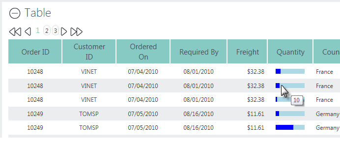
Selecting the Bars value will produce a horizontal bar chart within the column, as shown above. The actual data value will be automatically assigned to the element's Tooltip attribute.
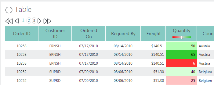
Selecting the BackgroundColorSlider value will display the column value using an imbedded Cell Color Slider, as shown above.
![]() Note that if you use the Analysis Grid Column element's Format attribute to change the appearance of data, for example, to cause a 1 or 0 data value to be displayed as Yes or No, users who attempt to create custom formulae at runtime using that column may run into difficulties. They may not realize that the data is really, as in the example, a number instead of text.
In this case, user education about the actual underlying data values is the key to smooth operations.
Note that if you use the Analysis Grid Column element's Format attribute to change the appearance of data, for example, to cause a 1 or 0 data value to be displayed as Yes or No, users who attempt to create custom formulae at runtime using that column may run into difficulties. They may not realize that the data is really, as in the example, a number instead of text.
In this case, user education about the actual underlying data values is the key to smooth operations.
Control Column Availability
Each Analysis Grid Column element has attributes that allow you to control whether or not that column can be used with a specific feature. For example, you may decide that some columns should be available for Sorting, while others should not.
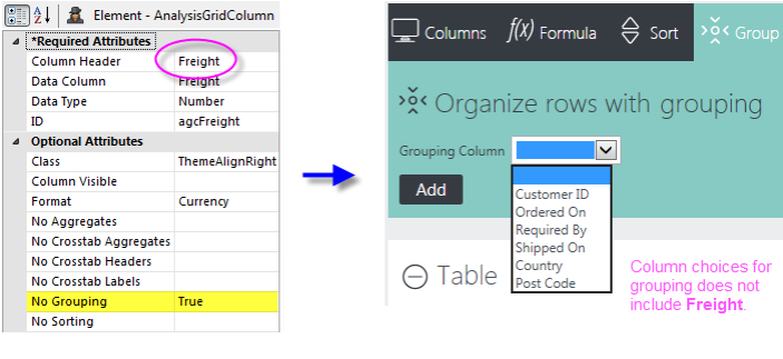
For example, assume that an Analysis Grid Column that displays freight charges is not a good candidate for grouping. Setting this column's No Grouping attribute to True removes this column from the list of available columns in the Grouping feature.
Developers can improve the overall usability of the Analysis Grid by determining in advance which columns are good candidates for aggregation, grouping, sorting, etc. and configuring the Analysis Grid columns accordingly.
Change Column Order and Width
The top-to-bottom order of Data Table Column and Analysis Grid Column elements in your report definition dictates the initial left-to-right order of columns in the Analysis Grid table.
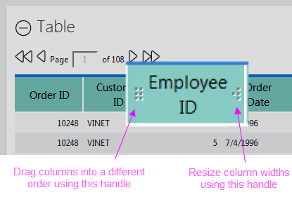
Users can rearrange the order, and change the widths, of table columns using two "drag" handles that appear when you hover your mouse over a column header, as shown above.
Set Filtering Popup Values
Analysis Grid Column element's have a Popup Values for Filter attribute, which can be set to List or Calendar.
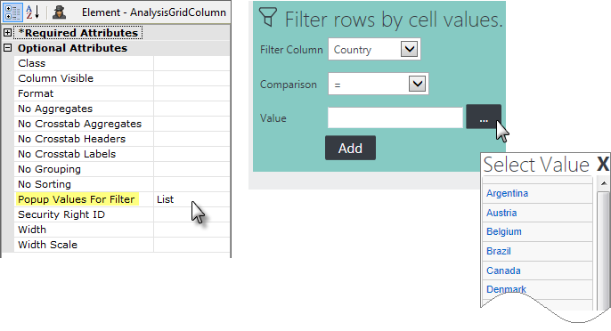
The example above shows what happens when it's to List. When this column is selected in the Filter panel, users can either type in a value or click a browse button. Clicking the button will cause a pop-up option list to be displayed, and the value for the filter can then be chosen from the list.
If the attribute is set to Calendar, then a pop-up calendar will appear. Obviously, this attribute value should only be used for date-type columns.
Use a More Info Row
The More Info Row element can be used to show additional data "inside" a table or crosstab table row. The row expands vertically to accommodate rows of additional data or other visualizations.
In order to use a More Info Row element with an Analysis Grid, you must include a regular Data Table Column element as one of your table columns. This is because More Info Row elements are shown/hidden using an Action.Show Element element, which is not a valid child of Analysis Grid Column elements.
Use this Data Table Column to display values, such as invoice, product, or ID numbers, that won't be used for further analysis in the Analysis Grid.
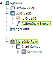
In the example above, Action.Show Element has been added beneath the Data Table Column element "colOrderID". A More Info Row element has also been added, with a Chart Canvas chart beneath it.
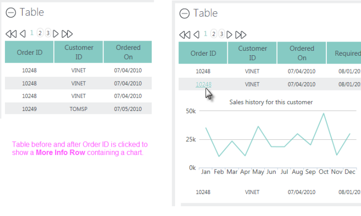
As shown above, clicking the column's value at runtime will then show/hide the More Info Row and whatever it contains.
For more information about the general use of More Info Rows, see Data Table Rows.
Controlling Feature Access
The Analysis Grid and Analysis Grid Column elements include attributes that allow developers to control access to features and data, and user interaction with the element's controls. The following table lists the elements and the attributes that can be used to control feature access.
| Element | Attribute | Description |
|---|---|---|
Analysis Grid | Hide Aggregates | Controls whether or not feature buttons are visible in the menu row. Default value is False. |
Analysis Grid | Hide Exports | Controls whether or not the Export buttons are visible above the data grid. Default value is False. |
Analysis Grid | Security Right ID | If Logi Security is implemented, identifies the security Right required to view this element. Default value is no restriction. |
Analysis Grid | Draggable Columns | Available in versions prior to v11.0.416, specifies whether the user can re-arrange table columns by dragging column headers sideways. The new arrangement is "remembered" only for the user's current session. The default value is False. Draggable Columns can't be used when there are custom header rows with columns that span multiple columns. |
| Analysis Grid | Draggable Panels | Controls whether the user can re-arrange the vertical order of the major table and chart panels. The new panel arrangement is "remembered" only for the user's current session. The default value is True. |
Analysis Grid Column | Column Visible | Controls whether or not this column is initially visible. Default value is True. |
Analysis Grid Column | No Aggregates | Controls whether or not this column is included in the drop-down list of columns in the control panel for the feature. Default value is False. |
Analysis Grid Column | Security Right ID | If Logi Security is implemented, identifies the security Right required to view this column. Default value is no restriction. |
Setting Pagination Options
This feature allows users to determine how many rows of data will appear in the data table:
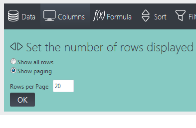
Selecting the paging option Show all rows will display all of the data at once in the data table; Show paging will display a subset of rows and also include the paging controls. Developers may not want to allow users to select all rows as it may result in a lengthy delay while data is retrieved. You have the option to hide this radiobutton from users by setting the Analysis Grid element's Disable Show All Rows attribute to True.
When Show Paging is selected, one of three styles of paging controls is displayed, depending on how the developer configures the Analysis Grid element in the report definition:
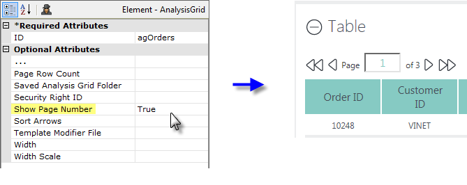
If the Analysis Grid element's Show Page Number attribute is set to True, the navigation controls, with page number display and input, as shown above, will appear.
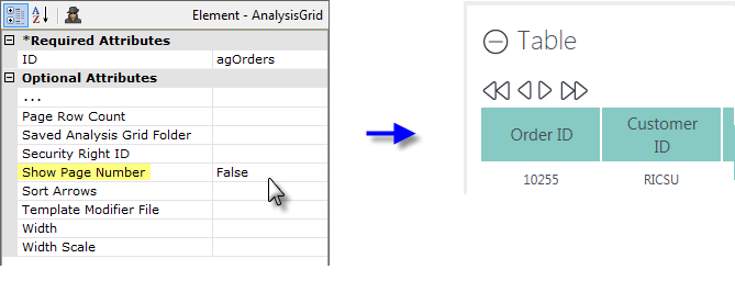
If the Show Page Number attribute is set to False, the navigation controls will appear, as shown above, but without a page number.
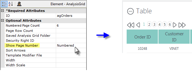
And, finally, if the Show Page Number attribute is set to Numbered, or is left blank, the navigation buttons will appear, as shown above, along with a range of page numbers. In addition, two other attributes will become active: Numbered Page Count, which specifies how many numbers will be shown at a time (default = 10), and Current Page Class, which allows the number for the current page to be styled (color, size, background, etc.) differently from the others.
Note that the look of the navigation controls will vary depending on which Theme is applied.
Exporting Data
The Analysis Grid can be configured by the developer to include three buttons that allow exporting to other formats: Excel, CSV, and PDF:
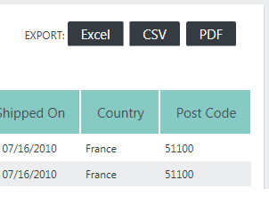
In all cases, the exported file is written to a temporary file, which is then opened in the target application for display, manipulation, printing, or storage.
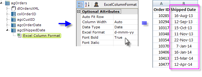
Developers can optimize Excel exports by adding an Excel Column Format element to each grid column, as shown above. This provides developers with full control over the layout and appearance of exported data in the worksheet. The element's Data Type attribute is especially useful for ensuring that data is correctly formatted when it arrives in Excel. There are no export-specific elements for the other export formats.
Export Threshold
When working with very large data sets, exports may not be practical. Developers can control this using the Analysis Grid element's Max Rows Export attribute specifies the maximum number of data rows that can be exported.
When the number of rows in the Analysis Grid's main table is equal to or less than this value, exports will be enabled; if the number of rows exceeds this value, exports are disabled. This allows developers to prevent users from running export requests that will take an unacceptable amount of time. The default value for this attribute is 100,000 rows.
At runtime, users can reduce the number of rows in the Analysis Grid's main table, and thus enable exports, by adding one or more Analysis Grid filters.
Configuring Add-to-Dashboard
The Analysis Grid allows users to generate a data table or chart, then add it as a new panel in an existing Dashboard in another report. This is the "Add-to-Dashboard" feature.

When properly configured, Analysis Grid charts will display an Add to Dashboard button, as shown above.
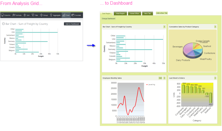
When the button is clicked, the chart, with its resizing control, is added as a new panel in the Dashboard, as shown above. When the resizing control is used to resize the chart, the widths of the dashboard columns and other panels will adjust dynamically.
Behind the scenes, when the button is clicked, the Analysis Grid writes the underlying XML for its chart into the Dashboard's configuration file (its "Save File"). In the Dashboard, the chart is inserted at the top of Column 1; if Dashboard tabs are being used, the insertion occurs in the currently active tab.
Just before panel insertion, the user will be prompted for the Panel Title (with the chart title from the Analysis Grid provided as a suggestion) and a description for display on the Configuration Page:
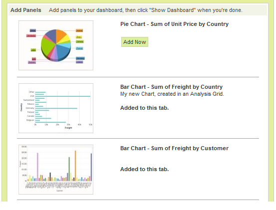
The new chart panel thereafter appears in the Dashboard Configuration Page, as shown above, just like any other panel, complete with a thumbnail image. The new panel can be removed from the visible dashboard panels and from the configuration page entirely, using the usual controls.
The user can insert multiple charts into a Dashboard using this technique.
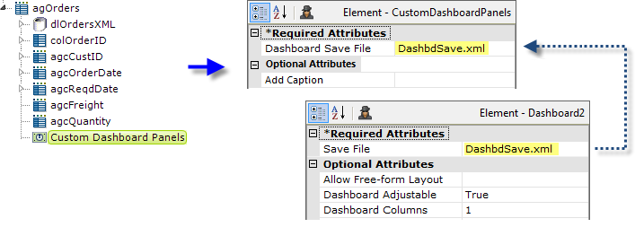
In the report definition, the developer makes this functionality available by adding a Custom Dashboard Panels element, shown above, beneath an Analysis Grid element. Its Dashboard Save File attribute value should be set to match the target dashboard's Save File attribute value.
![]() The Save File attribute values shown above have been shortened for visual clarity. However, a fully-qualified path and file name, with .xml extension, is required, so a realistic attribute value would be something like:
The Save File attribute values shown above have been shortened for visual clarity. However, a fully-qualified path and file name, with .xml extension, is required, so a realistic attribute value would be something like:
@Function.AppPhysicalPath~\DashFiles\DashbdSave.xml
and the account the Logi application runs under (in Windows, ASPNET or NETWORK SERVICE) would be given Write permissions to the "DashFiles" folder. For experimentation purposes, you can use the rdDownload folder, for which appropriate permissions already exist (but its contents are periodically deleted, so don't use it for anything but experimentation).
Dashboard Save Files are often named using a token, such as @Function.UserName~, in order to create personalized dashboard configurations and, in that case, the Custom Dashboard Panel attribute would use the same token.
![]() The Custom Dashboard Panel element has a new attribute, Add Caption, which sets the caption for the button used to save the data table or chart. If left blank, the caption is "Add to Dashboard".
The Custom Dashboard Panel element has a new attribute, Add Caption, which sets the caption for the button used to save the data table or chart. If left blank, the caption is "Add to Dashboard".
For more information about Dashboards, see Introduction to the Dashboard - v11.2.
Configuring for Report Author
![]() The Report Author element (see Report Author), available in the Self-Service Reporting Module (SSRM) add-on, v1.1.41+, provides users with the ability to construct reports using a drag-n-drop interface. Visualizations for use with the Report Author are created using the Analysis Grid's "Add to Dashboard" feature.
The Report Author element (see Report Author), available in the Self-Service Reporting Module (SSRM) add-on, v1.1.41+, provides users with the ability to construct reports using a drag-n-drop interface. Visualizations for use with the Report Author are created using the Analysis Grid's "Add to Dashboard" feature.
To do this, the Custom Dashboard Panels element is used with an Analysis Grid, just as described in the previous section. However, for this purpose, its Dashboard Save File attribute value does not point to an existing Dashboard Save file. Instead, it identifies a separate Save file that will be used later by the Report Author as its "Gallery" file.
If Logi Security has been and will be used, the current user's name will be available in the @Function.UserName~ token. This can be embedded into this attribute to provide separate Gallery files for individual users. For example, the attribute value might be:
@Function.AppPhysicalPath~\GalleryFiles\@Function.UserName~.xml
which might translate to:
C:\inetpub\wwwroot\MyReportApp\GalleryFiles\BGates.xml
This file can be created, renamed, and copied as necessary to make it available to report definitions using the Report Author element.
Saving and Loading Analysis Grids
As mentioned earlier, it may be important for users to be able to save their Analysis Grid configurations between sessions. Their configurations can be saved on the web server and made available to them during their next session. Developers can implement this behavior with a simple Process definition. The following examples illustrate how to save and manipulate grid settings.
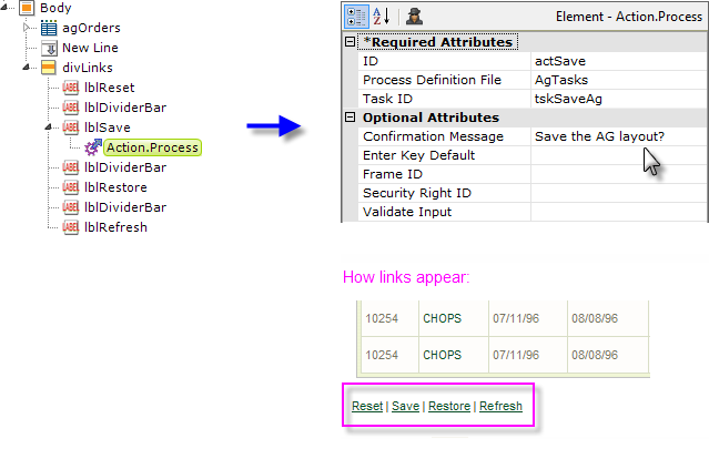
The original Analysis Grid example definition is shown above with a set of Label and Action elements added, beneath their own Division. The actSave element attributes point to a Process definition task, tskSaveAg.

To create the task:
- In a Process definition, add a Task element ("tskSaveAg").
- Below it, add a Procedure.Set Session Vars element ("getAgID").
- Below that, add a Session Parameters element and set its attributes as shown above. The GUID token provides a random 48-character number for use as a unique identifier. Remember: the session parameter name is case-sensitive!

- Next, add to the task a Procedure.Create Folder element and set its attributes as shown above.

- Add a Procedure.Save Analysis Grid element to the task and set its attributes as shown above. The full Filename value is:
@Function.AppPhysicalPath~\UserData\@Session.AgID~.xml
Note that the session variable created from the GUID token earlier is now being used as the file name; use of a session variable allowed us to "pass" the value through the task from an earlier procedure to this one.

- Add a Procedure.Set Cookie Vars element to the task. Below it, add a Cookie Parameters element and set its attributes as shown above. This stores the name of the Analysis Grid settings file on the user's computer; the cookie will be used in future sessions to open the find and restore the settings.
- Add a Response.Report and Target.Report element to the task to return processing to the report definition containing the Analysis Grid.
Cookies are useful when the user is unknown to the server and session information is unimportant. If authentication is integral to an application, developers can use strategies such as tying a saved Analysis Grid filename to a user ID and storing this information in a database. Developers can also create a list of saved Analysis Grids that users can access from any workstation.
Special Query String Parameters
Logi Studio provides developers with three special query string parameters to manipulate Analysis Grids:
- rdAgReset - Set to True to revert the Analysis Grid back to its original, unmodified state
- rdAgLoadSaved - Set to the name of an XML file (with .xml extension) that contains saved Analysis Grid settings
- rdAgRefreshData - Set to True to refresh the Analysis Grid with current data from the data store, while preserving user configurations.
This example shows how to restore saved Analysis Grid settings using two of these parameters:

First, select the Analysis Grid element, as shown above, and set its Saved Analysis Grid Folder attribute to the path to the folder where we earlier saved the grid configurations.
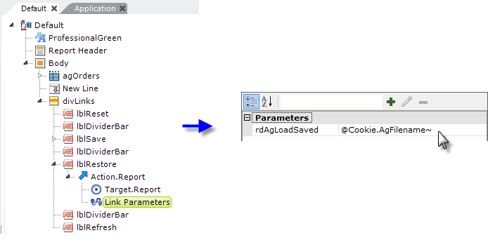
Next, examine the "lblRestore" element in the example shown above. It has a Target.Report child element set to the current report ("Default" - not "Current Report") and a Link Parameters element that defines one of the special parameters as shown. When the Restore link is clicked, the report will be called and the parameter passed to it in the query string.
When this happens, the Analysis Grid settings will be set to those in the saved settings file (whose name was saved as a cookie on the user's computer in the previous example). The datalayer will then be run again to get fresh data, without resetting any of the configurations the user has made with the Analysis Grid controls.
A similar technique can be used to create "reset" functionality, using the rdAgReset parameter, which does clear any user settings and returns the Analysis Grid to its default state.
Customizing Analysis Grid Appearance
Analysis Grid appearance can be changed most easily by applying a theme to the report definition. Most of the screen shots in this document were taken with the Signal theme applied.
Changing Appearance Using Style Classes
Analysis Grid appearance can also be customized using style classes and Info Studio provides the following standard style sheet for all Analysis Grids:
<YourAppFolder>\rdTemplate\rdAnalysisGrid\rdAg10Style.css
Developers can override classes in this style sheet by copying them into their own application style sheet and modifying them there.
![]() Do not make changes in the standard style sheet in the rdTemplate folder!
Do not make changes in the standard style sheet in the rdTemplate folder!
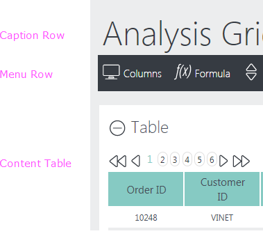
The three general Analysis Grid areas referenced by the style sheet classes are shown above.
| Class | Description |
|---|---|
rdAgCaptionRow | Applied when the Caption attribute is set for the Analysis Grid element. |
rdAgHeaderRow | Applied to the header row created when users add aggregate values to the Analysis Grid. |
rdAgGroup0HeaderRow | Applied when users add a grouping column. |
rdAgGroup1HeaderRow | Applied when users add a second grouping column. |
rdAgGroup2HeaderRow | Applied when users add a third grouping column. |
rdAgContentRow | Applied to each row of the content table. |
rdAgContentTable | Applied to the entire content table. The content table contains all the GUI controls that allow users to modify the Analysis Grid. |
rdAgContentHeading | Applied to content in the first row of the content table. |
rdAgContentCell | Applied to each cell of the content table. |
rdAgAlignRight | Applied to various Analysis Grid content such as the export controls, aggregate values and cross-tab value columns. |
rdAgCommand | Applied to the Analysis Grid buttons. |
rdAgError | Applied to error messages produced by the Analysis Grid. |
| rdAgImage | Set a zero border and margin for images. |
The table shown above lists the classes found in rdAg10Style.css and provides a short description of how each class is applied to the Analysis Grid. Developers can add/remove/edit any of the properties for each class.
Changing Appearance Using Template Modifiers
The Analysis Grid element uses a "template file" to define certain element properties that are not otherwise available as attributes to the developer for modification. These include language- and culture-specific Caption attributes that you may want to change for locale-based reasons (or you may simply want to change the captions to better suit your application).
The element's Template Modifier File attribute identifies a custom XML file developers can create containing elements that will override the same elements in the template file.
For example, the Analysis Grid template file:
<yourAppFolder>\rdTemplate\rdAnalysisGrid\rdAg10Template.lgx
contains several Label elements. One of them has an ID of "lblInstructCols"; this controls the "help text" that is displayed when the Layout icon is clicked. This text can be modified by changing the Caption associated with that Label element. To change the text from its default "Reorder and hide columns" to "Rearrange and hide columns", create your own XML file, identify it in the Template Modifier File attribute, and add this code to it:
<?xml version="1.0" encoding="UTF-8"?>
<TemplateModifier>
<SetAttribute ID="lblInstructCols" Caption="Rearrange and hide columns" />
</TemplateModifier>
You can set the attributes for any number of elements in this file; examine the rdAgTemplate.lgx file to learn the ID and Caption attributes available. The template modifier file can be in any folder accessible to the web application; if a fully-qualified file path is not provided in the Template Modifier File attribute value, then the application expects it to be in your applications's _SupportFiles folder.
More detailed information about template modifier files can be found in Template Modifier Files.