Data Table Rows
This topic introduces the Logi developer to several types of row-related elements available for data tables, including Header and Summary rows and the dynamic "More Info" row.
- Create Header and Summary Rows
- Highlight Rows with CSS
- Work with "More Info Rows"
Create Header and Summary Rows
Header and summary rows allow developers to display data column summary information on the first (excluding the column header row) and/or last rows of a data table. Developers can customize header and summary rows by adding individual Column Cell elements.
The easiest way to display summary information is to use Summary elements with each Data Table Column to be summarized and then create a header and/or summary row.
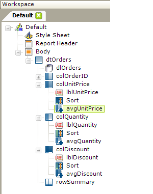
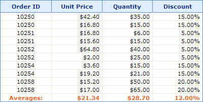
Create a Standard Header/Summary Row:
- Ensure that each Data Table Column to be summarized has a child Summary element.
- Select the parent Data Table element and add a Header Row or Summary Row element to the definition.
- Set the Caption attribute to display a title in the first column of the header/summary row.
- Set the First Page Only and/or Last Page Only attributes to hide or show the header/summary row when using interactive paging.
A standard header/summary row works well when every data column contains summary information. For data tables with numerous columns or columns with non-numeric data, a customized header/summary row may be a better solution.
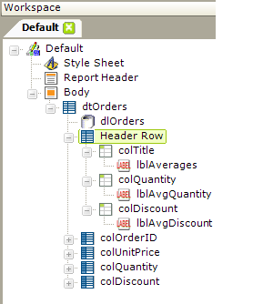
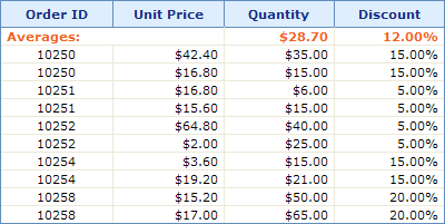
Create a Customized Header/Summary Row:
- Ensure that each Data Table Column to be summarized has a child Summary element.
- Select the parent Data Table element and add a Header Row and/or Summary Row element to the definition.
- Beneath the Header Row or Summary Row elements, add one or more Column Cell elements.
- Add Label elements beneath the Column Cell elements to display the summary data and use the @Data token to retrieve the summarized values. For example, @Data.avgDiscount~ (see the previous example as well).
Note that in the example shown above, the header row has three Column Cell elements, but the data table has four columns. This is handled by setting the first Column Cell element's Column Span attribute to span 2 columns, allowing for the difference.
Highlight Rows with CSS
In order to increase the "readability" of tables, especially wide tables, it's often useful to be able to highlight the entire row the cursor is hovering over.

This effect is shown in the example above and can be created using a simple style class.
The CSS used to create the effect is:
|
![]() Note that, in order for this to work with Internet Explorer, your application must be configured for a Doctype (i.e. the General element's Doctype attribute value in the _Settings definition cannot be set to None).
Note that, in order for this to work with Internet Explorer, your application must be configured for a Doctype (i.e. the General element's Doctype attribute value in the _Settings definition cannot be set to None).
Work with "More Info Rows"
The More Info Row element provides a mechanism that allows detail information to appear beneath each data table row. This detail information can be visible all the time, or can be shown and/or hidden by clicking a link in one of the data table columns. It provides developers with an opportunity to make data tables less cluttered and more flexible.
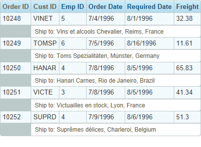
In the example shown above, the "Ship to:" detail data is displayed beneath each data row using a More Info Row element. The font size, color, number of regular data table columns spanned, background color, etc. can be set to differentiate the detail data, if desired. This is accomplished as follows:
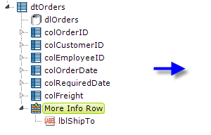
- Beneath the parent Data Table element, add a More Info Row element, as shown above.
- Set its Show Modes attribute value to All. This causes the rows to be shown at all times.
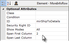
- Set its Span First Column attribute value to 2, which causes the its data to appear beginning underneath the second data table column (leaving this attribute and the Span Last Column attribute blank causes the data to span the entire data table).
- Add elements beneath the More Info Row element to display the desired text and data (data from the table's datalayer is available here using @Data tokens).
In v11.0.313, the More Info Row element was given a Condition attribute. This attribute allows you to conditionally include the element, for greater control over when the element can be seen, primarily when the More Info Rows are displayed by default.
Show/Hide More Info Rows
In the next example, the More Info Rows are hidden from view until the user takes some action to display them.
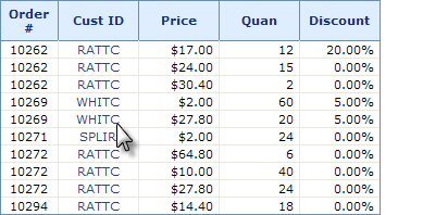
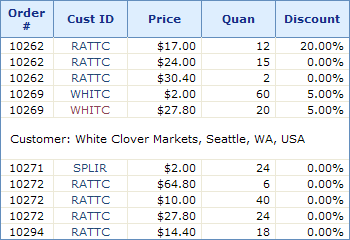
When the user clicks on a customer ID link, above left, the table expands downward to add a More Info Row that displays detail information about the customer, above right. The new row is added right beneath the row that contains the clicked link. Depending on the element's configuration, clicking the link again will hide the new row.
The information in the More Info row can be text, as shown above, or an image, another table, or even a sub-report. Here are the key elements and attributes used to created the example above:
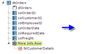
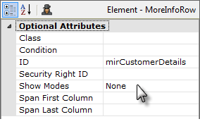
- Beneath the parent Data Table element, add a More Info Row element, as shown above.
- Set its ID to a unique value and its Show Modes attribute value to None, hiding the detail rows.
- Add elements beneath the More Info Row element to display the desired text and data (data from the table's datalayer is available here using @Data tokens).
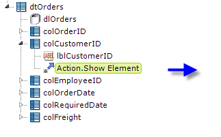
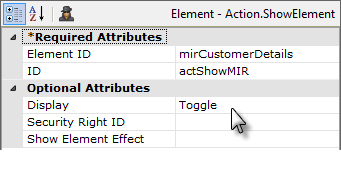
- Identify the data that you want to be the link that shows and hides your More Info row. Beneath it, add an Action.Show Element element, as shown above.
- Set its Element ID attribute value to the ID of the More Info Row element you added earlier.
- Set its ID attribute to a unique value and its Display attribute to Toggle.
The More Info Row element allows developers to quickly and easily build useful functionality into their reports.
It is possible to "nest" More Info Row elements, so that you have one More Info Row element as a child of a table that's a child of another More Info Row. However, be aware that the lowest More Info Row contents may not export correctly, or at all, so we don't recommend this design arrangement if exporting of expanded rows is desired.
In v11.0.212, the More Info Row Column element was introduced. This element can be used to closely align More Info Row columns with the columns of its parent table. When this element is used, the More Info Row element's Span First Column and Span Last Column attributes are left blank, and the More Info Row Column element's Column Span attribute is used instead to control spanning of parent table columns.