Introduction to the Dashboard - v11.2
Dashboards provide an organized arrangement of business intelligence visualizations, in panels, which may be configured to be customizable by the user. Logi Info developers can easily create reports featuring static or customizable dashboards using the Dashboard element, which is discussed here.
- Use the Refresh Element Timer
- Use Action.Add Dashboard Panel
- Change Appearance with Themes and Style Sheets
- Change Appearance with Template Modifiers
- Dashboard Change History
- About the Dashboard
- Add Tabs to the Dashboard
- Add Panels to the Dashboard
- Save Dashboard Settings
- Dashboard Panels
- Use Dashboard Elements
- Use Panel and Panel Content Elements
- Use Panel Parameters Elements
- Use the Refresh Element Timer
- Use Action.Add Dashboard Panel
- Change Appearance with Themes and Style Sheets
- Change Appearance with Template Modifiers
- Dashboard Change History
About the Dashboard
A Logi "dashboard" is a collection of panels, each containing a Logi report. Optionally, users can customize the dashboard at runtime by adding, removing, or rearranging these panels on the browser page. A dashboard may be configured to have tabbed pages, so that different collections of panels can be viewed.
The reports in dashboard panels contain regular Logi tables, charts, images, etc. and users can be allowed to vary the reporting criteria for them at runtime. Links within the reports can be used to drill-down and drill-through to detail data.
All in all, dashboards present a very flexible way of presenting a range of information that's easy to take in with a single glance.
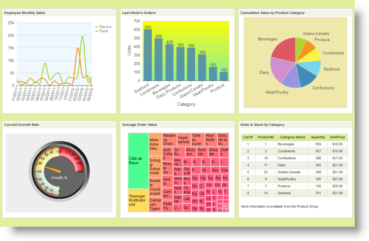
A simple dashboard, with no user customization features, styled using the ProfessionalGreen theme, is shown above.
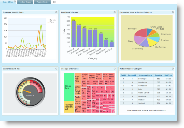
In the example above, we see a more complex dashboard, styled using the ProfessionalBlue theme. It includes tabs and user customization has been enabled.
Dashboards are created using the Dashboard element and its child elements. It provides attributes that control customization features and AJAX-based techniques are use for web server interactions, allowing selective updates of dashboard panels. It also provides a mechanism for saving runtime customizations between sessions, on an individual-user basis.
Add Tabs to the Dashboard
The dashboard can consist of a single collection of panels (a base page) or a series of tabbed pages, each with its own collection of panels. If a dashboard has been configured to be adjustable and have tabs, then users can add, remove, and rearrange tabs at runtime.
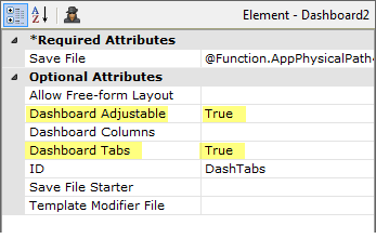
In the example above, the Dashboard element's attributes have been set to make it adjustable and have tabs.
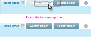
A dashboard with tabs will have one tab created by default. In the example shown above, two additional dashboard tabs have been added. Tabs can be dragged with the mouse to rearrange them, as shown above.

Adjustable dashboards display a "gear" icon like this ![]() on the selected tab; click the icon to configure their settings. To add a new tab to the dashboard, click the "plus sign" icon.
on the selected tab; click the icon to configure their settings. To add a new tab to the dashboard, click the "plus sign" icon.
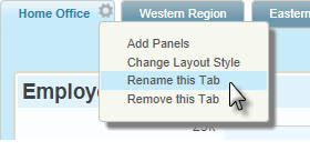
The tab Settings pop-up menu, shown above, appears when the gear icon is clicked and allows you to add panels to the tab, change the number of columns being used in the tab, to rename the tab, or to remove the tab.
Add Panels to the Dashboard
If a dashboard has been configured to be adjustable, then users can add, remove, and rearrange panels at runtime. Developers who want to build a non-adjustable, or static, dashboard, actually do so by making it adjustable, running it, configuring it, saving the configuration, and then making it static again.
Adjustable dashboards display "gear" icons like this ![]() on their base page or tabs. Click this icon to configure their settings.
on their base page or tabs. Click this icon to configure their settings.
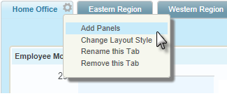
As shown in the example above, when the gear icon is clicked, a Settings pop-up menu appears. Its menu items vary depending on the dashboard configuration, but "Add Panels" is a common item. Click this item to view the Add Panels pop-up panel.
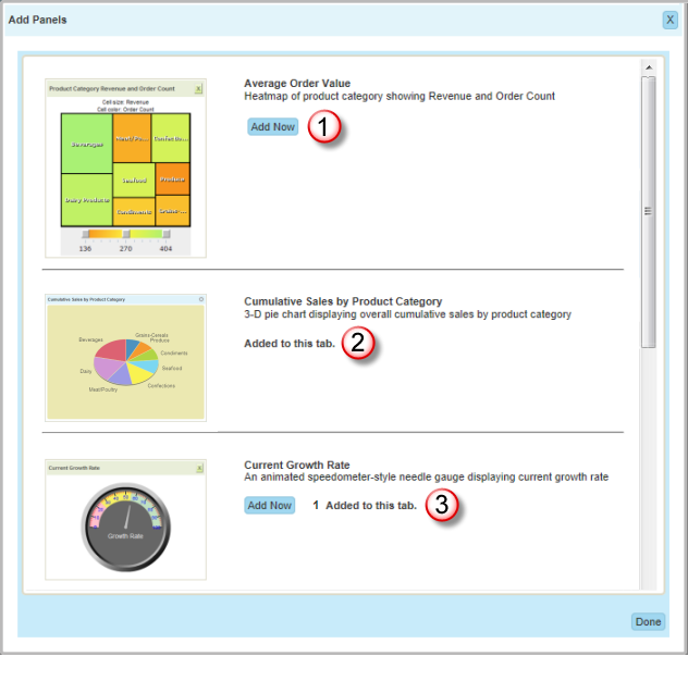
This modal pop-up panel, shown above, is used to add panels to the dashboard or to a specific dashboard tab. If the dashboard has never been configured before (or its settings file is deleted), this panel appears automatically.
The list of available dashboard panels can include a thumbnail image, a title, and a description. The (1) Add Now button adds the panel to the dashboard or tab.
Dashboard panels can be configured for single or multiple instances. If only a single instance has been configured, then after a panel has been added, its Add Now button is replaced (2) with an "Added to this..." message.
Multiple instances allows the same panel to appear more than once in a dashboard or tab. If the dashboard has been configured to allow multiple instances, then after a panel has been added, its Add Now button remains available (3) and a count of the number of instances is shown.
Runtime Panel Re-Arrangement
A dashboard is usually laid out to consist of one or more columns and, if the dashboard is configured to be adjustable, users can drag and drop the panels into the columns and arrangement of their choice at runtime.
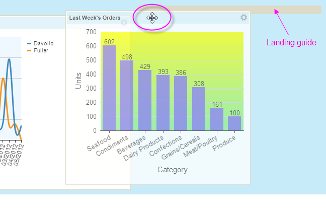
Panels are dragged by clicking on their caption bar, as shown above (note the cursor change). As the panel is dragged into a differ column or position, a "landing guide" appears temporarily to help snap the panel into its new location. Panels will automatically resize based on the width of the column they're dropped into which, in turn, is determined by the widest panel it contains. Using the Settings pop-up menu, users can even change the number of columns.
A "Free-form Layout" option is also available. When enabled, users can resize and rearrange dashboard panels at runtime without regard to any predetermined columns:
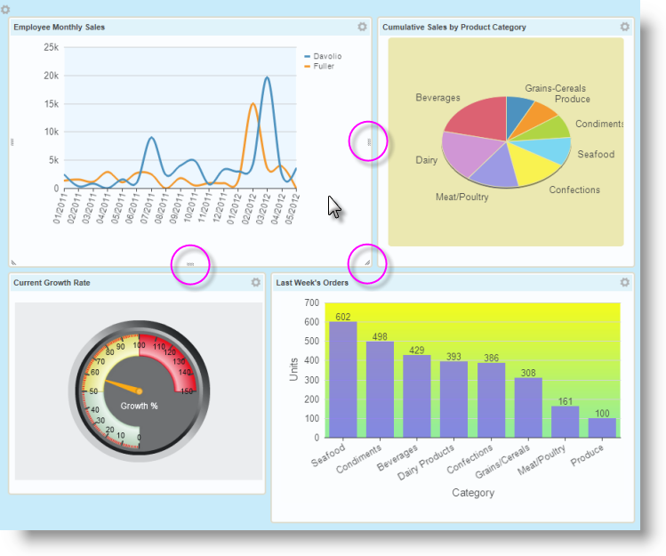
In Free-form layout, as shown above, any widths and placements can be achieved. When the mouse hovers over a panel, "resizing handles" appear at its sides and bottom and these can be dragged to resize the panel. Internal panel scroll bars will automatically appear if the panel is made too small for its contents.
The Dashboard Wizard
In v10.0.259, the Create a Dashboard wizard was added to Studio's collection of wizards. This wizard assists developers in creating dashboards by populating the report definition with the necessary dashboard-related elements. More information about this wizard is available in The Dashboard Wizard.
Save Dashboard Settings
Given that users can potentially customize a dashboard at runtime, it's useful to be able to save those customizations for future use. There are several ways to do this.
Save Files, Gallery Files, and Bookmarks
The Save File is an XML file that stores a record of the dashboard changes users make at runtime. Its data is associated internally with IDs for the dashboard and panels used to create it.
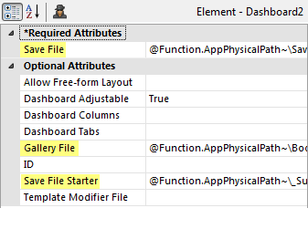
The Dashboard element's Save File attribute specifies a fully-qualified path and file name, as shown above, for the Save File. Tokens may be used in the path and file name. This creates the opportunity for reusing an individual user's configuration for their next session through the use of Logi Security, or a GUID-and-cookie scheme, tying the user name to the Safe File. For example:
C:\inetpub\wwwroot\myLogiApp\SavedDash\DashConfig.xml
@Function.AppPhysicalPath~\SavedDash\DashConfig.xml
@Function.AppPhysicalPath~\SavedDash\@Function.UserName~.xml
In the examples shown above, a special folder "SavedDash" has been created by the developer in the application folder to hold dashboard Save Files and is shown as part of the Save File path. (Extra spaces in the examples are just there for reading clarity).
![]() A Gallery File contains the same data as a Save File and its attribute accepts the same values and tokens. However, unlike a Save File, it's not associated internally with a specific dashboard and its panels. Instead, it's created using an Analysis Grid and can be copied, moved, and shared between Logi applications and users, providing an independent collection of visualizations as a resource.
A Gallery File contains the same data as a Save File and its attribute accepts the same values and tokens. However, unlike a Save File, it's not associated internally with a specific dashboard and its panels. Instead, it's created using an Analysis Grid and can be copied, moved, and shared between Logi applications and users, providing an independent collection of visualizations as a resource.
A Bookmark for a report page that includes a dashboard, when created manually using Action.Add Bookmark, stores Request and Session variables and a reference to the dashboard's Save File. It does not contain the dashboard configuration data itself.
![]() Manual bookmarks can be created independently of updates to the dashboard configuration (and, therefore, updates to the Save File). So running a bookmark for a page containing a dashboard may not necessarily reproduce the dashboard configuration that existed at the time the bookmark was created.
Manual bookmarks can be created independently of updates to the dashboard configuration (and, therefore, updates to the Save File). So running a bookmark for a page containing a dashboard may not necessarily reproduce the dashboard configuration that existed at the time the bookmark was created.
![]() Automatic Bookmarks, created using the Auto Bookmark element, on the other hand, will automatically create a bookmark and the bookmark equivalent of a Save File whenever the dashboard configuration is changed, giving you the best of both worlds. Do not specify a Save File value when using this child element. For more information, see the Add Automatic Bookmarks section of .
Automatic Bookmarks, created using the Auto Bookmark element, on the other hand, will automatically create a bookmark and the bookmark equivalent of a Save File whenever the dashboard configuration is changed, giving you the best of both worlds. Do not specify a Save File value when using this child element. For more information, see the Add Automatic Bookmarks section of .
Initial Standard Panel Arrangement
A default tab and/or panel configuration can be saved for later use. The Dashboard element has two attributes that relate to this: Save File and Save File Starter.
As mentioned earlier, the file specified in the Save File attribute value is created automatically the first time the user changes the dashboard configuration. It records any configuration changes a user makes to the dashboard, such as which panels are included, panel arrangement, and tabs. When the user returns to use the dashboard in a subsequent session, this file is used to automatically configure the dashboard. As mentioned earlier, this file can be identified on a per-user basis to provide each user with their own personal arrangement every time they use the dashboard.
If a file is specified in the Save FileStarter attribute, and no Save File has been created yet (because this is the first time the user is using the dashboard), then the Save File Starter file will provide the initial dashboard configuration. This allows each user to begin with a standard initial dashboard configuration.
Creating a Save File Starter file is easy: the developer runs the application and configures the dashboard as desired (which creates a "Save" file). That file is then renamed and/or moved and specified by the developer as the dashboard's Save File Starter file. All first time users will then see the dashboard configured just the way the developer configured it.
The names of both of these files can be represented in a definition with tokens, allowing different Save and Save File Starter files to be used for different users (as long as some Logi security is in place to determine user names or rights).
See the table of attributes below for examples.
Dashboard Panels
Dashboard panels are the basic building blocks of the dashboard:
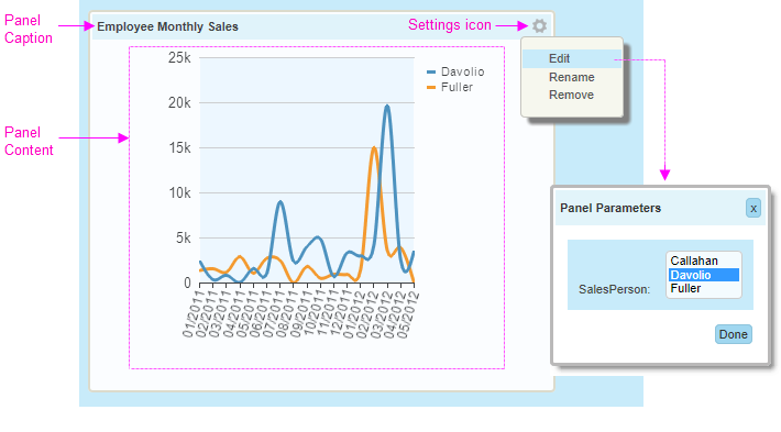
As shown above, panels have a caption and content, and may be configurable by users at runtime in other ways. If the dashboard is adjustable, a panel can have its caption changed or be removed from its dashboard via its Settings menu. If the panel has been created with parameters, users can adjust the parameter values, affecting the panel content.
In the definition, the Panel element creates a dashboard panel. Its Panel Content and Panel Parameters child elements are used to create and configure the panel.
Use the Dashboard Element
Only one Dashboard element is allowed per
report definition. Four child elements, discussed in separate sections below, are used with the Dashboard element. We do not recommend that you use this element within an embedded sub-report.
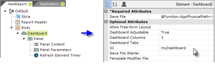
Let's examine the Dashboard element's attributes:
Use the Panel and Panel Content Elements
The dashboard Panel element is simply a required container for the other child elements and multiple panel elements are generally used to create a dashboard.
![]() If specifying a Gallery File (v11.4.046+) in the Dashboard element attributes do not use Panel elements. See the Attibutes table above for more information.
If specifying a Gallery File (v11.4.046+) in the Dashboard element attributes do not use Panel elements. See the Attibutes table above for more information.
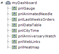
The presence of Panel elements means simply that the panels are available, but they will not be displayed in the dashboard unless configured through the dashboard configuration page to be visible.
The Panel element has these attributes:
| Attribute | Description |
|---|---|
| Caption | (Required) Text displayed in the panel's title bar, and used as a title in the dashboard configuration page. |
| ID | (Required) A unique identifier for this element. |
| Allow Caption Rename | Specifies if the user is allowed to change the dashboard panel caption. When True, the "Rename" item appears in the panel Settings menu. When selected, the caption can be edited in place then saved by pressing Enter or clicking outside of the text box. The default value is True. |
| Image | Specifies the file name of a thumbnail image that will appear on the left side of the Add Panels panel. For the best appearance, images should be less than 200 pixels wide. The image name can come from an image in the _SupportFiles folder or from a relative URL within the same Logi application. |
| Minimum Height | When the dashboard has been configured for Free-form Layout, specifies the minimum height, in pixels, to which a panel can be resized. The default value, if left blank, is 100 pixels. |
| Minimum Width | When the dashboard has been configured for Free-form Layout, specifies the minimum width, in pixels, to which a panel can be resized. The default value, if left blank, is 100 pixels. |
Multiple Instances | Specifies whether multiple instances of a panel can be added to a dashboard. When set to True, the dashboard panel can be added multiple times to the same dashboard or tab. This is especially useful for panels that have input parameters because the user can show different versions of the same panel with different parameters in the same dashboard or tab. |
| Panel Description | Specifies the descriptive text for this panel that appears in the Add Panels panel. |
| Security Right ID | If entered, controls access to this element via Logi security. Supply the ID of a Right defined in the application's settings/security section. Only users that have a Role referenced in the Right will be able to see the element. (Be careful - when the Right is not defined in the settings, the element is visible.) Multiple Right IDs, separated by commas may be entered. In this case, the user will see the element if he has access to any one of the Rights. |
| Tooltip | Text that appears in a small balloon when the user hovers his mouse pointer over the panel's Title Bar. |
The Panel Content element is the first child element of a dashboard panel. This element is a container for the actual content to be displayed. Its only attribute, Height, is optional and used to set a fixed panel height. When left blank, the height is resized automatically to fit the contents. If a fixed height is set, a vertical scroll-bar appears when necessary if the content's height is greater than the fixed height specified.
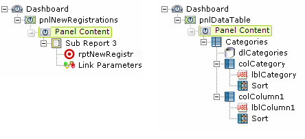
As shown above, left, content can be included as a sub-report, or be included directly in the Panel Content element or, as shown above, right.
![]() Inclusion of content as a sub-report, especially if there are many panels, is a very desirable approach: it keeps the main definition containing the dashboard from becoming overly long and complex and allows panel content to be developed and tested independently before being integrated into the dashboard. In addition, if you plan to export panel content, we highly recommend that you
use sub-reports.
And finally, for .NET applications, the use of sub-reports causes separate HTTP requests for each panel to be sent to the web server, where they are serviced by separate threads, resulting in improved performance.
Inclusion of content as a sub-report, especially if there are many panels, is a very desirable approach: it keeps the main definition containing the dashboard from becoming overly long and complex and allows panel content to be developed and tested independently before being integrated into the dashboard. In addition, if you plan to export panel content, we highly recommend that you
use sub-reports.
And finally, for .NET applications, the use of sub-reports causes separate HTTP requests for each panel to be sent to the web server, where they are serviced by separate threads, resulting in improved performance.
Each Panel Content element is an individual reporting environment and, as such, can have its own Default Request Parameters element, Local Data element, etc. If necessary, panels can be identified with the token @Function.InstanceID~.
Use the Panel Parameters Element
It's often desirable to let users change dashboard report criteria at runtime. This can be done using user input elements that are included within the panel content definition, or by using the Panel Parameters element, which allows the data entry feature to be de-coupled from the panel content.
In this way, user input elements are placed into a special pop-up panel. This approach is useful as it prevents user
input controls from permanently taking up valuable screen real estate.
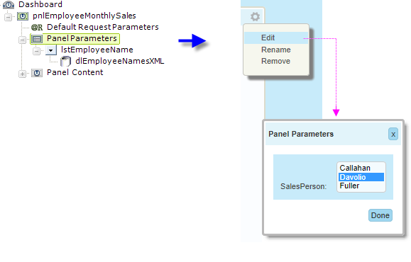
The images above illustrate how the Panel Parameters element is used in a report definition and how it looks on the screen. Notice the links in the upper right hand corner of the panel images:
- Click the Settings icon to display the settings menu.
- Click the Edit item to get the Panel Parameters panel to pop-up.
- Select or change the user input controls as desired. Click Done to close the panel, write the user input values to the Save File (discussed earlier) and refresh the panel's content using the new values.
- Or, click X to close the panel. If the Panel Parameter element's Refresh For Cancel attribute is True, the dashboard panel will be refreshed using the original values (i.e. no change); if the attribute is False (the default), the new values are used.
![]() The next time the application is run, the user input values are retrieved from the Save File and presented to the Panel as @Request variables. This allows the content definition to use them, for example, by embedding @Request.variable~ tokens in a DataLayer.SQL statement. Note that, if you're using a sub-report for your content, you will need to pass these Request variables
to it, using Link Parameters.
The next time the application is run, the user input values are retrieved from the Save File and presented to the Panel as @Request variables. This allows the content definition to use them, for example, by embedding @Request.variable~ tokens in a DataLayer.SQL statement. Note that, if you're using a sub-report for your content, you will need to pass these Request variables
to it, using Link Parameters.
Use the Refresh Element Timer
Dashboards are often used to display time-sensitive or transactional data and it's very useful to be able to update the dashboard panel contents periodically and automatically. This can be accomplished using the Refresh Element Timer element. This element uses AJAX techniques to automatically refresh one or more elements in a panel's content using an adjustable time interval.

Attributes for this element include:
- Element ID - Specifies the ID of the element that you want to periodically refresh. Multiple IDs, separated by commas, can be entered but the scope of each timer element is limited to its own panel. Multiple elements can also be refreshed by placing them under a Division element and specifying the Division element ID here. Do not specify elements that are children of Data Table elements (datalayers, columns, etc.)
- Refresh Interval - Specifies the amount of time, in seconds, between refreshes of the element specified in Element ID. Use caution when specifying a very short interval if a large number of users will access this dashboard: database server performance could be seriously impacted.
When there's a data table in the report being refreshed and it has Interactive Paging or Sorting elements, set the Data Table element's AjaxPaging attribute to True.
The Refresh Element Timer element works by re-running the panel's report with just those elements that are to be refreshed. The report runs using request parameters from 1) Input elements on the report, 2) LinkParams and 3) URL request parameters when Request Forwarding = True.
When debugging has been turned on for an application, you can view debug information generated for each Refresh Element Timer request. These appear as additional links at the bottom of the Debug Trace page. For more information, see Debug Reports.
Use Action.Add Dashboard Panel
The Action.Add Dashboard Panel element, used in other definitions with elements like data tables and Analysis Grids, adds specified content to a new dashboard panel which is added to a specified dashboard. A bookmark for the content can optionally be created by adding a Bookmark Linkback element beneath this action element.
Essentially the element works by allowing the developer to specify all of the necessary content in the current report that will be copied into the new dashboard panel. This includes the properties of the panel itself and any relevant parameters. On execution at runtime, the report definition containing the specified dashboard, and its supporting files, are edited to include the new dashboard panel and its content.
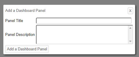
At runtime, when a user clicks on this element's parent element (Button, Label, Image, Event Handler, or Popup Option), a pop-up panel, shown above, is displayed soliciting a title and a description for the new Dashboard Panel, which is used in the Dashboard Configuration Page. Optional attributes allow default information, and a thumbnail image, to be specified by the developer.
Parameters
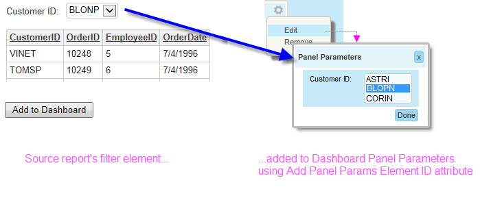
Action.Add Dashboard Panel includes a mechanism for copying these elements into the new dashboard panel as Panel Parameters, as shown above. The Add Panel Params Element ID attribute allows you to specify the IDs of the elements to be added as parameters.
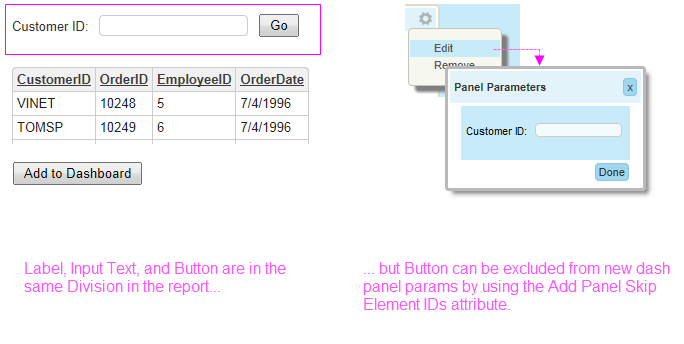
You can specify the ID of a Division or other container element and all of its contents will be added to the panel parameters, with the exception of any elements specified in the Add Panels Skip Element IDs attribute. This allows you to exclude, for example, a Submit button that's in a Div, along with Input elements, in the current report but which won't be needed in the dashboard parameters panel (which has its own Done button).
Token Handling
In anticipation of the need at runtime to "pass along" some tokens (i.e. don't resolve them now) associated with the new content into the new dashboard panel (where they will be resolved when the dashboard definition is run), a special token handling scheme has been provided:
In general, @Function tokens will not be resolved, but will be passed along with the content into the panel for resolution when the panel is viewed. This was done in anticipation that these tokens will most likely be used to provide date/time- or user-related information.
@Local tokens, specified by the developer in the Add Panel Local Data IDs attribute, will not be resolved and will be passed along. Multiple tokens can be entered in a comma-separated list. Tokens not listed will be resolved before the panel is created.
@Request tokens, specified by the developer in the Add Panel Request IDs attribute, will not be resolved and will be passed along. Multiple tokens can be entered in a comma-separated list. Tokens not listed will be resolved before the panel is created.
@Session tokens, specified by the developer in the Add Panel Session IDs attribute, will not be resolved and will be passed along. Multiple tokens can be entered in a comma-separated list. Tokens not listed will be resolved before the panel is created.
Security
If a value is entered in the Add Panel Security Right ID attribute, access to the resulting dashboard panel access can be controlled with Logi Security. This value should be ID of a security Right defined in the application's _Settings definition, under the Security element. This value is written into the panel's Security Right ID attribute and, with Logi Security enabled, only users with that Right will be able to see the new dashboard panel.
Note these two special conditions:
- When user rights come from Right From Role elements under the Security
 User Rights elements, and this element's Security Right ID does not match any of the Right IDs defined in the Settings definition, then the user does have access.
 - But when rights are instead derived from Rights From DataLayer or Rights From Roles elements, and the user does not have a matching Right, then the user does not have access.
Multiple Right IDs can be entered in a comma-separated list. The user will see the dashboard panel if he has any one of the Rights.
Attributes
The Action.Add Dashboard Panel element has the following attributes:
| Attribute | Description |
|---|---|
Add Panel Content Element ID | (Required) Specifies the ID of the element that will be added to the new dashboard panel. Only one ID is valid, multiple IDs are not allowed. However, you can specify the ID of a Division or similar container element and all of its contents will be added to the new panel. |
Dashboard Save File | (Required) Specifies the dashboard that will become the parent of the new dashboard panel. Provide a fully-qualified web server file path and file name, with .xml extension, for the target dashboard's existing Save File. Hint: This can be copied directly from the dashboard's Save File attribute. |
| ID | (Required) Specifies a unique element identifier. |
Add Panel Button Caption | Specifies the text inside the button, in the popup panel, that triggers the addition of the target content as a new panel in the specified Dashboard. Default: Add to Dashboard |
Add Panel Content Height | Specifies the height of the new dashboard panel content, in pixels. |
Add Panel Description | Specifies the new panel's default description, which will appear in the Dashboard Configuration Page. Users can change this text prior to executing the process. |
Add Panel Local Data IDs | Specifies the IDs of @Local data tokens that will be passed along, unresolved, to the new panel. @Local tokens not listed here will be resolved when the panel gets saved into the dashboard. Multiple token IDs can be entered as a comma-separated list. |
Add Panel Params Element ID | Specifies the ID of the element in the current definition that will be added to the new panel's child Dashboard Panel Parameters element. This is used to include Input elements and supporting data in the panel, accessible using the panel's Edit button. This can be the ID of a Division or other container element, causing all of its child elements to be included. Some of those child elements can be excluded by specifying their IDs individually in the Add Panel Skip Element IDs attribute. |
Add Panel Popup Caption | Specifies the title text shown in the popup panel displayed when the user clicks the Action.Add to Dashboard Panel element's parent element. |
Add Panel Request IDs | Specifies the IDs of @Request tokens that will be passed along, unresolved, to the new panel. These tokens will be resolved in the new panel's Default Request Params or Dashboard Panel Parameters. @Request tokens not listed here will be resolved when the panel gets saved into the dashboard. Multiple token IDs can be entered as a comma-separated list. |
Add Panel Security Right ID | Specifies the security Rights a user must have in order to access the new dashboard panel. Multiple Right IDs can be entered as a comma-separated list. Please see the Security section above for special conditions. |
Add Panel Session IDs | Specifies the @Session token IDs that will be passed along, unresolved, to the new panel. @Session tokens not listed here will be resolved when the panel gets saved into the dashboard. Multiple token IDs can be entered as a comma-separated list. |
Add Panel Skip Element IDs | Specifies the ID of one or more child elements of the element named in Add Panel Params Element ID that will be excluded from being added to the new Dashboard Panel Parameters. Multiple element IDs can be entered as a comma-separated list. |
Add Panel Title | Specifies the new dashboard panel's default caption. Users can change this text prior to executing the process. |
| Image | Specifies the file name of an image that will appear on the left side of the Add Panels section of the Dashboard Configuration page. For the best appearance, images should be less than 200 pixels wide. The file name can be selected from a list of the images in the _SupportFiles folder or be entered manually as a relative URL to a file within the same Logi application. URLs to external sites or applications are not valid. |
Multiple Instances | Specifies whether or not the new dashboard panel can be added multiple times to the same dashboard or dashboard tab. Default: False |
Security Right ID | Specifies the security Rights a user must have in order to use this Action element. Users without Rights that match Rights specified here will not be able to execute the action. Multiple Right IDs can be entered as a comma-separated list. |
With Bookmark Linkback
The optional Bookmark Linkback element can be added as a child of Action.Add Dashboard Panel:

As shown above, once you include the element and configure a few attributes, it will automatically add a link to the new dashboard panel which will run the target content with the request variables that were used in the original report.
You must provide the name for the Bookmark Collection (usually associated with a user) and provide a Caption, which is the text that appears as the bookmark link in the new dashboard panel. You can optionally decide to "run" the bookmark in a new window or selected window.
For more information about this feature, see .
Change Appearance with Themes and Style Sheets
The appearance of a dashboard can be changed easily by assigning a theme to your report. In addition, or as an alternative, you can change dashboard appearance using style.
The Dashboard element has its own Cascading Style Sheet (CSS) file containing predefined classes that affect the display colors, font sizes, button labels, and spacing seen when the dashboard is displayed. You can override these classes by adding classes with the same name to your own style sheet file.
The default Dashboard style sheet is: <yourAppFolder>\rdTemplate\rdDashboard\rdDashboard2.css
![]() Be sure to copy the classes you wish to override to your style sheet - do not change the classes in rdDashboard2.css
Be sure to copy the classes you wish to override to your style sheet - do not change the classes in rdDashboard2.css
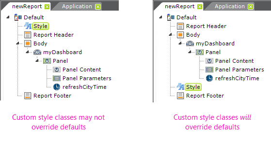
As shown above, to ensure that style classes cascade correctly, in your report definition your Style element should be lower in the element tree than the Dashboard element (the Style Sheet element has to be processed after the Dashboard element in order to override the default classes).
Here are some examples of specific classes, with their default values, that can be overridden by adding them to your project style sheet and then setting additional elements:
Change font size of all panel captions:
.rdDashboardTitleCaption {
font-size: 14pt;
}
Change pop-up parameters panel caption:
.rdPopupPanelTitleCaption {
font-size: 14pt;
}
Change color of the pop-up parameters panel "Done" button text:
.rdPopupPanelTitleCaption {
color: Red;
}
Many of the class names needed to override dashboard styling can be discovered by using your browser's development tools (press F12 in many browsers).
Change Appearance with Template Modifiers
The Dashboard element uses a "template file" to define certain element properties that are not otherwise available as attributes to the developer for modification. These include language- and culture-specific Caption attributes that you may want to change for locale-based reasons (or you may simply want to change the captions to better suit your application).
The Dashboard element's Template Modifier File attribute identifies a custom XML file developers can create containing elements that will override the same elements in the template file.
For example, the Dashboard template file:
<yourAppFolder>\rdTemplate\rdDashboard\rdDashboard2Template.lgx
contains several Label elements. One of them has an ID = "lblAddPanelsTitle"; this controls the title in the Add Panels selection list (shown earlier). The title for that selection list can be modified by changing the Caption associated with that Label element. To change the title from its default "Add Panels" to "Add New Dashboard Panels", create your own XML file, identify it in the Template Modifier File attribute, and add this code to it:
<TemplateModifier>
<SetAttribute ID="lblAddPanelsTitle" Caption="Add New Dashboard Panels" />
</TemplateModifier>
You can set the attributes for any number of elements in this file; examine the rdDashboard2Template.lgx file to learn the ID and Caption attributes available. The template modifier file can be in any folder accessible to the web application; if a fully-qualified file path is not provided in the Template Modifier File attribute value, then the application expects it to be is your project's _DataXMLs folder.
More detailed information about template modifier files can be found in Template Modifier Files.
Dashboard Change History
| Version | Dashboard Changes |
|---|---|
| 11.4.046 | Gallery File attribute and functionality added. |
| 11.2.040 | Dashboard and panel settings, parameters, and Add Panels re-designed. |
| 11.0.727 | Action.Add Dashboard Panel added to streamline insertion of targeted content into a new Dashboard Panel in a specified dashboard. Can be a child of Labels, Buttons, Images, Event Handlers, and Popup Options. New child element Bookmark Linkback can be used to save bookmark and add a link to it in the new dashboard panel. |
| 10.0.366 | Free-form Layout mode option added: resize and rearrange dashboard panels without being constrained by layout columns. |
| 10.0.259 | The Create a Dashboard wizard was added to Logi Studio's wizards. |
| 9.5.132 | Enhancements:
|
| 9.5.104 | Enhancement: maximum number of dashboard columns increased from 3 to 8. |
| 8.0.10 | Enhancements:
|