Report Author
This topic discusses the Report Author super-element which allows end-users to work with a dashboard-like interface to create their own basic reports at runtime.
- About Report Author
- Report Components
- Design Mode
- Add Visuals
- Component Settings
- Report Author Attributes
- Use Report Author
- Use Template Modifier Files
![]() The Report Author is not intended for use with Internet Explorer 7 or 8.
The Report Author is not intended for use with Internet Explorer 7 or 8.
About Report Author
The Report Author super-element was introduced in the Self-Service Reporting Module (SSRM) v1.1.41. The SSRM is an add-on module which is installed separately from Logi Info. Once installed, the Report Author element will be enabled in Logi Info. For more information about Logi Info add-on modules, see Introduction to Add-on Modules.
Reports created with Report Author can include charts, tables, images, labels, links, and PDF export links. Charts and tables, which are created using an Analysis Grid, are retrieved when using the Report Author from a "Gallery" file.
The Gallery file is created using the Analysis Grid's "Add to Dashboard" feature but without actually involving a dashboard - the data is simply saved to a file that isn't related to the usual Dashboard "Save" file. For more information, see Use the Analysis Grid - v11.3+.
Images can be included in Report Author reports by users by uploading files to a designated folder and selecting them during the report design process.
![]() The Report Author is often used with the Auto Bookmark element (see ), allowing all aspects of a report to be automatically saved as the user works with the report.
The Report Author is often used with the Auto Bookmark element (see ), allowing all aspects of a report to be automatically saved as the user works with the report.
The appearance of the Report Author user interface is controlled by any Theme or other styling you may care to apply.
Report Components
A Report Author report consists of the following components:
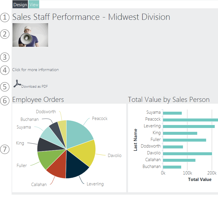
In View mode, the report components are displayed. They include:
- Text - You can enter text to be displayed in the report. Various font attributes like size can be set as desired.
- Image - You can upload an image for display in the report.
- Line Space -You can add blank lines to provide spacing and reading clarity.
- Link - You can add links to other reports or web pages.
- PDF Link - You can add a link that will download the report to PDF format.
- Split Row - You can add an empty row that's divided into multiple columns, then drag content into them.
- Visual - You select a visual from your Visual Gallery for display in the report.
You may have as many of these components in your report as you'd like.
Design Mode
At the top of the Report Author report, you can see the Design and View buttons, which let users switch modes.
In Design mode, they can work with components to create or edit a report. Components in the report will appear in a series of rows or panels:
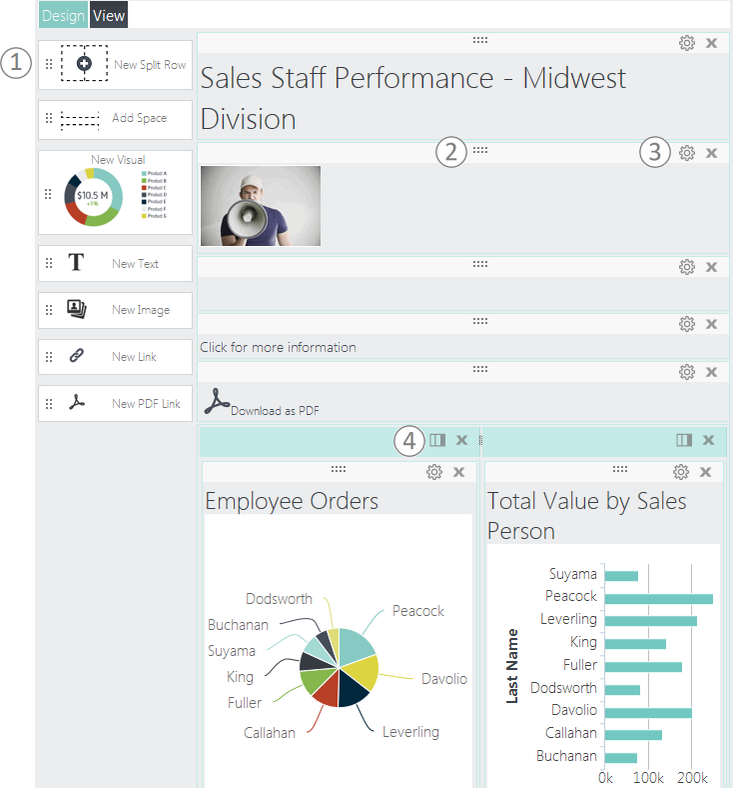
Design mode, shown above, let's users build or modify a report at runtime.
- Drag components from the Component Toolbox on the left onto the report canvas to add them.
- Re-arrange components on the canvas by clicking their drag icon -
 - and dragging them into a new location.
 - Configure component settings or delete them by clicking the "gear" or "x" icons.
- Add/Remove columns for the Split Row component by clicking the "columns" icon.
When you add a Visual component to the canvas, your Visual gallery will be displayed and you can select one or more visuals to be inserted into your report, as shown in the next section. Chart animation, resizing, hover highlighting, and quicktips will all be active in the report. Each selected visual will be inserted into its own separate panel.
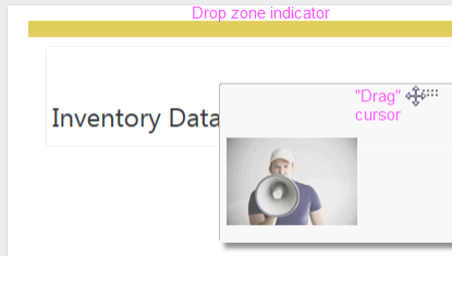
Components can be re-arranged by dragging their drag icon. As shown above, the cursor changes to a drag cursor and a "drop zone indicator" bar will appear as you drag the component toward a new location. If the drop zone is above or between other components, they'll move when the component is dropped.
An optional Report Author attribute setting, discussed later, allows you to control the default mode, View or Design, and whether editing is allowed.
Add Visuals
When the New Visual component is dropped on the report canvas, a gallery of panels is displayed:
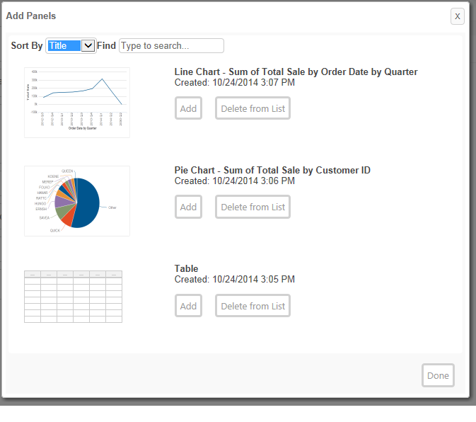
These come from the Gallery file and users can add one or more of them to the report by clicking each item's Add button. When done, each Visual will appear in its own panel on the report canvas. From there, they can be re-arranged or dragged into Split Row columns, as desired.
Component Settings
When other components are dropped on the canvas, their Settings panel is displayed. You can also edit the settings by clicking the component's "gear" icon:
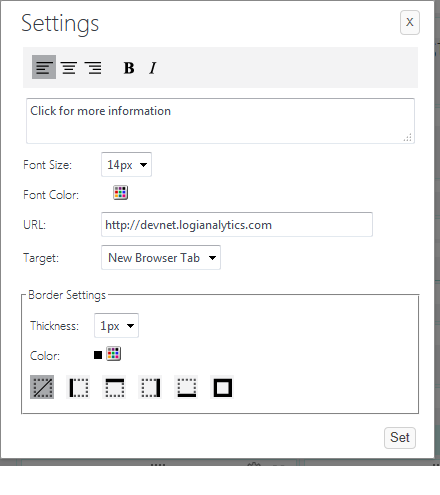
As you'd expect, the settings will be different for different components. The settings for the Link component are shown above.

The Text component has a similar Settings panel. However, for quick, text-only changes, users can edit the text "in place". They just hover their mouse over the right end of the component, as shown above, to see its special "pencil" icon, then click it to edit the text.
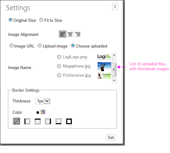
The Image component Settings panel, shown above, lets users include images using a URL or by uploading them. They can also select them from a list of uploaded images stored in a designated folder.
Report Author Attributes
The Report Author element has the following attributes:
Use Report Author
Using the Report Author element is very easy:
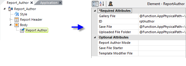
As shown above, add the Report Author element to your report definition. Examples of the attribute values are:
- Gallery File = @Function.AppPhysicalPath~\GalleryFiles\RAGallery.xml
- Save File = @Function.AppPhysicalPath~\GalleryFiles\RASaveFile.xml
- Uploaded File Folder = @Function.AppPhysicalPath~\GalleryFiles\images
As described earlier in the Attributes section, if Logi Security is in use, you could further differentiate the files and folders using the @Function.UserName~ token.
That's all you need to do. The Report Author element provides a huge amount of functionality with very little developer effort.
Use Template Modifier Files
The Report Author element uses a "template file" to define certain element properties that are not otherwise available as attributes to the developer for modification. These include language- and culture-specific Caption attributes that you may want to change for locale-based reasons (or you may simply want to change the captions to better suit your application).
The Report Author element's Template Modifier File attribute identifies a custom XML file developers can create containing elements that will override the same elements in the template file.
For example, the Report Author template file:
<yourAppFolder>\rdTemplate\rdReportAuthor\ReportAuthorTemplate.lgx
contains several Label elements. One of them has an ID = "lblSwitchToDesignModeTrue"; this controls one of the Design button captions. It can be modified by changing the Caption associated with that Label element. To change the caption from its default "Design" to "Create", create your own XML file, identify it in the Template Modifier File attribute, and add this code to it:
<TemplateModifier>
<SetAttribute ID="lblSwitchToDesignModeTrue" Caption="Create" />
</TemplateModifier>
You can set the attributes for any number of elements in this file; examine the ReportAuthorTemplate.lgx file to learn the ID and Caption attributes available. Other template files exist in the same folder for the Settings panels.
The template modifier file can be in any folder accessible to the application; if a fully-qualified file path is not provided in the Template Modifier File attribute value, then the application expects it to be in its _SupportFiles folder.
More detailed information about template modifier files can be found in Template Modifier Files.