Work with Analysis Grids
This topic introduces Logi Info developers to one of the "super-elements", the Analysis Grid. Like all super-elements, the Analysis Grid has its own built-in user interface and functionality. The Analysis Grid is a dynamic analysis tool that allows users to manipulate data, create charts, change table layouts, and much more, at runtime.
- About Analysis Grids
- Build an Analysis Grid
- Control Analysis Feature Access
- Add Formula Columns
- Layout: Select Columns for Display
- Arrange and Size Columns
- Set Sort Order
- Filter to Exclude Data
- Group and Sub-Group Data
- Aggregate Data
- Add Charts
- Add Crosstab Pivot Table
- Set Pagination Options
- Export Data
- Add Analysis Charts to Dashboards
- Save and Load Analysis Grids
- Customize Analysis Grid Appearance
The Analysis Grid was given additional functionality in Logi Info v11.3. For information about that, see Develop with Analysis Grids - v11.3 +.
About Analysis Grids
The purpose of the Analysis Grid element is to provide a complete package of data analysis capabilities in a single element, providing developers with the ability to provide their users with a lot of functionality, without having to build it themselves.
An Analysis Grid consists of separate panels for controls, configuration, tables, charts, and crosstabs. At runtime, users can manipulate the controls, creating data analysis and presentation on the fly. Logi Studio provides developers complete control over the content and layout of Analysis Grids, including restrictions on which controls are available to users. Here's what an Analysis Grid looks like, with both a table and a chart displayed, using the Professional Green theme:
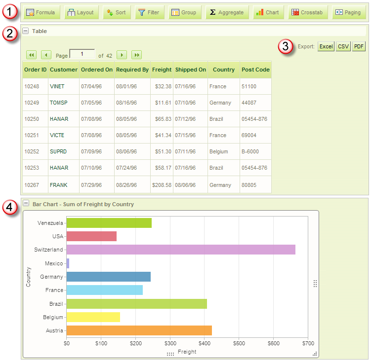
- The Controls Panel includes a set of "buttons" that allow the user at runtime to configure the data visualizations. The buttons can be individually shown or hidden, by the developer or based on conditional criteria.
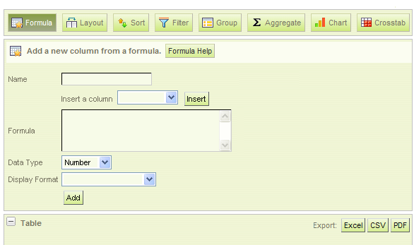
When a button is clicked, a configuration panel for that feature appears, as shown above, right below the Controls Panel. Clicking any button hides the panel. - A Table Panel contains a data table or crosstab table. The panel can be collapsed or expanded using the + and - buttons.
- Buttons are available to export the table data to Excel, CSV, or PDF. The buttons can be shown or hidden, by the developer or based on conditional criteria.
- Charts appear in a Chart Panel, when a chart has been configured. The panel can be collapsed or expanded using the + and - buttons.
![]() Chart Canvas charts, introduced in v11.2.040, are used by default by the Analysis Grid, in all new applications started in v11.2.040 and later. Older Logi applications that are upgraded to v11.2.040+ will use the classic static charts for their Analysis Grids. To force upgraded apps to use Chart Canvas charts, add the constant rdFavorChartCanvas
= True
to your _Settings definition.
Chart Canvas charts, introduced in v11.2.040, are used by default by the Analysis Grid, in all new applications started in v11.2.040 and later. Older Logi applications that are upgraded to v11.2.040+ will use the classic static charts for their Analysis Grids. To force upgraded apps to use Chart Canvas charts, add the constant rdFavorChartCanvas
= True
to your _Settings definition.
Beginning in v10.0.385, the Analysis Grid can be configured so that users can drag Table and Chart Panels into a different order at runtime.
Data tables displayed in the Analysis Grid can have all of the features typically available in Logi data table elements, including interactive paging and click-to-sort column headers. The data values can also be defined with Action elements to make them functional links, in order to drill-down or -through to detail data. Optional sort direction indicators can be enabled in the header.
![]() Do not use a SubReport element configured for Embedded mode to embed report definitions containing an Analysis Grid. Internal component naming and session variable conflicts will arise and the super-element will not work correctly. You must use IncludeFrame mode instead.
Do not use a SubReport element configured for Embedded mode to embed report definitions containing an Analysis Grid. Internal component naming and session variable conflicts will arise and the super-element will not work correctly. You must use IncludeFrame mode instead.
Retain User Settings
With all these configuration possibilities, it may be important for users to be able to save their settings between sessions. Their settings can be saved on the web server and made available to them during their next session (this is discussed in more detail below).
Retain Parameters
Do not send critical information to a page for use with an Analysis Grid via request parameters such as LinkParams. When an Analysis Grid's configuration is changed by the user at runtime and the element refreshes itself, request parameters may become unreliable. We recommend that any information that needs to be passed to a page for use with an Analysis Grid be sent using Session variables.
Retrieve and Use Data
Typically, like other Logi data tables and charts, the Analysis Grid uses a datalayer to retrieve and cache all of its data. In most cases, this provides adequate performance.
However, because users can create dynamic views of the data by manipulating the Analysis Grid interface, performance may suffer when working with large amounts of data. One alternate approach is to locate the data cache on a high-performance storage device. By default, the data cache is located in:
<yourLogiApp>\rdDataCache
but you can specify an alternate location, on a faster device, using the General element's Data Cache Location attribute, in the _Settings definition. If you use this alternative, note that it affects all datalayers in the application and you must ensure that the local ASPNET (IIS 5.x) or NETWORK SERVICE (IIS 6+) account has Full file-access permission to whatever device and location you choose.
The data cache performs its own clean-up periodically, after which, requests for the same data will cause the original datalayer to be re-run and the data cached again.
Beginning in v11, another performance-enhancing alternative is available if you're working with an Oracle, MySQL, or Microsoft SQL Server 2005+ database server and large data sets. In that case, you can use a new, special-purpose datalayer, DataLayer.ActiveSQL, to improve performance. In v11.0.519+, PostgreSQL was added to the list of supported database servers. Note that these database servers may support data object names that are case-sensitive, so the spelling of things like table names in queries may be case-sensitive.
This datalayer provides the basic SQL query needed to retrieve data but doesn't initially retrieve and cache
all of the result set. Instead, in response to runtime manipulations of the Analysis Grid interface, it dynamically modifies its own SQL query and retrieves the minimum required amount of data with each request. This increases the number and frequency of SQL queries the database server must handle (and, generally, does not prove to be a burden on the database server) but improves performance for the user.
Refresh
Action.Refresh Element uses AJAX technology to refresh portions of a report page, which produces a smooth update. However, we do not recommend that you use this element to refresh a Division which contains a "super element", such as an Analysis Grid. Because the super elements incorporate AJAX themselves, unexpected results can occur when AJAX calls are "nested" by this scenario.
Build an Analysis Grid
Studio includes a "Create an Analysis Grid" wizard that can get you started creating Analysis Grids (right-click the Body element in the element tree and select Element Wizards). The following discussion is designed to let you learn what goes into this interesting element.
Even though the Analysis Grid encapsulates its user-interface functionality, a developer still has to build the data retrieval and display configurations in his report definition. This example shows a typical set of Analysis Grid elements:
- An Analysis Grid element (only one can be used in a report definition, and they should not be used within Dashboards or Tabbed Panels).
- A DataLayer element, to retrieve the data used in tables and charts.
- One or more Data Table Column elements, to display data that will not be available for further analysis.
- One or more Analysis Grid Column elements, to display data that will be available for analysis (these do not require any child elements, such as a Label element, in order to display data).
- An optional Crosstab Comparison element, available in v10.0.319 and later, which displays column value differences in crosstab tables.
The Analysis Grid element itself has a large number of attributes and you can find out detailed information about them on the element's Element Reference page.
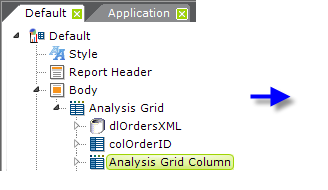
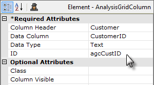
Analysis Grid Columns are used to display records from a specified column in the datalayer and they work with the grid's analysis features, however customization of them is limited. To add sub-tables and other types of content to an Analysis Grid, you can use standard Data Table Column elements. Using the two types of column elements together is a common practice.
To add an Analysis Grid Column:
- As shown above, select the parent Analysis Grid element and add an Analysis Grid Column element beneath it.
- Set the Column Header and ID attributes. The Column Header value is the text that appears above each column.
- Set the Data Column attribute to the name of a column returned by the data layer. Do not use tokens when the attribute name includes the word "column"; just provide the actual column name.
- Set the Data Type attribute to Text, Number, or Date. In v10.2.224+, tokens can be used here to set the data type.
Visibility
When a regular Data Table Column element is used in an Analysis Grid, its visibility can be controlled by conditional criteria. However, there is no similar mechanism for available for Analysis Grid Column elements, other than when using Logi Security and Security Rights.
Format
Data shown in an Analysis Grid Column element can be formatted using the element's Format attribute. In v10.0.189, the standard values for this attribute (available in a drop-down list) were expanded to include new Bars and BackgroundColorSlider values.
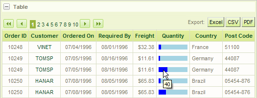
Selecting the Bars value will produce a horizontal bar chart within the column, as shown above. The actual data value will be automatically assigned to the element's Tooltip attribute.
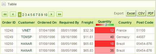
Selecting the BackgroundColorSlider value will display the column value using an imbedded Cell Color Slider, as shown above.
![]() Note that if you use the Analysis Grid Column element's Format attribute to change the appearance of data, for example, to cause a 1 or 0 data value to be displayed as "Yes" or "No", users who attempt to create custom formulae at runtime using that column may run into difficulties. They may not realize that the data is really, as in the example, a number instead of text.
In this case, user education about the actual underlying data values is the key to smooth operations.
Note that if you use the Analysis Grid Column element's Format attribute to change the appearance of data, for example, to cause a 1 or 0 data value to be displayed as "Yes" or "No", users who attempt to create custom formulae at runtime using that column may run into difficulties. They may not realize that the data is really, as in the example, a number instead of text.
In this case, user education about the actual underlying data values is the key to smooth operations.
Pre-Determine Column Availability
Developers can improve the overall usability of the Analysis Grid by predetermining which columns make good candidates for aggregation, grouping, and crosstabs and configuring accordingly.
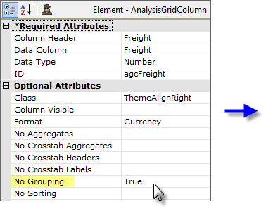
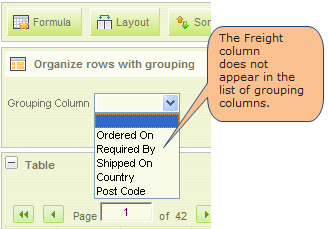
For example, assume that a grid column that displays freight charges is not a good candidate for grouping. Setting this column's No Grouping attribute to True removes this column from the list of available columns in the Row Grouping feature. Other attributes control inclusion in Aggregating and Crosstab features in a similar manner.
Set and Change Column Order
The top-to-bottom order of Data Table Column and Analysis Grid Column elements in your report definition dictates the initial left-to-right order of columns in the Analysis Grid data table.
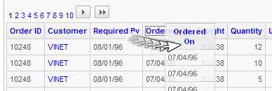
However, users can rearrange the Analysis Grid columns at runtime by dragging their column headers, as shown above. In versions prior to v11.0.416, this behavior has to be specifically enabled, using the AG element's Draggable Columns attribute (its default value is False). Note that, when the Draggable Columns attribute is enabled, the Layout feature (discussed on the next page) no longer includes its column-order controls.

Beginning in v10.0.428, columns that can be dragged will include a special icon in their headers, as shown above, although in later releases the icon may not be seen until the mouse pointer is hovered over it.
Use a More Info Row
In order to use a More Info Row element with an Analysis Grid, you must include a regular Data Table Column element as one of your AG columns (More Info Rows are shown using Action.Show Element, which is not a valid child of Analysis Grid Column elements). Use this column to display values, such as invoice, product, or ID numbers, that will not be used for further analysis in the Analysis Grid. Add the Action.Show Element element as a child of the this column; clicking the column's value will then show/hide the More Info Row.
For more information about the general use of More Info Rows, see Data Table Rows.
Control Feature Access
The Analysis Grid and Analysis Grid Column elements include attributes that allow developers to control access to features and data, and user interaction with the element's controls.
| Element | Attribute | Description |
|---|---|---|
Analysis Grid | Hide Aggregates | Controls whether or not feature buttons are visible in the menu row. Default value is False. |
Analysis Grid | Hide Exports | Controls whether or not the Export buttons are visible above the data grid. Default value is False. |
Analysis Grid | Security Right ID | If Logi Security is implemented, identifies the security Right required to view this element. Default value is no restriction. |
Analysis Grid | Draggable Columns | Available in versions prior to v11.0.416, specifies whether the user can re-arrange table columns by dragging column headers sideways. The new arrangement is "remembered" only for the user's current session. The default value is False. Draggable Columns can't be used when there are custom header rows with columns that span multiple columns. |
| Analysis Grid | Draggable Panels | Controls whether the user can re-arrange the vertical order of the major table and chart panels. The new panel arrangement is "remembered" only for the user's current session. The default value is True. |
Analysis Grid Column | Column Visible | Controls whether or not this column is initially visible. Default value is True. |
Analysis Grid Column | No Aggregates | Controls whether or not this column is included in the drop-down list of columns in the control panel for the feature. Default value is False. |
Analysis Grid Column | Security Right ID | If Logi Security is implemented, identifies the security Right required to view this column. Default value is no restriction. |
The table above lists the elements and attributes that can be used to control access. Users ability to view or analyze column data can be restricted based on criteria, including Rights, if Logi Security is implemented.
Add a Formula Column
This feature allows users to add Formula (calculated) Columns to the data table. New columns are appended to the right of the last column but can be relocated using the Layout feature or by dragging them at runtime.
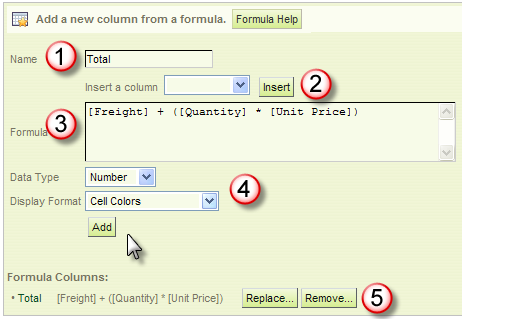
Click the Formula button to open the Formula Column configuration panel. The following steps are used to add a new Formula column to the grid.
- Enter the Name for the column to be added to the grid.
- If desired, select an available column and insert it into the Formula. Analysis Grid Column attributes allow you to exclude columns from this list.
- Enter the formula by typing; to prevent spelling errors, columns can be inserted by selecting them from the column list (2). Column names are enclosed within square brackets [ ] and typical math operator symbols, such as + - * / are used.
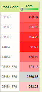
- Indicate the Data Type and Display Format. Formatting options include numeric and date formats and in-cell bar gauges and cell coloring (shown). Click Add to create the new column.
- As formula columns are created, they're added to the Formula Columns list. Use the adjacent Replace and Remove buttons to manage the list. Columns that have been added are now included in the list of available columns (2) for use in other formulas.
A formula entered into the Formula text box can make use of any of the intrinsic functions that we provide, as described in Intrinsic Functions and Operators, in combination with either the standard set of JavaScript or VBScript functions, depending on the scripting language option chosen for the Logi application. In addition, through the use of an external script file, custom script functions can be created and then referenced from within the Analysis Grid.
![]() When using DataLayer.ActiveSQL with an Analysis Grid, functions entered into the Formula Column configuration panel are not treated as scripting, as they are with other datalayer types. Instead they're passed directly through to the database for processing; therefore you need to ensure that the functions used are, in fact, supported by the database.
When using DataLayer.ActiveSQL with an Analysis Grid, functions entered into the Formula Column configuration panel are not treated as scripting, as they are with other datalayer types. Instead they're passed directly through to the database for processing; therefore you need to ensure that the functions used are, in fact, supported by the database.
The resulting column is appended to the right of existing columns, as shown above. Click the Formula button to hide the panel.
Layout: Select Columns for Display
This feature allows users to select which columns are displayed in the data grid. Click the Layout button to open the Table Layout configuration panel.

In v11.0.416, the Layout panel was reconfigured to show data table columns in a more compact arrangement, and select All and None buttons were added, as shown above. If the column's checkbox is checked, it will appear in the grid.
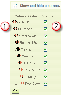
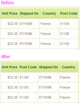
In versions prior to v11.0.416, the Layout panel looked similar to the one shown above.
- If the Draggable Columns attribute is not set to True, then column arrangement arrows, shown above, will be visible. Click on the left or right arrows beside any column to move it one column to the left or right. The icons for other columns will automatically adjust to show their new relative positions. Click OK to redraw the grid.
- Uncheck the Visible checkbox next to any column that you wish to hide; check the box to show the column again.
The effects of rearranging the last four columns are shown above, right. Click the Layout button to hide the panel.
As discussed earlier, another method of re-ordering columns is to drag them, if Draggable Columns has been enabled (versions prior to v11.0.416). Enabling Draggable Columns prevents the column ordering feature, discussed above in #1, from being displayed in the Table Layout configuration panel.
Arrange and Size Columns
Analysis Grid columns can be rearranged and/or resized at runtime by the user.
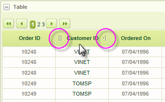
As shown above, icons appear when the mouse is hovered in a column header.
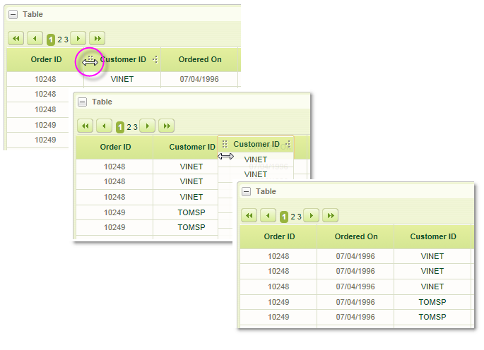
When the mouse is hovered over the left icon, as shown above, the cursor changes to left-right arrows and you can drag the entire column left or right to rearrange the column order. In some product versions prior to v11.0.519, there may be a Draggable Columns attribute that controls this feature.
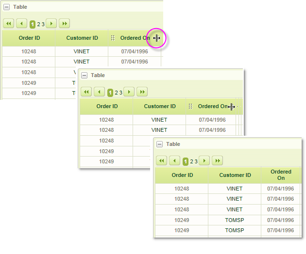
When the mouse is hovered over the right icon, as shown above, the cursor changes shape and you can drag it left or right, contracting or expanding the width of the column.
Set the Sort Order
This feature allows users to set the initial sort order of the grid columns.
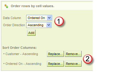
Click the Sort button to open the Sort Order configuration panel. The following steps are used to create initial sort order columns:
- Select a data column and a sorting order from the selection lists, and click Add to add the sort. Repeat as desired.
- As Sort Order columns are created, they're added to the list of sorts. Use the adjacent Replace and Remove buttons to manage the list.
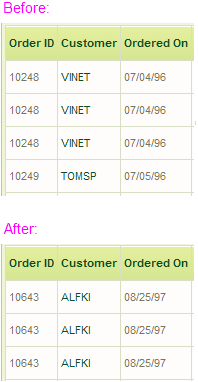
The columns are displayed initially in the sort order created, as shown above. Sorting on individual columns is still available, by clicking their column titles. Click the Sort button to hide the panel.
Filter to Exclude Data
This feature allows users to exclude data from the display grid using a variety of criteria.
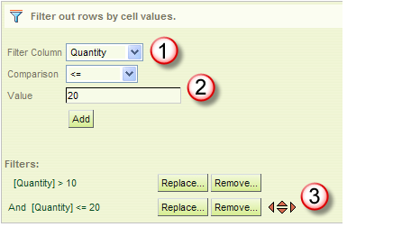
Click the Filter button to open the Row Filter configuration panel. The following steps are used to filter data values:
- Select the Column to be filtered from the column list.
- Set the filtering criteria by selecting a Comparison operator from the list, then enter a comparison Value and click Add.
- As filters are created, they're added to the filter list. Use the adjacent Replace and Remove buttons to manage the list.
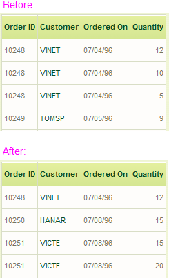
The results a simple filtering of the data can be seen in the example above. Comparison operators include = , <, >, <=, >=, <>, Starts With, Contains, Not Contains (v11.1.033), and Does Not Start With (v11.1.033).
The Starts With and Contains operators are useful for finding values at the beginning or within data (analogous to SQL WHERE clause operators LIKE and CONTAINS) and will work with both text and numeric data. The Not Contains and Does Not Start With operators work in the opposite manner. No wildcard characters are supported in these comparisons.
The Analysis Grid element's Filter Case Sensitivity attribute controls whether filters are case-sensitive or not. When its value is set to Insensitive, values are compared without regard to upper and lower case. When set to Sensitive, case must match exactly. Its default value is blank, in which case, the "Starts With" and "Contains" filter comparisons are case-insensitive, and the other comparisons are case-sensitive.
You can add multiple filters which are initially AND'd together. Clicking the And link to the left of a filter in the Filters list will cause the relationship to change to OR. If two or more filters are created, a set of four arrows appear by the Replace and Remove buttons. These can be used to re-order the precedence of the filters or to group them together in various arrangements using parentheses.
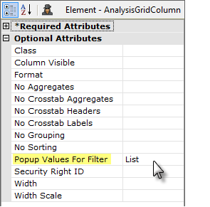
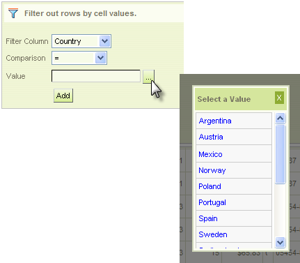
Analysis Grid Column element's have a Popup Values for Filter attribute, which can be set to List or Calendar. When a column that has this attribute set is selected in the Row Filter configuration panel, a browse button will appear, as shown above, right. Clicking this button will cause either a pop-up option list or calendar to appear, depending on the column's data type. The value for the filter can then be chosen from the pop-up.
Filter by Dates
If the Filter Column selected is a date type column, the interface presents different value controls:
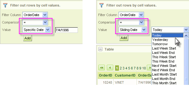
You may choose to filter on a Specific Date and enter it or, as shown above, right, you can filter using a Sliding Date value and select from a long list of relative dates (Last Month Start, 90 Days Ago, etc.)

In addition, the interface will now include the Date Range comparison option and different value controls, as shown above, for Starting and Ending dates, which can be used in a variety of combinations.
Click the Filter button to hide the panel.
Group and Sub-Group Data
This feature allows users to group and sub-group data in the display grid using a variety of criteria.
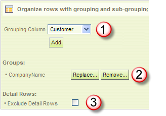
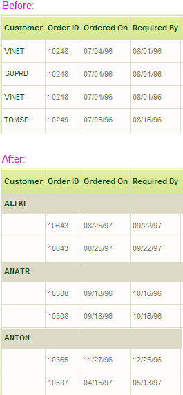
Click the Group button to open the Row Grouping control panel. The following steps are used to group data values:
- Select the Grouping Column for the first level of grouping from the list of columns. Click Add to group the data and redisplay the grid. Repeat as desired to create sub-groups.
- As groups and sub-groups are created, they're added to the Group list. Use the adjacent Remove and Replace buttons to manage the list.
- v10.0.405+: The Exclude Detail Rows checkbox can be used to hide the rows that have been grouped, "collapsing" each group into a single row in the grid's data table.
Beginning in v10.1.46, specifying a grouping on a column containing date-type data makes a control visible that allows you to select whether the grouping should be based on the Year, Quarter, Month, or Day parts of the data.
Click the Group button to hide the panel.
Aggregate Data
This feature allows users to aggregate data in the display grid using a variety of aggregation methods.
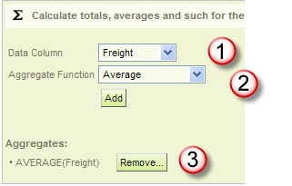
Click the Aggregate button to open the Aggregate configuration panel. The following steps are used to aggregate data values:
- Select the Data Column to be aggregated from the column list.
- Select the Aggregate Function. Options include: Sum, Average, Standard Deviation, Count, Distinct Count, Minimum, and Maximum. Click Add to aggregate the data and re-display the grid.
- As aggregates are created, they're added to the Aggregates list. Use the adjacent Remove button to manage the list.
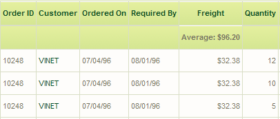
If Grouping is in effect, aggregate values will also appear at each grouping level in the data grid. Click the Aggregate button to hide the panel.
Add Charts
This feature allows users to add charts to their display. Charts will appear as new panels, below the table panel.
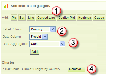
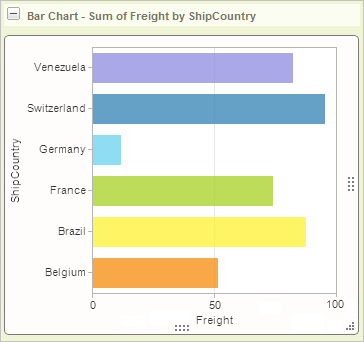
Click the Chart button to open the Charts configuration panel. Use the following steps to add a chart to your display:
- Click the button for the type of chart to be created. Additional controls will be displayed, depending on the chart type.
- Assuming a Bar chart was selected, select the Label Column. This provides data for the X-axis of the chart.
- Select the Data Column (Y-axis data, the "height" of each bar) and an Data Aggregation function. Aggregating options include: Sum, Average, Standard Deviation, Count, Distinct Count, Minimum, and Maximum. Click Add to generate the chart and refresh the display. If a table is visible, the chart is added in a panel below it.
- As charts are created, they're added to the Charts list. Use the adjacent Remove button to manage the list.
Note that the chart has "resizer handles" around it; you can click and drag them to resize the chart. In v10.2.424, these handles were changed to be hidden until the mouse pointer is over them.
Beginning with v10.2.314, Bar charts that are not time-oriented will automatically be shown in a horizontal format, as shown above. This allows greater clarity in reading the "x-axis" label text.
Data Forecasting
Beginning in v10.1.46, data forecasting was introduced for the Analysis Grid for Bar, Line, and Curved Line charts. Data forecasting is the process of generating values based on events that have not yet occurred. "Prediction" is a similar but more general term but forecasting refers to formal, statistical methods that use time series, cross-sectional, or longitudinal data to produce predicted data. Typically, forecasts are displayed most effectively on charts.
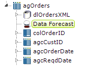
This feature is enabled by adding the Data Forecast element, as shown above, as a child of the Analysis Grid element. The Data Forecast element does not have any attributes.
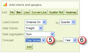
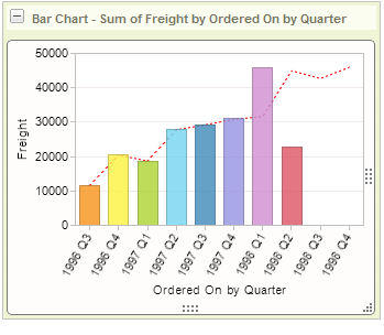
Once forecasting is enabled, the Chart configuration panel, shown above left, includes Forecast (5) and Cycle or Type (6) controls. In the example shown above right, quarterly freight costs have been forecast using a Time Series method and are displayed as a dotted line on the bar chart. The line suggests the values for two quarters which have not yet occurred (at least, in the data).
Forecasting analysis options include:
- Time Series (Time Series Decomposition), consisting of data in a natural, time-related order with a strong interval, where the Label Column data is of DateTime-type and the Data Column is a number. In the example shown, it's "Freight by Ordered On (aka Order Date) by Quarter".
- Regression, using one of several regression analysis functions. Regression analysis is recommended when the focus is on a relationship between a dependent value and one or more independent values. Available analysis functions include:
- Linear - used to calculate predictive values based on a trend line.
- Autoregressive - used when attempting to predict an output of a system based on previous outputs. The estimation technique used is based on "Burg's" method.
- Exponential, Logarithmic, Polynomial, or Power - non-linear types used to display the relationship between dependent and independent variables as a curvilinear function, which may provide more accuracy than a linear regression.
For more information, see Logi Resources.
Quicktips
Also beginning in v10.1.46, Analysis Grid charts include a feature called Quicktips:
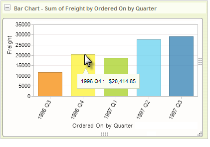
Quicktips, shown above, automatically provide a small, popup "balloon" at the cursor location, containing the data relevant to the part of the chart indicated by the cursor. Developers do not need to do anything to enable Quicktips.
Click the Chart button to hide the configuration panel.
Add a Crosstab (Pivot) Table
This feature allows users to add a Crosstab (also called a Pivot) table to their display. Crosstabs will appear as new sections, below the data grid. Two buttons (- and +) allow the sections (including the data grid) to be made hidden or visible but the order of the sections cannot be changed (data grid will always be first).
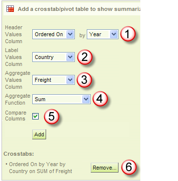
Click the Crosstab button to open the Crosstabs configuration panel. Use the following steps to add a crosstab to your display:
- Select the column that will provide the values to be shown horizontally, as columns, across the top of the crosstab table. Additional controls may appear depending on the data type of the selected column.
- Select the column the will provide the values to the shown vertically, as rows, down the left side of the crosstab table.
- Select the column that will be aggregated to produce the values in the crosstab table.
- Select the aggregating function (Sum, Average, Standard Deviation, or Count) to be applied to the values selected in Step 3.
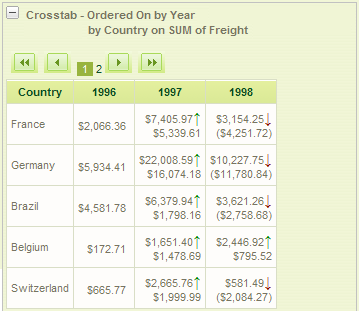
- The Compare Columns checkbox is only available in v10.0.319 and later, and only visible if the Crosstab Comparison element has been added to the Analysis Grid. Check it to cause the difference between column values to be displayed, along with indicator arrows, as shown in the output example.
Click Add to generate the crosstab table. If a table or charts are already visible, the crosstab is added in a panel below them - As crosstabs are created, they're added to the Crosstab list. Use the adjacent Remove button to manage the list.
Click the Crosstab button to hide the configuration panel.
Set Pagination Options
This feature allows users to determine how many rows of data will appear in the data table:
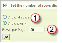
Click the Paging button to open the Paging configuration panel. The default values are shown above. Use the following steps to set the pagination of your data display:
- Select the paging option: Show all rows will display all of the data at once in the data table; Show paging will display a subset of rows and also include the paging controls. Caution: selecting all rows can result in a length delay while data is retrieved. Beginning in v11, the developer has the option to hide this radiobutton from end users by setting the Analysis Grid element's Disable Show All Rows attribute to True.
- If Show paging has been selected, enter the number of data rows to display per data table page. If the developer has set the Analysis Grid element's Page Row Count attribute, that number will appear here as the default, otherwise a default value of 20 rows will appear. Click OK to refresh the display.
When paging is turned on in this manner, three styles of paging controls are available, depending on how the developer configures the Analysis Grid element in the report definition:

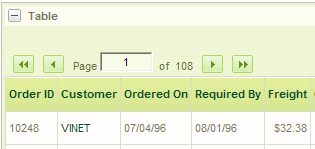
If the Analysis Grid element's Show Page Number attribute is set to True, or is left blank, the navigation controls, with page number display and input, as shown above, will appear.
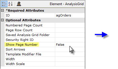
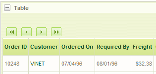
If the Show Page Number attribute is set to False, the navigation buttons will appear, as shown above, but without a page number.
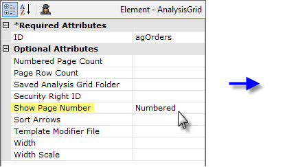
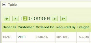
And, finally, if the Show Page Number attribute is set to Numbered, the navigation buttons will appear, as shown above, along with a list of page numbers in the style of web search engine results. In addition, two other attributes will become active: Numbered Page Count, which determines how many numbers will be in the list (default = 10), and Current Page Class, which allows the number for the current page to be styled (color, size, background, etc.) differently from the rest.
Click the Paging button to hide the configuration panel.
Export Data
The Analysis Grid can be configured by the developer to include three buttons that allow you to export data to other formats: Excel, CSV, and PDF:
![]()
In all cases, the exported data is written to a temporary file which is then opened in the target application for display, manipulation, printing, or retention.
Temporary files are written to the rdDownload folder within your application project folder and you should ensure that the local ASPNET or NETWORK SERVICE account has Write permissions to that folder.
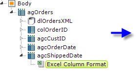
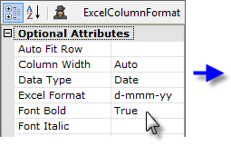
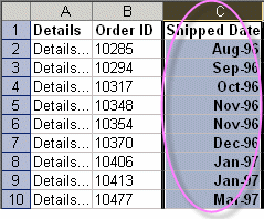
Exporting data to Microsoft Excel format is a key feature of Analysis Grids, and developers can optimize Excel exports by adding an Excel Column Format element to each grid column, as shown above. This provides developers with full control over the layout and appearance of exported data in the worksheet. The element's Data Type attribute is especially useful for ensuring that data is correctly formatted when it arrives in Excel. There are no export-specific elements for the other export formats.
Export Threshold
When working with very large data sets, exports may not be practical. In v11, the Max Rows Export attribute was added; it specifies the maximum number of data rows that can be exported. When the number of rows in the Analysis Grid's main table is equal to or less than this value, exports will be enabled; if the number of rows exceeds this value, exports are disabled. This allows developers to prevent users from running export requests that will take an unacceptable amount of time. The default value for this attribute is 100,000 rows.
At runtime, users can reduce the number of rows in the Analysis Grid's main table, and thus enable exports,
by adding one or more Analysis Grid filters.
Add Analysis Grid Charts to Dashboards
An exciting new level of interaction between the Analysis Grid and the Dashboard element was introduced in v10.0.151: the ability, at runtime, to let users working with an Analysis Grid in one report generate a chart, then add that chart as a new panel in an existing Dashboard in another report.
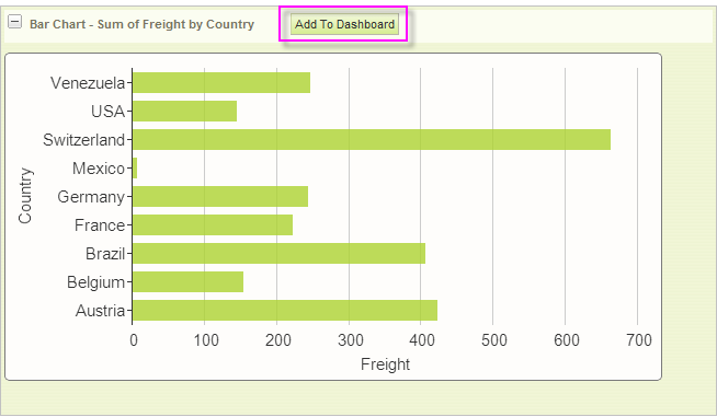
When properly configured, Analysis Grid charts will display an Add To Dashboard button, as shown above.
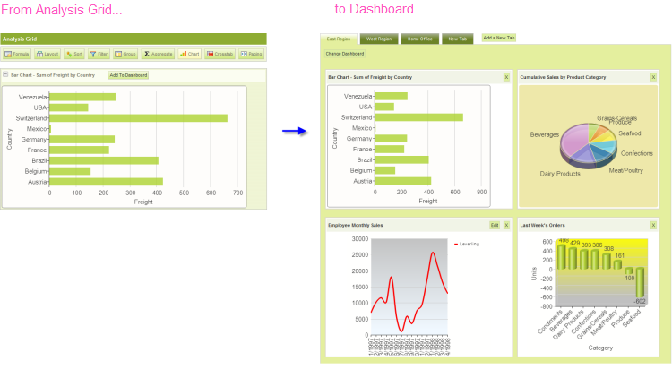
When the button is clicked, the chart, with its resizing control, is added as a new panel in the Dashboard, as shown above. When the resizing control is used to resize the chart, the widths of the dashboard columns and other panels will adjust dynamically.
Behind the scenes, when the button is clicked, the Analysis Grid writes the underlying XML for its chart into the Dashboard's configuration file (its "Save File"). In the Dashboard, the chart is inserted at the top of Column 1; if Dashboard tabs are being used, the insertion occurs in the currently active tab.
Just before panel insertion, the user will be prompted for the Panel Title (with the chart title from the Analysis Grid provided as a suggestion) and a description for display on the Configuration Page.
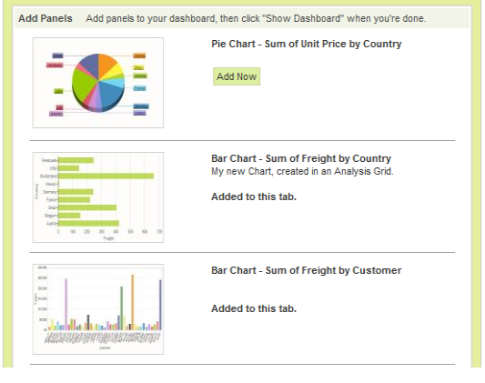
The new chart panel thereafter appears in the Dashboard Configuration Page, as shown above, just like any other panel, complete with a thumbnail image. The new panel can be removed from the visible dashboard panels and from the configuration page entirely, using the usual controls.
The user can insert multiple charts into a Dashboard using this technique.
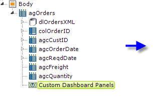
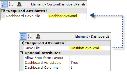
In the report definition, the developer makes this functionality available by adding a Custom Dashboard Panels element, shown above, beneath an Analysis Grid element. Its Dashboard Save File attribute value should be set to match the target dashboard's Save File attribute value.
![]() The Save File attribute values shown above have been shortened for visual clarity. However, a fully-qualified path and file name, with .xml extension, is required, so a realistic attribute value would be something like:
The Save File attribute values shown above have been shortened for visual clarity. However, a fully-qualified path and file name, with .xml extension, is required, so a realistic attribute value would be something like:
@Function.AppPhysicalPath~\DashFiles\DashbdSave.xml
and the account the Logi application runs under (in Windows, ASPNET or NETWORK SERVICE) would be given Write permissions to the "DashFiles" folder. For experimentation purposes, you can use the rdDownload folder, for which appropriate permissions already exist (but its contents are periodically deleted, so don't use it for anything but experimentation).
Dashboard Save Files are often named using a token, such as @Function.UserName~, in order to create personalized dashboard configurations and, in that case, the Custom Dashboard Panel attribute would use the same token.
For more information about Dashboards, see Introduction to the Dashboard.
Save and Load Analysis Grids
As mentioned earlier, it may be important for users to be able to save their Analysis Grid configurations between sessions. Their configurations can be saved on the web server and made available to them during their next session. Developers can implement this behavior with a simple Process definition. The following examples illustrate how to save and manipulate grid settings.
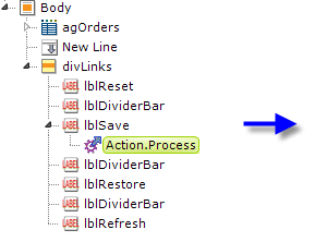
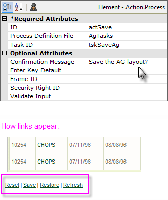
The original Analysis Grid example definition is shown above with a set of Label and Action elements added, beneath their own Division. The actSave element attributes point to a Process definition task, tskSaveAg.
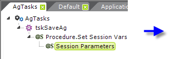

To create the task:
- In a Process definition, add a Task element ("tskSaveAg").
- Below it, add a Procedure.Set Session Vars element ("getAgID").
Below that, add a Session Parameters element and set its attributes as shown above. The GUID token provides a random 48-character number for use as a unique identifier. Remember: the session parameter name is case-sensitive!
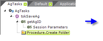
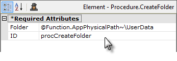
Next, add to the task a Procedure.Create Folder element and set its attributes as shown above.
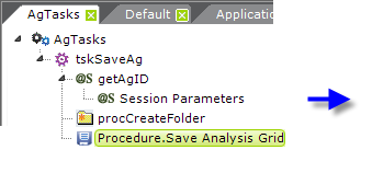
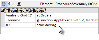
Add a Procedure.Save Analysis Grid element to the task and set its attributes as shown above. The full Filename value is: @Function.AppPhysicalPath~\UserData\@Session.AgID~.xml
Note that the session variable created from the GUID token earlier is now being used as the file name; use of a session variable allowed us to "pass" the value through the task from an earlier procedure to this one.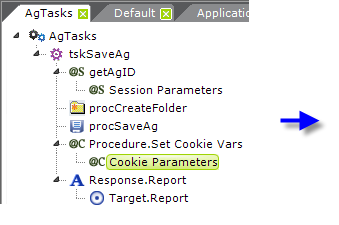

- Add a Procedure.Set Cookie Vars element to the task. Below it, add a Cookie Parameters element and set its attributes as shown above. This stores the name of the Analysis Grid settings file on the user's computer; the cookie will be used in future sessions to open the find and restore the settings.
- Add a Response.Report and Target.Report element to the task to return processing to the report definition containing the Analysis Grid.
Cookies are useful when the user is unknown to the server and session information is unimportant. If authentication is integral to an application, developers can use strategies such as tying a saved Analysis Grid filename to a user ID and storing this information in a database. Developers can also create a list of saved Analysis Grids that users can access from any workstation.
Special Query String Parameters
Logi Studio provides developers with three special query string parameters to manipulate Analysis Grids:
- rdAgReset - Set to True to revert the Analysis Grid back to its original, unmodified state
- rdAgLoadSaved - Set to the name of an XML file (with .xml extension) that contains saved Analysis Grid settings
- rdAgRefreshData - Set to True to refresh the Analysis Grid with current data from the data store, while preserving user configurations.
This example shows how to restore saved Analysis Grid settings using two of these parameters:
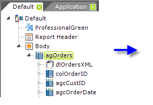
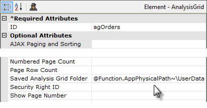
First, select the Analysis Grid element, as shown above, and set its Saved Analysis Grid Folder attribute to the path to the folder where we earlier saved the grid configurations.
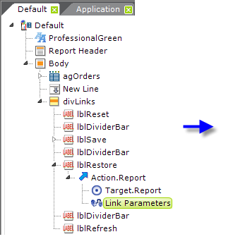

Then, look at the "lblRestore" element in the example shown above. The Target.Report element is set to the current report and the Link Parameters element defines one of the special parameter as shown. When the Restore link is clicked, the report will be called and the parameter passed to it as in the query string. The Analysis Grid settings will be set to those in the saved settings file (whose name was saved as a cookie on the user's computer in the previous example) and the datalayer will be run again to get fresh data, without resetting any of the configurations the user has made with the Analysis Grid controls.
A similar technique can be used to create the "reset" functionality, using the rdAgReset parameter, which clears any user settings and returns the Analysis Grid to its default state.
Customize Analysis Grid Appearance
Analysis Grid appearance can be changed most easily by applying a theme to the report definition. The screen shots in this document were taken with the ProfessionalGreen theme applied.
Changing Appearance Using Style Classes
Analysis Grid appearance can also be customized using style classes and Info Studio provides the following standard style sheet for all Analysis Grids:
<YourAppFolder>\rdTemplate\rdAnalysisGrid\rdAgStyle.css
Developers can override classes in this style sheet by copying them into their own application style sheet and modifying them there.
![]() Do not make changes in the standard style sheet in the rdTemplate folder!
Do not make changes in the standard style sheet in the rdTemplate folder!
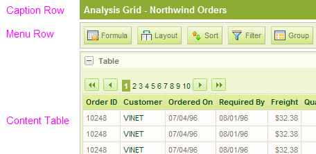
The three general Analysis Grid areas referenced by the style sheet classes are shown above.
| Class | Description |
|---|---|
| rdAgCaptionRow | Applied when the Caption attribute is set for the Analysis Grid element. |
| rdAgHeaderRow | Applied to the header row created when users add aggregate values to the Analysis Grid. |
rdAgGroup0HeaderRow | Applied when users add a grouping column. |
rdAgGroup1HeaderRow | Applied when users add a second grouping column. |
rdAgGroup2HeaderRow | Applied when users add a third grouping column. |
rdAgContentRow | Applied to each row of the content table. |
| rdAgContentTable | Applied to the entire content table. The content table contains all the GUI controls that allow users to modify the Analysis Grid. |
| rdAgContentHeading | Applied to content in the first row of the content table. |
| rdAgContentCell | Applied to each cell of the content table. |
| rdAgAlignRight | Applied to various Analysis Grid content such as the export controls, aggregate values and cross-tab value columns. |
| rdAgCommand | Applied to the Analysis Grid buttons. |
| rdAgError | Applied to error messages produced by the Analysis Grid. |
| rdAgImage | Set a zero border and margin for images. |
The table shown above lists the classes found in rdAgStyle.css and provides a short description of how each class is applied to the Analysis Grid. Developers can add/remove/edit any of the properties for each class.
Change Appearance Using Template Modifiers
The Analysis Grid element uses a "template file" to define certain element properties that are not otherwise available as attributes to the developer for modification. These include language- and culture-specific Caption attributes that you may want to change for locale-based reasons (or you may simply want to change the captions to better suit your application).
The element's Template Modifier File attribute identifies a custom XML file developers can create containing elements that will override the same elements in the template file.
For example, the Analysis Grid template file:
<yourAppFolder>\rdTemplate\rdAnalysisGrid\rdAgTemplate.lgx
contains several Label elements. One of them has an ID of "lblInstructCols"; this controls the "help text" that is displayed when the Layout icon is clicked. This text can be modified by changing the Caption associated with that Label element.
To change the text from its default "Reorder and hide columns" to "Rearrange and hide columns", create your own XML file, identify it in the Template Modifier File attribute, and add this code to it:
<?xml version="1.0" encoding="UTF-8"?>
<TemplateModifier>
<SetAttribute ID="lblInstructCols" Caption="Rearrange and hide columns"
</TemplateModifier>
You can set the attributes for any number of elements in this file; examine the rdAgTemplate.lgx file to learn the ID and Caption attributes available. The template modifier file can be in any folder accessible to the web application; if a fully-qualified file path is not provided in the Template Modifier File attribute value, then the application expects it to be is your project's _DataXMLs folder.
For more information about template modifier files, see Template Modifier Files.
This concludes our topic. Analysis Grids offer a dynamic way for users to analyze data interactively at runtime and is a very useful part of the Logi Analytics tool set.