Action.Show Element
The Action.Show Element element is used in Logi reports to show or hide sections of a report or elements within it. Using DHTML techniques, this element gives the user dynamic control over the content of the page and is very useful.
- About Action.Show Element
- Usage Example: Show/Hide Divisions
- Usage Example: Show/Hide a More Info Row
About Action.Show Element
Like most Action elements, Action.Show Element is the child of a parent element such as Label, Image, or Button element, and is activated when its parent element is clicked.
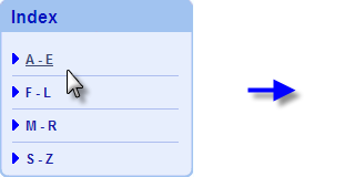
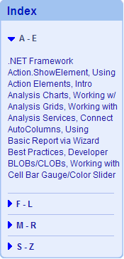
The example shown above, from DevNet's Developer Library Index, shows that clicking the "A - E" link on the left results in the Index panel expanding to reveal links for the documents in that category. Clicking it again will collapse the panel back to its original state.
This is accomplished by placing the document links within a Division element; clicking the A-E link activates an Action.Show Element element that alternately shows or hides the division. The background images are applied using style and automatically expand or collapse to fill the space that the text requires.
The Action.Show Element element's Element ID attribute determines which element (the "target" element) will be affected when the Action.Show Element is activated. Action.Show Element works by overriding the Show Modes attributes of the target element. Multiple target elements can be specified in a comma-separated list and you can independently assign the desired action (show or hide) to each element in the list by adding :Show or :Hide after the element ID. Note that these terms are case-sensitive; you must use ":Show", for example, not ":show". In addition, if these explicit actions are specified, the usual "toggle" effect will not work. In other words, clicking on a link that calls Action.Show element with <ElementID>:Show will show the element, but another click on the same link will not hide it.
Action.Show Element's Display attribute determines whether a target element will be visible or invisible; there are three values that can be selected: Show (visible), Hide (invisible), or the default Toggle (opposite of current state).
The Show Element Effect attribute, introduced in v10.0.85, can be set to FadeIn and the target element will be shown with a brief transparency effect, so it appears to "fade-in".
Unlike other actions, Action.Show Element does not have a specific Target child element. No links can be made to another report definition and only elements within the same definition can be controlled.
Usage Example: Show/Hide Divisions
This example provides the functionality shown in the previous section: showing and hiding links in the DevNet Developer Library Index. The example actually includes three links that can be clicked to activate the Action.Show Element element: a "right arrow" image, a "down arrow" image, and the A-E text link itself.
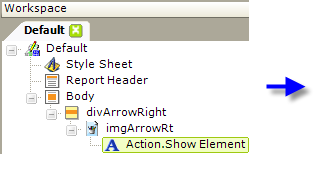
- Add a Division element to contain the "right arrow", as shown above. Set its Show Modes attribute to All.
- Beneath it, add the actual right arrow image and beneath it, an Action.Show Element element.
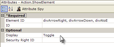
- We'll have three divisions that are affected by the Action.Show Element element, so all of their element IDs are entered, as a comma-separated list, into the Element ID attribute, as shown above.
- The Display attribute is set to Toggle so that we get alternating show/hide behavior.
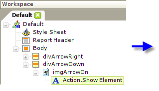

- Add a Division for the "down arrow" and repeat the previous steps, as shown above. Set the new division's Show Modes attribute to None. Be sure to give the new division an Element ID that is in the comma-separated list of element IDs for the Action.Show Element element.
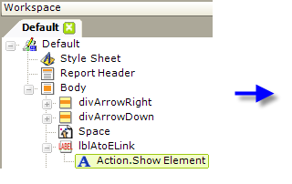

- Add Space and a Label elements, as shown above.
The Label will become the A-E text link, so add an Action.Show Element element beneath it and set its attributes as shown. Be sure to specify the IDs of the three divisions in a comma-separated list in the Element ID attribute.
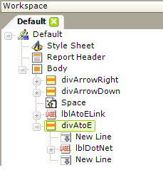
- Finally, add the last Division element, as shown above, and beneath it add the detail text to be shown and hidden. Set the new division's Show Modes attribute to None. Be sure to give the new division an Element ID that is in the comma-separated list of element IDs for the Action.Show Element elements.
By setting the Show Modes attributes to All or None, you determine which divisions will be initially shown and which hidden. The Action.Show Element element works by overriding these Show Modes settings. The values All and None are just arbitrary text, so you can use whatever values make sense in the specific situation.
Preview the report and you'll see how the divisions are shown or hidden when the images or link are clicked.
Usage Example: Show/Hide a More Info Row in a Data Table
This example illustrates the use of the Action.Show Element element to show and hide a More Info Row within a data table. For more information, see Data Table Rows.
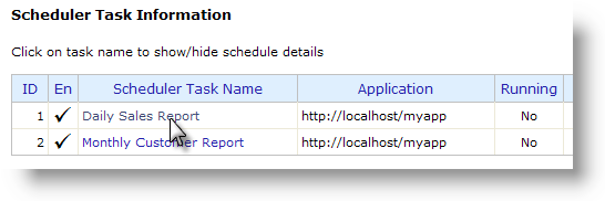
In the image shown above, the Logi Scheduler Console sample application displays two scheduled tasks. The Task Name is a link that can be clicked to show detail information,
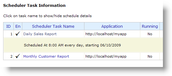
as shown above. Clicking the Task Name link again hides the detail information. This is a handy way of making lots of information available in a data table when you have limited horizontal space on the page or a large number of data columns. Here's how this was done:
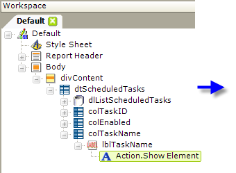
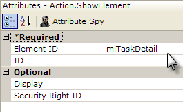
- In the example report definition above, an Action.Show Element element has been added as the child of the Label element used to display the data in the table's Task Name column, making the data itself a link.
- The new element's Element ID attribute value has been set to the name ("miTaskDetail"). This name will also be given to a More Info Row element added in the next step.
The Display attribute's default value is Toggle, so it has been left blank.
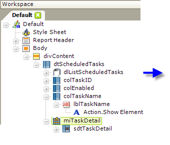
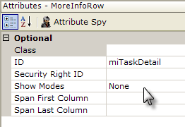
- Next, a More Info Row element has been added to the table, as shown above.
- Its ID has been set to match the ID used in the previous step ("miTaskDetail") and its Show Modes attribute has been set to an arbitrary text value, None.
In v11.0.212, the More Info Row Column element was introduced. This element can be used to closely align More Info Row columns with the columns of its parent table. When this element is used, the More Info Row element's Span First Column and Span Last Column attributes are left blank, and the More Info Row Column element's Column Span attribute is used instead to control spanning of parent table columns.
In v11.0.313, the More Info Row element was given a Condition attribute. This attribute allows you to conditionally include the element, for greater control over when the element can be seen, primarily when the More Info Rows are displayed by default.
Now, when run, the report will display its data table and clicking the Task Name will insert a row of additional detail information right below the row that was clicked, as desired. A second click will hide the detail information.