Themes
Our stock themes are designed to help developers instantly apply a consistent "look" to their applications. This topic discusses themes, how to apply them, and how to create them.
- About Themes
- Select a Theme in Studio's Wizard
- Add Themes Manually
- Themes and Style Sheets
- Create Your Own Themes
- Theme Release Notes
About Themes
Several standard themes are included with Logi Info and Logi Report for your use (and are also available here on DevNet in the Sample Themes library). These themes include a collection of graphic images, a style sheet, and a template modifier file, which impart a specific appearance to a Logi application.
Themes do the work for you, setting appearance attributes for charts and data tables, and for complex super-elements such as the Analysis Grid, generally making it easy to produce great looking reports without an in-depth knowledge of Cascading Style Sheets. You can easily switch between themes in order to experiment with them.
As of this writing the standard themes shipped with the products include:
| Theme | Description | Introduced in |
|---|---|---|
| A black background and dramatic colors make this an unusual theme. | 10.0.31 | |
Offers a clean look that's "easy on the eyes". | 10.2.424 | |
Professional Blue | Gradients and a polished look, with colors grouped in the blue spectrum. | 10.0.31 |
Professional Green | Gradients and a polished look, with colors grouped in the green spectrum. | 10.0.31 |
A modern, professional, and attractive look that works well with both desktop and mobile displays. | 11.3.049 | |
| A simple, understated look. | 10.0.31 | |
Simple Blue | A stronger appearance with flat blue color scheme. | 10.0.31 |
A bold theme designed to look good on mobile devices. | 10.2.424 |
![]() Note that standard themes may be updated when a new product version is released, and this may produce changes in the appearance of applications that are upgraded to the new version. See the Theme Release Notes section below to determine when the standard themes have been updated. The section also includes information about how to revert to older theme versions if you have upgraded
your Logi application but prefer the older theme appearance.
Note that standard themes may be updated when a new product version is released, and this may produce changes in the appearance of applications that are upgraded to the new version. See the Theme Release Notes section below to determine when the standard themes have been updated. The section also includes information about how to revert to older theme versions if you have upgraded
your Logi application but prefer the older theme appearance.
Use Beyond Appearance
Themes, however, are not "just a pretty face". Because themes are capable of altering your report definitions, they can be used for purposes unrelated to application appearance. For example, they can be used to set default attribute values. This can be very useful if you consistently use the same set of attribute values for, say, data tables, and you want to apply them as defaults every time you start a new definition or application. See the final section in this topic for more information.
Select a Theme in Studio's Wizard
When you use the New Application and Select Theme wizards in Studio, one of the steps is the selection of a theme:
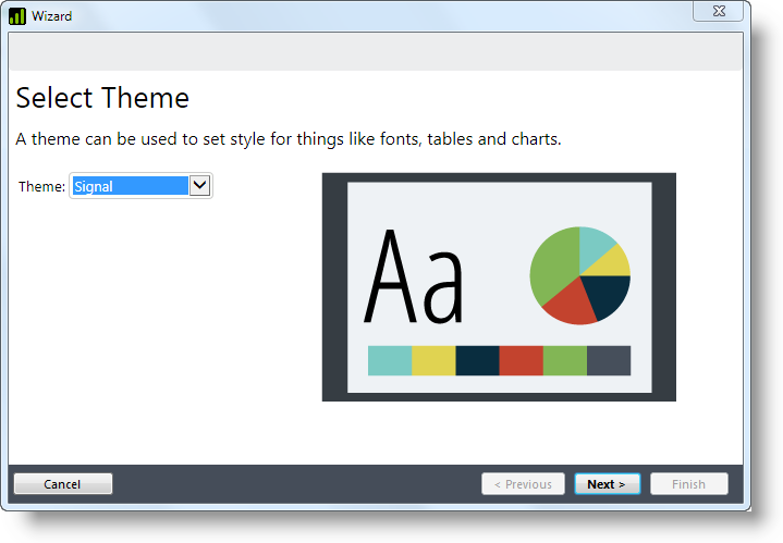
Just select a theme from the list and it will be applied automatically to your new application.
Add Themes Manually
You can also apply a theme manually. A theme can be applied at the application level (which is what the wizard does):
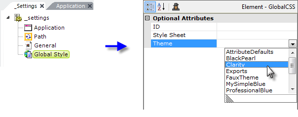
As shown above, to apply a theme to the application as a whole, add a Global Style element to the _Settings definition. Then set its Theme attribute to the name of one of the available themes. All reports in the application will have the theme applied to them.
To apply a theme to an individual report definition:
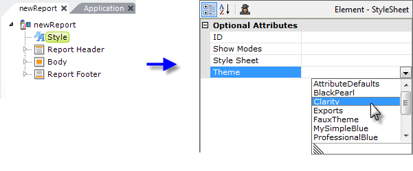
As shown above, add a Style element to the report definition. Then set its Theme attribute to the name of one of the available themes. The report will have the theme applied to it.
Themes and Style Sheets
When a theme is selected for a definition or application, it automatically applies a specific appearance to super-elements, like the Analysis Grid. In addition, the theme makes available a standard set of styleclasses that developers can apply to regular elements. This can save a lot of time and helps to create a consistent appearance.
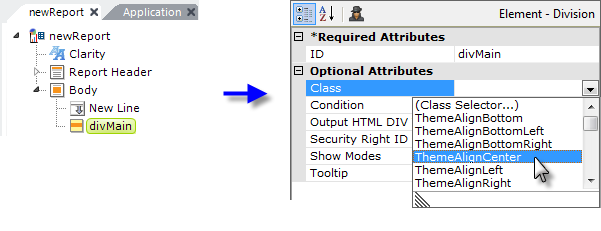
In the example shown above, we see a definition that has had a theme applied to it. A Division element has been selected and one of the theme-supplied style classes is being assigned to it. As you can see, all of the theme-supplied classes begin with the letters "Theme" and they address alignment, font sizes, borders, and other useful styles.
Themes do not set the style class for every element; for example, Label and Rows, Row, and Column Cells (HTML tables) are not affected. You can set the Class attribute for these elements independently of the theme.
You can specify both a style sheet and a theme in a Global Style or Style element. If you have a style sheet and a theme assigned, the available classes from both will appear in the drop-down class list.
Interaction with Other Style Sheets
You may already have a style sheet that you like to work with when developing reports. How will that interact with a theme when it's applied to your report?
If you have assigned a style class to an element and the theme also applies a style class to that same element, the theme's style will be applied first, then yours. This means both styles will be applied but your style will "win" when there's a direct conflict. When there's no conflict, the effect will be additive.
Themes and Exports
Theme effects will also be applied to exports, which may or may not be desirable, and there is no way to block or undo the effects of a theme that has been assigned using the Global Style element. So if you plan to export reports to a format where appearance is important, such as PDF, you may want to assign themes using individual Style elements in each report, instead of the Global Style element.
Create Your Own Themes
More advanced developers are encouraged to examine the stock themes and use them as a "jumping off" point for the creation of their own custom themes. At a minimum, themes consist of a Theme Modifier file, which does the work. Themes that impart an appearance generally also include a collection of images and a theme style sheet. Each theme is contained in its own folder, which bears the name of the theme.
While themes are generally used to give an application a specific appearance, the Attribute Defaults sample theme (Advanced category) on DevNet is an example of a theme that sets attributes to default values, but does not deal with appearance.
When you create a Logi application, the stock themes distributed with Logi products are stored in separate folders in the <yourApp>\rdTemplate\rdTheme folder; these should never be edited.
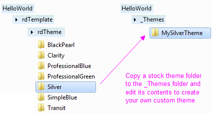
However, you can copy stock theme folders and then customize the files within them to create your own custom theme. Copy the stock theme folder to the _Themes folder beneath your application folder, i.e. <yourApp>\_Themes, (which you may have to create) and rename it to the name of your new custom theme, as shown above.
Apply your customizations to the files in this folder. Your custom theme will then be available for your application, by name, along with the stock themes, in the Style and Global Style elements' Theme attribute selection list, and will also be available for deployment with Studio's Deployment Tool.
One of the key mechanisms in a theme is the "template modifier file" or TMF. In your copied Theme folder, you'll find such a file, named ThemeModifier.xml. A TMF is an XML file that includes instructions for modifying the elements and attributes in a report definition. The TMFs in the stock themes are quite complex, as they attempt to cover all of the elements available for use in a report. Your custom TMF doesn't necessarily have to be so all-encompassing; it could, for example, only address the charts or other elements that are specifically used in your reports.
If you examine the TMF and style sheet in one of the stock themes, you'll see that the class and ID names are all carefully constructed to be unique, which is very important and which you are also encouraged to do.
![]() Note that the stock ThemeModifier.xml file may contain references to the stock style sheet and stock images in the rdTemplate/rdTheme/<Theme> folder. In your custom TMF, you
may need to change these to reference the style sheet and images in your custom Theme folder.
Note that the stock ThemeModifier.xml file may contain references to the stock style sheet and stock images in the rdTemplate/rdTheme/<Theme> folder. In your custom TMF, you
may need to change these to reference the style sheet and images in your custom Theme folder.
Template Modifier Files provides detailed information about creating and using TMFs.
DevNet's Element Reference page has information about all of the elements and their attributes and may be useful when creating your own themes.
Your Themes in the New Application Wizard
If you want your custom theme to be available in Studio's New Applicationwizard, copy its folder to (you may have to create the _Themes folder):
(.NET) C:\Program Files\LogiXML IES Dev\LogiStudio\BaseApp\<version>\_Themes
(Java) C:\Program Files\LogiXML IES Dev\LogiStudio\BaseApp\<version>\_Themes
The New Application wizard displays a thumbnail image of each theme and, if you want to include images for your custom theme, place it, as a 225x160px .JPG image with the same name as your theme, in this folder:
C:\Program Files\LogiXML IES Dev\LogiStudio\bin
Finally, If you create a custom appearance-specific theme that you think looks cool, it would be great if you shared it here on DevNet.
Element-Specific Theme Classes
Theme definitions also include an element-specific class filtering mechanism. This mechanism ensures that theme-related style classes meant for a specific element will appear in the Class attribute drop-down list for that element and only for that element.
If you're creating your own theme, use the following text in its Theme.css file to indicate the start of those class definitions:
/*User classes*/
/*rdElement: elementName */
where elementName is the name of the element (the XML source name, which appears at the top of the Attributes panel, not the name that appears in the Element Tree, which may have embedded spaces)
Classes that apply to multipleelements can be specified by using the | character to combine the element names, like this:
/*rdElement: element1Name | rdElement: element2Name */
Classes defined like this will appear in the class list for the named elements, along with all the other appropriate theme classes and style sheet classes.
Here's a more complete example (don't enter the directions, within square brackets):
/*rdElement: Label */ /*rdElement: Division */ /*rdElement: InputText | rdElement: InputPassword*/ /*End Element*/ [ this is already in the file ] |
Once the custom theme is applied, the class "font12pt" will appear in the list of Class attribute choices for all Label elements, and "font16pt" will appear in the list of class choices for all Division elements. "alignMiddle" will appear in the list of choices for both the Input Text and Input Password elements.
Theme Release Notes
This table shows the history of changes to stock themes:
| Version | Date | Changes |
11.3.049 | 30 Jun 2014 | New Signal theme introduced. |
10.2.424 | 7 Sep 2012 | Original set of stock themes updated; Clarity and Transit themes introduced. |
10.0.31 | 4 Feb 2010 | Original set of stock themes introduced. |
Reverting Themes
To revert to a v10.0.31 stock theme after upgrading a Logi application to v10.2.424+:
- Copy the desired older theme's folder into <appRoot>\_Themes and ensure that it doesn't have the same name as a newer stock theme. Older theme folders can be copied from an older Logi application's rdTemplate\rdTheme folder or they can be downloaded from DevNet.
- Set your application's Style elements to use the older theme. This should return approximately 90% of the old theme appearance. Run your application to see if the appearance is satisfactory; if not, go on to the next steps.
- Set the Label Font and Data Font elements' Border Color attribute value to #000000.
- Though removed in later versions, Format Label and Format Data elements are still supported, so you can continue to use them.
- If you're using Chart.XY to produce a horizontal bar chart, set a Left Border attribute value to suppress the automatic label area sizing included with new themes and instead size it as you desire.
- Compensate for an extra grid line now added to the top of charts by ensuring that the chart Border Color attribute value is the same as the Grid Horizontal Color attribute value.
- To restore the old appearance of colored symbols in legends, set the Edge Color attribute value to #000000.
- To restore the old appearance of tick marks, set the Tick Marks attribute value to True.