Use the Analysis Grid - v11.3+
This document introduces Logi Info end-users to the Analysis Grid. It has its own user interface that allows you manipulate data, create charts, change table layouts, and much more, at runtime. Topics include:
- About the Analysis Grid
- Select Data
- Show, Hide, and Move Columns
- Sort Rows
- Filter Rows
- Group Rows
- Aggregate Data
- Create Charts and Gauges
- Pivot and Summarize Data
- Control Paging
- Export Data
- Add Analysis Grid Charts to Dashboards
The Analysis Grid was given additional functionality in Logi Info v11.3. If you're using an earlier version, see our document Working with Analysis Grids.
Information for developers is available in our Developing with the Analysis Grid - v11.3document.
About the Analysis Grid
The Analysis Grid user interface consists of separate panels for controls, tables, and visualizations. At runtime, you can manipulate the controls, creating data analyses and visualizations on the fly.
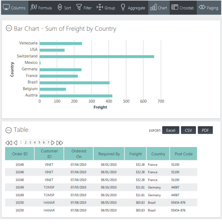
In the example Analysis Grid shown above, both a table and a chart are displayed.
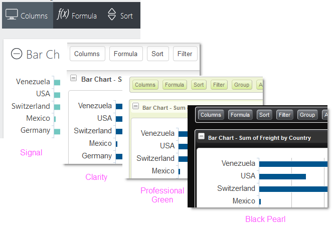
As you can see in the examples above, the Analysis Grid can look quite different depending on the theme being used.
The Analysis Grid consists of a set of panels. The Controls Panel, at the top, includes a set of tabs or buttons that allow you to manipulate the data and visualizations at runtime. The visibility of specific controls is configured by the application developer and so you may or may not see the full set shown here.
When a tab or button is clicked, a configuration panel for that feature appears, as shown above. Clicking it again hides the panel. If you make some kind of change in the panel, the tab or button will indicate this visually.
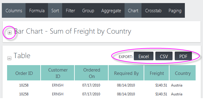
Visualization Panels contain either a data table, crosstab table, or chart. Panels can be collapsed or expanded using the "+" and "-" icons. You can also rearrange their order by clicking with your mouse near the top of a panel, and dragging it up or down.
Tables can be sorted by clicking their column headers, and columns can be dragged to rearrange their order or adjust their widths. Charts can be resized by dragging "resizing handles" which appear when the mouse is hovered over the chart.
Panels containing tables can display buttons for exporting them to Excel, CSV, or PDF. The visibility of the export buttons is under developer control, so you may or may not see the full set shown here.
Now, let's get started using the Analysis Grid.
Select Data
Depending on how your application has been configured, you may or may not see this feature. Skip this section if you do not see a "Data" tab or button at the top of your Analysis Grid.
Click the "Data" tab or button to open its panel:
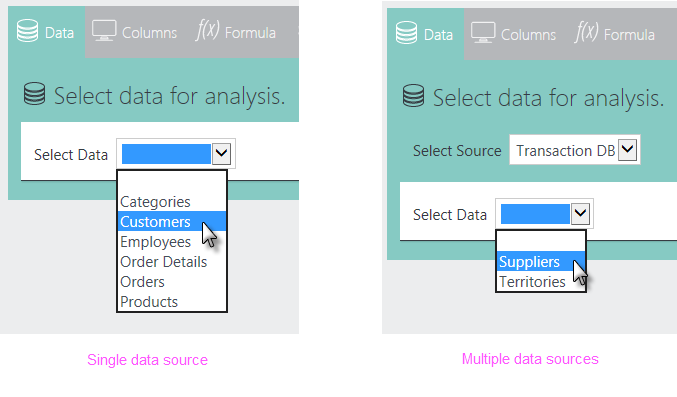
As shown above, left, select the data table or view you want to work with. Your application may be configured for multiple data sources; if so, it will look like the example shown above, right. If that case, you'll need to select a data source first, then a table or view.
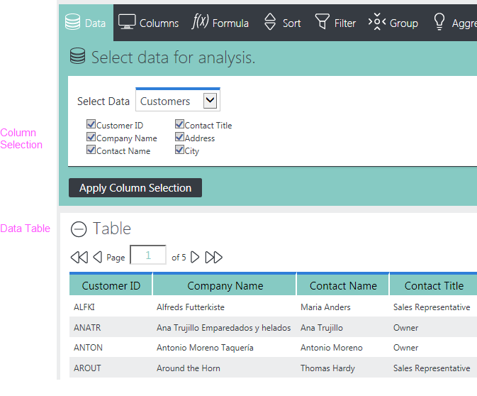
As soon as you select data, a table will appear showing it. A set of column selection checkboxes will also appear, as shown above. You can un-check the boxes for columns you don't want to include in your analysis work. Click Apply Column Selection to update the table.
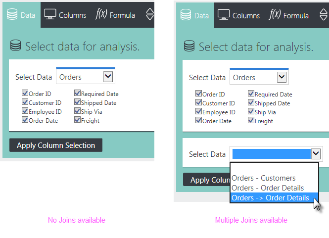
Your application may be configured to allow you to "join" different data tables. If so, you'll see additional data selection lists, as shown above left. By default, items like Orders - Customers indicate an Inner Join, while items like Orders![]() Order Details indicate a Left Outer Join. However, these designations can be customized by your application's developer and other Join types may be available.
Order Details indicate a Left Outer Join. However, these designations can be customized by your application's developer and other Join types may be available.
![]() What's a "join"? A join combines two sets of data to produce a single dataset. Different types of joins produce different results. For example, an Inner Join selects all rows from both tables as long as there is a match between a column in both tables. A Left Outer Joinselects all rows from the first table and adds
rows from the second table that match a specified column value.
What's a "join"? A join combines two sets of data to produce a single dataset. Different types of joins produce different results. For example, an Inner Join selects all rows from both tables as long as there is a match between a column in both tables. A Left Outer Joinselects all rows from the first table and adds
rows from the second table that match a specified column value.
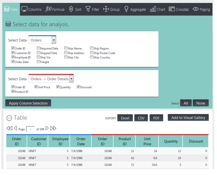
When you select data that joins tables, you'll see a color-coding scheme applied to the table that indicates where data came from. In the example shown above, table columns with a blue border came from the original table "Orders" while columns with a red border came from the selected join.
Once you've selected data, all of the other tabs or buttons at the top of the Analysis Grid become enabled.
Click the Data tab or button to hide the data selection controls.
Show, Hide, and Move Columns
You've selected which data columns to include in your working dataset but you may not want to see them all. The Columns tab or button let's you control which columns are displayed:
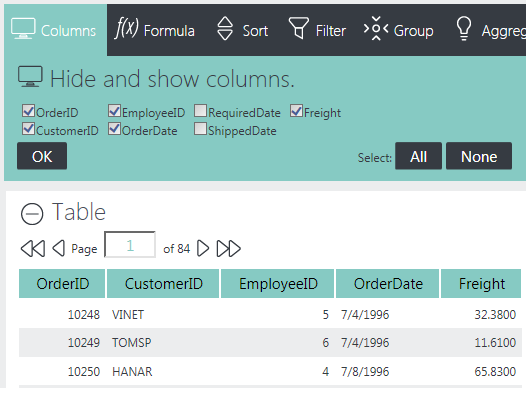
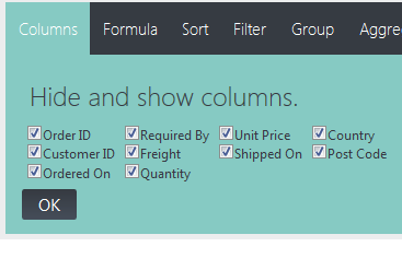
As shown above, you can remove a column from the table by un-checking it. The All or None buttons make working with lots of columns easier, and you'll need to click OK to refresh the table with any changes.
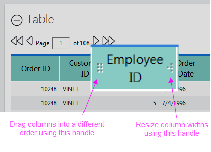
You can also rearrange the order, and change the widths, of table columns using two "drag handles" that appear when you hover your mouse over a column header, as shown above.
Click the Columns tab or button again to hide the controls.
Add Formula Columns
Click the Formula tab or button to use the feature allows you to add calculated columns
to the data:
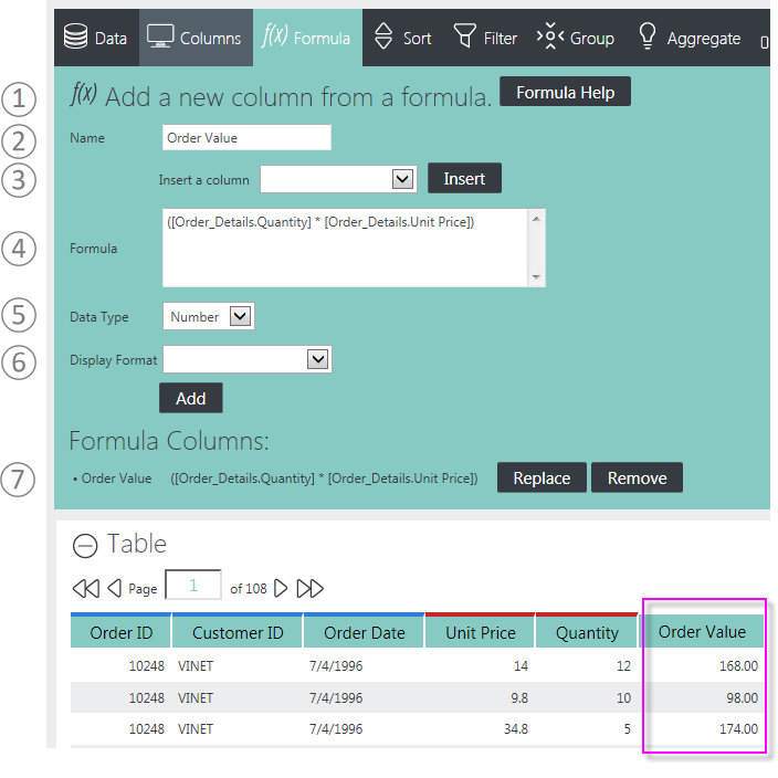
New columns are added at the right side of the table but can be relocated by dragging them. Here's how to use this feature:
- Help constructing a formula is available via the Formula Help button.
- Enter the Name for the column that will be added to the table.
- Insert column names into the Formula box by selecting them here and clicking Insert.
- Enter the formula by typing it in here. Column names should be enclosed within square brackets [ ] and typical math operator symbols, such as + - * / should be used. You can always edit or delete anything in this space.
- Specify the Data Type for the new column.
- Specify a Display Format. Formatting options include numeric and date formats. Click Add to create the new column and refresh the table.
- As formula columns are created, they're added to the Formula Columns list. Use the adjacent Replace and Remove
buttons to manage the list. Columns that have been added are now included in the list of available columns (3) for use in other formulae.
Your application developer will have to advise you concerning which function set is valid in the Formula box. These can vary depending on the way in which data is retrieved from the data source. In once case, JavaScript-style functions can be used, but in another case only functions supported by the database server itself can be used. The help shown when you click the Formula Help button will provide useful information depending on the data source.
Click the Formula tab or button to hide the controls when done.
Sort Rows
This feature allows users to set the sort order of the table columns:
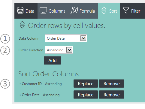
Here's how to use this feature:
- Select a data column to sort on.
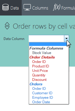
You'll see that the available columns are grouped and color-coded to make it easier for you to identify them. If you created any Formula Columns, they'll be in there, too.
- Select a sorting orderdirection - ascending or descending. Click Add to add the sort and refresh the table. The table will immediately be updated with the new sort. Repeat as desired for additional sorting.
- As Sort Order columns are created, they're added to the list of sorts. Use the adjacent Replace and Remove buttons to manage the list.
The table rows will be displayed in the sort order created. Sorting on individual columns is still available, by clicking their column titles.
Click the Sort tab or button to hide the panel.
Filter Rows
Click the Filter tab or button to use the feature that lets you remove table rows that don't meet your criteria:
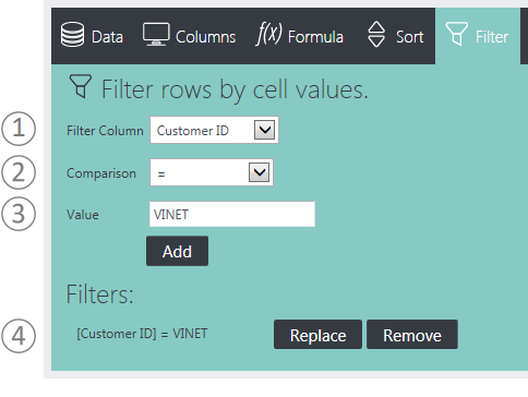
Here's how to use this feature:
- Select the Filter Column containing the values to be compared.
- Set the filtering criteria by selecting a Comparison operator from the list.
Comparison operators include = , <, >, < =, > =, Not =, Starts With, Contains, Not Contains, and Does Not Start With. If the Filter Column is a date, then Date Range is available and some other options are not. The Starts With and Contains operators are useful for finding values at the beginning or within data and will work with both text and numeric data. The Not Contains and Does Not Start With operators work in the opposite manner.
Depending on the comparison chosen, additional input controls may be displayed, for example, for date ranges. As filters are created, they're added to the filter list. Use the adjacent Replace and Remove buttons to manage the list.
- Enter a comparison Value. Wildcard characters (*, %) are not allowed in these values. Click Add. Rows that don't meet these criteria will be removed from the table.
- As filters are created, they're added to the filter list. Use the adjacent Replace and Remove buttons to manage the list.
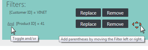
If you add multiple filters, only rows that meet all the conditions will be retained (an "And" situation). Clicking the And link in the Filters list, shown above, changes it to an Or link, so rows that meet any
of the conditions will be retained. A set of four arrow icons will also
appear by the Remove button. These can be used to re-order the
precedence of the filters or to group them together in various
arrangements using parentheses.
Filter by Dates
If the Filter Column selected is a datetype column, the interface presents different value controls:
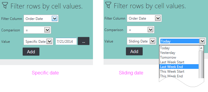
You may choose to filter on a Specific Date and either type it in or select it from a pop-up calendar. Or, as shown above, right, you can filter using a Sliding Date value and select from a long list of relative dates (Last Week End, Last Month Start, 90 Days Ago, etc.)
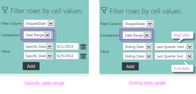
If the Comparison option Date Range is chosen, as shown above, different value controls for Starting and Ending dates, which can be used in a variety of combinations are displayed.
Click the Filter tab or button to hide the panel.
Group Rows
Click the Group tab or button to use the feature that lets you group table rows together:
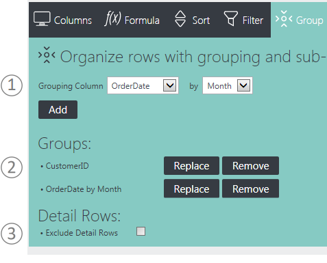
Here's how to use this feature:
- Select the Grouping Column for the first level of grouping from the list of columns. Depending in the column's data type, additional input controls may be displayed. Click Add to group the data and refresh the table. Repeat as desired to create sub-groups.
- As groups and sub-groups are created, they're added to the Groups list. Use the adjacent Remove and Replace buttons to manage the list.
- The Exclude Detail Rows checkbox can be used to hide the rows that have been grouped, "collapsing" each group into a single row in the table.
Click the Group tab or button to hide the panel.
Aggregate Data
Click the Aggregate tab or button to use the feature that lets you calculate totals, averages, and other aggregations:
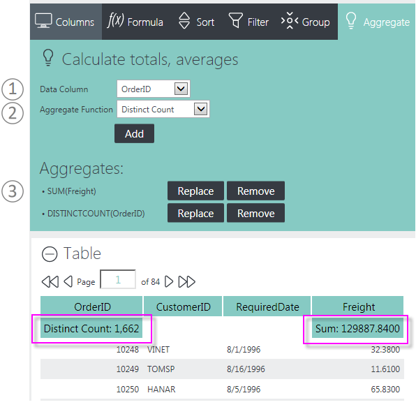
Here's how to use this feature:
- Select the Data Column to be aggregated from the column list.
- Select the Aggregate Function. Options include: Sum, Average, Standard Deviation, Count, Distinct Count, Minimum, and Maximum. Click Add to aggregate the data and refresh the table.
- As aggregates are created, they're added to the Aggregates list. Use the adjacent Replace and Remove buttons to manage the list.
Aggregate values will be displayed in the header, as shown above. If Grouping is in effect, aggregate values will also appear at each grouping level in the data grid.
Click the Aggregate tab or button to hide the panel.
Create Charts and Gauges
Click the Chart tab or button to use the feature that lets you create charts and gauges:
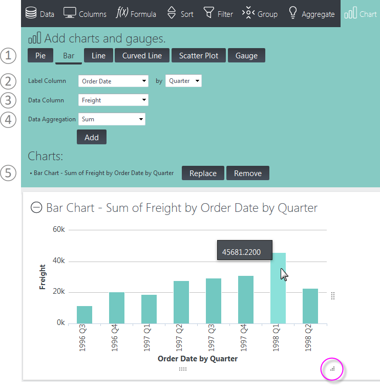
Here's how to use this feature:
- Click the button for the type of chart to be created. Specific controls will be displayed, depending on the selected type.
- Assuming a Bar chart was selected, select the Label Column. This provides data for the X-axis of the chart. If the column selected is a date-type column, an interval control (Year, Quarter, Month, Day) will be displayed.
- Select the Data Column (Y-axis data, the "height" of each bar). You'll see that the options are grouped and color-coded to make it easier for you to identify them. If you created any Formula columns, they'll be in there, too.
- Select a Data Aggregation function. Options include: Sum, Average, Standard Deviation, Count, Distinct Count, Minimum, and Maximum.
- As charts are created, they're added to the Charts list. Use the adjacent Replace and Remove
buttons to manage the list. Note that you select the chart type again,
modify the existing values, and then click Replace to change a chart.
Tables and charts are displayed in their own panels. You can expand and collapse these panels using their "+" and "-" icons. You can also rearrange their order by clicking with your mouse near the top of a panel, and dragging it up or down
Charts will include Quicktips, which appear when you hover your mouse over a data value, as shown above. In addition, "resizing handles" will appear when the mouse is over the chart, allowing you to resize it by dragging them.
Bar charts that are not time-oriented will
automatically be shown in a horizontal format, unlike the one shown above. This
allows greater clarity in reading the "X-axis" label text.
Data Forecasting
Data Forecasting, if included by your application developer, is available for Bar, Line, and Curved Line charts.
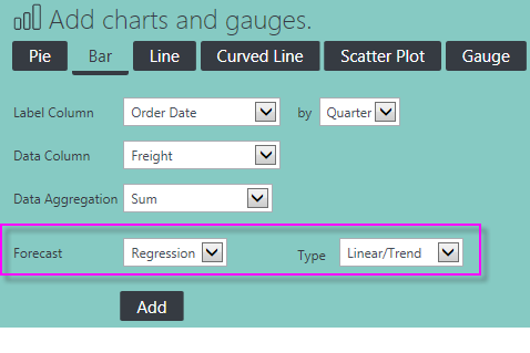
If it's available, extra controls for it will appear in the Chart configuration panel, as shown above.
Data forecasting is the process of generating values based on events that have not yet occurred. "Prediction" is a similar but more general term. Forecasting refers to formal, statistical methods that use time series, cross-sectional, or longitudinal data to produce predicted data. Typically, forecasts are displayed most effectively on charts.
Forecasting analysis options include:
- Time Series (Time Series Decomposition), consisting of data in a natural, time-related order with a strong interval, where the Label Column data is of DateTime-type and the Data Column is a number.
- Regression, using one of several regression analysis functions. Regression
analysis is recommended when the focus is on a relationship between a
dependent value and one or more independent values. Available analysis functions include:
- Linear - used to calculate predictive values based on a trend line.
- Autoregressive - used when attempting to predict an output of a system based on previous outputs. The estimation technique used is based on "Burg's" method.
- Exponential, Logarithmic, Polynomial, or Power - non-linear types used to display the relationship between dependent and independent variables as a curvilinear function, which may provide more accuracy than a linear regression.
Click the Chart tab or button to hide the panel.
Pivot and Summarize Data
Click the Crosstab tab or button to use the feature that lets you create a crosstab (also known as a "pivot") table:
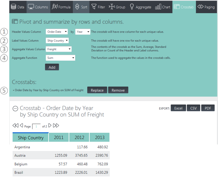
Here's how to use this feature:
- Select the Header Values Column, whose values will be shown horizontally, as column headers, across the top of the crosstab table. Additional controls may appear depending on the data type of the selected column.
- Select the Label Values Column, whose values will be shown vertically, in the left-most column of each row.
- Select the Aggregate Values Column, whose values will be aggregated to produce the contents for the rest of the table cells.
- Select the Aggregate Function to be applied to the column selected in Step 3. Options include Sum, Average, Standard Deviation, and Count. In v11.4.046, a Distinct Count option was added.
- As crosstabs are created, they're added to the Crosstabs list. Use the adjacent Replace and Remove buttons to manage the list.
Click the Crosstab tab or button to hide the panel.
Control Paging
Click the Paging tab or button to control the pagination of Analysis Grid tables:

Here's what you need to do:
- Choose a paging option:
- Show all rows will display all of the data at once in the table. Caution: Selecting all rows can result in a length delay while data is retrieved.
- Show paging
will display a fixed number of rows per page and display the paging controls.
- If Show paging has been selected, enter the number of data rows to display per table page. Click OK to refresh the display.
These settings affect all tables simultaneously. Click the Paging tab or button to hide the panel.
Export Data
Analysis Grid tables include three Export functions, controlled by the Export buttons:
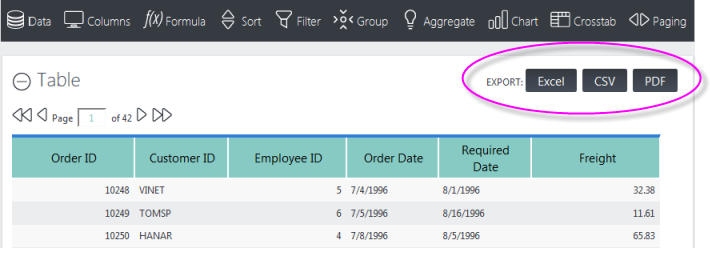
Depending on your application's configuration, you may see some, all, or none of the Export buttons. They allow you to export the table's data, as follows:
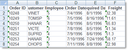
Excel - The data is exported into an .xls file, as raw data. The file can be viewed in Excel (if installed on your computer) or can be saved to your file system. Table column headers are exported into the first row of the Excel worksheet, as shown above, and numbers are exported as text. Depending on your application's configuration, the data may be formatted and specific worksheet column widths may be set.

CVS - The data is exported into a .csv file, as raw data. The file can be viewed in Notepad (or any text editor) and in Excel (if installed on your computer) or can be saved to your file system. Table column headers are exported into the first row. All fields are enclosed in double-quotes and separated by commas.
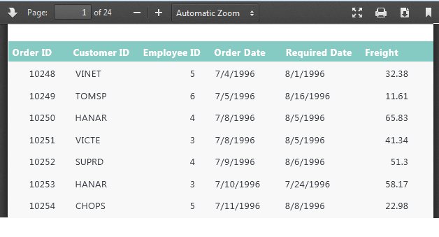
PDF - An image of the table is exported into a temporary .pdf
file. This file can be viewed in your browser using the Adobe Acrobat
plug-in, similar plug-ins, or, in some cases, native browser technology.
Viewers usually let you save the export as a file, if desired, or print
it. Table headers will be displayed at the top of each PDF page.
Export Threshold
When working with very large data sets, exports may not be practical. To prevent unacceptably long exports, your application may have been configured with a limit on the number of rows that can be exported. In this case, the export controls will be disabled. If so, you may be able to reduce the number of rows, by adding one or more Analysis Grid filters, thereby enabling exports.
Add Analysis Grid Charts to Dashboards
The Analysis Grid includes an optional feature that let's you create a chart in one report, then
add that chart as a new panel in an existing Dashboard in another
report.
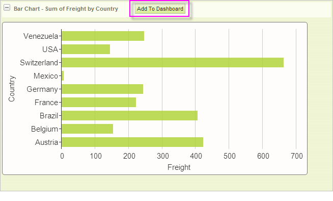
If your application has been configured for this feature, Analysis Grid charts will display an Add To Dashboard button, as shown above.
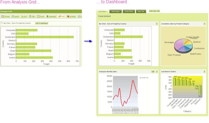
When the button is clicked, the chart, with its resizing control, is added as a new panel in the Dashboard, as shown above. Just before panel insertion, you'll be prompted for the Panel Title (with the chart title from the Analysis Grid provided as a suggestion) and a description for display in the Dashboard Configuration Page.
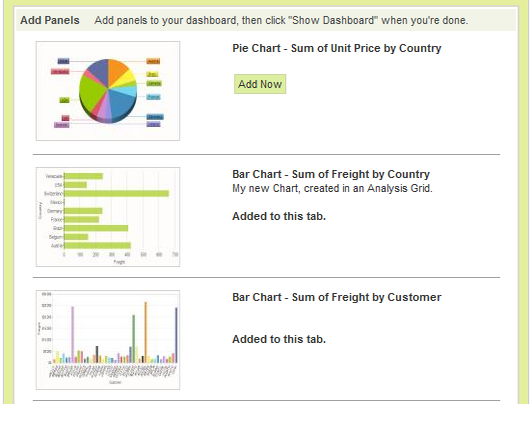
The new chart panel thereafter appears in the Dashboard Configuration Page, as shown above, just like any other panel, complete with a thumbnail image. The new panel can be removed from the visible dashboard panels and from the configuration page entirely, using the usual controls.
You can insert multiple charts into a Dashboard using this technique.
For more information about Dashboards, see our document Introducing the Dashboard - v11.2.