The Analysis Grid for End Users
The Analysis Grid has its own user interface that allows you manipulate data, create charts, change table layouts, and much more, at runtime.
The following topics introduce Logi Info end-users to the Analysis Grid:
- Selecting Data
- Adding Formula Columns
- Filtering Rows
- Showing, Hiding, and Moving Columns
- Sorting Rows
- Grouping Rows
- Creating Aggregations
- Creating Custom Aggregations
- Controlling Paging
- Formatting Data
- Creating Charts and Gauges
- Pivoting and Summarizing Data
- Exporting Data
- Adding Analysis Grid Charts to Dashboards
Information for developers is available in The Analysis Grid for Developers.
About the Analysis Grid
The Analysis Grid user interface consists of separate panels for controls, tables, and visualizations. At runtime, you can manipulate the controls, creating data analyses and visualizations on the fly.
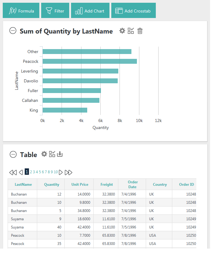
In the example Analysis Grid shown above, both a table and a chart are displayed.
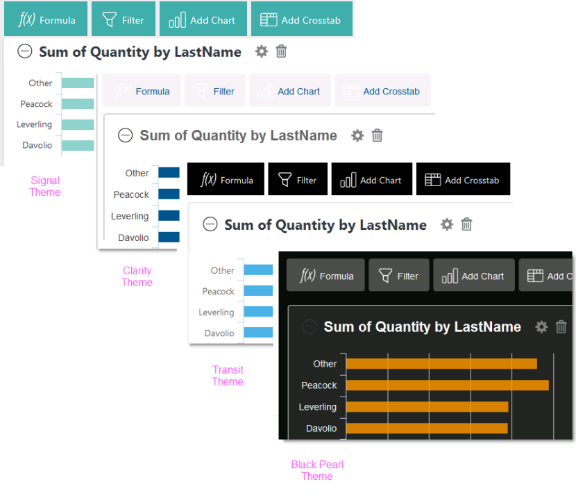
As you can see in the examples above, the Analysis Grid can look quite different depending on the Theme being used. The examples in this topic use the Signal Theme.
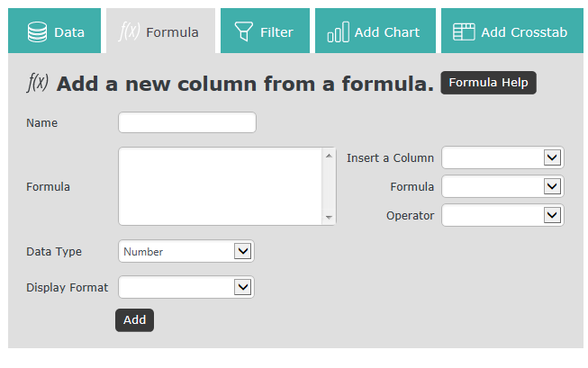
The Analysis Grid consists of a set of panels. The Controls Panel, at the top, includes a set of tabs or buttons that allow you to manipulate the data and visualizations at runtime. The visibility of specific controls is configured by the application developer and so you may or may not see the full set shown here.
When a tab or button is clicked, a configuration panel for that feature appears, as shown above. Clicking it again hides the panel.
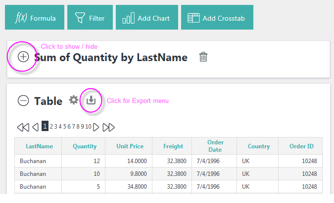
Visualization Panels contain either a data table, crosstab table, or chart. Panels can be collapsed or expanded using the "+" and "-" icons. You can also rearrange their order by clicking with your mouse near the top of a panel, and dragging it up or down.
Panels containing tables may display an icon for exporting them to Excel, CSV, or PDF. The availability of the different types of exports is under developer control, so those available to you may vary.
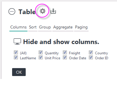
Clicking a panel's gear icon will display a configuration area for the specific visualization. The Table configuration area, shown above, let's users control a variety of table features.
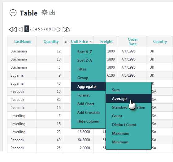
Table column headers contain a variety of features. They can be dragged
to rearrange the column order or to adjust column widths. When column
header text is clicked, drop-down menus provide sorting, filter,
formatting, grouping, and other features, as shown above. The
availability of each feature can be restricted during development.

If your application has been configured for it, you'll see Undo and Redo icons, circled above, beside Add Crosstab. These allow you to undo and redo your recent actions.
Now, let's get started using the Analysis Grid.