Dashboard for End Users
Dashboards present collections of visualizations so that you can quickly see analyses of your data. Depending on how it's been configured, you may be able to customize the dashboard to suit your needs.
The following topics discuss Logi Dashboards:
- Working with Dashboard Tabs
- Managing Dashboard Panels
- Panel Re-Arrangement and Sizing
- Filtering Dashboard Data
- Drill to Dashboard Data
- Editing Visualizations
- Exporting Panel Content
Information for developers is available in Logi Info Dashboard
.
About the Dashboard
A Logi "dashboard" is a collection of dashboard panels, each containing a data visualization (table, chart, gauge, etc.). Depending on how it's been configured, you may be able to customize it by adding, removing, or rearranging these panels on the browser page. Your dashboard may also be configured to have tabbed pages, so that different collections of dashboard panels can be viewed.
The visualizations in dashboard panels can be interactive, so you may have the option of varying the reporting criteria for them. Links within the reports can be used to drill-down and drill-through to detail data.
All in all, dashboards present a very flexible way of presenting a range of information that's easy to take in with a single glance.

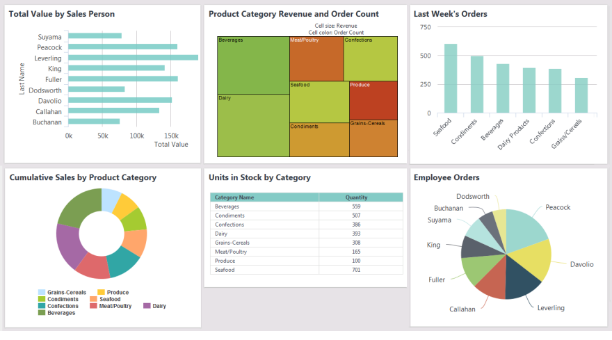
A simple dashboard, with no user customization features, styled using the standard Signal theme, is shown above.

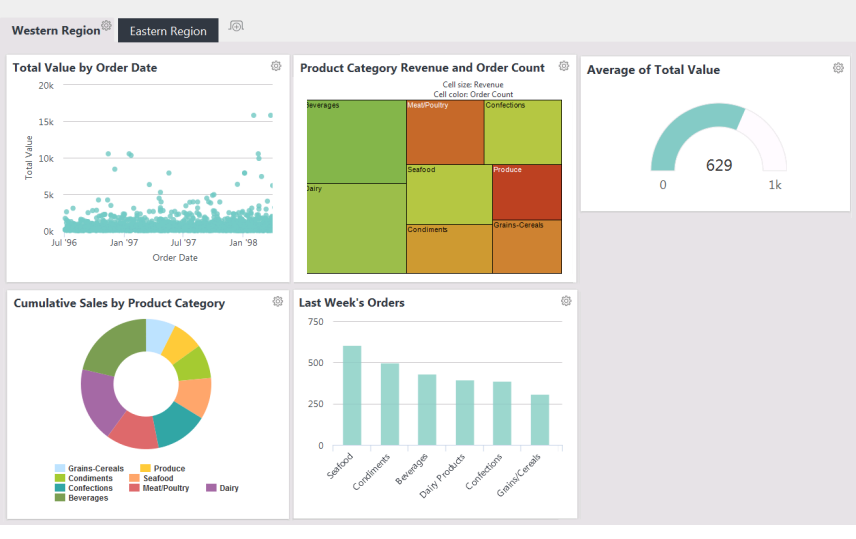
In the example above, we see a more complex dashboard which includes tabs and has end-user customization enabled.
![]() The data used in Dashboard panel visualizations is based on "metadata". If the metadata changes, such as the removal of a column, the panel will display a warning about the missing column, instead of the expected visualization.
The data used in Dashboard panel visualizations is based on "metadata". If the metadata changes, such as the removal of a column, the panel will display a warning about the missing column, instead of the expected visualization.
Now, let's get started using the Dashboard.