Managing Dashboard Panels
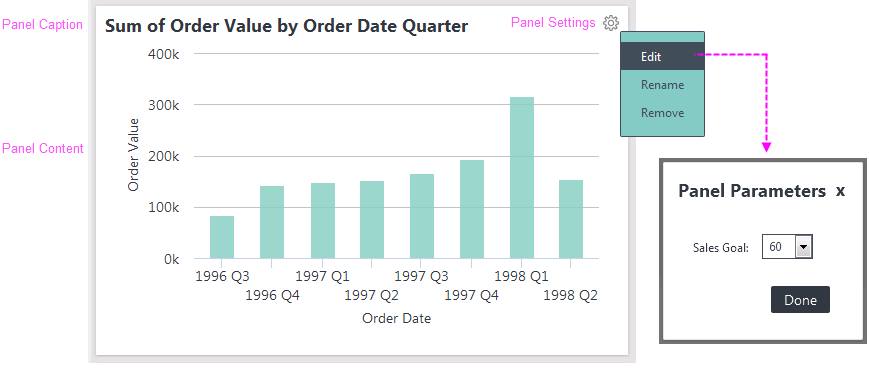
Dashboard panels are the basic building blocks of the dashboard:

As shown above, dashboard panels have a Caption and content.
If a panel is adjustable, it displays a gear icon like this ![]() in its upper right-hand corner; click it to configure the panel's settings.
in its upper right-hand corner; click it to configure the panel's settings.
Adjustable panels can be renamed (changing their captions), rearranged on in the dashboard or tab, or removed completely. If a panel has been created with parameters, you can adjust the parameter values or filter the data, affecting the panel content.
Your dashboard may have been configured with a default set of tabs and panels, so you're not looking at a blank canvas when you browse to it the first time.
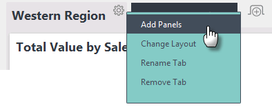
Adjustable dashboards display a gear icon like this ![]() on their base page or tabs. Click this icon to configure their settings and to add panels:
on their base page or tabs. Click this icon to configure their settings and to add panels:

As shown in the example above, when the gear icon is clicked, a Settings pop-up menu appears. Its menu items vary depending on the dashboard configuration, but "Add Panels" is a common item. Click this item to display the Add Panels pop-up panel:

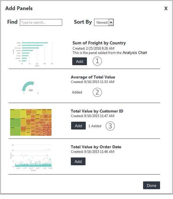
The Add Panels pop-up panel, shown above, displays the collection of panels that are available for your use in the dashboard. If the dashboard has never been configured before, this panel is the first thing that appears when you view the dashboard.
The list of available dashboard panels may include a thumbnail image, a title, a creation timestamp, and a description. Click the (1) Add button to add the panel to the dashboard or tab. After you add a panel, its Add button is replaced (2) with an "Added" label.
Dashboard panels can be configured by your developer for single or multiple instances, determining whether they can used multiple times or not. When configured for multiple instances, the same panel can appear more than once in a dashboard or tab. If the dashboard has been configured to allow multiple instances, then after a panel has been added, its Add button remains available and a count (3) of the number of instances already added is shown.