Using the Configuration Panel
If you want the dashboard users to make use of the configuration panel at runtime, you need to configure the panel for each library component in Logi JReport Designer. You can insert labels and web controls such as text fields, checkboxes, drop-down lists, and lists into the configuration panel to filter or sort a library component, or change properties of objects in a library component. When a library component contains parameters, values of the parameters can also be specified via the configuration panel.
To display the configuration panel, check the Display Configuration Panel checkbox on the top-right corner of the design area. The initial configuration panel contains a title bar, a checkbox and two buttons.
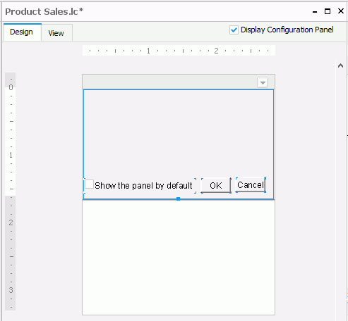
The title bar contains the title of the library component and a button  . You can use the button to show or hide the panel when the library component is in view mode as a dashboard component or inserted into a dashboard. The checkbox is used to specify whether to show the panel by default when the library component is inserted into a dashboard in JDashboard. You can check the checkbox by setting a property of the configuration panel Default Show to true in the Report Inspector.
All actions in this panel will be bound with the OK and Cancel buttons in it. You can select OK to apply the actions to the library component. The button Cancel is used to make this panel invisible and initialize the value of the web controls to the last values.
The height of the panel can be adjusted to the size of the content, but its width is equal to the width of the library component and cannot be adjusted. You can resize its width only by resizing the width of the library component. The two buttons are built-in buttons that cannot be deleted, cut, copied, or pasted, but their properties can be edited in the Report Inspector and they can be moved by dragging and dropping. Other components in the panel can be deleted.
Below is a list of the sections covered in this topic:
Specifying Parameter Values using the Panel
When a library component contains parameters, the configuration panel will be automatically populated with all the parameters needed to run the library component, and web controls for the parameters will be created automatically in this panel. Therefore, this panel can be used to specify parameter values for the library component at runtime.
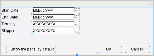
When the library component is published to Logi JReport Server and inserted into a dashboard using JDashboard, the values of the parameters saved in the library component will be used as the default values. If JDashboard users want to change the parameter values, they can make use of the configuration panel published with the library component. After specifying new values in the configuration panel and selecting OK, the specified parameter values will be used to populate the data. The changed values will be saved in the dashboard and take effect when the dashboard is opened next time.
Applying Web Controls in the Panel
You can insert web controls which are used as variables into the configuration panel, and apply web behaviors to the web controls to perform specific actions at runtime.
Inserting web controls
The web controls that can be inserted into the configuration panel of a library component are: text field, checkbox, drop-down list, and list.
To insert a text field into the configuration panel and define its web options:
Do one of the following to insert the text field:
- Select Insert > Web Controls > Text Field, then drag the text field to the required destination.
- From the Components panel, drag the Text Field button
 to the required destination.
- Right-click the text field and select Web Options from the shortcut menu. The Web Options dialog displays.
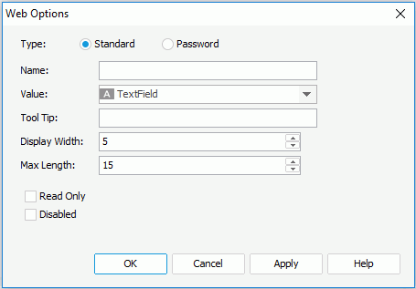
- Select the type of the text field: Standard or Password.
Standard means that the text field will be a normal text field. Password means that the text field will be a password box in which the typed characters will be displayed as asterisks.
- Enter the name, value for the text field in the Name and Value fields.
- In the Tool Tip field, enter the tip you want to show for the text field. When the component is displayed in a dashboard, when you hover the mouse over the text field, the tooltip will be displayed.
- Set the character width in the Display Width field, and the maximum number of characters the user can enter in the Max Length field.
- Check the Read Only option if you would like to set this text field to be read-only.
- Check the Disabled checkbox if you want to make the text field disabled.
- Upon finishing, select the OK button to close this dialog.
To insert a checkbox into the configuration panel and define its web options:
Do one of the following to insert the checkbox:
- Select Insert > Web Controls > Checkbox, then drag the checkbox to the required destination.
- From the Components pabel ,drag the Checkbox button
 to the required destination.
- Right-click the checkbox and select Web Optionsfrom the shortcut menu. The Web Options dialog displays.
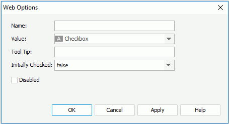
- Specify the name, value of the checkbox in the Name and Value fields.
- In the Tool Tip field, enter the tip you want to show for the checkbox button. When the component is displayed in a dashboard, when you hover the mouse over the text field, the tooltip will be displayed.
- Set Initially Checked to true if you want the checkbox to be selected by default.
- Check the Disabled checkbox if you want to make the checkbox disabled.
- Upon finishing, select OK to close this dialog.
To insert a list/drop-down list into the configuration panel and define its web options:
Do one of the following to insert the list/drop-down list:
- Select Insert > Web Controls > List/Drop-down List , then drag the list/drop-down list to the required destination.
- From the Components panel, drag the List button
 or Drop-down List button
  to the required destination.
- Right-click the list/drop-down list and select Web Options from the shortcut menu. The Web Options dialog displays.
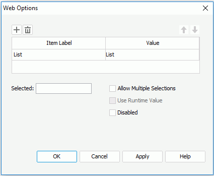
- Specify the item labels and the value of each item in the items box by inputting some strings as the labels and values respectively.
If you want to use a DBField/formula field/parameter field to control the value, select
 in the Value column to insert one with the Insert Fields dialog, and then select the format for the inserted field from the drop-down list in the Item Label column. Check the All radio button in the Insert Field dialog if you want to add an All value to the list/drop-down list. Then when All is selected as value of the list/drop-down list at runtime, all filter actions defined on the list/drop-down list will not take effect, and if you applied some other web action that needs value from the list/drop-down list, a Null value will be returned.
 - For a list web control, you can check the Allow Multiple Selections checkbox if you want to allow multiple items to be selected.
- In the Selected field, specify the selected value for the list/drop-down list.
- To use the runtime value as the selected value, check Use Runtime Value.
- If you want to disable the list/drop-down list, check the Disabled option.
- When done, select OK to apply the settings.
Note: If you have specified a tooltip for any web control, when the library component is opened in JDashboard, the tooltip of the web control will be displayed differently on different browsers:
- On Internet Explorer, the tip text will be automatically wrapped if its length exceeds the maximal tip width the browser allows. In addition, for Internet Explorer, you can manually add a new line by adding 
 or 
 ahead of the text when editing it in the Tool Tip field.
- On Firefox, the tip text will be displayed in one line with the maximal tip width the browser allows, and the text that cannot be displayed within the width will be cut off and replaced by ellipsis.
Adding web behaviors
You can apply web behaviors, including Filter, Sort and Change Property, to the web controls you insert in the configuration panel of a library component so as to filter or sort the records in the table, chart or crosstab of the library component or change the properties of an object in the library component at runtime.
To bind the Filter web behavior to a web control:
- Right-click the web control, and then select Web Behaviors > Filter from the shortcut menu. The Filter - Web Behavior dialog appears.
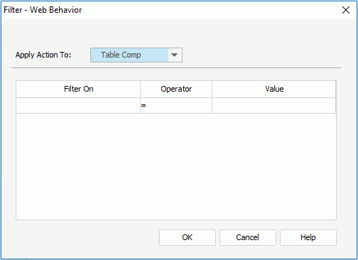
- From the Apply Action To drop-down list, select the data component the records of which you want to filter.
- In the Filter On column, specify the field on which to filter the records. The field may be a column in the component, or be specified by the value of a web control.
- Specify the operator and value. The value may be input by yourself, or be the value of a web control.
- Select OK to accept the settings.
Then at runtime, when end users specify a value for the web control and select OK in the configuration panel, the records in the data component will be filtered.
To bind the Sort web behavior to a web control:
- Right-click the web control, and then select Web Behaviors > Sort from the shortcut menu. The Sort - Web Behavior dialog appears.
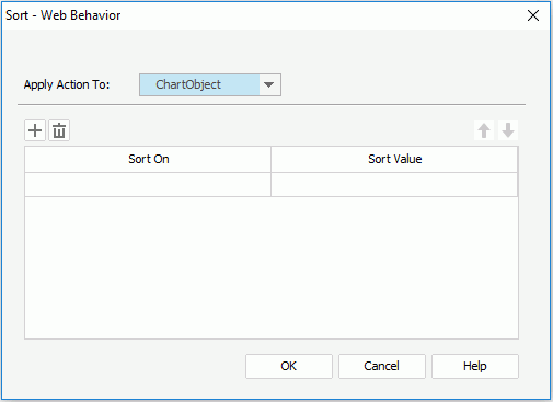
- From the Apply Action To drop-down list, select the data component the records of which you want to sort.
- In the Sort On column, specify the field on which to sort the records. The field may be a column in the component, or be specified by the value of a web control.
- Specify the sort value. The value may be Ascending or Descending, or be the value of a web control.
- If necessary, select
 to add a new sort condition.
To delete a sort condition, select
 . To adjust the order of the sort conditions, select
  or
or  .
. - Select OK to accept the settings.
Then at runtime, when end users specify a value for the web control and select OK in the configuration panel, the records in the data component will be sorted.
To bind the Change Property web behavior to a web control:
- Right-click the web control, and then select Web Behaviors > Change Property from the shortcut menu. The Change Property - Web Behavior dialog appears.
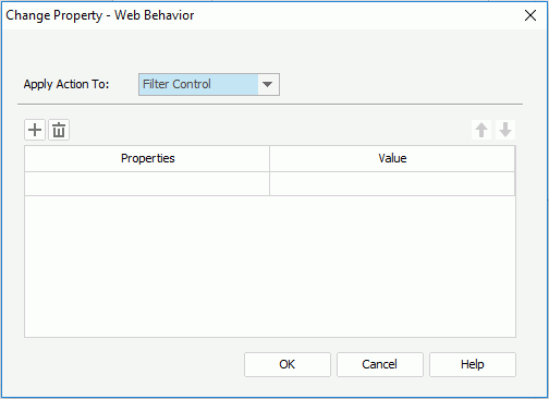
- From the Apply Action To drop-down list, select the object the properties of which you want to change.
- In the Properties column, specify the property you want to change. All the properties of the object you select from the Apply Action To drop-down list are listed here.
- In the Value column, specify the value of the property. The value may be input by yourself, or be specified by the value of a web control.
- If necessary, select
 to add a new line to change a property.
To delete a property line, select
 . To adjust the order of the properties, select
  or
or  .
. - Select OK to accept the settings.
Then at runtime, when end users specify a value for the web control and select OK in the configuration panel, the properties of the specified object in the library component will be changed.
 Previous Topic