Work with Logi Mobile Reports
This topic provides examples for Logi Info developers who wish to create Mobile Reports.
- About Logi Mobile Reports
- Create a New Mobile Report Definition
- Create a Supplemental Stylesheet
- Build the Default Definition
- Build a Data Table Definition
- Build a Chart Definition
Mobile Reports are not available in Logi Report.
About Logi Mobile Reports
If you haven't done so, we encourage you to read Introduction to Logi Mobile Reports before proceeding.
Logi Mobile Reports, introduced in v10.0.259, allows developers to create reports that are to be viewed on a mobile device. This is achieved by generating web pages that have been optimized for the mobile device environment and that run on the "mobile web". Developers design and code Mobile Report definitions in Logi Studio, using many of the same techniques used to develop standard Logi reports.
This topic provide a complete, step-by-step example of how to build a Mobile Report. The menu in this example is built based on a data table. In a separate topic, The Data Menu, you can learn how to use the Data Menu element to create more complicated mobile device-specific menus.
Create a New Mobile Report Definition
Creating a new Mobile Report definition is similar to creating a regular report definition:
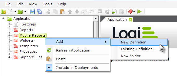
- Select and right-click the Mobile Reports folder in Studio's Application Panel.
- Select Add, and then New Definition items for the pop-up menus.
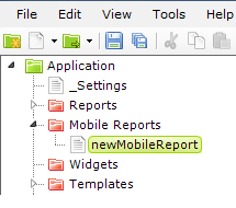
- The new definition will be created, with a temporary name, and opened in the Workspace editor.
- Rename the new definition, as desired. We'll use "mDefault".
You're almost ready to build your first Mobile Report definition. But first, let's create a special style sheet.
Create a Supplemental Stylesheet
This step will create a supplemental stylesheet that will be used along with a theme and will help control the main menu and data table appearance. This is not an absolutely necessary step and, for your mobile device, some adjustments may be necessary to achieve the desired look. These classes will work fine for an iPhone.
- Select and right-click the Support Files folder in Studio's Application Panel.
- Select Add and New File... from the pop-up menus.
- In the dialog box that appears, select Stylesheet and click OK.
- The new stylesheet file will be created, with a temporary name, and opened in the Workspace editor.
- Rename the new file, as desired. We'll use "mobileStyles.css".
- Copy the text below into your stylesheet file:
#myAppendPaging .infoRow .menuRow .mobileTable |
- Save the new stylesheet file and close it.
Now we're ready to proceed with building our first Mobile Report definition.
Build the Default Definition
In the Workspace panel editor, select the tab for your new Mobile Report definition.

- Select the Style element that was added by default to your definition, and set its Style Sheet and Theme attributes as shown above.

- Beneath the Body element add a Division element, and set its attributes as shown above. This will ensure that everything displayed on the mobile device is neatly centered. Note that the Output HTML DIV Tag attribute has been set to True. Without this, the centering will not work.

- Add as many Label and New Line elements as necessary to put a title and description in the report. As shown above, use the classes from your Theme, available in the pull-down list, to provide consistent font styles for your labels.
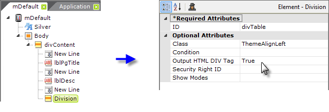
- We're about to build our main menu, but first we need to add another Division element. Without it, our menu items will also be centered because the style of the first Div will be inherited by the data table we'll use for our menu. So add another Div and set its attributes as shown above.
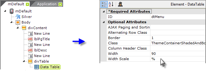
- Add a Data Table element beneath the last Div, and set its attributes as shown above (some blank attributes have been removed from the image to save space). Its complete Class attribute value, which combines a theme class and a supplemental style sheet class, is: ThemeContainerShadedAndBordered,mobileTable .

- Add a DataLayer.Static element beneath the table and several Static Data Row elements beneath it, as shown above. Of course, any type of datalayer could be used here. Our static data rows will include a column for the menu item text to be displayed and the name of the Mobile Report definition to be called when the menu item is tapped.
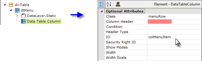
- Add a Data Table Column element beneath the data table and set its attributes as shown above. Notice that you're leaving the Column Header attribute blank. This will result in no column header being shown at all, which helps our data table look more like a list of menu options than a data table.

- Add a Label element beneath the data table column and set its attributes as shown above. The text for the menu item is drawn from the data in the datalayer.

- Add an Action.Report and a Target.Report element beneath the Data Table Column element (not the Label element) and set its attributes as shown above. This is one of those mobile device usability issues: it's easier for the user to tap a large space (anywhere in the data table row) rather than a comparatively small text link in the row.
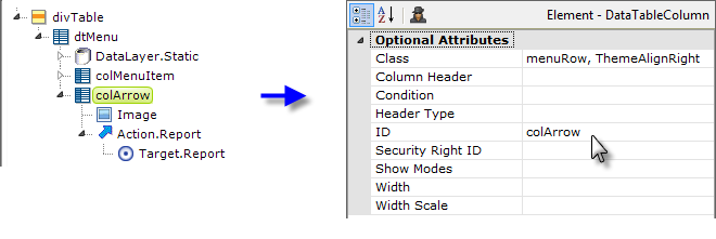
- Now copy the existing Data Table Column element and paste it beneath the Data Table, as shown above. Change its element ID and modify its Class attribute. Replace the Label element beneath it with an Image element. Set the Image element's Caption to the file name of an image of an arrow that points horizontally to the right.

- Finish off the definition by adding a New Line and Label element, under the first Division element, to center it, as shown above. Put some footer text in the Label element's Caption attribute.
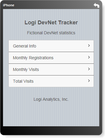
When you preview your definition, it should look something like the example shown above (although the text itself will vary, depending on what you chose to enter).
You can easily test your definition right on your own mobile device, assuming that you can connect it to your network. Many companies, for example, have Wi-Fi available internally and you may be able to connect your device to it. If so, then you should be able to browse your development web server.
Note that the "localhost" designation used inside Studio will not work for this; you'll need to get the IP address of your development machine and use it instead. The URL you use in your mobile device browser will look something like: http://192.168.0.12/yourLogiAppName
You will need to set your Mobile Report definition to be the Default Report for your application:
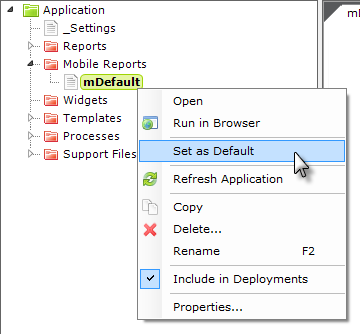
This can be done in Studio in several ways and one of the easiest is to select and right-click your definition in the Application Panel, and then select Set As Default in the popup menu, as shown above.
This topic continues on the next page.
Build Data Table Definition
Now that we have a menu, let's build a few Mobile Report definitions for our menu to select. The first of these will display a data table.
- Start by creating a new definition and duplicating the initial steps used for the mDefault definition: create a new Mobile Report definition, add a Style element, a centering Division, title text, and a second Division to left-align the table contents.
 A quick way to do this would be to right-click and copy mDefault in the Application panel, then select the Mobile Reports folder, right-click and paste the copied definition, and rename it. Then open it and delete the dtMenu element and its children.
Make sure the name of your new definition agrees with its entry in the menu data (static or otherwise) in the mDefault definition, so tapping the right menu item will redirect to this report.
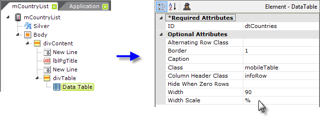
- Your definition should look something like the example shown above. Next add a Data Table element beneath the second Division, and set its attributes a shown (some blank attributes have been removed to save space).
This data table is only going to have two columns and will fit horizontally on the mobile device screen. However, if a table has many columns, users will be able to use flick or drag gestures to scroll the table sideways to see all the columns.
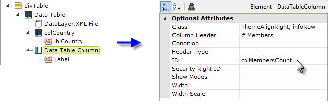
- Add an appropriate datalayer element and two sets of Data Table Column and Label elements, as usual, to display the data. Note that this data table does use Column Headers and that the columns use both a theme class and a supplemental stylesheet class. In the Label elements, use @Data tokens to reference the datalayer data.

- Next, add one of the specialized Mobile Reporting elements, Append Paging, beneath the data table and set its attributes as shown above. The table will display ten rows and a button, with the caption "More countries" just below the table. When the user taps the button, the next ten rows will be appended to the table. Each tap will append ten more rows. The supplemental stylesheet includes a class assigned by ID to the "myAppendPaging" element ID, so if you choose to give this element a different ID, make sure you change it in the stylesheet, too.
- Finally, finish up by adding a Label element as a footer, if desired, as you did in the mDefault definition.
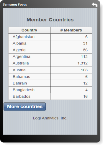
Preview your definition and it should look similar to the example above. You can click the "More countries" button to see how it works. Use your mobile device to browse to the mDefault definition, then tap the menu to navigate to your mobile data table definition.
Build a Chart Definition
And now, let's build a Mobile Report that displays a chart. In the example that follows, we'll be displaying data that can be filtered by year, and include an Input Select List to allow the user to select different years to display.
- Once again, create a new definition duplicating the initial steps used for the mDefault definition or copy and alter the mDefault definition as described in the previous section. However, no second Division for left-alignment is necessary this time.
Make sure the name of your definition agrees with its entry in the menu data (static or otherwise) in the mDefault definition, so tapping the right menu item will redirect to this report.

- To ensure that our data filtering always has a default value, add a Default Request Parameters element to the definition, and set its attributes as shown above.
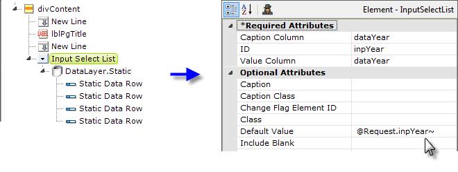
- Next, add an Input Select List element, with datalayer and supporting elements, shown above, to your definition. In the example, we've used Static Data Rows to provide the years 2010-2013 in the select list. The list's default value will be its last selected value or, the first time the report is run, the value of the Default Request Parameter you created in the previous step.

- Next, add an Event Handler element beneath the Input Select List and set its attributes as shown above. Beneath it, add Action.Report and Target.Report elements. The Target.Report element's Report Definition File attribute should be set to the name of the current report definition, i.e. mMonthlyReg or whatever your definition is named.
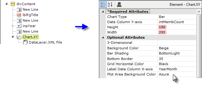
- Add a Chart element, as shown above, and a datalayer to retrieve the data for it. Configure their attributes appropriately. The chart's Height and Width attributes do not have to be completely accurate, as we'll be automatically sizing it, but the ratio of the values you enter is relevant, as it will be preserved during the automatic sizing. You may care to experiment with different values later to get the right aspect ratio.

- Add a Condition Filter element beneath your datalayer and set its attributes as shown above. This will ensure that the data displayed matches the selection the user makes in the Input Select List.
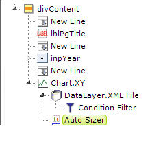
- Now add an Auto Sizer element beneath the chart element, as shown above. There are no attributes to set for this element. It will automatically resize the chart to fit the available width in the mobile device browser window, and resize it if the device is rotated to landscape orientation.
- Finally, finish up by adding a Label element as a footer, if desired, as you did in the mDefault definition.
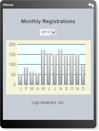
Preview your definition and it should look similar to the example above. You can click the Input Select List and select another year to see how it works. Use your mobile device to browse to the mDefault definition, then tap the menu to navigate to your mobile chart definition.