The Data Menu
The Data Menu element is used to define a menu, with optional sub-menus, for use in Logi mobile reports. This topic provides guidance for using the Data Menu, with simple and complex examples.
- About the Data Menu
- Attributes
- Example: Simple Menu
- Example: Complex Menu (with sub-menus)
- Change Appearance with Template Modifiers
About the Data Menu
Logi developers can use the Data Menu element to create menus and sub-menus for their mobile reports:
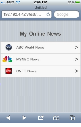
A typical menu is shown above. Each menu item appears in its own horizontal bar, followed by a right-justified ">" symbol. An optional image can be included to the left of the menu item. When the menu item is tapped, the application navigates to a sub-menu, a new mobile report, or a different URL.
The Data Menu can be used to create a simple menu or more complex menus that include a hierarchy of sub-menus.
The menu items, links, and all other required information are retrieved into a datalayer, so the menu can be data-driven and security can be applied. The attributes of the Data Menu element are used to identify the columns in the datalayer whose values comprise the menu items, image file names, actions, etc. that make up the menu.
The examples below assume that you're using a Logi Info build that includes the Data Menu element and that you're working in a Mobile Report definition.
Attributes
The Data Menu element has the following unique attributes:
| Attribute | Description |
|---|---|
| Caption Column | (Required) The name of the column in the datalayer whose values will be displayed as the menu items. |
| Action ID Column | The name of the column in the datalayer whose values are the ID of a child Action element that will be executed when the menu item is tapped. This is used for menu items that call another report definition, a URL, etc., not for navigating to sub-menus. |
| Image Column | The name of the column in the datalayer whose values are the names of image files. These images are displayed to the left of the menu item. If the image file is stored in the _SupportFiles folder, no file path is required. Relative file paths may be used. Example: abcnews.png |
| Sub Menu ID Column | The name of the column in the datalayer whose values are the names of the sub-menus, if any, that each menu item resides in. Used in data rows for sub-menus only. |
| Target Sub Menu ID Column | The name of the column in the datalayer whose values are the names of the sub-menus to navigate to when each menu item is tapped. Used only when sub-menus exist. |
When working a hierarchy of sub-menus with DataLayer.Static, it is possible to construct and use Static Data Rows that do not necessarily all have the same number of columns. Different data rows contain data for different purposes and the Logi Server Engine won't object if columns exist in one row but don't exist in another row where they serve no purpose.
Obviously, if you use a database to provide your menu data, then all rows returned by a query will have the same number of columns. In that case, you'll need to ensure that the query returns all of the columns needed for all purposes.
Example: Simple Menu
The following example demonstrates how to construct a simple, one-level main menu in a Mobile Report.
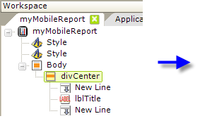
- Begin by configuring a theme and adding a title. Add a Style element and select a theme, as shown above, and, if desired, add a second Style element and select the Rounded theme.
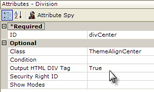
- Add a Division element and set its attributes as shown above. Beneath it add New Line and Label elements to provide a menu title.
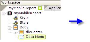
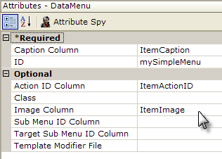
- Add a Data Menu element beneath the Body element and set its attributes as shown above. Although we recommend you use the values in this example for now, the text that's used in these attributes is completely arbitrary; you may use any value that makes sense to you.
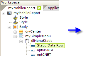
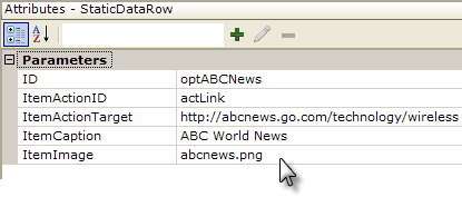
- Next, add a DataLayer.Static element beneath the Data Menu, as shown above.
- Add a Static Data Row element beneath the datalayer, and set its dynamic attributes as shown above.

Note that the Data Menu element's attributes match the data row's "column" names. One additional column not found in the Data Menu attributes has also been added: ItemActionTarget. This is used by Action elements we'll add later. - Repeat the previous step a few times to create additional menu items.
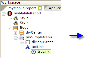
- Add an Action.Link element beneath the Data Menu element, and give it an element ID that matches the value of the ItemActionID attribute in the Static Data Rows (i.e. "actLink"). This identifies the action to be executed when the menu item is tapped.
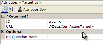
- Finally, add a Target.Link element beneath the Action element and set its URL attribute as shown above. This is where that "extra" Static Data Row attribute is used. In general you can add any number of extra attributes and access them using @Data tokens in this manner. This might be useful, for example, for passing data to the target URL or report using Link Parameters.
Your menu is now ready. Click the Preview button in Studio and an image similar to the one at the top of this document should be displayed.
Navigate to Another Report
If you want your users to tap a menu item and load a different Mobil Report definition, you can substitute Action.Report and Target.Report for Action.Link and Target.Link in our example. But, what if some menu items need to point to report definitions and some to URLs? In that case, you can "mix and match":
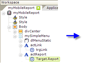
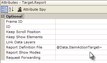
Add both Action.Link and Action.Report elements beneath the Data Menu, as shown above, then set the ItemActionID attribute value for each menu item to use the desired action element.
Example: Complex Menu (with sub-menus)
The following example demonstrates how to construct a more complex menu, with sub-menus, in a Mobile Report. Here's the menu hierarchy we'll build:
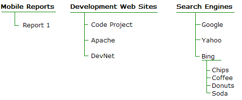
The first main menu item will point to a different mobile report, and the second to a sub-menu of web sites. The last main menu item will point to a sub-menu that will have an item that points to another sub-menu.


- As before, begin by configuring a theme and adding a title. Add a Style element and select a theme, as shown above, and, if desired, add a second Style element and select the Rounded theme.
- Add a Division element and set its attributes as shown above. Beneath it add New Line and Label elements to provide a menu title.

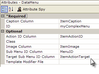
- Add a Data Menu element beneath the Body element and set its attributes as shown above.
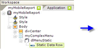
- Next, add a DataLayer.Static element beneath the Data Menu, as shown above.
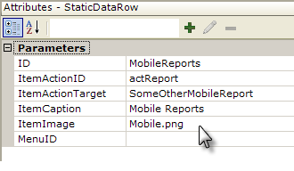
- Add a Static Data Row element beneath the datalayer, and set its dynamic attributes as shown above. The data for this menu item is similar to that used for the Simple Menu example. This completes the first main menu item.
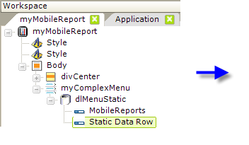
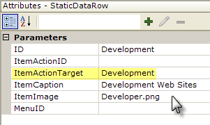
- Add a second Static Data Row and set its column data as shown above. This item will point to a sub-menu, so note that its ItemActionTarget column is set to a value, "Development", that we'll use in the next steps to identify the sub-menu.
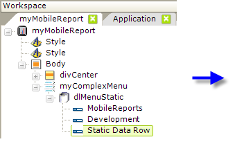
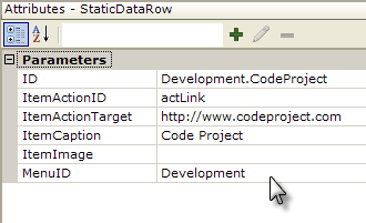
- Add another Static Data Row and set its column data as shown above. Note that the ID column contains a "dot" in it - this will make things easier to read in the Element Tree - and that the MenuID column is used to indicate that this item is in a sub-menu called "Development", which relates to the ItemActionTarget discussed in the previous step.
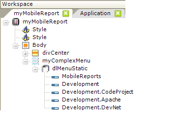
- Add two more Static Data Rows and set their columns data in the same fashion as the previous row. These become the menu items in the sub-menu. This completes the second main menu item and its sub-menu.
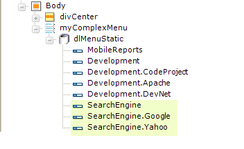
- Repeat the last three steps to add three Static Data Rows for the Search Engines main menu item and two of its sub-menu items. Their column data values will be similar to those set previously. At this point, you can see the value of the "dotted" element IDs.
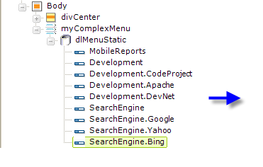
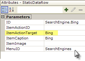
- Add another Static Data Row and set its column data as shown above. This sub-menu item is going to point to another sub-menu, so note that its ItemActionTarget column value is "Bing", the ID of the next sub-menu.
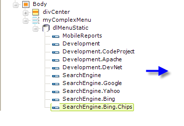
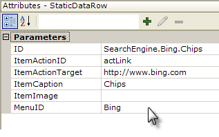
- Add another Static Data Row and set its column data as shown above. This is the first menu item in the second-level sub-menu. Note that its ItemActionID and ItemActionTarget column values will be used by the Action elements we'll add in a few steps.
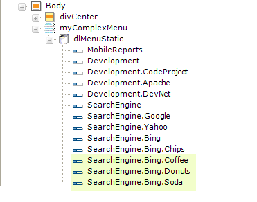
- Repeat the last step to add Static Data Rows for three more Bing sub-menu items. Their column data values will be similar to those set previously.
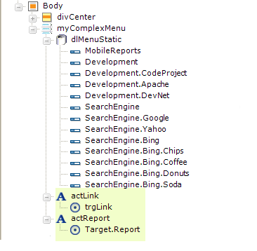
- Finally, add the Action.Link and Action.Report elements, with child Target elements, as shown above, to provide an action when a menu item (which does not point to a sub-menu) is tapped. Be sure to set the Action elements' ID attribute to match the ItemActionID column value in the Static Data Rows, as appropriate (see Step #7 in the Simple Menu example).
Your menu is now ready. Click the Preview button in Studio and test out the menu, sub-menus, and menu items.
Change Appearance with Template Modifiers
The Data Menu element uses a "template file" to define certain element properties that are not otherwise available as attributes to the developer for modification. These include language- and culture-specific attributes that you may want to change for locale-based reasons (or you may simply want to change the element to better suit your application).
To do this, you can use the element's Template Modifier File attribute to identify a custom XML file you create containing custom elements that will override the same elements in the template file.
The Data Menu template file is:
<yourAppFolder>\rdTemplate\rdPopup\rdDataMenuTemplate.lgx
More detailed information about template modifier files can be found in Template Modifier Files.