Introduction to Logi Mobile Reports
Smart phones and tablets are creating a big demand for access to business intelligence on handheld devices. Logi Info developers can leverage their experience with Logi reporting, using special Logi Mobile Report definitions, to satisfy this demand. This topic introduces the concepts, Studio features, and special elements available for developing mobile reports.
Mobile Reports are not available in Logi Report.
- About Logi Mobile Reports
- Mobile Reporting Features in Logi Studio
- Elements: Additions and Restrictions
- Performance Considerations
About Logi Mobile Reports
Logi Mobile Reports, introduced in v10.0.259, bring business intelligence reporting to mobile devices. This is achieved by generating web pages that have been optimized for the mobile device environment.
Logi Mobile Reports are not compiled native device apps; they're pages displayed within the device's browser. Developers design and code Mobile Report apps in Logi Studio, using many of the same techniques used to develop standard Logi reports. An experienced Logi developer already has most of the skills needed to develop a Mobile Report application.
Mobile Reports can include most standard Logi application features, such as charts, tables, tabs, dynamic pages, drill-downs, scrolling, etc. A subset of the standard collection of elements can be used, along with some specialized elements created just for this type of report. Studio automatically provides the mobile-ready elements when you're working in a Mobile Report definition.
In v11.0.416, Animated Charts, based on JavaScript, were made available in Mobile Reports.
Mobile Reports can be displayed on devices that include full-featured browsers, such as:
- iPhone and iPod Touch
- Android devices
- Blackberry devices
- Windows Phone 7+ devices
- iPad and Android tablets (these however may be better candidates for regular Logi reports)
Obviously, the mobile device environment and technology differs from that of a regular browser on a PC. Therefore, developers should be aware of the following considerations.
Regular or Mobile?
Developers may want to create mobile versions of existing regular reports, and give them both the same name. How will the Logi Server Engine know which report to provide when the request is received? It's likely in the future that the product will include some form of "browser detection" that would allow this to happen automatically, but in the near term there are several things you can do:
- Use a Query string flag - If the query string of the Logi report request includes the argument "rdMobile=True" then the engine will respond with the mobile report rather than the regular report.
- Use separate reports, apps, or domains - Use different URLs for regular and mobile reporting. For example, give mobile reports slightly different names, such as prefixing them with "m", or create different Logi applications for each type of reporting, or use sub-domains, such as a mobile.mySite.com instead of www.mySite.com.
- Give your users a choice - It's a common practice to place a "Show Full Version" link in the mobile version of a report. This provides an option to break-out of the mobile view into a more standard view of the same content. This can also be done in reverse.
- Use script-based detection or other methods - You could insert some Javascript in your reports to manage browser detection and redirection to mobile versions of reports. This can be tricky and may be somewhat unreliable due to a lack of consistency in the information reported by different devices, and some mobile browsers even disable Javascript, but it might work for your situation. In addition, there are third-party tools available on the Internet: search for "mobile browser detection".
Screen Real Estate
The size of a mobile device screen is obviously smaller and has a different aspect ratio than that of a traditional computer monitor. Therefore, there are a number of report design considerations related to the amount of screen real estate available, such as the readability of the material being displayed, font and image sizes, etc.
In addition, different mobile devices have different screen sizes and developers may need to design for all device possibilities. Logi Studio provides a very useful feature for previewing Mobile Reports in a variety of device screen sizes (discussed in the next section).
Most devices also change their display size and orientation when the device is rotated from "portrait" to "landscape", and developers may want to provide application behavior that can take advantage of this.
User Interface
Mobile device browsers support HTML5, the latest extension of the HTML standard most web developers are familiar with, and CSS3. In addition, many mobile devices bind user input controls displayed in their browser into controls in their operating system. This causes the "standard" HTML controls, such as a select list, to be displayed in a different manner and perhaps differently in different devices.
In many cases, Logi developers don't need to do anything: standard Logi user input elements will be automatically converted into a device's specialized input representation.
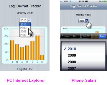
The examples above show the Logi Input Select List element in use. When clicked in a PC browser, it appears as a drop-down list of choices, but when tapped in an iPhone, it's automatically presented as a "Picker" control.
Logi Studio also provides some special user input elements for Mobile Reports, including Input Email and Input Telephone, which are described in a later section of this topic.
Developers can refer to a number of interface design guides available from the manufacturers of mobile device operating systems for guidance and best practices:
Apple: iOS Human Interface Guidelines
Google: Android User Interface Guidelines
Microsoft: User Experience Design Guidelines for Windows Phone
General Navigation
Mobile device browsers enable user interaction with touch gestures, such as tap, double-tap, flick, wipe, touch 'n' drag, and pinch. In Logi Mobile Reports, objects such as links are tapped instead of clicked. Action elements and drill-down links that redirect to other Mobile Report definitions will behave as usual. Developers should take care that objects such as links are in a large enough font, and positioned in such a way, that recognizing them and tapping them is easy. Crowding links
together, for example, might make it difficult to tap them without tapping their neighbors, too.
Scrolling and Paging
Due to the relatively limited amount of screen space on a mobile device, developers need to design data tables and charts so that they're easily viewed. Displaying thousands of rows in a data table, for example, is potentially going to require a lot of scrolling by the user, which is not desirable.
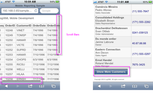
Data tables, for example, can be scrolled vertically and horizontally on mobile devices by flicking or wiping the screen and by dragging the scroll bars, as shown above left, that appear when the table is tapped. A special element, Append Paging, is available for use with data tables; it provides vertical paging and the "show more" button, as shown above right. This replaces the functionality of the Interactive Paging element, whose links are deemed to be too small for mobile device use.
Chart Sizing
Sizing charts for mobile devices presents a challenge, especially if a Mobile Report will be viewed on different devices. A special element, the Auto Sizer, is available to assist with this: it automatically expands or shrinks a chart to fit the available space.
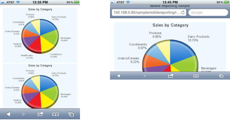
As shown in the examples above, the Auto Sizer also resizes the chart automatically when the device orientation changes.
Themes
The standard Themes provided in Studio for use with Logi applications have been extended for use in Mobile Reports. As usual, developers can also create their own custom themes. Themes include a special style sheet file called MobileTheme.css, which is active only for Mobile Reports and which makes fonts a little larger, increases padding so that to it's easier to tap on links, etc., to generally improve the user experience.
Security
All of the regular Logi security models are supported in Mobile Reports.
Mobile Reporting Features in Logi Studio
Logi Studio includes a number of unique features for Mobile Report definitions, beginning with a special type of report definition:
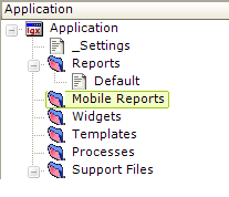
The Application panel includes a folder, Mobile Reports, as shown above. This folder can be right-clicked to create a new Mobile Report definition. When working with a Mobile Report definition, special elements will become available for use and certain other elements, which are not suitable for mobile reports, will be unavailable.
Preview Masks
In order to allow developers to see their work in the proper context, Studio includes a special preview mode for mobile reports:
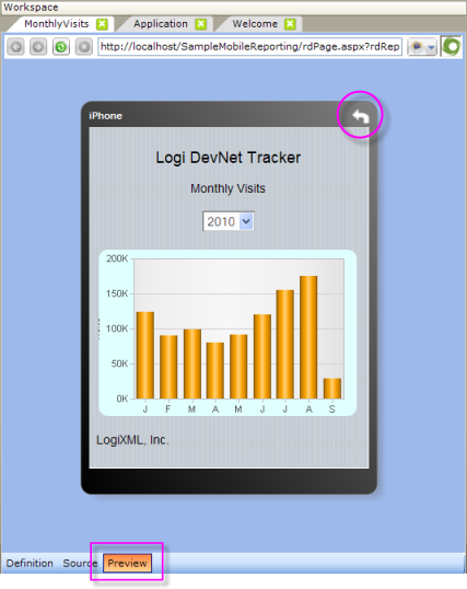
As shown above, when the Preview button is pressed, a Mobile Report definition will be displayed in the Workspace panel within a mask that approximates the size of the target mobile device, using the appropriate browser for that device. The mask can be rotated to landscape orientation by clicking the white arrow on the mask frame.
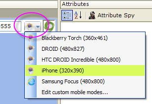
Different device preview masks can be selected from a list (click the button next to the Preview URL); selecting a different mask immediately changes the displayed report preview. Standard masks are provided and developers can add custom masks as well.
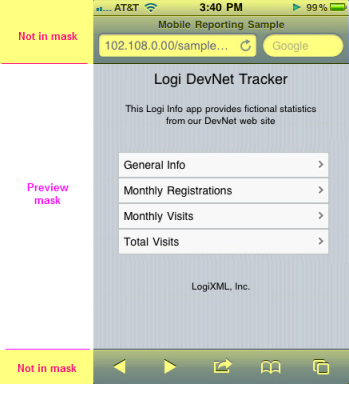
These preview masks are only geographic simulators; they show you how your report will look in the available space. As shown above, they do not display any onscreen buttons or status bars that may normally appear above and below the space on the device screen. The real device OS is not being loaded, so Logi user input elements are not bound to OS controls; recalling the example in the previous section, this means no "Picker" control will appear if you click the Input Select List in the preview.
Full-fledged mobile device emulators are not included because they would present some operational problems, not the least of which would be the relatively long amount of time it would take to load and start them when the Preview button was clicked.
Elements: Additions and Restrictions
The following special elements have been added for exclusive use with Mobile Report definitions.
| Element | Description |
|---|---|
Action.Dial Phone | Launches the device's phone app and feeds it the number in its Phone Number attribute, if any. The call is not placed until the user clicks the app's "Call" button. |
Action.Draft Email | Launches the device's email app and feeds it the addresses, subject, and body text, if any, from this element's attributes. The message is not sent until the user clicks the app's "Send" button. |
Action.Draft Text Message | Launches the device's SMS text messaging app and feeds it the number in its Phone Number attribute, if any. The message is not sent until the user clicks the app's "Send" button. |
Action.Map Location | Runs a Google Maps query to show a map with one or more locations highlighted. Locations can be specified in its attributes with either Place Query or specific Latitude and Longitude coordinates. Assumes the mobile device has mapping capabilities. |
| Append Paging | Used to paginate a data table. Starts by displaying a specified number of rows and a button below the table. Clicking the button displays the next set of rows, beneath the previous set of rows. The button may be clicked repeatedly until all rows are visible, at which time the button will no longer appear. |
| Auto Sizer | Auto Sizer automatically sets the width of a chart so that it fits the full width of its container. This is very useful for making charts as large as possible, within the browser dimensions, and it also resizes the chart when the device orientation changes. |
| Data Menu | Creates a menu, and optional sub-menus, for use on a mobile device. Information used to construct the menu (caption, image, target, etc.) is taken from a datalayer at runtime. See The Data Menu. |
Input.Email | Allows entry of an email address. On some mobile devices, the screen keyboard is configured specifically for entering email addresses. In v10.0.366, this element was enhanced to allow entry of a comma- or semi-colon- separated list of multiple email addresses. |
| Input.Number | Allows entry of a number. On some mobile devices, the screen keyboard is configured specifically for entering numbers. |
Input.Telephone | Allows entry of a telephone number. On some mobile devices, the screen keyboard is configured specifically for entering phone numbers. |
| Mobile Dashboard | Allows mobile report developers to "share" a dashboard created in a regular Logi report definition, using the Dashboard element. The Mobile Dashboard applies special formatting and functionality to the visualizations in the existing regular dashboard. See Mobile Dashboard. |
| Validation.Email | Ensures that a valid Email Address has been entered, using Input.Email. The address is validated for the "@" symbol and domain name. Certain special characters are not allowed. If the validation does not pass, an error message will be displayed in a message box. In v10.0.366, this element was enhanced to allow entry of a comma- or semi-colon-delimited list of multiple email addresses. |
A subset of the standard elements is currently available for Mobile Reports. As development of Mobile Reports progresses in the product, more elements will become available.
Certain attributes for some elements, such as Tooltips and target Frame IDs, make no sense in the mobile device context and are unavailable for Mobile Reports.
Performance Considerations
For a variety of reasons, connectivity to mobile devices may be more sensitive to bandwidth limitations and performance issues than a PC. Developers who wish to improve performance have several measures they may care to use:
Actual transmission performance can be enhanced using HTTP compression to reduce network bandwidth usage. Administrators can configure their web servers so that application and/or file output is compressed. Microsoft offers this information about enabling compression on IIS 7, and numerous sources are available online describing the same for Apache Tomcat.
In addition, there are a number of things developers can do to ensure good Mobile Report performance. For example, limiting the amount of data being delivered to the device in any one request, and breaking complex reports into a number of simpler reports.
There are examples of complete Mobile Report definitions in Work with Logi Mobile Reports.