Using Basic Web Controls in a Report
Basic web controls can be used in page reports created using query resources, web reports and library components. This topic introduces how to insert and define values of basic web controls in a report.
This topic includes the following sections:
Inserting Basic Web Controls
Basic web controls can be inserted in report areas listed in Component Placement in a report.
Tips:
- When defining a basic web control in a page report created using query resources, you can find the button
 next to some options such as Name, Tool Tip in the Display Type dialog. When the button is available, you can select it and select a formula or DBField from the given drop-down list to control an option. If a DBField is selected as the value of an option, the first record of the field in the database will be used.
 - The display type of a basic web control can also be changed after it is created. Basic web controls other than list and drop-down list can be converted to each other and can be displayed as a general type, and you may notice that these web controls have a common Class Type property value "Label" in the Report Inspector, which signifies that these web controls are labels in nature.
Inserting a Text Field/Password
- Do one of the following to insert the text field/password:
- Drag
 /
/ from the Components panel to the destination.
 - Select Insert > Web Controls > Text Field/Password to insert to the destination.
- Drag
- Right-click the text field/password and select Display Type from the shortcut menu. The Display Type dialog appears.
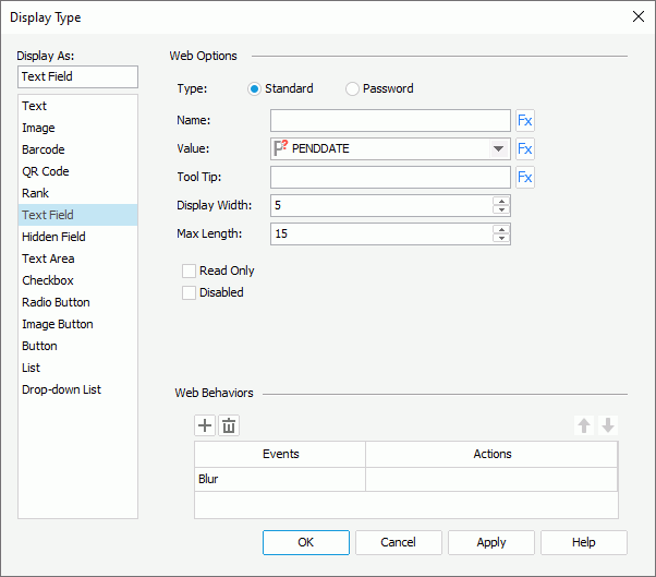
- In the Web Options panel, specify the options of the text field/password.
- In the Name text box, specify the name of the text field/password.
- From the Value drop-down list, select <Input...> and type the value of the text field/password.
- In the Tool Tip text box, type the tooltip you want to show for the text field/password. The tooltip will be displayed when you hover the mouse over the text field/password at server runtime or in HTML results.
- Set the number of characters in the Display Width text box, and the maximum number of characters the user can specify in the Max Length text box.
- Select the Read Only checkbox if you would like to set this text field/password to be read-only.
- Select the Disabled checkbox if you want to make the text field/password disabled.
- In the Web Behaviors panel, bind web actions to the text field/password to trigger specific operations at runtime.
Adding web actions to a web control allows you to customize the web control to make it respond to interactive events, and execute corresponding actions such as sorting and filtering. For example, you can associate an action with a web control's select event. Then when you run the report at runtime and select the web control, the defined operation will be executed.
- Choose an event from the Events column, then select in the Actions column and select
 that appears in the text box.
Logi Report supports the following events for triggering web actions:
Event Description Blur Fires when the object loses the input focus. Data Change Fires when the contents of the object or selection have changed. Select Fires when the user selects the left mouse button on the object. onContextMenu Fires when the user selects the right mouse button on the object, opening the shortcut menu. Double_select Fires when the user double-clicks the object. Focus Fires when the object receives focus. Key Down Fires when the user presses a key. Key Press Fires when the user presses an alphanumeric key. Key Up Fires when the user releases a key. Mouse Down Fires when the user selects the object with either mouse button. Mouse Move Fires when the user moves the mouse over the object. Mouse Out Fires when the user moves the mouse pointer outside the boundaries of the object. Mouse Over Fires when the user moves the mouse pointer into the object. Mouse Up Fires when the user releases a mouse button while the mouse is over the object. Resize Fires when the size of the object is about to change. Scroll Fires when the user repositions the scroll box in the scrollbar on the object. Select Fires when the current selection changes. - In the Web Action List dialog, select the required action and select OK. The web actions available in the dialog vary according to the report type.
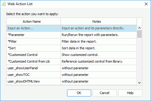
- If the selected web action is Parameter, Filter, Sort, Property, Go Down, Go Up, Go To, Send Message, or Customized Control, the corresponding web action builder dialog appears. Specify the settings according to your requirements.
- If Customized Control from Lib is selected, the Customized Control Manager dialog is displayed, which shows all the customized control files in the customized control library. Select the one you want and select OK.
- If the selected action needs no parameter, the Web Action List dialog is closed. Such web actions are available to page reports created using query resources only.
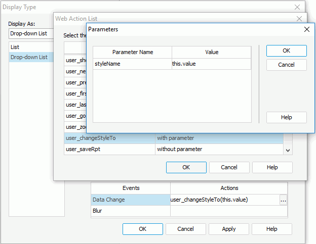
- If the selected web action needs parameters, the Parameters dialog appears, listing the parameters the web action requires. See a sample dialog below.
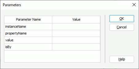
Specify the parameter values in the Value column. For parameters that refer to instance name, you can type in the mapping name of the instance, or the display name plus the prefix "&" as the parameter value. For details about the parameter values, refer to Appendix 3: Parameters of User Defined Web Actions.
Tip: You can define your own web actions by adding API functions into both the file API.js located at
<designer_install_root>\lib\html\javascript\dhtmland the same name file located at<server_install_root>\public_html\dhtmljsp\js. - Select
 in the Display Type dialog and repeat the above steps to add more web actions. If a web action is not required, select
  to remove it.
 - Adjust the order of the added web actions by selecting
 or
or  . Then, when an event that has been bound with more than one action happens, the upper action will be triggered first.
- Choose an event from the Events column, then select in the Actions column and select
- Select OK to insert the text field.
The following details how to define a specific web action:
The Parameter web action enables you to run a specified report, especially one with parameters using the predefined parameter values when the designated event occurs on the trigger object at runtime.
- In the Web Action List dialog, select *Parameter and select OK. The Parameter - Web Action Builder dialog appears.
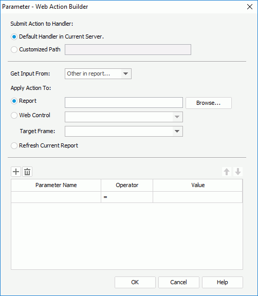
- Specify the handler which will receive the parameters of the web action. The handler may be the default one in the current server, or in another server specified by Customized Path.
- From the Get Input From drop-down list, specify where to get the input, which may be a form (available to page report only), a parameter form control in the report, or Other in report.
- Specifies whether to apply the action to run a report or refresh the current report. If you choose to run a report, select the Browse button to specify the report or use a web control in the current page report tab or web report to retrieve the report name at runtime, then select the window or frame in which the report will be opened from the Target Frame drop-down list.
- In the parameter box, specify the parameters and the values with which to run or refresh the report.
- When Report is selected and a report is specified, if the report contains parameters, the parameters will be automatically loaded into the parameter box. Edit the value for each parameter.
- When Web Control or Refresh Current Report is selected, all the parameters used by the current report are listed in the parameter box if it contains parameters. Edit the value for each parameter.
- Select
 to add more parameter conditions and specify the parameter names and values according to your requirements.
When specifying the name and value of a parameter, you can also use web controls in the current page report tab or web report to retrieve them from the values of the web controls at runtime, provided that the values of the web controls are valid to create a parameter condition at runtime.
To delete a parameter condition, select it and select
 . To adjust the order of the conditions, make use of
  and
and  .
. - Select OK to accept the parameter values.
The Filter web action enables you to filter the specified data components based on predefined filter conditions when the designated event occurs on the trigger object at runtime.
- In the Web Action List dialog, select *Filter and select OK. The Filter - Web Action Builder dialog appears.
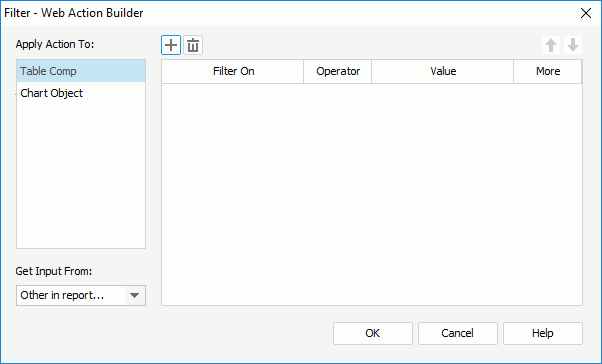
- In the Apply Action To box, select a data component in the current report whose records will be filtered.
- From the Get Input From drop-down list, specify where to get the input, which may be a form (available to page report only), a parameter form control in the report or library component, or Other in report.
- Select
 to add a filter condition line.
 - In the Filter On column, specify the field on which to filter the records. You can also use a web control in the current report to retrieve the field name at runtime.
- Specify the operator to compose the filter condition.
- In the Value column, specify the value of how to filter the field. The value may be specified by yourself, or be retrieved from a web control.
If you choose to type in the value manually, when multiple values are required, you should separate them with ",", and if "," or "\" is contained in the values, write it as "\," or "\\".
If you want to use a web control to retrieve the value, you need to make sure its value is one of the specified field's so that a valid filter condition can be created at runtime.
- Select
 to add more filter conditions
according to your requirements.
 - In the More column, specify the relationship between the filter conditions: And or Or.
To delete a filter condition, select it and select
 . To adjust the order of the conditions, make use of
  and
and  .
. - You can select other data components in the Apply Action To box and take the above steps to specify the filter conditions on them one by one.
- Select OK to accept the filter conditions.
The Sort web action enables you to sort the specified data components based on predefined sort conditions when the designated event occurs on the trigger object at runtime.
- In the Web Action List dialog, select *Sort and select OK. The Sort - Web Action Builder dialog appears.
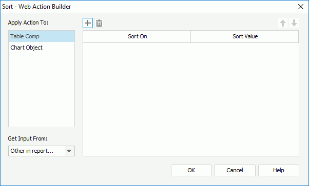
- In the Apply Action To box, select a data component in the current report whose records will be sorted.
- From the Get Input From drop-down list, specify where to get the input, which may be a form (available to page report only), a parameter form control in the report or library component, or Other in report.
- Select
 to add a sort condition line.
 - In the Sort On column, specify the field in the specified data component by which to sort the records. You can also use a web control in the current report to retrieve the field name at runtime. If a web control is used, you need to make sure a valid field name can be retrieved from the value of the web control at runtime.
- In the Sort Value column, specify the sort direction: Ascending, Descending, or be retrieved from a web control at runtime. If a web control is used, you need to make sure its value is valid for composing a sort condition at runtime.
- Select
 to add more sort conditions and specify the sort-by fields and sort direction according to your requirements.
To delete a sort condition, select it and select
 . To adjust the order of the sort conditions, make use of
  and
and  . The order will determine the sort priority of the fields at runtime.
 - You can select other data components in the Apply Action To box and take the above steps to specify the sort conditions on them one by one.
- Select OK to accept the sort conditions.
The Property web action enables you to change properties of the specified report objects when the designated event occurs on the trigger object at runtime.
This web action is only supported on web reports and library components.
- In the Web Action List dialog, select *Property and select OK. The Change Property - Web Action Builder dialog appears.
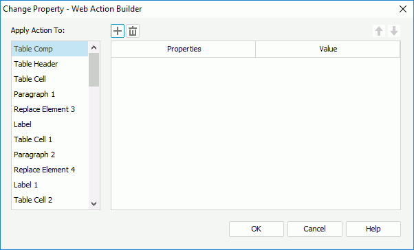
- In the Apply Action To box, select an object the properties of which you want to change.
- Select
 to add a property condition line.
 - In the Properties column, specify the property you want to change. All the properties of the selected object are listed in the drop-down list.
- In the Value column, type in the value of the property. You can also use a web control in the current report to retrieve the value at runtime. If a web control is used, you need to make sure a valid property value can be retrieved from the value of the web control at runtime.
- Select
 to add more property conditions and specify the properties and values according to your requirements.
To delete a property condition, select it and select
 . To adjust the order of the property conditions, make use of
  and
and  .
. - You can select other objects in the Apply Action To box and take the above steps to specify their property values one by one.
- Select OK to accept the property values.
The Go Down web action enables you to drill data of the specified data components to lower-level groups according to the predefined hierarchies in the business views the data components use when the designated event occurs on the trigger object at runtime. It works on the groups of tables and banded objects, the row and column headers of crosstabs, the category and series axes of charts, and the current layer of geographic maps.
This web action is only supported on web reports and library components.
- In the Web Action List dialog, select *Go Down and select OK. The Go Down - Web Action Builder dialog appears.
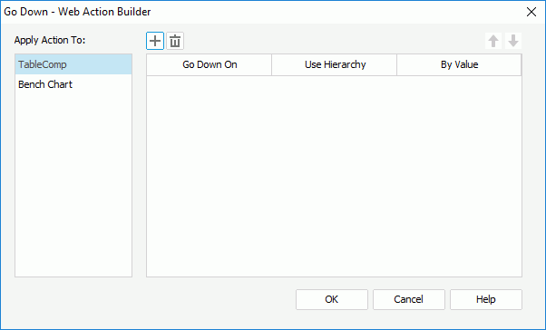
- In the Apply Action To box, select a data component whose data will be drilled through.
- Select
 to add a condition line. You can add one condition at most.
 - In the Go Down On column, select the group on which the go-down action will be performed. For a geographic map, it is Current Layer and cannot be changed.
- In the Use Hierarchy column, select the hierarchy based on which the go-down action will be performed. You can also use a web control in the report to retrieve a hierarchy name at runtime. For a geographic map, the Built-in hierarchy is used and cannot be changed.
- In the By Value column, type in a value of the specified group field to go down to the lower level with the filter condition SpecifiedGroupField=TheValue. You can also use a web control to retrieve a value at runtime.
- You can select other data components in the Apply Action To box and take the above steps to define the go-down conditions for them one by one.
- Select OK to accept the conditions.
The Go Up web action enables you to drill data of the specified data components to upper-level groups according to the predefined hierarchies in the business views the data components use when the designated event occurs on the trigger object at runtime. It works on the groups of tables and banded objects, the row and column headers of crosstabs, the category and series axes of charts, and the current layer of geographic maps.
This web action is only supported on web reports and library components.
- In the Web Action List dialog, select *Go Up and select OK. The Go Up - Web Action Builder dialog appears.
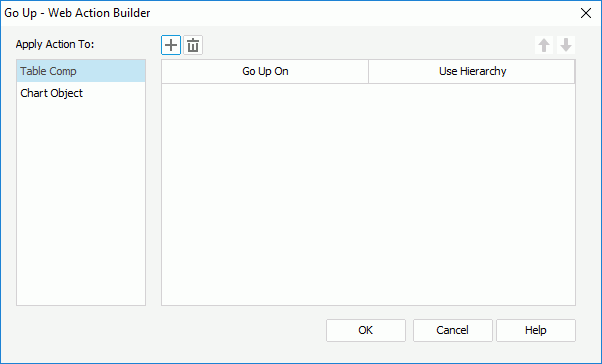
- In the Apply Action To box, select a data component whose data will be drilled through.
- Select
 to add a condition line. You can add one condition at most.
 - In the Go Up On column, select the group on which the go-up action will be performed. For a geographic map, it is Current Layer and cannot be changed.
- In the Use Hierarchy column, select the hierarchy that the go-up action will be performed according to. You can also use a web control in the report to retrieve a hierarchy name at runtime. For a geographic map, the Built-in hierarchy is used and cannot be changed.
- You can select other data components in the Apply Action To box and take the above steps to define the go-up conditions for them one by one.
- Select OK to accept the conditions.
The Go To web action enables you to change the data fields in the specified data components when the designated event occurs on the trigger object at runtime. It works on tables, charts and crosstabs.
This web action is only supported on web reports and library components.
- In the Web Action List dialog, select *Go To and select OK. The Go To - Web Action Builder dialog appears.
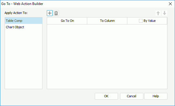
- In the Apply Action To box, select a data component whose data field will be changed.
- Select
 to add a condition line. You can add one condition at most.
 - In the Go To On column, select the field on which the go-to action will be performed.
- In the To Column column, select another field to change the Go To On field to. You can also use a web control in the report to retrieve a field name at runtime.
- To apply the go-to action by filtering the Go To On field at the same time, select the By Value checkbox and then type in the value by which to filter the field or select a web control in the report to retrieve the value at runtime. Skip this step if you select to perform the action on a crosstab aggregate field.
- You can select other data components in the Apply Action To box and take the above steps to define the go-to conditions for them one by one.
- Select OK to accept the conditions.
Inserting a Text Area
- Do one of the following to insert the text area:
- Drag
 from the Components panel to the destination.
 - Select Insert > Web Controls > Text Area to insert to the destination.
- Drag
- Right-click the text area and select Display Type from the shortcut menu. The Display Type dialog appears.
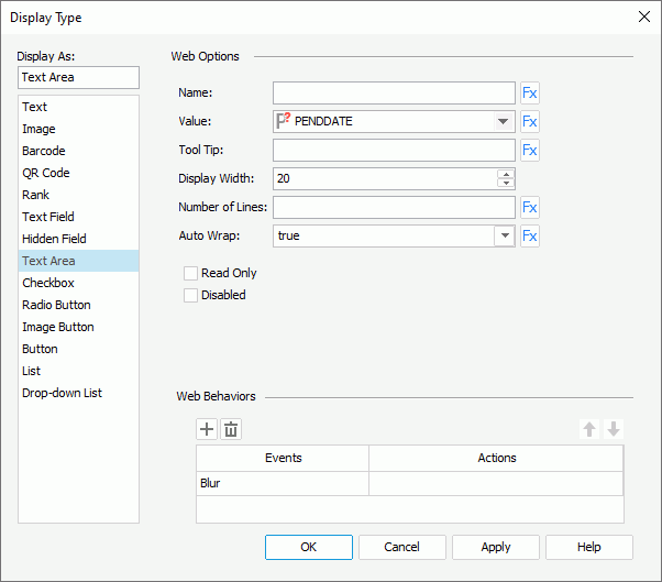
- In the Name text box, specify the name of the text area.
- From the Value drop-down list, select <Input...> and type the value of the text area.
- In the Tool Tip text box, type the tooltip you want to show for the text area. The tooltip will be displayed when you hover the mouse over the text area at server runtime or in HTML results.
- In the Display Width text box, specify the maximum number of characters allowed in the text area.
- In the Number of Lines text box, type the number of lines that is allowed in the text area.
- Set Auto Wrap to true if you want to automatically wrap the text in the text area.
- Select the Read Only option if you would like to set this text area to be read-only.
- Select the Disabled checkbox if you want to make the text area disabled.
- In the Web Behaviors panel, bind web actions to the text area.
- Select OK to insert the text area.
Inserting a Checkbox/Radio Button
- Do one of the following to insert the checkbox/radio button:
- Drag
 /
/ from the Components panel to the destination.
 - Select Insert > Web Controls > Checkbox/Radio Button to insert to the destination.
- Drag
- Right-click the checkbox/radio button and select Display Type from the shortcut menu. The Display Type dialog appears.
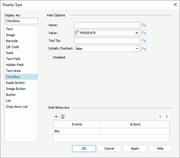
- In the Name text box, specify the name of the checkbox/radio button.
- From the Value drop-down list, select <Input...> and type the value of the checkbox/radio button.
- In the Tool Tip text box, type the tooltip you want to show for the checkbox/radio button. The tooltip will be displayed when you hover the mouse over the checkbox/radio button at server runtime or in HTML results.
- Set Initially Checked to true if you want the checkbox/radio button to be selected by default.
- Select the Disabled checkbox if you want to make the checkbox/radio button disabled.
- In the Web Behaviors panel, bind web actions to the checkbox/radio button.
- Select OK to insert the checkbox/radio button.
Inserting an Image Button
- Do one of the following to insert the image button:
- Drag
 from the Components panel to the destination.
 - Select Insert > Web Controls > Image Button to insert to the destination.
- Drag
- In the Select an image dialog, select the image to use for the image button.
- Right-click the image button and select Display Type from the shortcut menu. The Display Type dialog appears.
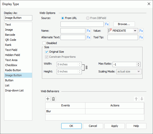
- You can select the Browse button to change the image source.
Tip: When you create an image button by editing the display type of a DBField, formula or summary to Image Button, you can also select the From DBField radio button to make the value of the DBField/formula/summary the image source. If you choose this option, the Decode Type drop-down list is enabled, from which you can specify the type for decoding the image.
- Type the name of the image button in the Name text box.
- From the Value drop-down list, select <Input...> and type the value of the image button.
- Type a string in the Alternate Text text box to serve as the content when the image cannot be displayed.
- In the Tool Tip text box, type the tooltip you want to show for the image button. The tooltip will be displayed when you hover the mouse over the image button at server runtime or in HTML results.
- Select the Disabled checkbox if you want to make the image button disabled.
- In the Max Ratio text box, specify the maximum scaling ratio up to which the image can be scaled. By default the scaling ratio of the image is not limited. If you set the ratio to any value greater than 0, the actual scaling ratio is less than or equal to it.
- By default Logi Report Designer displays the image in its original size. Clear Original Size if you want to use customized image size, then set the width and height of the area for displaying the image in the Width and Height text boxes, select Constrain Proportion to constrain the aspect ratio when setting the width and height, and specify the scaling mode of the image from the Scaling Mode drop-down list.
The following are the available scaling modes. The specified scaling mode will control the image behavior when you adjust the size of the area for displaying the image.
- actual size - Shows the image in its actual size. If the size of the area for displaying the image is smaller than that of the image, part of the image will be cut off.
- fit image - Adjusts the image to fill up the area for displaying the image, with its original perspective remained but under the limitation of Max Ratio.
- fit width - Adjusts the image to fit the width of the area for displaying the image but under the limitation of Max Ratio.
- fit height - Adjusts the image to fit the height of the area for displaying the image but under the limitation of Max Ratio.
- customize - Adjusts the image according to the width and height that you specify in the Width and Height text boxes, regardless of Max Ratio.
- In the Web Behaviors panel, bind web actions to the image button.
- Select OK to insert the image button.
Inserting a Button
- Do one of the following to insert the button:
- Drag
 from the Components panel to the destination.
 - Select Insert > Web Controls > Button to insert to the destination.
- Drag
- Right-click the button and select Display Type from the shortcut menu. The Display Type dialog appears.
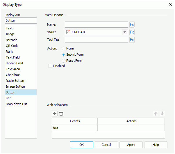
- In the Name text box, specify the name of the button.
- From the Value drop-down list, select <Input...> and type the value of the button.
- In the Tool Tip text box, type the tooltip you want to show for the button. The tooltip will be displayed when you hover the mouse over the button at server runtime or in HTML results.
- Select the action of the button: None, Submit Form or Reset Form.
- Select the Disabled checkbox if you want to make the button disabled.
- In the Web Behaviors panel, bind web actions to the button.
- Select OK to insert the button.
Inserting and Defining a List/Drop-down List
- Do one of the following to insert the list/drop-down list:
- Drag
 /
/ from the Components panel to the destination.
 - Select Insert > Web Controls > List/Drop-down List to insert to the destination.
- Drag
- Right-click the list/drop-down list and select Display Type from the shortcut menu. The Display Type dialog appears.
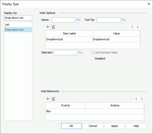
- In the Name text box, specify the name of the list/drop-down list.
- In the Tool Tip text box, type the tooltip you want to show for the list/drop-down list. The tooltip will be displayed when you hover the mouse over the list/drop-down list at server runtime or in HTML results.
- Specify the item labels and the value of each item in the items box by inputting some strings as the labels and values respectively.
If you want to use a DBField/formula field/parameter field to control the value, select
 in the Value cell to insert one from the Insert Fields dialog, and then select the format for the inserted field from the drop-down list in the Item Label cell. Select the All radio button in the Insert Field dialog if you want to add an All value to the list/drop-down list. Then when All is selected as value of the list/drop-down list at runtime, all filter actions defined on the list/drop-down list will not take effect, and if you applied some other web action that needs value from the list/drop-down list, a Null value will be returned.
 - In the Selected text box, specify the selected value for the list/drop-down list.
Tip: When you create an list/drop-down list by editing the display type of a parameter to List/Drop-down List, the Use Runtime Value option is activated. You can select it to use the runtime value as the selected value of the list/drop-down list.
- If you want to disable the list/drop-down list, select the Disabled option.
- When defining a list, you can select the Allow Multiple Selections checkbox if you want to allow multiple items to be selected in the list. If the list is inserted in a web report or library component, you can further specify whether to display the list as Text, Button, Checkbox, or Radio Button, whether to use the vertical or horizontal layout, the width/height of each item, and the vertical/horizontal gap between two adjacent items in the list.
- In the Web Behaviors panel, bind web actions to the list/drop-down list.
- Select OK to insert the list/drop-down list.
Note: If you have specified a tooltip for any basic web control, the tooltip will be displayed differently on different browsers:
- On Internet Explorer, the tip text will be automatically wrapped if its length exceeds the maximal tip width the browser allows. In addition, for Internet Explorer, you can manually add a new line by adding 
 or 
 ahead of the text when editing the tooltip.
- On Firefox, the tip text will be displayed in one line with the maximal tip width the browser allows, and the text that cannot be displayed within the width will be cut off and replaced by ellipsis.
Example: Using Web Controls in a Page Report
In the following example, a page report is built for guiding you through the process of using web controls and applying web actions step by step. The example contains the following tasks:
- Task 1: Create the sample report
- Task 2: Apply a web action without parameters
- Task 3: Apply a web action with parameters
- Task 4: Apply a web action with the Builder Wizard
- Task 5: Preview the report in Page Report Studio and apply the web actions
Task 1: Create the sample report
- Make sure SampleReports.cat is the currently open catalog file. If not select File > Open Catalog to open it from
<install_root>\Demo\Reports\SampleReports. - Select File > New > Page Report to create a page report with a standard banded object in it. Define the banded object as follows:
- Use the query WorldWideSales in Data Source 1 of the catalog.
- Show the following detail fields: Country, Product Type Name, Product Name, Unit Price, Quantity, Discount, and the formula Total.
- Apply the filter conditions "COUNTRY = Canada AND PRODUCT TYPE NAME = Decaf".
- Use the Classic style.
- Insert a crosstab into the report and place it below the banded object. The crosstab shares the same dataset with the banded object, comprises the column field: Product Type Name, row field: Category, and aggregate field: Total (aggregate function: Sum) and applies the Classic style.
- Select View > Page Header to have this panel visible, then set its Height property to 1.0 in the Report Inspector to hold all the web controls that will be inserted in the report later.
- Save the report.
Task 2: Apply a web action without parameters
First, we want to allow the report user to select a button in the report to show the Search dialog of Page Report Studio. To achieve this:
- Select the page header panel and select Insert > Web Controls > Button to insert a Button web control in it.
- Right-click the button, and select Display Type from the shortcut menu.
- In the Web Behaviors box of the Display Type dialog, specify event to Select, then select in the Actions column and select
 that appears in the text box.
 - In the Web Action List dialog, choose user_showSearchDialog to be web action of the button, then confirm the settings.
- Go to the Report Inspector and set the Text property of this button to Search.
- Save the report.
Task 3: Apply a web action with parameters
Now we want to allow the report user to rotate the crosstab in the report and to change the report style.
- Insert another Button web control in the page header panel of the report and place it next to the Search button.
- Specify the Select event and user_rotateCrosstab action to the button as explained above, then set &CT Crosstab to be the value of the action parameter instanceName (CT Crosstab is the name of the crosstab we can see in the report structure panel of the Report Inspector, and here the symbol & shall be prefixed to the crosstab name).
- In the Report Inspector, edit the Text property of the button to Rotate Crosstab.
- Insert a Label object in the page header panel and place it below the two buttons, then resize the label and edit its text to "Change Report Style To:".
- Insert a Drop-down List web control next to the label.
- Right-click the drop-down list and select Display Type shortcut menu.
- In the Display Type dialog, add these items and corresponding values to the drop-down list (to add an item line, select
 ):
):
Item Label Value Classic Classic Black Black Bottle Green BottleGreen Default Default None None Then, in the Web Behaviors box of the dialog, set Event to Data Change, Action to user_changeStyleTo, and specify the value for the web action parameter styleName to this.value.
- Save the report.
Task 4: Apply a web action with the Builder Wizard
The actions Filter, Sort and Parameter have a Builder Wizard. Now we would like to use the wizard to allow the report user to sort records in the banded object by one of the specified fields.
- Insert another Drop-down List web control into the page header panel, and place it below the above web controls. The drop-down list is displayed as Multi-Value Container 1 in the Report Inspector.
- Right-click the drop-down list and select Display Type shortcut menu.
- In the Display Type dialog, add these items and corresponding values to the drop-down list:
Item Label Value Unit Price UNIT PRICE Quantity QUANTITY - Insert a List web control next to the drop-down list. The list is displayed as Multi-Value Container 2 in the Report Inspector.
- In the Display Type dialog for this list, add these items and corresponding values:
Item Label Value Ascending Ascending Descending Descending - Insert a Button web control and place it next to the list, then right-click the button and select Display Type on the shortcut menu.
- In the Display Type dialog, specify Event to Select and Action to Sort, then in the Sort - Web Action Builder dialog, select MultiValueContainer1 from the Sort On column, and MultiValueContainer2 from the Sort Value column. Confirm the settings, and go to the Report Inspector to modify the Text property of the button to Sort.
- Save the report.
Task 5: Preview the report in Page Report Studio and apply the web actions
- Select View > Preview As > Page Report Result to preview this report in Page Report Studio.
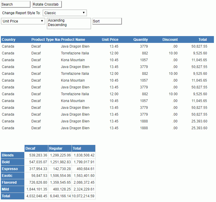
- Select the Search button and the Search dialog appears.
- Select the Rotate Crosstab button, the columns and rows of the crosstab are rotated.

- Select a style from the Change Report Style To drop-down list, for example, select Bottle Green, and the report style now changes to the selected one. It affects both the banded object and the crosstab.
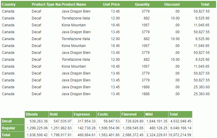
Note: You may notice that the value of the drop-down list does not change to the selected one after the report style is updated. To update the drop-down list value to the current report style, you need to append another action user_changeCompProperty to the event Data Change to the drop-down list.
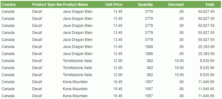
- Select a field name from the third drop-down list and then the sort direction from the list. Here we select Unit Price and Descending respectively, then select the Sort button.
The records in the banded object now are sorted based on the Unit Price values descending.
 Previous Topic