Introduction to User Input Elements
User Input elements allow users to interact with applications, most often to provide reporting criteria. They can be used to gather input in order to filter or restrict data, to modify the style or appearance of a report, and to insert new or update existing data. When the page is submitted, the data is passed as form request variables and does not appear in the query string. This document covers the basic techniques for working with these elements. Topics in this document include:
- Input Hidden
- Input Text
- Input Password
- Input Date
- Date Picker
- Input Email
- Input Number (Mobile only)
- Input Telephone (Mobile only)
- Input Time
- Input File Upload
- Input Text Area
- Input Checkbox
- Input Select List
- Input Checkbox List
- Input Radio Buttons
- Input Slider
- Input Chart.List
- Input Chart.Range
Other helpful resources include Work with User Input Elements and our User Input Sample Application. There are also special mobile input elements available when working with a Mobile Report definition.
Input Hidden
This is the invisible member of the user input elements so some might say it's debatable whether it's actually a user input element at all.
Using It
It does not appear on the report page and has no caption but it can serve either of two purposes:
- It can hold any data value that you want to pass discreetly. Because the POST method is used when the current page is submitted, the data does not appear in the query string. Contrast this behavior to a Link Parameter, which is passed as part of the query string and is therefore visible in the browser's URL display. This element is especially useful when passing data from within data tables to another report or process task (see the companion document Work with User Input Elements).
- It can act as a "change flag", indicating to a process task whether or not any input data has been changed. This can be used with conditional processing to determine, for example, whether or not a database record needs to be updated. Its ID must be named in the Change Flag Element ID attributes of other user input elements for this to work. In the Process task, the request variable associated with this element will have a value of "True" if any changes have occurred.
This change flag functionality relies on the Javascript "onChange" event, so you will not be able to use your own "onChange" event handler with elements implementing Change Flag Element ID.
Beginning in v10.0.503, this element can be used by itself or within an Input Grid element. In earlier versions, it was not available for use within an Input Grid.
Getting Its Data
The data placed into this element will be available in the next report or process by using an @Request token. For example, if the Input Hidden element's ID is set to "hdnChangeFlag", then its data will be available in the next page or process task as the token @Request.hdnChangeFlag~.
More Information
For additional information, see the Element Reference entry for Input Hidden.
Input Text
The next four user input elements all use the same base control: a single-line text input box. The Input Text element is probably the most commonly-used of the group and allows users to type in characters.
![]()
Using It
Attributes set the width of the input box, in characters, and the maximum number of characters that can be entered. If the latter is greater than the former, then the text will automatically scroll horizontally within the box. Other attributes of interest include:
| Attribute | Description |
|---|---|
Change Flag Element ID | Specifies the ID of an Input Hidden element that will be used as a "change flag". |
Default Value | Specifies the default text that will appear in the text box. Can be used with @Request tokens to display text passed from another report or a process. |
Format | Formats the text entered, but does not act as a mask (for example, it does not force entry of characters in a specific pattern) nor does it change the visible data after entry. More information can be found in our Formatting Data document. |
| Save In Cookie | When True, stores the data entered by the user in a cookie, named after the element ID. The cookie can then be used to set the element's default value, so that previously entered data is retrieved, by setting the Default Value attribute to "@Cookie.myInputId~". |
| Save In Local Storage | (v10.2.002+) When True, stores the data entered by the user in the browser's "local storage" (if the browser supports this HTML5 technology). Data stored this way is retained between sessions and automatically restored as the Input element's default value when the page is redisplayed. The local storage size limit is approximately 5 MB and all values are stored as strings. Save In Local Storage is overridden by the Default Value attribute. Do not use them at the same time. |
This element can be used by itself or within an Input Grid element.
Getting Its Data
The data placed into this element will be available in the next report or process by using an @Request token. For example, if the element's ID is set to "txtFirstName", then its data will be available in the next page or process task as the token @Request.txtFirstName~.
More Information
For additional information, see the Element Reference entry for Input Text.
Input Password
The purpose of this element is to allow the entry of passwords. It's identical to the Input Text element except that it does not show the characters being typed. Instead, a black dot is shown for each character. This is a commonly-accepted method of preventing a bystander from reading the password as it's entered.
![]()
Using It
Attributes set the width of the input box, in characters, and the maximum number of characters that can be entered. If the latter is greater than the former, then the text will automatically scroll horizontally within the box. Other attributes of interest include:
| Attribute | Description |
|---|---|
Change Flag Element ID | Specifies the ID of an Input Hidden element that will be used as a "change flag". |
Default Value | Specifies the default text that will appear in the text box. Can be used with @Request tokens to display text passed from another report or a process. |
| Save In Cookie | When True, stores the data entered by the user in a cookie, named after the element ID. The cookie can then be used to set the element's default value, so that previously entered data is retrieved, by setting the Default Value attribute to "@Cookie.myInputId~". |
| Save In Local Storage | (v10.2.002+) When True, stores the data entered by the user in the browser's "local storage" (if the browser supports this HTML5 technology). Data stored this way is retained between sessions and automatically restored as the Input element's default value when the page is redisplayed. The local storage size limit is approximately 5 MB and all values are stored as strings. Save In Local Storage is overridden by the Default Value attribute. Do not use them at the same time. |
This element can be used by itself or within an Input Grid element.
Getting Its Data
The data placed into this element will be available in the next report or process by using an @Request token. For example, if the element's ID is set to "txtPassword", then its data will be available in the next page or process task as the token @Request.txtPassword~.
More Information
For additional information, see the Element Reference entry for Input Password.
Input Date
The purpose of this element is to allow the entry of a date. It's similar to the Input Text element and a date can be typed right into it. It can include an icon or link beside it, which allows a date to be selected from a small popup calendar.
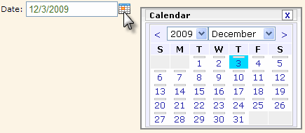
The selected date (or range of dates) is highlighted with a special color. Colors can be configured with CSS by overriding style classes found in <yourApp>\rdTemplate\rdCalendar\rdDataCalendarStyle.css.
Using It
The Input Size attribute sets the width of the input box, in characters. In addition, it has many of the attributes of the Input Text element and also includes:
| Attribute | Description |
|---|---|
| Calendar Caption Format | Specifies the format of the text above the popup calendar. Set to None to prevent display of the caption row entirely. |
Calendar Link | These three attributes specify the type of popup calendar link, if any, that appears beside the text box. A small calendar image is provided or a custom image or text can be used. |
| Caption | Specifies the caption of the input element. |
| Caption Class | Specifies the style sheet class to be applied to the element's caption. Leave this value blank unless you want the caption to have a different class from the input element itself. |
Change Flag Element ID | Specifies the element ID of the Input Hidden element that will be used as a "change flag". |
| Class | Specifies the style sheet class to be applied to the input element. |
Default Value | Specifies the default date that will appear in the text box. Can be used with @Function.Date~ token to display the current date in Short Date format. |
| End Date Default Value | Specifies the default value for the "end" date in a date range, if used. |
| End Date Range Caption | Specifies the caption for the "end" date text box, if used. |
| End Date Range ID | Specifies the ID to be associated with the "end" date text box, if used. This is the ID that will be used with a @Request token when the page is submitted. |
| Format | Specifies the expected date format of the value users enter. |
Input Date Reformat | Causes the date entered to be reformatted into one of several formats before being made available as a request variable. More information can be found in our Formatting Data document. |
| Input Size | Specifies the width of the text box, in characters. |
| Number of Dropdown Years | Specifies the number of years that will appear in the Year drop-down list in the pop-up calendar associated with the input element. This value creates a range of years with the current year in the middle of the list. |
| Save In Cookie | When True, stores the data entered by the user in a cookie, named after the element ID. The cookie can then be used to set the element's default value, so that previously entered data is retrieved, by setting the Default Value attribute to "@Cookie.myInputId~". |
| Save In Local Storage | (v10.2.002+) When True, stores the data entered by the user in the browser's "local storage" (if the browser supports this HTML5 technology). Data stored this way is retained between sessions and automatically restored as the Input element's default value when the page is redisplayed. The local storage size limit is approximately 5 MB and all values are stored as strings. Save In Local Storage is overridden by the Default Value attribute. Do not use them at the same time. |
Show Date Range | This attribute causes two text input boxes for dates to be displayed. If the popup calendar feature is used (Calendar Link Type = Image or Text), the first date selected becomes the value for the starting date; the second date selected sets the value for the ending date. Additional attributes are available that allow you to specify a Caption, Default Value, and ID for the second text input box. Dates can range over 1, 2, or 3 months. |
The Input Date Calendar element can be added as a child of Input Date and used to configure the popup calendar. Input Date Calendar has the same attributes and behavior as the Date Picker element, which is described in the next section below.
The control does not provide an "input mask" to control the format of what can be typed into it. Instead, developers must validate the date entered when the page is submitted, using Validation elements, or when various DHTML events occur, using Event Handler elements. See our Work with User Input Elements document for more information about validation and events.
This element can be used by itself or within an Input Grid element, and a special element, Validation.Date, is available as a child of Input Date, to ensure that a valid value is entered by the user.
Getting Its Data
The data placed into this element will be available in the next report or process by using an @Request token. For example, if the element's ID is set to "txtHireDate", then its data will be available in the next page or process task as the token @Request.txtHireDate~.
If Show Date Range is being used to allow entry of a date range, then the starting date is available using an @Request token that includes the Input Date element's ID, and the ending date is available using an @Request token that includes the ID specified in the End Date Range ID attribute.
Globalization and Localization
The format and presentation of calendars and dates varies widely depending on country and/or language. Some aspects of the date-related input elements are controlled by the "preferred language" settings of the browser being used and others may be affected by the default date and time format settings of the operating system.
At the application level, date-related aspects of your Logi application can also be changed by adding and configuring a Globalization element in the application's _Settings definition. For example, it has two attributes, Default Input Date Format and Default Input Date Reformat, that can be used, if desired, to specify a format with global scope.
Setting the Globalization element's First Day of Week attribute will change the display of the calendars associated with Input elements. If the attribute value is set to 1, then Monday will be the first day in the calendar; the default is Sunday. See Studio's Information Panel for the available values for this and other attributes.
In addition, the browser's preferred language setting will affect the display of the month and day-of-week names in both a Logi element calendar and the selected value:
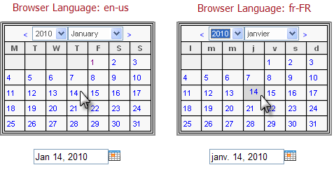
In the examples shown above, a Globalization element has been used to change the first day of the week to Monday. Notice that the month name and day-of-week abbreviations in the calendar change based on the browser's preferred language setting.
In addition, the actual value returned after the user clicks on a date, shown below the calendars, also reflects the language preference in any text it contains - "Jan" vs. "janv". The element's Format attribute, of course, controls the format of the date value returned into
the element's input text box after the mouse click.
![]() In a "globalized date" scenario, when passing/submitting dates from your input controls to other definitions for use within tokens, as filters on queries, or within elements such as Condition Filters, we highly recommend utilizing the ISO-standard date format (yyyy-MM-dd) to avoid any locale/browser date conflicts that might arise. The input element's Input Date Reformat attribute
can
be used for this purpose.
In a "globalized date" scenario, when passing/submitting dates from your input controls to other definitions for use within tokens, as filters on queries, or within elements such as Condition Filters, we highly recommend utilizing the ISO-standard date format (yyyy-MM-dd) to avoid any locale/browser date conflicts that might arise. The input element's Input Date Reformat attribute
can
be used for this purpose.
More Information
For additional information, see the Element Reference entry for Input Date.
Date Picker
This element is not available in Logi Report until after v10.1.25.
The Date Picker element displays a calendar on the page, rather than a text input box, and allows the user to select a date. It can be configured to allow selection of a range of dates by selecting the starting and ending date.
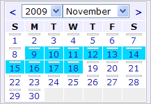
The selected date (or range of dates) is highlighted with a special color. Colors can be configured with CSS by overriding style classes found in <yourApp>\rdTemplate\rdCalendar\rdDataCalendarStyle.css.
Using It
The Width attribute sets the width of the calendar, in pixels or percent; without it, a default width is applied. In addition, it has many of the common attributes for input elements, and:
| Attribute | Description |
|---|---|
Dropdown Year and Month | Specifies if the calendar header will have a drop-down list for year and month selection, allowing the user to change years and months. When set to False, the drop-down lists are replaced by a caption with the current calendar year and month names. Default: True |
End Date Default Value | Specifies the default value for the "end" date in a date range and the ID to be used for that value. |
Number of Dropdown Years | Specifies the number of years to be listed in the calendar's Year dropdown list. |
Number of Months | Specifies if 1, 2, or 3 monthly calendars are displayed. If Show Date Range (see below) is True, highlighting for selected dates in different months can span the calendars. |
Input Date Reformat | Causes the date selected to be reformatted into one of several formats before being made available as a request variable. Date format information relevant to this attribute can be found in our Format Data document. |
Show Date Range | Specifies if a single date can be selected, or if a range of dates can be selected. If set to True, then all days in the range of dates selected will be highlighted. Default: False |
Weekday Caption Format | Specifies the format for the weekday name captions that appear across the top of the calendar. The default value is dd, which displays a single letter for each day; use ddd to display a weekday name abbreviation ("Mon"); use dddd to display the full weekday name ("Monday"); and set the value to None to prevent display of the weekday names. |
Getting Its Data
Date Picker automatically adds Input Hidden elements to your definition and they are assigned the date(s) selected in the calendar. The IDs of the Input Hidden elements are based on the ID attributes of the Date Picker element. The selected dates will be available in the next report or process by using an @Request token. For example, if the Date Picker element's ID is set to "dpHireDate", then the selected date will be available in the next page or process task as the token @Request.dpHireDate~.
If Show Date Range is being
used
to allow selection of a date range, then the starting date is available using an @Request token that includes the Date Picker element's ID, as above, and the ending date is available using an @Request token that includes the ID specified in the End Date Range ID attribute.
More Information
The globalization and localization information presented about the Input Date element also applies to the Date Picker element.
For additional information, see the Element Reference entry for Date Picker.
Input Email
The purpose of this element, introduced in v10.0.405, is to allow the entry of one or more email addresses. It's similar to the Input Text element and addresses can be typed right into it.
![]()
Using It
Attributes set the width of the input box, in characters, and the maximum number of characters that can be entered. If the latter is greater than the former, then the text will automatically scroll horizontally within the box. Other attributes of interest include:
This element can be used by itself or within an Input Grid element, and a special element, Validation.Email, is available to ensure that valid email address values are entered by the user.
Getting Its Data
The data entered into this element will be available in the next report or process by using an @Request token. For example, if the element's ID is set to "inpEmailAddress", then its data will be available in the next page or process task as the token @Request.inpEmailAddress~.
More Information
For additional information, see the Element Reference entry for Input Email.
Input Number
Available in Logi Info Mobile Report definitions only and introduced in v10.0.366, this element allows the entry of a number and may trigger a special data entry control in the mobile device interface. Otherwise, it's similar to the Input Text element and numbers can be typed right into it.
![]()
Using It
Attributes set the width of the input box, in characters, and the maximum number of characters that can be entered. If the latter is greater than the former, then the text will automatically scroll horizontally within the box. Other attributes of interest include:
| Attribute | Description |
|---|---|
Change Flag Element ID | Specifies the ID of an Input Hidden element that will be used as a "change flag". |
Default Value | Specifies the default text that will appear in the text box. Can be used with @Request tokens to display text passed from another report or a process. |
| Save In Cookie | When True, stores the data entered by the user in a cookie, named after the element ID. The cookie can then be used to set the element's default value, so that previously entered data is retrieved, by setting the Default Value attribute to "@Cookie.myInputId~". |
| Save In Local Storage | (v10.2.002+) When True, stores the data entered by the user in the browser's "local storage" (if the browser supports this HTML5 technology). Data stored this way is retained between sessions and automatically restored as the Input element's default value when the page is redisplayed. The local storage size limit is approximately 5 MB and all values are stored as strings. Save In Local Storage is overridden by the Default Value attribute. Do not use them at the same time. |
This element can be used by itself or within an Input Grid element, and a special element, Validation.Numeric, is available to ensure that valid numeric values are entered by the user.
Getting Its Data
The data entered into this element will be available in the next report or process by using an @Request token. For example, if the element's ID is set to "inpQuantity", then its data will be available in the next page or process task as the token @Request.inpQuantity~.
More Information
For additional information, see the Element Reference entry for Input Number.
Input Telephone
Available in Logi Info Mobile Report definitions only and introduced in v10.0.366, this element allows the entry of a telephone number and may trigger a special data entry control in the mobile device interface. Otherwise, it's similar to the Input Text element and numbers can be typed right into it.
![]()
Using It
Attributes set the width of the input box, in characters, and the maximum number of characters that can be entered. If the latter is greater than the former, then the text will automatically scroll horizontally within the box. Other attributes of interest include:
| Attribute | Description |
|---|---|
Change Flag Element ID | Specifies the ID of an Input Hidden element that will be used as a "change flag". |
Default Value | Specifies the default text that will appear in the text box. Can be used with @Request tokens to display text passed from another report or a process. |
| Save In Cookie | When True, stores the data entered by the user in a cookie, named after the element ID. The cookie can then be used to set the element's default value, so that previously entered data is retrieved, by setting the Default Value attribute to "@Cookie.myInputId~". |
| Save In Local Storage | (v10.2.002+) When True, stores the data entered by the user in the browser's "local storage" (if the browser supports this HTML5 technology). Data stored this way is retained between sessions and automatically restored as the Input element's default value when the page is redisplayed. The local storage size limit is approximately 5 MB and all values are stored as strings. Save In Local Storage is overridden by the Default Value attribute. Do not use them at the same time. |
This element can be used by itself or within an Input Grid element.
Getting Its Data
The data entered into this element will be available in the next report or process by using an @Request token. For example, if the element's ID is set to "inpPhoneNo", then its data will be available in the next page or process task as the token @Request.inpPhoneNo~.
More Information
For additional information, see the Element Reference entry for Input Telephone.
Input Time
The purpose of this element, introduced in v10.0.319, is to allow the entry of time. It's similar to the Input Text element and a time can be typed right into it. It can include an icon or link beside it, which allows a time to be selected from a small popup panel.
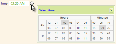
As shown above, the popup panel has separate section for hours, minutes, and (not shown) seconds, and the selected hours, minutes, and seconds are highlighted with a special color. Colors can be configured with CSS by overriding style classes found in <yourApp>\rdTemplate\rdClock\rdTimePickerStyle.css.
Using It
The Input Size attribute sets the width of the input box, in characters. In addition, it has many of the attributes of the Input Text element and also includes:
| Attribute | Descriptions |
|---|---|
Clock Link | These three attributes specify the type of popup link, if any, that appears beside the text box. A small clock image is provided, or a custom image or text link may be used. |
| Change Flag Element ID | Use this to associate the element with an Input Hidden element that will be used as a "change flag". |
| Default Value | Specifies the default time that will appear in the text box. Can be used with @Function.Time~ token to display the current date in mm:hh:ss format. |
| Format | Specifies one of the three standard formats (Short, Medium, or Long Time) or your own custom format. More format information can be found in our Formatting Data document. |
| Input Time Reformat | Causes the time entered to be reformatted into one of several formats before being made available as a request variable. |
| Save In Cookie | When True, stores the data entered by the user in a cookie, named after the element ID. The cookie can then be used to set the element's default value, so that previously entered data is retrieved, by setting the Default Value attribute to "@Cookie.myInputId~". |
| Save In Local Storag | (v10.2.002+) When True, stores the data entered by the user in the browser's "local storage" (if the browser supports this HTML5 technology). Data stored this way is retained between sessions and automatically restored as the Input element's default value when the page is redisplayed. The local storage size limit is approximately 5 MB and all values are stored as strings. Save In Local Storage is overridden by the Default Value attribute. Do not use them at the same time. |
The Input Time Clock element can be added as a child of Input Time and used to configure the popup panel. Input Time Clock has the following optional attributes:
| Attribute | Description |
|---|---|
| Clock Caption | Specifies a specific title in the popup panel. Default: Time Picker |
| Hours Header | Specifies a title for the Hours section. Default: Hours |
| Minutes Header | Specifies a title for the Minutes section. Default: Minutes |
| Seconds Header | Specifies a title for the Seconds section. Default: Seconds |
| Show Minutes | Specifies if the Minutes section is displayed. Default: True |
| Show Seconds | Specifies if the Seconds section is displayed. Default: False |
| Time Picker Hours | Specifies the hour scheme: 12-hour, 24-hour, or whatever the browser's Locale setting requires. Default: BrowserLocale |
This element can be used by itself or within an Input Grid element, and a special element, Validation.Time, is available to ensure that a valid time value is entered by the user.
Getting Its Data
The data placed into this element will be available in the next report or process by using an @Request token. For example, if the element's ID is set to "inpMeetingTime", then its data will be available in the next definition or process task by using the token @Request.inpMeetingTime~.
Globalization and Localization
The format and presentation of times varies depending on country and/or language. Some aspects of the time-related input elements are controlled by the "preferred language" settings of the browser being used and others may be affected by the default time format settings of the operating system.
At the application level, time-related aspects of your Logi application can also be changed by adding and configuring a Globalization element in the application's _Settings definition. For example, it has two attributes, Default Input Time Format and Default Input Time Reformat, that can be used, if desired, to specify a format with global scope.
![]() In a "globalized time" scenario, when passing/submitting dates from your input controls to other definitions for use within tokens, as filters on queries, or within elements such as Condition Filters, we highly recommend utilizing the ISO-standard date format (hh:mm:ss, with leading zeros) to avoid any locale/browser time conflicts that might arise. The input element's Input Time Reformat
attribute can
be used for this purpose.
In a "globalized time" scenario, when passing/submitting dates from your input controls to other definitions for use within tokens, as filters on queries, or within elements such as Condition Filters, we highly recommend utilizing the ISO-standard date format (hh:mm:ss, with leading zeros) to avoid any locale/browser time conflicts that might arise. The input element's Input Time Reformat
attribute can
be used for this purpose.
More Information
For additional information, see the Element Reference entry for Input Time.
Input File Upload
The purpose of this element is to allow local files to be uploaded to the web server. It's similar to the Input Text element but includes a "Browse" button that allows the local file system to be browsed. It expects the data entered to be a fully-qualified file path and file name. Use of this element requires a Logi Info license.
![]()
Using It
The Input Size attribute sets the width of the box, in characters. It has some of the attributes of the Input Text element, including the Change Flag Element ID attribute.
This element can be used by itself or within an Input Grid element.
Getting Its Data
When the page containing this element is submitted, an RFC 1867 file upload occurs. The uploaded file is then available and must be processed or saved using a process task and the Procedure.Save File Upload element. A variety of information about the uploaded file (name, type, size, etc.) is then available using @Procedure tokens. For detailed information about the file upload process, see our document Uploading
Files.
More Information
For additional information, see the Element Reference entry for Input File Upload.
Input Text Area
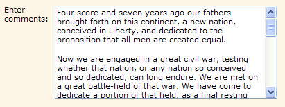
The purpose of this element is to allow multi-line entry of text. It's similar to the Input Text element but allows paragraph-style text entry.
Using It
The Input Columns attribute sets the width of the box, in characters. It has many of the attributes of the Input Text element, and includes:
| Attribute | Description |
Change Flag Element ID | Specifies the ID of the Input Hidden element that will be used as a "change flag". |
Input Columns | Specifies the width of the input control, in characters. |
Rows | Specifies the number of lines of text that can be seen in the control, affecting its height on the page. Text entered will automatically wrap to the next line if it exceeds the length of the text box. It the number of lines of text entered exceeds this attribute's value, vertical scroll bars are enabled and the control scrolls. |
| Save In Cookie | When True, stores the data entered by the user in a cookie, named after the element ID. The cookie can then be used to set the element's default value, so that previously entered data is retrieved, by setting the Default Value attribute to "@Cookie.myInputId~". |
| Save In Local Storage | (v10.2.002+) When True, stores the data entered by the user in the browser's "local storage" (if the browser supports this HTML5 technology). Data stored this way is retained between sessions and automatically restored as the Input element's default value when the page is redisplayed. The local storage size limit is approximately 5 MB and all values are stored as strings. Save In Local Storage is overridden by the Default Value attribute. Do not use them at the same time. |
This element can be used by itself or within an Input Grid element.
Getting Its Data
The data placed into this element will be available in the next report or process by using an @Request token. For example, if the element's ID is set to "txtDescription", then its data will be available in the next page or process task as the token @Request.txtDescription~.
More Information
For additional information, see the Element Reference entry for Input Text Area.
Input Checkbox
The next five user input elements are not related to the Input Text element and offer slightly more complexity in usage and alignment. The purpose of the Input Checkbox element is to provide a single, square box (with a caption) that can be checked or unchecked.
![]()
Using It
The Caption attribute displays text that precedes the checkbox. To create text that follows the checkbox, leave this attribute blank and add trailing Space and Label elements. Other attributes of interest include:
| Attribute | Description |
Checked Value | Specifies the value that will be passed to the next page or process task as a @Request token if the checkbox is checked. No value is passed if the checkbox is unchecked and the token will be null. |
Change Flag Element ID | Specifies the ID of the Input Hidden element that will be used as a "change flag". |
Default Value | Specifies the default value for the control. If it matches the Checked Value attribute, a check symbol will appear in the checkbox. Can be specified using @Request tokens passed from another report or a process task, and other tokens. |
| Save In Cookie | When True, stores the data entered by the user in a cookie, named after the element ID. The cookie can then be used to set the element's default value, so that previously entered data is retrieved, by setting the Default Value attribute to "@Cookie.myInputId~". |
| Save In Local Storage | (v10.2.002+) When True, stores the data entered by the user in the browser's "local storage" (if the browser supports this HTML5 technology). Data stored this way is retained between sessions and automatically restored as the Input element's default value when the page is redisplayed. The local storage size limit is approximately 5 MB and all values are stored as strings. Save In Local Storage is overridden by the Default Value attribute. Do not use them at the same time. |
This element can be used by itself or within an Input Grid element. If multiple Input Checkbox elements are placed on a page, there is no inherent relationship between them and each operates independently of one another.
Getting Its Data
The "state" of the checkbox, checked or unchecked, can be determined in the next report or process with an @Request token. For example, if the element's ID is set to "chkRememberMe" and the checkbox is checked, then in the next page or process task the token @Request.chkRememberMe~ will equal the value in the Checked Value attribute. If it is not checked, then this @Request token will not exist.
This is an important
distinction to note when creating conditional processing that evaluates this token.
More Information
For additional information, see the Element Reference entry for Input Checkbox.
Input Select List
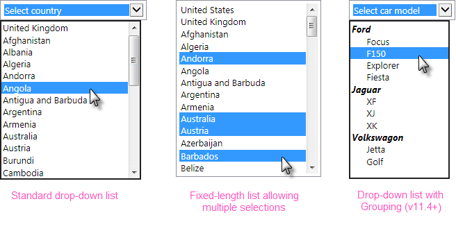
The next three user input elements operate using collections of data and they require a datalayer to provide that data. The purpose of the Input Select List element is to provide a drop-down or fixed-length list of options, one or more of which can be selected.
Using It
The default configuration is for a drop-down list, but a static list can be created by entering a value in the element's Rows attribute.
This element requires a datalayer to provide the items that will appear in the list. If the list of items is short and unchanging, the DataLayer.Static element can be used to "hard code" the items. If the list is longer, the DataLayer.XML element can be used to read the data from an XML file. If the list is dynamic, elements such as DataLayer.SQL can be used to retrieve the items from a datasource.
If the datasource provides one, the value passed to the next report or process task can be different from the displayed text. The control automaticallysizes itself to accommodate the longest display text.
The element has many of the attributes common to all user input elements. In addition, it includes these attributes of interest:
| Attribute | Description |
|---|---|
Caption Column | Specifies the name of the datalayer column that contains the text to be displayed in the selection list. |
Value Column | Specifies the name of the datalayer column that contains the value to be passed to the next report or process task. For example, if "United Kingdom - Pound" is selected in the list, the value "GBP" might be passed to the next report. This allows the flexibility to display and pass different values and even different types of values, such as numbers. |
Change Flag Element ID | Specifies the ID of the Input Hidden element that will be used as a "change flag". |
Default Value | Specifies a default value (not the displayed caption text). If it matches the value of an item in the list, then that item will be pre-selected in the control. Can be used with @Request tokens passed from another report or a process task, and other tokens. To specify multiple default selected values in an Input Select List configured for multiple selections, enter a comma-separated list of values. Do not include any spaces in the list. To use a data-driven set of default selected values, see the Default Values section below. |
Group Caption Column | Specifies the datalayer column that provides the text for group headings in the option list. The is the same column used by the datalayer's Group Filter to group the options. |
Group Class Column | Specifies the datalayer column that provides style sheet class names for the list's group captions. This allows each group caption to have its own styling, based on the data. |
Include Blank | These three attributes allow you to display and use a default item that is not based on data from the datalayer, for example, an instruction such as "Make a selection". See the notes below regarding use of these attributes under "Getting Its Data". |
Multiple Selections | Specifies if multiple list items can be selected simultaneously, using the Ctrl or Shift keys. Default: False. |
Rows | Specifies the number of items to display in a static list, determining the height of the control on the page. If the number of items in the list exceeds this value, vertical scroll bars are enabled and the control will scroll. The default blank setting for this attribute causes a drop-down list to be displayed instead. |
| Save In Cookie | When True, stores the data entered by the user in a cookie, named after the element ID. The cookie can then be used to set the element's default value, so that previously entered data is retrieved, by setting the Default Value attribute to "@Cookie.myInputId~". |
| Save In Local Storage | (v10.2.002+) When True, stores the data entered by the user in the browser's "local storage" (if the browser supports this HTML5 technology). Data stored this way is retained between sessions and automatically restored as the Input element's default value when the page is redisplayed. The local storage size limit is approximately 5 MB and all values are stored as strings. Save In Local Storage is overridden by the Default Value attribute. Do not use them at the same time. |
| Tooltip | (v10.1.59+) Specifies text to be displayed as a tooltip when the mouse is hovered over the control and, if no Tooltip Column is specified, over the list of options. |
| Tooltip Column | (v10.1.59+) Specifies the datalayer column that contains text to be shown as a tooltip when the mouse is hovered over eachitem in the list of options. Can be used with or without the Tooltip attribute. |
This element can be used by itself or within an Input Grid element. If the Input Select List is placed under a Data Table that produces multiple rows, the Input Select List's datalayer only runs once and thus all select lists will have the same rows. You cannot reference @Data tokens from the parent Data Table in the Input Select List's datalayer.
Hierarchical Grouping
![]() Input Select List elements can be configured to list their options in groups, with a group caption, as shown earlier.
Input Select List elements can be configured to list their options in groups, with a group caption, as shown earlier.
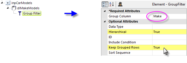
To use this, a Group Filter must be applied to the data, and its attributes set as shown above. Its Group Column value is the datalayer column that will supply the group captions.
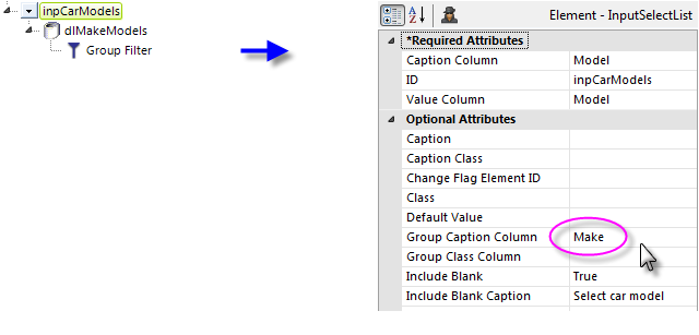
The Input Select List element's Group Caption Column attribute is configured with the same column name used in the Group Filter, as shown above. The Group Class Column attribute gives you the option of setting a different style for each group caption, in the data.
Default Values
A list of default values for the Input Select List can also retrieved from a datalayer. The Input element's Default Value attribute must be left blank in order to use this technique.

As shown above, a Default Valueselement, with its own datalayer, is added as a child of the Input element. Its Data Column attribute is set to the name of the datalayer column containing the default values. This has be effect of turning all of the values in all datalayer rows in this column into a comma-separated list which is then fed into the Input element as its default value.
Getting Its Data
The value (from the "value column") associated with the selected item (from the "caption column") is available in the next report or process with an @Request token. For example, if the element's ID is set to "lbxCurrency" then in the next page or process task the token @Request.lbxCurrency~ will equal that value.
![]() The availability of default data when using the three Blank attributes varies based on the list type:
The availability of default data when using the three Blank attributes varies based on the list type:
If you've specified a Blank Value and nothing is deliberately selected in a drop-down list (no Rows value) and the page is submitted, then the item visible in the control is considered selected and its value will be available using the @Request token.
However, if you've specified a Blank Value and nothing is selected in a static list (Rows > 0) and the page is submitted, then nothing is considered selected and this @Request token will not exist. This is an important distinction to note when creating conditional processing that evaluates this token.
If the Multiple Selections attribute is set to True, the @Request token will contain a comma-separated list of selected values. For use with SQL statements, it may be desirable to surround each individual value in the list with single quotes. This can be done using the SingleQuote token prefix. For example, consider the token:
@Request.MySelections~
which contains the string 1,2,3. When we apply the SingleQuote token prefix, like this:
@SingleQuote.Request.MySelections~
the token is modified so it now contains '1','2','3' which is acceptable in a SQL query.
More Information
For additional information, see the Element Reference entry for Input Select List.
Input Checkbox List
The Input Checkbox List element, introduced in v10.2.224, combines the features of the previous two elements: it displays items in a list, each with its own checkbox.

Using It
This element requires a datalayer to provide the items that will appear in the list. If the list of items is short and unchanging, the DataLayer.Static element can be used to "hard code" the items. If the list is longer, the DataLayer.XML element can be used to read the data from an XML file. If the list is dynamic, elements such as DataLayer.SQL can be used to retrieve the items from a datasource.
If the datasource provides one, the value passed to the next report or process task can be different from the displayed text. The control automatically sizes itself to accommodate the longest display text, or you can specify a width.
The element has many of the attributes common to all user input elements. In addition, it includes these attributes of interest:
| Attribute | Description |
|---|---|
Caption Column | Specifies the name of the datalayer column that contains the text to be displayed in the selection list. |
Value Column | Specifies the name of the datalayer column that contains the value to be passed to the next report or process task if the checkbox is checked. |
Change Flag Element ID | Specifies the ID of the Input Hidden element that will be used as a "change flag". |
| Check All Caption | Specifies the text for the "Check all" checkbox. Enter a value of "none" to hide it altogether. |
| Checkbox List Dropdown | Specifies whether the list is rendered as a drop-down list. Default: False (i.e. static list) |
| Column Count | Specifies how many columns of items should be displayed. Default: 1 |
Default Value | Specifies the value of the item to be pre-checked in the control. Enter the actual the value (from the "Value" column), not the displayed text, in order to set this. Can be used with @Request tokens passed from another report or a process task, and other tokens. To specify multiple items to be pre-checked, add a child Default Values element. |
| Dropdown Button Class | Specifies the style sheet class used to control the drop-down header and button appearance, such as font color. The actual button icon image can be overridden by creating a class named |
| Dropdown None Selected Caption | Specifies the text that appears in the drop-down header when there are no items selected. Default: Select options |
| Dropdown Selected Caption | As items are checked, their Caption text is displayed in a comma-separated list in the drop-down header. When there are too many items to be shown, the text changes to show the number of items selected. This attribute specifies the text displayed at that time. The "#" character is the placeholder for the number of selected items. Default: # selected |
Multiple Selections | Specifies if multiple list checkboxes can be checked at the same time. Default: True |
| Save In Cookie | When True, stores the selections in a cookie, named after the element ID. The cookie can then be used to set the element's default value, so that previously entered data is retrieved, by setting the Default Value attribute to "@Cookie.myInputId~". |
| Save In Local Storage | When True, stores the selections in the browser's "local storage" (if the browser supports this HTML5 technology). Data stored this way is retained between sessions and automatically restored as the Input element's default value when the page is redisplayed. The local storage size limit is approximately 5 MB and all values are stored as strings. Save In Local Storage is overridden by the Default Value attribute. Do not use them at the same time. |
| Tooltip | Specifies text to be displayed as a tooltip when the mouse is hovered over the control and, if no Tooltip Column is specified, over the list of options. |
| Tooltip Column | Specifies the datalayer column that contains text to be shown as a tooltip when the mouse is hovered over eachitem in the list of options. Can be used with or without the Tooltip attribute. |
This element can be used by itself or within an Input Grid element. If the Input Checkbox List is placed under a Data Table that produces multiple rows, the Input Checkbox List's datalayer only runs once and thus all select lists will have the same rows. You cannot reference @Data tokens from the parent Data Table in the Input Checkbox List's datalayer.
Displaying Hierarchical List Items
The Checkbox List Branch element, introduced in v11.1.033, allows the items inside Input Checkbox List to be displayed in a hierarchical arrangement. The example below shows two levels of items below the major item:
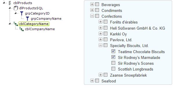
When one or more Checkbox List Branch elements are used, data for the Input Checkbox List must come from a hierarchical datalayer. This can be created by using a datalayer that has a Group Filter element with its Hierarchical attribute set to True. The data should have the same number of hierarchical levels as there are Checkbox List Branch elements or, put more simply, the number of Group Filters under the datalayer should equal the number of Checkbox List Branch elements.
As with the Input Checkbox List element, Checkbox List Branch provides optional custom expanded/collapsed image attributes, and Class and initial state attributes.
Getting Its Data
The value (from the "Value column") associated with a checked item (from the "Caption column") is available in the next report or process with an @Request token. For example, if the element's ID is set to "inpCity" then in the next page or process task the token @Request.inpCity~ will equal that value.
If nothing is checked in the list and the page is submitted, then this @Request token will equal an empty string ("").
If the Multiple Selections attribute is not set to False, the @Request token will contain a comma-separated list of the checked values. For use with SQL statements, it may be desirable to surround each individual value in the list with single quotes. This can be done using the SingleQuote token modifier. Thus
@Request.MySelections~ which has a value of London,Berlin,Rome becomes
@SingleQuote.Request.MySelections~ which has a value of 'London','Berlin','Rome'
Default values for an Input Checkbox List element with multiple selections can be provided using a child Default Values element. The default values are retrieved by a child datalayer beneath the Default Values element. If a Default Values element is present, then the Input Checkbox List's Default Value attribute is ignored.
More Information
For additional information, see the Element Reference entry for Input Checkbox List.
Input Radio Buttons
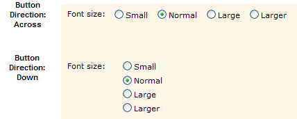
The purpose of this element is to provide at least two "radio buttons", small circles (with captions) that can be selected. They are "mutually exclusive" - only one of a group of radio buttons can be selected at a time.
Using It
This element requires a datalayer to provide the items that will appear as options. One radio button will be produced for each record in the datalayer. If list of options is short and unchanging, the DataLayer.Static element can be used to "hard code" the options. If the list is longer, the DataLayer.XML element can be used to read the data from an XML file. If the options are dynamic, elements such as DataLayer.SQL can be used to retrieve the items from a datasource.
If the datasource provides one, the value passed to the next report or process task can be different from the displayed text. The control automatically sizes itself to accommodate the displayed text.
The element has many of the attributes common to all user input elements. In addition, it includes these attributes of interest:
| Attribute | Description |
|---|---|
Caption Column | Specifies the name of the datalayer column that contains the text to be displayed beside the radio buttons. |
Value Column | Specifies the name of the datalayer column that contains the value to be passed to the next report or process task. For example, if the "Larger" radio button is selected in the list, the value "4" might be passed to the next report. This allows the flexibility to display and pass different values and even different types of values, such as numbers. |
Change Flag Element ID | Specifies the ID of an Input Hidden element that will be used as a "change flag". |
Default Value | Specifies which radio button will be selected by default; enter the actual the value (from the "Value" column), not the displayed text, in order to set this. Can be used with @Request tokens passed from another report or a process task, or other tokens. |
Radio Button Direction | Specifies the physical arrangement of the radio buttons: in a horizontal (Across) or vertical (Down) layout, as shown in the image above. |
| Save In Cookie | When True, stores the data entered by the user in a cookie, named after the element ID. The cookie can then be used to set the element's default value, so that previously entered data is retrieved, by setting the Default Value attribute to "@Cookie.myInputId~". |
| Save In Local Storage | (v10.2.002+) When True, stores the data entered by the user in the browser's "local storage" (if the browser supports this HTML5 technology). Data stored this way is retained between sessions and automatically restored as the Input element's default value when the page is redisplayed. The local storage size limit is approximately 5 MB and all values are stored as strings. Save In Local Storage is overridden by the Default Value attribute. Do not use them at the same time. |
Tooltip Column | (v10.1.59+) Specifies the name of an optional column in the datalayer that contains explanatory text to be displayed as a tooltip unique to each radio button. |
This element can be used by itself or within an Input Grid element. However, it cannot be used beneath a Data Table element, so you cannot display radio buttons in table columns.
Getting Its Data
The value (from the "Value" column) associated with the selected radio button (from the "Caption" column) is available in the next report or process with an @Request token. For example, if the element's ID is set to "radFonts" then in the next page or process task the token @Request.radFonts~ will equal that value.
If there is no default selection and no radio button is selected and the page is submitted, then this @Request token will not exist. This is an important distinction to note when creating conditional processing that evaluates this token.
More Information
For additional information, see the Element Reference entry for Input Radio Buttons.
Input Slider
The purpose of this element is to provide one, or a pair of, sliding "thumbs" that can be used to adjust numeric value inputs. The thumbs are clicked and dragged to change the input value. This element is not available in Logi Report until after v10.1.25.

Using It
The slider can be oriented horizontally or vertically. It does not have a Caption attribute, so a caption for this element must be provided separately. Other attributes of interest include:
| Attribute | Description |
|---|---|
ID | Specifies the unique element ID associated with this control. This ID is used with an @Request token after the page is submitted to identify the data value for the first sliding thumb. |
Background Image | Specifies the filename of an image for the background of the slider; if left blank, a default image is supplied. An image provided here is not stretched to fit; it must exactly fit the size of the slider and, prior to v10.2.224, tick marks must be added to the image. Beginning with that version, tick marks are automatically generated. |
Decimal Points | Specifies the number of decimal places in the data values. The default is 0, which causes the slider to return only integer values. |
Default Value | Specifies the default value associated with the first sliding thumb, shown when the report page is first displayed. |
Minimum Value | Specifies the range of numeric values represented by the slider scale. The default values are 0 and 100, respectively. |
Second Default Value | Specifies the default value associated with the second sliding thumb, if used, when the report page is first displayed. |
Second Slider ID | Specifying a value here causes a second sliding thumb to be displayed; leave this blank to display just one sliding thumb. This ID is used with an @Request token after the page is submitted to identify the data value for the second thumb. |
Slider Length | Specifies the width or height of the slider, in pixels, depending on the Slider Orientation attribute. The value represents the distance that the thumbs can move. Default: 200 pixels. |
Slider Orientation | Specifies the orientation of the slider: horizontal or vertical. Default: Horizontal. |
Slider Thumb Offset Left | Allows fine adjustment, in pixels, of the thumb image positioning, so that it aligns well with the slider. |
Thumb Image | Specifies the filename of an image for the thumbs; if left blank, a default (shown above) is used. |
Thumb Separation Value | When there are two sliding thumbs, specifies the minimum separation allowed between them. The value is based on the values of the Min Value and Max Value attributes, not in pixels. |
| Tick Count | Specifies the number of "detents", or stopping points, at which the thumbs will stop when dragged. Using this value, the detents are evenly distributed across the length of the slider. Beginning in v10.2.224, tick marks are automatically created. Prior to that, tick marks must be added to the background image when the image is designed. |
This element cannot be used within an Input Grid element. If multiple Input Slider elements are used on a page, ensure that each thumb has a unique ID.
This element causes two DHTML events to occur. These can be used with Event Handler elements to provide user feedback, to refresh the current page, or to launch another report. The onDrag event is fired as a thumb is dragged, and the onChange event is fired when the dragging operation finishes.
This element incorporates a JavaScriptfunction that can be called from script to set the slider value. The function syntax is:
rdInputSliderSet('sliderID', value)
This element will not appear in exported reports.
Getting Its Data
The numeric value selected using this element will be available in the next report or process by using an @Request token. For example, if the element's ID attribute is set to "Thumb1" and its Second Slider ID attribute is set to "Thumb2", then the selected values will be available in the next page or process task as the tokens @Request.Thumb1~ and @Request.Thumb2~.
More Information
For additional information, see the Element Reference entry for Input Slider.
Input Chart.List
This element, introduced in v11, enables a chart to become an input control. Once a static Bar or Pie chart has been made the child of this element, users can select
one or more bars, or one or more pie regions, by clicking on them. When the page is submitted, the Label values of the selected chart items are passed to the next report or process.
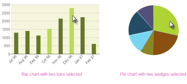
As shown above, the selected bars or wedges are displayed in a distinctly different color from the other bars or wedges by default. If the data has been grouped so that it's displayed as groups of several bars each, the entire group will be selected when clicked, rather than individual bars within the group.
Using It
All of the attributes of this element, except the element ID, are optional. They include:
| Attribute | Description |
| ID | (Required) A unique element ID. |
Change Flag Element ID | Specifies the ID of an Input Hidden element that will be used as a "change flag". |
Default Value | Specifies the default value for the element. If that value matches a bar or wedge value, then the chart will be initially displayed with that item already selected. Multiple default values are not supported. |
| Save In Cookie | When True, stores the data entered by the user in a cookie, named after the element ID. The cookie can then be used to set the element's default value, so that previously entered data is retrieved, by setting the Default Value attribute to "@Cookie.myInputId~". |
| Save In Local Storage | (v10.2.002+) When True, stores the data entered by the user in the browser's "local storage" (if the browser supports this HTML5 technology). Data stored this way is retained between sessions and automatically restored as the Input element's default value when the page is redisplayed. The local storage size limit is approximately 5 MB and all values are stored as strings. Save In Local Storage is overridden by the Default Value attribute. Do not use them at the same time. |
Selected Color | Specifies the selected bar or wedge's color, by name, decimal RGB value, or hex RGB value. Prefix hex values with the pound sign, like #112233. |
| Selected Transparency | Specifies the transparency level of the selected bar or wedge. The lowest possible value of 0 indicates that the region is opaque, with no transparency. The other end of the scale, 15, indicates a completely transparent bar or wedge. |
Unselected Color | Specifies the color of unselected bars or wedges, by name, decimal RGB value, or hex RGB value. Prefix hex values with the pound sign, like #112233. |
| Unselected Transparency | Specifies the transparency level of the unselected bars or wedges. The lowest possible value of 0 indicates that the region is opaque, with no transparency. The other end of the scale, 15, indicates a completely transparent bar or wedge. |
This element cannot be used within an Input Grid element. A child validation element, Validation.Required, is available to ensure that a selection is made by the user, if desired.
Getting Its Data
The Label values of the selected bars or wedges are available in the next report or process with a Request token. For example, if the element's ID is set to inpMyPie then in the next page or process task the token @Request.inpMyPie~will equal that value.
If no chart item is selected and the page is submitted, then this Request token will exist but it will be empty ("").
If multiple chart items are selected, the resulting Request token will contain a comma-separated list of selected values. When working use with SQL statements, it may be desirable to surround each individual value in the list with single quotes. This can be done using the SingleQuote token modifier. Thus
@Request.inpCLPie~ which has a value of 1,2,3 becomes
@SingleQuote.Request.inpCLPie~ which has a value of '1','2','3'
More Information
For additional information, see the Element Reference entry for Input Chart.List.
Input Chart.Range
This element, introduced in v11, enables a chart to become an input control. Once a static Line, Spline, or Scatter chart has been made the child of this element, users can select a region in the chart by drawing a selection box (by dragging the mouse). When the page is submitted, the maximum and minimum Label and Data values of the selected chart region are passed to the next report or process.
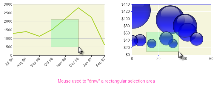
The selected region is displayed in a distinctly different color from the rest of the chart by default.
Using It
The attributes of this element include:
| Attribute | Description |
| ID | (Required) A unique element ID. |
MaxXaxisID | (Required) Specifies the name of the Request token that will provide the upper X-axis (Label) value in the next report or process. |
MaxYaxisID | (Required) Specifies the name of the Request token that will provide the upper Y-axis (Data) value in the next report or process. |
MinXaxisID | (Required) Specifies the name of the Request token that will provide the lower X-axis (Label) value in the next report or process. |
MinYaxisID | (Required) Specifies the name of the Request token that will provide the lower Y-axis (Data) value in the next report or process. |
Region Border Color | Specifies the border color of the region drawn on the chart, by name, decimal RGB value, or hex RGB value. Prefix hex values with the pound sign, like #112233. |
Region Color | Specifies the color of the region drawn on the chart, by name, decimal RGB value, or hex RGB value. Prefix hex values with the pound sign, like #112233. |
Region Transparency | Specifies the transparency level of the region drawn on the chart. The lowest possible value of 0 indicates that the region is opaque, with no transparency. The other end of the scale, 15, indicates a completely transparent bar or wedge. |
This element cannot be used within an Input Grid element.
Getting Its Data
The minimum and maximum Label and Data values of the region drawn on the chart are available in the next report or process with @Request tokens. For example, if the element's MaxXaxisID attribute is set to EndDate then in the next page or process task the token @Request.EndDate~will equal the maximum Label value.
If no selection region is drawn and the page is submitted, then the Request tokens will exist but they will be empty ("").
Special Event Elements
Two special, child event elements, Area Drawn and Area Cleared, are available for use with this element; both take Action elements as their children.
Area Drawn triggers its child Action element as soon as the user finishes drawing the area on the chart.
After an area has been drawn on the chart, if the user clicks somewhere on the chart
again, the drawn area will be removed and Area Cleared will then trigger its child Action element.
More Information
For additional information, see the Element Reference entry for Input Chart.Range.
More advanced information about all of these elements can be found in our document Work with User Input Elements.