Work with User Input Elements
User Input elements allow users to interact with applications, most often to provide reporting criteria. This topic discusses a variety techniques for working with these elements.
- Align Input Elements
- Wrap in a Fieldset Box
- Inclusion in Data Tables
- Populate Collection-type Input Elements
- Set Default Values
- Save Entered Values
- Validate Input
- Use Validation Elements
- Use Event Handlers
- Use Event Handlers with Javascript
Aligning Input Elements
One challenge when working with the default Flow Layout in Logi Studio is to get user input elements neatly aligned. The Input Grid element has been provided to assist developers in doing this.
The Input Grid is not a user input element per se but is instead a container for input elements that aligns them. It can be thought of as a two-column table with the first column containing the caption describing an input element and the second column containing the input element itself. Adding multiple rows allows a data input form to be created. The overall width of the table and the width of the caption column can be set using attributes.
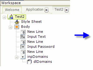
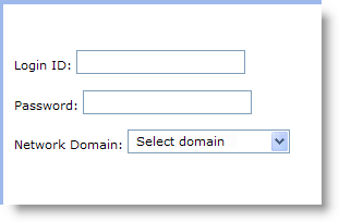
In the example shown above, user input elements are placed in a report definition without using the Input Grid element. As you can see, the alignment of the elements on the page is poor and the captions are not vertically centered on the controls.
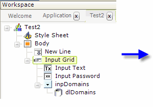
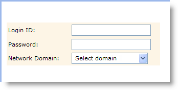
In the second example, above, the user input elements have been made the children of an Input Grid element and the resulting, more precise, layout on the page is evident. For the purpose of this example, the Input Grid element was assigned a style class that colored its background, so you can see it more clearly. Attribute settings have made the entire grid 300 pixels wide and the caption space 120 pixels wide. Note that, in this definition, New Line elements between the input elements are no longer necessary.
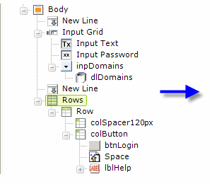
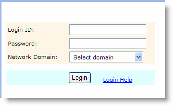
There are some limitations, however. No other elements, such as Buttons or Labels, for example, can be placed within the Input Grid. These elements need to be carefully placed outside the grid, in their own HTML table using Rows, Row, and Column Cell elements, as shown above, if similar alignment is desired. Once again, for clarity in the example, this table has been assigned a style class to give it a colored background.
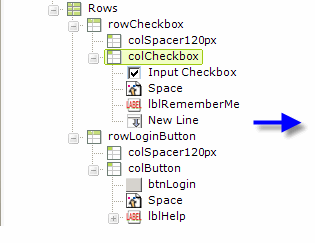
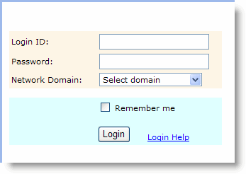
There are also times when you may wish to have the caption follow the control, rather than precede it. This can't be done within the Input Grid. Instead, as shown above, another row has been added to the table below the Input Grid and an Input Checkbox element placed in it. The Input Checkbox's Caption attribute has been left blank and a separate Label element provides the "caption" following the checkbox.
The Input Grid and HTML tables are useful elements for alignment. We've seen how you can combine them and there are a variety of combinations that can work. For example, if you create a one-row, two-column table first and then put an Input Grid into each column, you can even make a two column (or more) data entry form.
Alignment Using Style Classes
The user input elements typically have two attributes related to style sheet classes: one for the entire element and one for the caption. This allows, for instance in an Input Select List, the font for the caption and the list items to be set to a certain font and size and the caption only to be set to bold.

It also allows other style selectors, such as padding, to be applied to the caption to align it correctly. For example, in a horizontal arrangement of radiobuttons, padding-right: 3px can be applied to the caption to increase the space between each caption and the next button.

The default alignment for the caption of a Input Text Area element is centeredvertically, as shown above left. This may not look very good in a stack of input elements, so the vertical-align:top; style selector can be applied to position the caption at the top of the input box.
These are just a few examples of the many things that can be done using style classes. Be sure to distinguish between situations where style classes need to be applied to the elements themselves and to the objects that contain the elements, such as an Input Grid or table.
Wrap in a Fieldset Box
![]() The Fieldset Box element provides a visual container for other elements, including User Input elements.
The Fieldset Box element provides a visual container for other elements, including User Input elements.
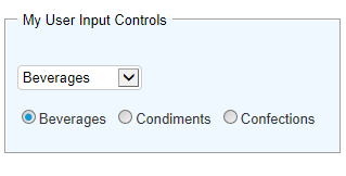
The example above shows a fieldset box, with a caption of "My User Input Controls" surrounding Input Select List and Input Radiobuttons elements. The box has been styled to have a pale blue background.

The elements used to produce the previous example are shown above, and this style sheet code:
#myFSBox {
background-color: AliceBlue;
}
#myFSBox legend {
padding: 0px 5px 0px 5px;
}
was used to style it. The second class sets the space before and after the box caption text.
Inclusion in Data Tables
Some applications display data in a Data Table and include user input elements in each row of the table. A common example is a "Delete" checkbox for every record.
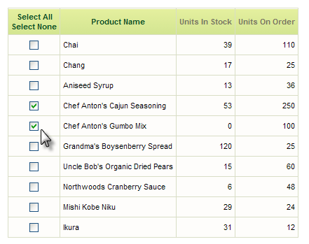
This can be done in Logi applications, but generally requires use of a Process Task to process the input values. Logi Report does not support Process Tasks, so this technique is limited to Logi Info applications.
In addition, this technique is not recommended when hierarchical data is being used. The complex data relationships involved make it impossible to uniquely identify the associated user input elements. This prohibition applies to obvious hierarchical representations, such as the Data Table, and also to elements like the Data Tree, which use hierarchical grouping internally to create their parent-child data representations.
Populate Collection-type Input Elements
Input Select List and Input Radio Buttons elements differ from the other UI elements in that they require a datalayer to provide their selection items. The use of a datalayer allows some interesting flexibility in presenting the data. Here are several examples of this in action.
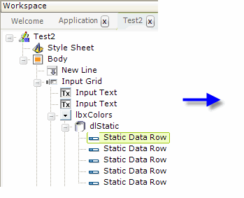
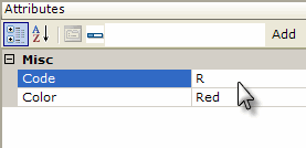
If the selection items are never going to change, then they can be "hard coded" into the definition using DataLayer.Static and child Static Data Row elements, as shown above.
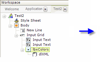
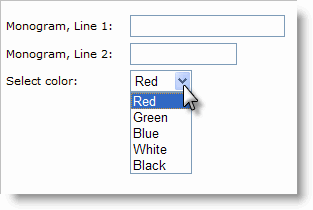
It may make sense to place the selection items in an XML file, which has the advantage of being able to be edited outside of your Logi application. In the example shown above, a DataLayer.XML element is used to provide the selection list items,
|
and above is an example of the supporting XML data file.
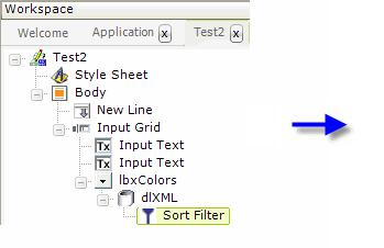

In the example above, a Sort Filter has been added to the datalayer, causing the list items to be sorted alphabetically.
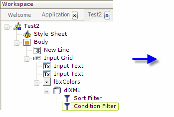
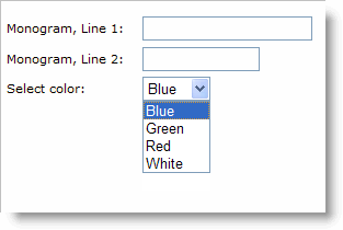
Condition Filter elements can also be added. In the example above, the Condition attribute has been set to "@Data.Color~" <> "Black", eliminating Black from the list of choices. Other tokens, such as @Request, can also be used in this attribute, which means the selection items can be changed dynamically.
Other datalayers, such as DataLayer.SQL, DataLayer.SP, or even DataLayer.Web Service, can be used to populate the selection items from various datasources.
Set Default Values
All of the user input elements, except Input File Upload, have a Default Value attribute, which lets the developer set the value that will be shown or selected when the page is first displayed.
Making the desired value appear or be selected can be as simple as entering that value into the attribute - "hard coding" what will appear each time the page appears. Note that in the case of the Input Checkbox, Input Select List and Input Radio Buttons elements, this value must be the one passed to the next page (from the Value column) not the displayed text. Tokens can also be used in the Default Value attribute.
In a situation where the user enters data then submits the page, for example to a process, and then that page or process calls the data input page again, it's common to want to redisplay the values the user entered. To do this, use @Request tokens in the Default Value attributes of your user input elements and ensure that the calling process task or page sends the values as request variables. Note that this cannot be done by just setting the Request Forwarding attribute for a Target.Report element to True; you must use Link Params instead.
If you've used @Request tokens as described above, how can you get some default values to appear the very first time the page is displayed?
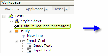
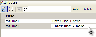
As shown above, the Default Request Parameters element will provide request variables, for use as your default values, when none are actually passed in the query string. So, in the example above, the Default Value attribute of the first Input Text element would be set to @Request.txtLine1~. When the query string that calls this page includes request variables of the same name, the Default Request Parameters values are ignored.
Beginning in v10.0.366, there's another option for populating the default value(s) in an Input Select List element. The Default Values element, added as a child of the Input Select List, allows you to provide multiple default values when the Input Select List's Multiple Selections attribute is set to True. The default values are retrieved by a child datalayer beneath the Default Values element. If a Default Values element is present, then the Input Select List's Default Value attribute is ignored.
Save Entered Values
After a user has entered value(s) in Input elements, a report refresh or additional processing of some kind usually takes place. When the report is redisplayed, it's often desirable to redisplay the last values the user entered in the Input elements. There are three ways to do this:
Set the Default Value Attribute
Most Input elements have a Default Value attribute and you can set its value to either the @Request token passed when the report was refreshed (e.g. @Request.theInputElementID~), or an @Request token passed as a Link Param from the calling report or process task.
Save the Value in a Cookie
The following elements have a Save In Cookie attribute:
|
|
|
Setting this attribute to True causes the entered value to be saved in a cookie, named for the element ID, when the page is submitted. This cookie survives the user session, preserving the value. You can then cause the saved cookie value to be used again in the next session by setting the Input element's Default Value attribute to the proper cookie token: @Cookie.theInputElementID~
Save the Value in Local Storage
Beginning in v10.2.002, the elements listed above were also given a Save In Local Storage attribute. Setting this attribute to True causes the entered value to be stored in the browser's "local storage" (if the browser supports this HTML5 technology). Data stored this way is preserved between sessions and is automaticallyrestored as the Input element's default value when the page is redisplayed. The local storage size limit is approximately 5 MB total and all the values are stored as strings.
![]() Save In Local Storage is overridden by a value in the Default Value attribute. Do not use them at the same time.
Save In Local Storage is overridden by a value in the Default Value attribute. Do not use them at the same time.
When should you save values in local storage instead of in cookies? Local storage is the "cleaner", recommended method. However, you should only use it when you're reasonably sure your users will be using newer browser versions that support HTML5 and local storage (Internet Explorer 7, for example, does not). In addition, all cookie values are passed with every request from the browser to the web server, increasing network traffic, while local storage values aren't passed to the server at all. Finally, some developers may have a policy against working with cookies, making local storage a good choice.
Data is not stored in an encrypted form in cookies or local storage. The data can easily be found and read or edited on a user's machine, so don't store any sensitive information using these techniques.
Validate Input
When it comes to validating data entered by users, we highly recommend it! It takes some additional development work up front, but can save so many heartaches (and time) later. Validating data is one of the most important tasks associated with processing user input.
The browser environment presents some validation challenges and there are generally three opportunities to do validation. The first occurs when the focus changes from one user input element to another element, or when the element contents change. Validation in this case is accomplished using event handlers.
The second opportunity occurs when the page is submitted. If the validation fails, then the submission is aborted. Logi Studio provides four Validation elements for this purpose. This topic concerns itself with these first two validation opportunities.
Finally, the third opportunity occurs in the next report page or process task, after submission has completed. That falls outside the scope of this topic but is highly encouraged, especially if you're updating a database.
Use Validation Elements
Validation elements are provided to allow you to validate the data the user enters. All of them have some behaviors and attributes in common: if validation fails, the page submission is aborted, an error message is displayed, and, optionally, the offending user input element can be highlighted by applying a different style class to it (coloring its background, for example). Multiple validation elements can also be used in combinations under the same input element.
![]() You must give each user input element being validated a unique ID. This allows the validation process to correctly identify the element in case validation fails; failing to do this will result in validation being ignored.
You must give each user input element being validated a unique ID. This allows the validation process to correctly identify the element in case validation fails; failing to do this will result in validation being ignored.
Some validation elements are not appropriate (nor available in Studio) for some user input elements. For example, it makes no sense to try to validate a numeric entry for the Input Radio Buttons element.
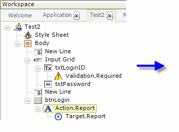
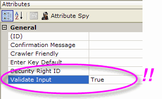
![]() A very important step, one that developers often overlook when working with Validation elements, is enablinginputvalidation. As shown above, the Action element used to submit the page has a Validate Input attribute which must be set to True or else none of the Validation elements will do anything.
A very important step, one that developers often overlook when working with Validation elements, is enablinginputvalidation. As shown above, the Action element used to submit the page has a Validate Input attribute which must be set to True or else none of the Validation elements will do anything.
Validation.Required
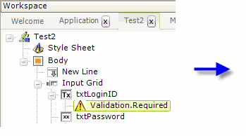
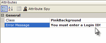
The purpose of the Validation.Required element, as shown above, is to ensure that the user enterssomething in the control. If the text box is left blank and the page is submitted,

a popup error message window will appear displaying the text set in the Error Message attribute. If the optional Class attribute is set, then the offending user input element will be set to that style class (allowing the developer to color its background). After the OK button in the popup error message window is clicked, submission of the page is aborted.
Validation.Numeric
The purpose of the Validation.Numeric element is to ensure that all of the characters entered in the text box are numbers. If any of the characters entered are letters or symbols, the validation fails, the error message is displayed, and the text box can have an optional style class applied to it. Page submission is aborted.
The Validation.Numeric element's attributes are the same as those discussed above for the Validation.Required element.
Validation.Length
The purpose of the Validation.Length element is to ensure that a minimum and/or maximumnumber of characters has been entered.
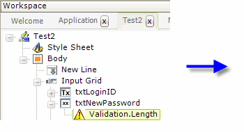
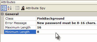
The Validation.Length element's attributes include those discussed above for the Validation.Required element and also adds Maximum Length and Minimum Length attributes, which are optional (though you should enter something for at least one of them or why bother with the element at all?)
Validation.Date
The Validation.Date element allows the developer to validate several things about dates entered in an Input Date element. The Validation.Date element's attributes include those discussed above for the Validation.Required element and also adds Range Start and Range End attributes.
Validation.Date will ensure that the date was entered in a format that matches the mask in the Input Date element's Format attribute. So, if the Input Date element's Format value is "MM/dd/yyyy" and the user enters "12/25/09", the error message will be displayed because a 4-digit year was not entered.
Validation.Date can also ensure that the date entered falls within the date range specified by its Range Start and Range End attributes. To be validated, the date entered must be on or after the Range Start date, and be on or before the Range End date. For this validation to work correctly, the format of the Range Start and Range End values entered must match the format described in the Input Date element's Format attribute.
If you use @Date tokens for the Range attributes, be aware that their default format, "yyyy-M-d", is not very user-friendly and might not match a more normal format you establish for Input Date. To reconcile this, in your _Settings definition, add a Globalization element and set its Default Input Date Reformat attribute to the same user-friendly format as your Input Date element. This will change the format of the @Date tokens, they'll match the Input Date element's Format
attribute, and the validation will work correctly.
Validation.Time
The Validation.Time element, introduced in v10.0.319, allows the developer to validate the time value entered in an Input Time element. The Validation.Times element's attributes include those discussed above for the Validation.Required element and also adds Range Start Time and Range EndTime attributes.
Validation.Time ensures that a time value has been entered. The format of the time entered must conform to that in the Format attribute of the parent Input Time element. Validation.Time can also ensure that the time falls within a time range, specified with the Range Start Time and Range End Time attributes. To pass the validation, the time entered must be on or after the Range Start Time, and be on or before the Range End Time.
Validation.Email
The Validation.Email element, introduced in v10.0.259, allows the developer to validate the value entered in an Input Email element.
Validation.Email ensures that a properly formatted email address value has been entered. The address is validated for the "@" symbol and a domain name. Certain special characters forbidden in email addresses are not allowed.
The validation elements provide a quick, easy method of implementing simple validation and can catch many data entry errors.
Use Event Handlers
Another popular method of validating user input is through the use of event handlers. The Validation elements use this same technique but shield you from the underlying details. For better control and more validation variety, developers can instead use their own event handlers, as shown in the following examples.
The Event Handler element is used for this purpose and it responds to DHTMLevents. If you're unfamiliar with these events, information about them is available here from Microsoft.
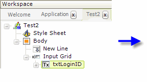
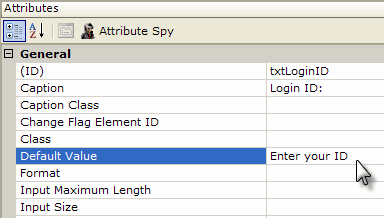
As shown above, to ensure that data changes in the following examples, the txtLoginID element's Default Value attribute is set to "Enter your ID".
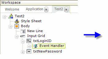
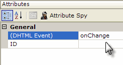
Next, as shown above, an Event Handler element has been added beneath the Input Text element ("txtLoginID"). Its DHTML Event property has been set to "onChange".
The onChangeevent only occurs ("fires") when the cursor moves to another control and if a change has been made to the data in txtLoginID. In that case, processing is passed to any elements beneath the event handler.
For Input Select List element, the onChange event fires when the selection is changed.
For the Input Radio Buttons and Input Checkbox elements, use the onClick event, which fires when a radiobutton or checkbox is clicked.
Caveat: The use of Event Handlers that "intercept" the onChange event will prevent the Change Flag Element scheme, described with Input Hidden and available to all user input elements, from working, so you can't use both. For more information, see the Input Hidden section of Introduction to User Input Elements.
Use Event Handlers to Refresh a Report
Developers often encounter requirements to have the contents of one Input Select List change dynamically based on user selections in another Input Select List. The second control is said to be "dependent" on the other. Event handlers provide an easy method of creating this dependency.
The following example depicts a web page that allows users to get information about automobiles. This is a classic example of select list dependency: once users select from a list of car brands, then a second list, of car models, is populated with choices based on
the brand selection.
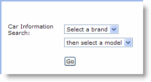
Here's how it works: when a car brand is selected, the page is submitted and the next page called, passing the selected brand as a request variable. The "next" page, however, will be the same report definition (the page calls itself or "refreshes") but now the selected brand will be available in an @Request token. This is then used to populate the list of car models.
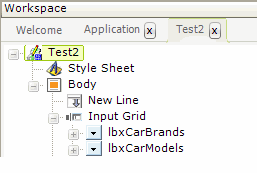 | <CarInfo> |
The example report definition, shown above left, contains two Input Select List elements. The example data is a simple XML file, shown above right. For the purposes of this example, BMW is the only manufacturer that's been given multiple models.
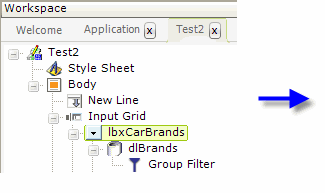
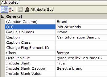
The attribute values for the car brands Input Select List are shown above. Note these two key attributes:
- Value Column - This attribute has been set to the same value as the Caption Column attribute, ensuring that the selected brand name is passed as a request variable.
- Default Value - This attribute is set to the request variable with the same ID as the Input Select List element, ensuring that the selected brand name will remain selected when the page refreshes.
In addition, DataLayer.XML and Group Filter elements have been added below the select list. The Group Filter's Group Column attribute is set to "Brand", ensuring that there are no duplicate entries in the list of brands.
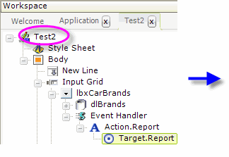
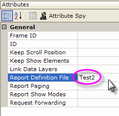
As shown above, an Event Handler element has also been added beneath the car brands Input Select List. Its DHTML Event attribute has been set to "onChange". In the case of an Input Select List, this event will fire as soon as a selection has been made. Action.Report and Target.Report child elements have been added and the target definition file has been set to the name of the current report definition, "Test2". Do not use the "CurrentReport" entry
available in the list of choices
for this attribute - it will not cause request variables to be passed.
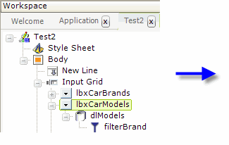
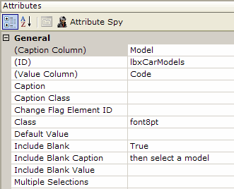
The attribute values for the car models Input Select List are shown above and its attributes are pretty straightforward.


As shown above, DataLayer.XML and Condition Filter elements have been added below the select list. The Condition Filter is the key to setting the second select list to the models of the chosen brand: its Condition attribute value is set to filter the brand data based on the @Request token containing the brand selection.
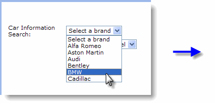
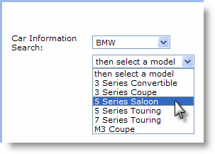
Finally, the interaction between the two select lists is shown above. The entire page will not repaint itself when a brand selection is made, so there'll be no annoying page flicker, due to the use of AJAX technology in Logi products.
In summary, this example has shown how an event handler can be tied to a change in a user input control and how it can trigger other actions based on that change.
Use Event Handlers with Javascript
A very powerful feature of Logi reports is the ability to execute Javascript when an event occurs.
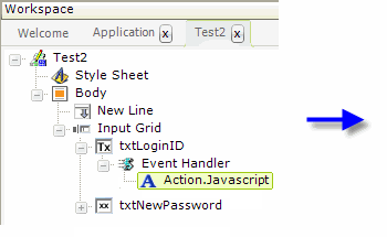
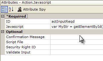
Developers using v10.0.259 or later, may use the Action.Javascript element, shown above, beneath an Event Handler element. Javascript code can be entered directly into the Javascript attribute and multi-line code is supported.
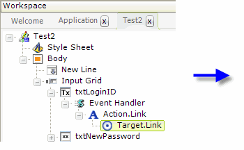
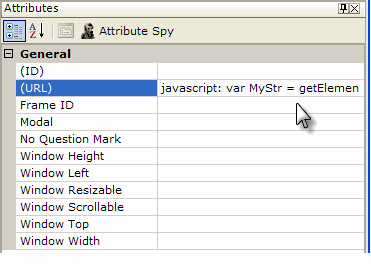
Developers using earlier versions can use Action.Link and Target.Link elements, as shown above, beneath an Event Handler. When used in this way, note that the word "javascript" followed by a colon must be the first thing in the URL attribute.
Now, we're able to use the power of Javascript and the DHTMLobject model for activities such as validation. The Attribute Zoom window come in handy when enter code (double-click the attribute name). Here are some examples:
Example 1: Ensure some data is entered
|
It's beyond the scope of this topic to delve too deeply into Javascript or the object model, but essentially the code above assigns the data in txtLoginID to a variable, then tests the length of that variable's value, and displays a message box if the length is zero. This is very similar to the Validation.Required element's functionality. The Document object's getElementById method is very handy in this situation. Remember: Javascript is case-sensitive.
Note that while you may enter multi-line Javascript, you may not include code blocks that are set off by curly brackets. This means structures like If...Then...Else blocks are not usable. As shown in these examples, you can get around this by using multiple lines of code, each with a single If statement.
Example 2: Ensure some data is entered but not more than 4,000 characters
|
The example script above does something special: it limits the length of data that can be entered into an Input Text Area element, which does not normally have maximum length attribute, and, if it's too long, reports the actual number of characters currently entered. It also requires that some data be entered.
Example 3: Replace all occurrences of '@' with '#'
|
Example 3 illustrates a method for replacing certain characters in the data entered, using a Javascript regular expression. In the example, any @ characters that were entered by the user are replaced with the # character, and then the altered data is substituted for the data that was entered. Regular expressions are very powerful, can be quite complex, and can perform actions such as adding, replacing, or removing characters, changing character case, and expanding or contracting phrases.
As you can see, the ability to run Javascript whenever data changes in user input elements provides developers with a very powerful validation tool.
Example 4: Handling Links within Tables
This is a slightly different example that deals with a common problem. Suppose you have a data table, and each row has a column in it that contains a link or button; for instance, an "Edit" button. When the link or button is clicked, you want to send data from that row to another report or process task. Internally, the Logi engine adds a row designator - "_Row1, _Row2, etc." - to the datalayer column names, so addressing the correct data using tokens (@Request.myCol_Row?~) in the receiving report or process task is complicated.
However, there's an easy solution: add an Event Handlerand an Action element beneath the link or button. The Event Handler will assign the data from the current table row to one or more Input Hidden elements (depending on how many columns you need to send) and the Action element submits the page and calls the next report or process task. The next report or task can work with the values in the @Request token for the Input Hidden elements.
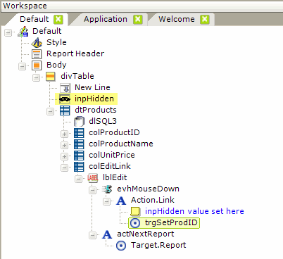
The example above shows the elements that might be used in this situation. This can also be done with Action.Javascript if you have a version that includes it.
First, an Input Hidden element is added at the top of definition, outside of the table and its columns.
Inside one of the table columns, beneath the Label element (which is the "Edit" link) an Event Handler is added and its DHTML Event attribute is set to onMouseDown. Beneath the Event Handler, Action.Link and Target.Link elements are added. The Target Link element's URL attribute is set to (enter text as shown, do not add any extra line feeds):
|
So, when the mouse button is depressed on the link, the data from the ProductID column for the current row will be assigned to the Input Hidden element.
And then, Action.Report and Target.Report elements (or an Action.Process element) are also added beneath the Label element. These submit the page when the mouse "click" occurs and calls the next report page or process task, where the Product ID value will be available as @Request.inpHidden~.
You can also use two Event Handlers, one for onMouseDown, and one for onClick, to achieve similar actions.