Get Started with OLAP Grids
The OLAP Grid family of elements available in Logi Info, for .NET and Java applications, is a data table with interactive controls and charting options that allows the user to "slice and dice" OLAP cube data at runtime. This topic provides instructions for creating and using these elements.
- About Logi OLAP Elements
- Create the Application and Connecting to Data
- Create a Basic OLAP Grid
- Configure the Grid Dynamically
- Re-use the MDX Query
- Using XOLAP with OLAP
- Add OLAP Grid Visualizations to Dashboards
- Customize OLAP Grid Appearance
If you have not already done so, we recommend you read Logi OLAP.
Information about connecting to MSSAS is available in Connect to MS SQL Server Analysis Services.
Note that the OLAP Grid super-element is not available in Logi Report.
About Logi OLAP Elements
Logi OLAP elements provide a front-end tool that's integrated into Logi managed reporting products and is used to query, analyze, and display data from OLAP cubes created in Microsoft SQL Server with Analysis Services (MSSAS). The examples shown in this topic are based on interactions with MSSAS.
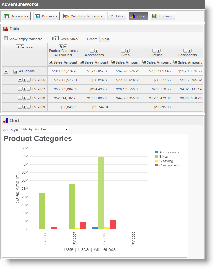
An example of the OLAP Grid element in use is shown above. The toolbarbuttons across the top show and hide feature panels, including: Dimensions, Measures, Calculated Measures, Filter, Chart, and Heatmap. By default, the OLAP Grid includes all of the toolbar buttons shown, but it can be configured, or restricted by security, to include fewer buttons and panels, if desired.
![]() Chart Canvas charts, introduced in v11.2.040, are used by default by the OLAP Grid, in all new applications started in v11.2.040 and later. Older Logi applications that are upgraded to v11.2.040+ will use the classic static charts for their OLAP Grids. To force upgraded apps to use Chart Canvas charts, add the constant rdFavorChartCanvas
= True
to your _Settings definition.
Chart Canvas charts, introduced in v11.2.040, are used by default by the OLAP Grid, in all new applications started in v11.2.040 and later. Older Logi applications that are upgraded to v11.2.040+ will use the classic static charts for their OLAP Grids. To force upgraded apps to use Chart Canvas charts, add the constant rdFavorChartCanvas
= True
to your _Settings definition.
At runtime, users can:
- Select Dimensions for the left and top axes
- Select Measures
- Select Filters for slicing the data
- Drill-down on Dimension members
- Create charts
- Drill-through to underlying data
With all these possibilities, it may be important for the user to be able to save these settings between sessions. Info developers can create a Process Task that uses Procedure.SaveOlapGrid to do this. A saved OLAP Grid can be reloaded with the rdOgLoadSaved parameter, for example: rdOgLoadSaved = myFilename.xml
Users' settings are automatically maintained during the session but can be cleared by calling the OLAP Grid element's report with the rdOgReset parameter, for example: rdOgReset = True
It is very important that the value of the ID attribute for the OLAP Grid element be unique throughout the entire application. This is because Logi Info saves the last state of the OLAP Grid in a user's session information based on the grid's ID. Consequently, if two different report definitions contain an OLAP Grid with the same ID value, the application will display the same grid for both reports.
Studio includes a wizard that will help you build an OLAP Grid.
DevNet includes an OLAP Grid sample application that demonstrates the material discussed in this topic.
Create the Application and Connecting to Data
These are the basic steps for creating an application using an OLAP Grid and connecting to the data:
- In Logi Studio, create a new application as usual and register it with IIS.
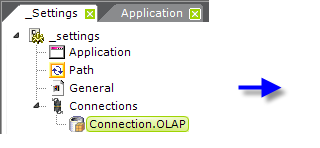

- In the _Settings definition, add a Connection.OLAP element, as shown above, and set its attributes. The ADOMD Connection String attribute value can be a bit more complicated than the usual database connection string; see Connect to MS SQL Server Analysis Services for guidance.
Create a Basic OLAP Grid
Now that you have a connection to Analysis Services configured, you can add the elements that comprise your OLAP Grid:
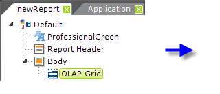
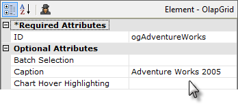
- In your report definition, add an OLAP Grid element beneath the Body element, as shown above. Specify a name for the ID attribute and a Caption. Other special attributes for the OLAP Grid element include:
- Batch Selection -When set to True, users can select a number of dimensions and
measures and then click an "Update Table" button to show their selections; otherwise the table updates with every selection. Default: False.
- Chart Hover Highlighting - Enables Hover Highlighting, which causes chart features such as bars and lines to be highlighted when the mouse pointer is hovered over them. Default value: True. (Introduced in v11)
- Drilldown All - When True, gives dimensions in the table an extra "Drilldown All" button.
- Hide Excel Export - Hides the Export link which allows you to export data to Excel.
- Level Indent - Sets the amount of indentation used to show levels in a hierarchy.
- OLAP Cell Colors - When True, displays foreground and background colors defined in Analysis Services in calculated measures.
- Pick Member Properties - When True, the user is able to pick Member properties that will be displayed in columns next to the Dimension column.
- Saved OLAP Grid Folder - The OLAP Grid settings made by a user at runtime may be saved by using the Procedure.Save OLAP Grid element in a process task. The settings can later be reloaded by passing the saved setting filename in the rdOgLoadSaved parameter. The value of this attribute (Saved OLAP Grid Folder) sets the name of the folder that contains the saved files.
- Show Dimension Attributes - Shows dimensions and dimension attributes.
- Template Modifier File - Identifies an XML file the specifies attributes, such as captions, fonts, and colors, in the underlying grid template.
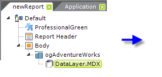
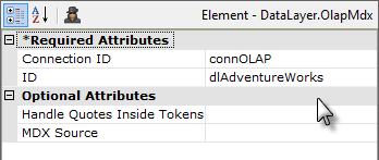
- Beneath the OLAP Grid element, add a DataLayer.MDX element and set its attributes as shown above. The Connection ID attribute value should be the ID of the Connection.OLAP element you configured at the start of this process.
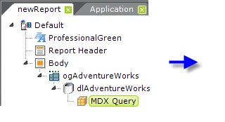
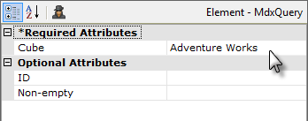
- Beneath the datalayer, add an MDX Query element and set its attributes as shown above.
Your OLAP Grid is now functional. Click the Preview tab at the bottom of the Workspace to view it.
Configure the Grid Dynamically
The following exercise will guide you through the steps of configuring the grid dynamically. The instructions and screen shots that follow assume you have made a connection to the AdventureWorks database but are applicable for any data source.
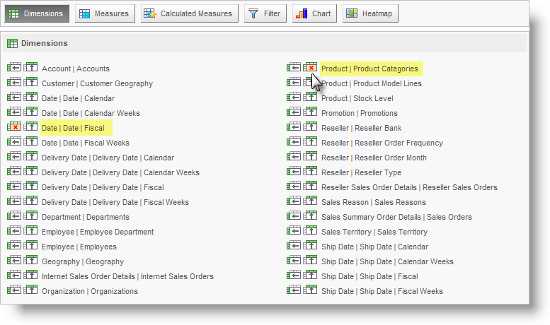
- Preview or browse your OLAP Grid application.
- Click the Dimensions button at the top to open the Dimensions panel, shown above. This is where users select dimensions for the left and top axes of the grid. In the Dimensions panel, select the data for Date Fiscal for the left axis and Product Categories for the top axis, as shown above. Depending on the grid's Batch Selection attribute setting, the changes will be applied, and the table updated, automatically, or you may have to click the Update Table button. You can click
the Dimensions button again (or another button) to hide the Dimensions panel.
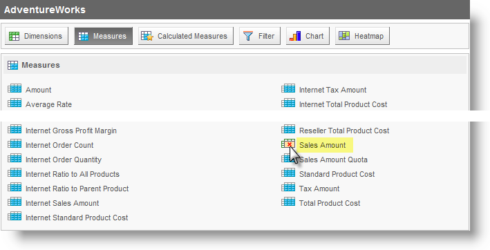
- Click the Measures button to display the Measures panel, shown above. Select the measures Sales Amountitem, as shown above. Click the Update Table button, if necessary. Click the Measures button again to hide the panel.
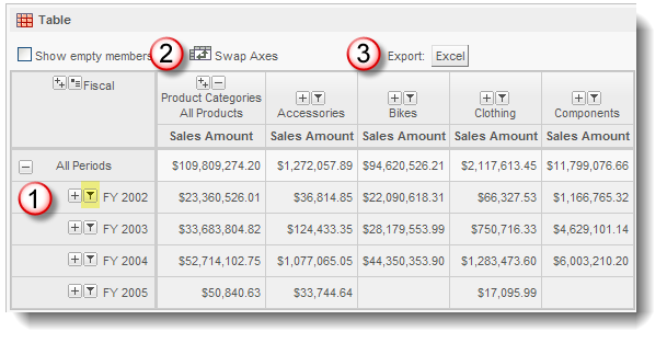
The resulting table should look something like the example shown above.
Experiment with the small icons to the left of the dimension on the left axis (1): the Filter icon allows you to toggle between the related member only ("Show just this member") and all its siblings. (2) The Swap Axes icon toggles the dimension axes and (3) the Export icon will export the table data to Excel.
- Click the Calculated Measures button to open the Calculated
Measures panel.
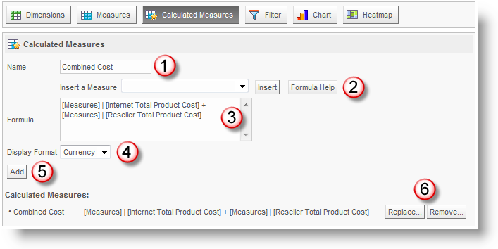
In the Calculated Measures panel, shown above, enter "Combined Cost" in the Name text box (1). Measures can be selected in the "Insert a Measure" select list (2) and added to the formula by clicking "Insert". The measures are inserted into the Formula text box (3), and/or you can type them in directly, to create a formula. Formulae can include VBScript functions. Then choose the Display Format (4) which can be Number, Percent, or Currency. When
your formula
is complete, click on the Add button (5). The calculated
measure will appear at the bottom of the panel, where it can be edited or removed (6) and it will appear immediately as a new column in your table. Click its button to hide the panel.
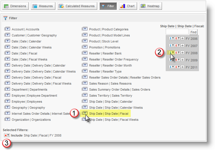
- Now experiment with filtering the measures. Click the Filter button to open the Filter panel, shown above, where you can filter your data by setting Include and Exclude parameters. For example, you can limit your view of sales data across regions of various departments to that which includes a fiscal 2008 shipping date by setting an Include filter, as follows:
Click the Ship Date.Fiscal measure (1) and, after a moment, the filter selector area will appear. Click the "I" icon, for Include, adjacent to the FY 2008 item (2). This will add the filter into the "Selected Filters" area (3), which lets you see what filters are in effect and where you can also delete a filter. The table automatically updates to reflect the filters chosen. Note that there's also an "E" icon, for Exclude, in the filter selector area. Click the Filter button to hide the Filter panel.
- Charts and Heatmaps, based on all of the current table data, are initially displayed by clicking the Chart and Heatmap buttons to open their respective panels:
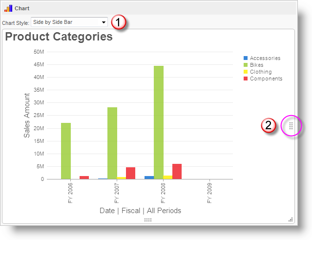
Charts can be customized once they're displayed by changing their charting style (1), and by using their re-sizing handles (2) (which may not be visible until the mouse pointer hovers over them). A variety of styles (Stacked, Line, Spline, etc.) are available using the selection list and charts and heatmaps can be drilled down into through all grid layers.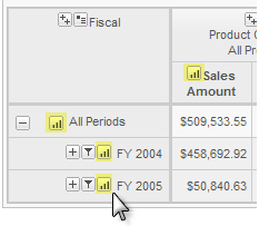
In addition, once the chart or heatmap has been displayed, additional small icons appear in each row and column in the table, as shown above; these allow you to pick which measure and dimension layer to chart.
That concludes this exercise in configuring an OLAP grid at runtime.
Use XOLAP with OLAP
As of v10.0.117, the XOLAP Cube and its child elements can be used with the OLAP Grid and OLAP Table elements. This provides alternate datasources for the OLAP elements and the ability to use the more flexible OLAP Grid with that data.
What are the differences between the XOLAP and OLAP grids? The XOLAP Grid is designed to be less complicated to use and doesn't support some features, such as multi-dimension sorting and multiple dimensions on both axes, that are found in the OLAP Grid. So the OLAP Grid allows more complex analysis of the XOLAP data.
![]() Prior to v11.0.727, you could not use a DataLayer Link element beneath DataLayer.XOLAP Query used with an OLAP Grid. This arrangement was not allowed and caused a "pipeline processing" error. In v11.0.727+, the link is allowed.
Prior to v11.0.727, you could not use a DataLayer Link element beneath DataLayer.XOLAP Query used with an OLAP Grid. This arrangement was not allowed and caused a "pipeline processing" error. In v11.0.727+, the link is allowed.
Re-use the MDX Query
Many of Logi's other data visualization components are capable of "2-D" representation of OLAP cube data, using MDX queries, so it may be useful to be able to access the MDX query used in an OLAP Grid in another report.
Each time the OLAP Grid is manipulated during runtime, a session variable is updated to reflect the resulting MDX query. This session variable, rdOlapLastMdxQuery, is available to other reports, Logi or otherwise. In a Logi report, it would be accessed using the token @Session.rdOlapLastMdxQuery~.
Add OLAP Grid Visualizations to Dashboards
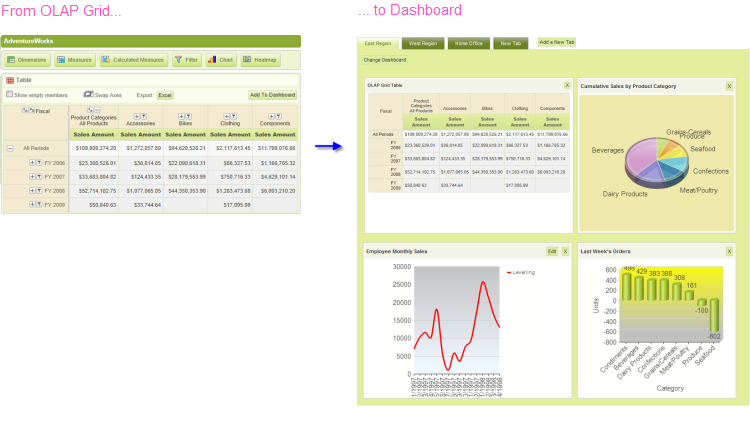
An exciting new level of interaction between the OLAP Grid and the Dashboard element was introduced in v11.1.033. Users working with an OLAP Grid in one report, at runtime, can generate a table or chart and then, with one mouse click, add it as a new panel in an existing Dashboard in another report.
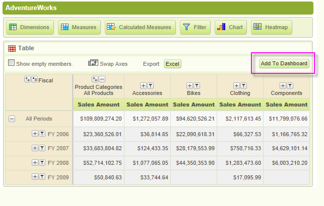
When properly configured, OLAP Grid tables and charts will display an Add To Dashboard button, as shown above.
When the button is clicked, the table or chart is added as a new panel in the Dashboard, as shown above. When the resizing control is used to resize a chart, the widths of the dashboard columns and other panels will adjust dynamically.
Behind the scenes, when the button is clicked, the OLAP Grid writes the underlying XML for its chart into the Dashboard's configuration file (its "Save File"). In the Dashboard, the chart is inserted at the top of Column 1; if Dashboard tabs are being used, the insertion occurs in the currently active tab.
Just before panel insertion, the user will be prompted for the Panel Title and a description for display on the Configuration Page.
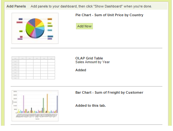
The new chart panel thereafter appears in the Dashboard Configuration Page, as shown above, just like any other panel, complete with a thumbnail image. The new panel can be removed from the visible dashboard panels and from the configuration page entirely, using the usual controls.
The user can insert multiple tables and charts into a Dashboard using this technique.
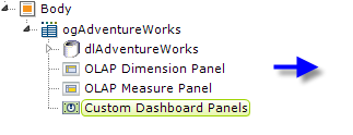
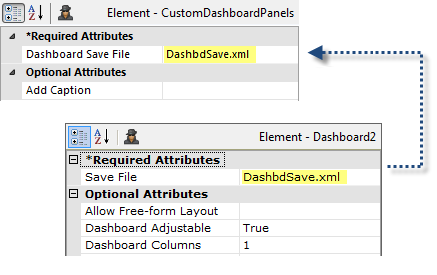
In the report definition, the developer makes this functionality available by adding a Custom Dashboard Panels element, shown above, beneath an OLAP Grid element. Its Dashboard Save File attribute value should be set to match the target dashboard's Save File attribute value.
![]() The Save File attribute values shown above have been shortened for visual clarity. However, a fully-qualified path and file name, with .xml extension, is required, so a realistic attribute value would be something like:
The Save File attribute values shown above have been shortened for visual clarity. However, a fully-qualified path and file name, with .xml extension, is required, so a realistic attribute value would be something like:
@Function.AppPhysicalPath~\DashFiles\DashbdSave.xml
and the account the Logi application runs under (in Windows, ASPNET or NETWORK SERVICE) would be given Write permissions to the "DashFiles" folder. For experimentation purposes, you can use the rdDownload folder, for which appropriate permissions already exist (but its contents are periodically deleted, so don't use it for anything but experimentation).
Dashboard Save Files are often named using a token, such as @Function.UserName~, in order to create personalized dashboard configurations and, in that case, the Custom Dashboard Panel attribute would use the same token.
![]() The Custom Dashboard Panels element has a new attribute, Add Caption, which sets the caption for the button used to save the data table or chart. If left blank, the caption is "Add to Dashboard".
The Custom Dashboard Panels element has a new attribute, Add Caption, which sets the caption for the button used to save the data table or chart. If left blank, the caption is "Add to Dashboard".
For more information about Dashboards, see Introduction to the Dashboard.
Customize OLAP Grid Appearance
OLAP Grid appearance can be customized using style sheets and Info Studio provides the following standard style sheet for all OLAP Grids:
<YourAppFolder>\rdTemplate\rdOlapGrid\rdOgStyle.css
Developers can override classes in this style sheet by copying them to their application stylesheet and modifying them there.
![]() Do not make changes in the standard style sheet in the rdTemplate folder.
Do not make changes in the standard style sheet in the rdTemplate folder.
Change Appearance Using Template Modifiers
The OLAP Grid element uses a "template file" to define certain element properties that are not otherwise available as attributes to the developer for modification. These include language- and culture-specific Caption attributes that you may want to change for locale-based reasons (or you may simply want to change the captions to better suit your application).
The element's Template Modifier File attribute identifies a custom XML file developers can create containing elements that will override the same elements in the template file.
For example, the OLAP Grid template file:
<yourAppFolder>\rdTemplate\rdOlapGrid\rdOgTemplate.lgx
contains several Label elements. One of them has an ID of "lblShowEmpty"; this controls the caption that appears next to the "Show empty members" checkbox. This text can be modified by changing the Caption associated with that Label element.
For example, to change the Label text from its default to "View empty members", create your own XML file, identify it in the OLAP Grid element's Template Modifier File attribute, and add this code to it:
<TemplateModifier>
<SetAttribute ID="lblShowEmpty" Caption="View empty members" />
</TemplateModifier>
You can set the attributes for any number of elements in this file; examine the rdOgTemplate.lgx file to learn the ID and Caption attributes available. The template modifier file can be in any folder accessible to the web application; if a fully-qualified file path is not provided in the Template Modifier File attribute value, then the application expects it to be in your project's _SupportFiles folder.
More detailed information about template modifier files can be found in Template Modifier Files.
