Chart Grid Wizard
The Chart Grid is a tabular arrangement of charts, wherein each chart fills a table cell. As a "super element", the Chart Grid includes an interface that allows users to customize the table and charts at runtime. This topic describes the Chart Grid Wizard in Logi Studio, which can be used to quickly create a Chart Grid.
- About the Chart Grid
- Preparing
- Using the Wizard
The Chart Grid is not available in Logi Report.
About the Chart Grid
For information about the capabilities and features of the Chart Grid, see Introduction to the Chart Grid.
The Chart Grid displays a tabular arrangement of bar, line, or scatter charts, with each table cell containing a separate chart. All of the charts in the grid will be of the same type; it is not possible to mix chart types in different rows or columns.
The Chart Grid is a "super-element", similar to the Analysis Grid and the Chart Grid elements. At runtime, users can manipulate the data they see and the way in which it's presented using the Chart Grid's user interface controls. The report developer has complete control over which controls are available to a user and can present them selectively to different users.
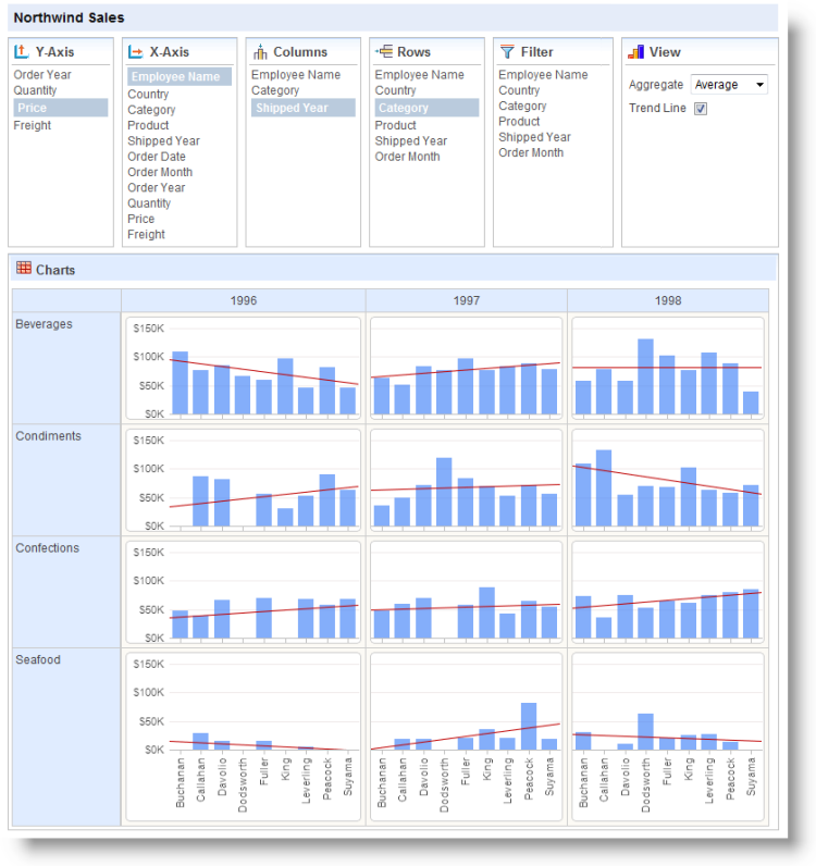
The example above shows a Chart Grid configured to show all of its option panels.
Preparation
Prior to running the Chart Grid wizard:
- Become familiar with the data you'll be working with. Identify the data columns that you want to use, what aggregations you need, and how you might want to filter the data.
- Ensure that you have a valid Connection configured in _settings and can connect to your datasource.
- If you're using a SQL data source, you may care to experiment a bit in the Query Builder to develop the query that you'll need.
Now, launch Studio and open your report definition.
Using the Wizard
The following examples walk you through using the Chart Grid wizard.
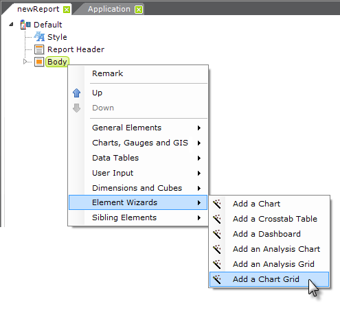
- Start the wizard by right-clicking the grid's parent and selecting Element Wizards
 Add a Chart Grid, as shown above.
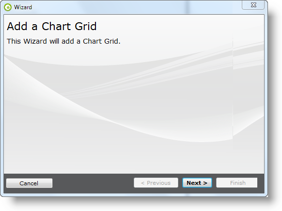
- Add a Chart Grid Wizard - Click Next to start the wizard.
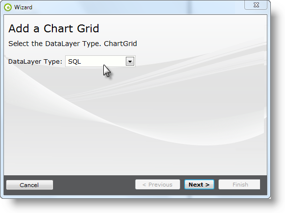
- Datalayer Type - Select the appropriate datalayer type for your datasource. Click Next.
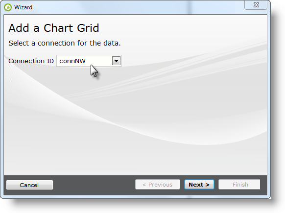
- Connection ID - Select the desired connection from the list of connections defined in the _Settings definition. Click Next.
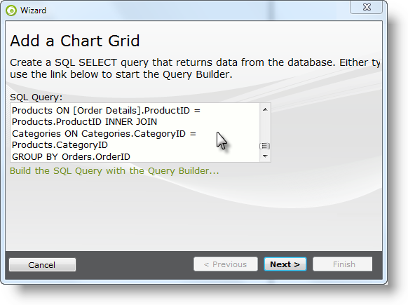
- SQL Query - If you 're using a SQL datasource, enter the query (or use the query wizard to build one) and click Next. This example uses the following T-SQL query:
SELECT Orders.OrderID, MIN(Orders.Freight) AS Freight, MIN(Orders.ShippedDate) AS ShippedDate, MIN(Orders.OrderDate) AS OrderDate, SUM([Order Details].UnitPrice) AS sumUnitPrice, SUM([Order Details].Quantity) AS sumQuantity, MIN(RTRIM(Products.ProductName)) AS ProductName, MIN(Categories.CategoryName) AS CategoryName, MIN(RTRIM(Employees.LastName)) AS LastName, MIN(Employees.EmployeeID) AS EmployeeID, MIN(Orders.CustomerID) AS CustomerID,
MIN(Customers.CompanyName) AS CompanyName, MIN(RTRIM(Customers.Country)) AS Country
FROM Orders INNER JOIN
[Order Details] ON [Order Details].OrderID = Orders.OrderID AND
Orders.OrderID = [Order Details].OrderID INNER JOIN
Employees ON Employees.EmployeeID = Orders.EmployeeID INNER JOIN
Customers ON Customers.CustomerID = Orders.CustomerID INNER JOIN
Products ON [Order Details].ProductID = Products.ProductID INNER JOIN
Categories ON Categories.CategoryID = Products.CategoryID
GROUP BY Orders.OrderID
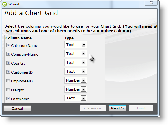
- Select Columns - Select at least two data columns, one of which must be a numeric data type. Set the data type indicator for each selected column, then click Next. In this example, the columns selected are:
- CategoryName
- CompanyName
- Country
- CustomerID
- LastName
- ShippedDate
- sumQuantity
- sumUnitPrice
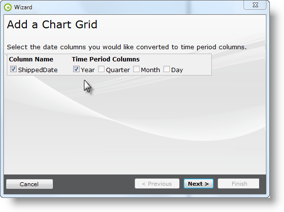
- Process Date Columns - If your data includes date type data columns, the wizard will give you the option of including a Time Period Column for the Day, Month, Quarter, or Year represented in the data in each of them. This is necessary if you want to use date data in the X-axis labels of the charts. In this example, the Year portion of the ShippedDate column is used. Click Next to continue.
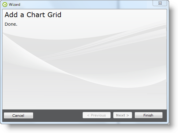
- Done - Click Finish to close the wizard.
As you've completed these steps, you may have noticed that the wizard has added all the appropriate elements to your report definition. Save the definition and run it.
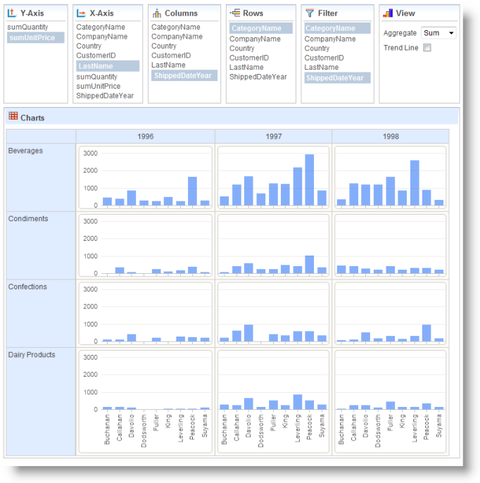
When it appears, select Y-Axis, X-Axis, Column, and Row options, as shown above, and view your new Chart Grid.
The example shown above has also had two filters applied to it, on the CategoryName (limits grid to four rows) and the ShippedDateYear (to remove null data).
Finally, you should examine the elements inserted into the definition by the wizard to review formatting, fine-tune captions, etc.
Remember that Chart Grid configurations are automatically saved with session variables, which can lead to frustration if you're trying to make a lot of changes during development. You may need to reset these variables to make changes occur; to do this, see the Refresh, Reset, and Save Grid Settings section in Introduction to the Chart Grid.