Introduction to the Chart Grid
The Chart Grid is a tabular arrangement of charts, wherein each chart fills a table cell. It allows "at-a-glance" comparisons of complex data. As a "super element", the Chart Grid includes a control panel that allows users to customize the table and charts at runtime.
- Overview
- The Chart Grid Element
- Chart Grid Settings Panels
- Configuring the Data
- Chart Zoom and Drill-through
- Refresh, Reset, and Save Grid Settings
Overview
The Chart Grid displays a tabular arrangement of bar, line, or scatter charts, with each table cell containing a separate chart. All of the charts in the grid will be of the same type; it is not possible to mix chart types in different rows or columns.
The Chart Grid is a "super-element", similar to the Analysis Grid and the Dimension Grid elements. At runtime, users can manipulate the data they see and the way in which it's presented using the Chart Grid's user interface controls. The report developer has complete control over which controls are available to a user and can present them selectively to different users.
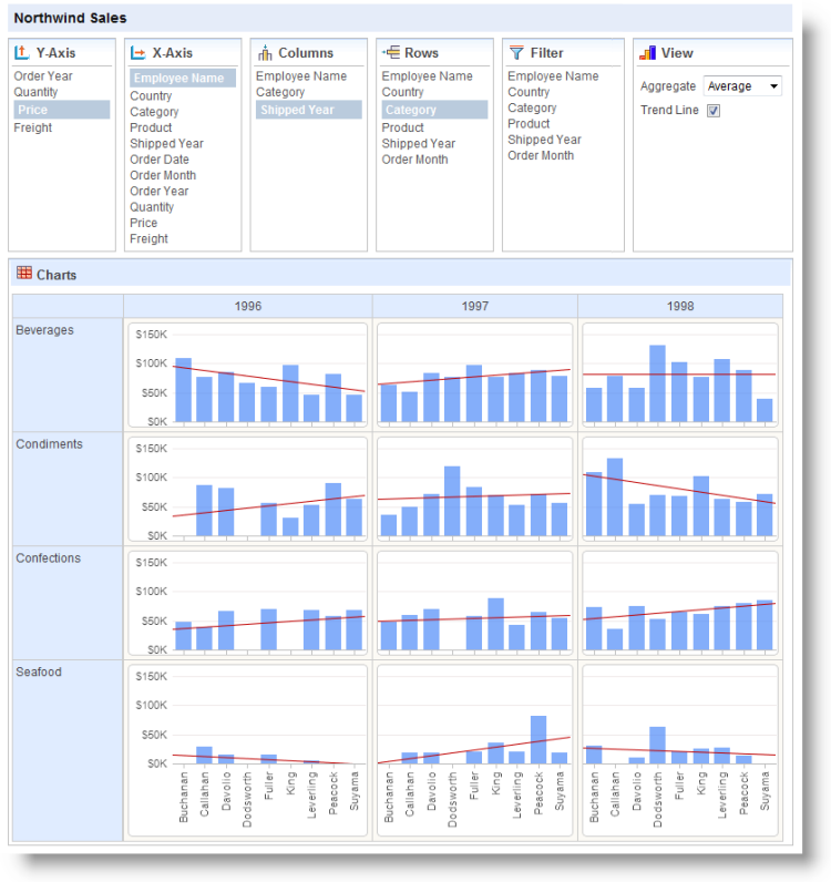
The example above shows a Chart Grid configured to show all of its option panels.
Each chart resides in the grid at the intersection of a grid row and grid column. The data used to generate any chart is conditioned by filtering the complete dataset so that it only includes data represented by the grid row and grid column intersection. Grid row titles and column headings show the actual data values used for this filtering.
Note that chart Y-axis labels only appear in the first chart column and the X-axis labels only appear in the bottom row.
The chart type generated is dependent on the X-axis data type selected: text-type columns produce bar charts and numeric- or date-type columns produce line or scatter charts (selectable by user). A technique for using dates with bar charts is explained later in this topic.
![]() Chart Canvas charts, introduced in v11.2.040, are used by default by the Chart Grid, in all new applications started in v11.2.040 and later. Older Logi applications that are upgraded to v11.2.040+ will use the classic static charts for their Chart Grids. To force upgraded apps to use Chart Canvas charts, add the constant rdFavorChartCanvas
= True
to your _Settings definition.
Chart Canvas charts, introduced in v11.2.040, are used by default by the Chart Grid, in all new applications started in v11.2.040 and later. Older Logi applications that are upgraded to v11.2.040+ will use the classic static charts for their Chart Grids. To force upgraded apps to use Chart Canvas charts, add the constant rdFavorChartCanvas
= True
to your _Settings definition.
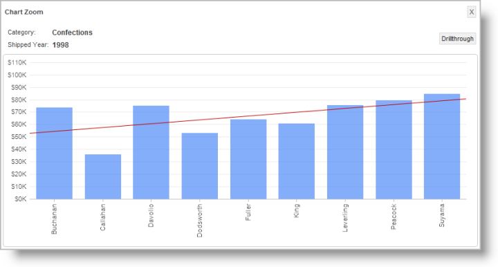
Clicking on an individual chart "zooms" the chart in a popup window, as shown above,
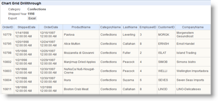
and clicking the zoomed chart's Drillthrough button displays a table, shown above, of the data underlying the chart. The zooming and drill-through functions are automatic and access to them can be controlled by the developer. An export button on the table allows the data to be exported to Excel.
The Chart Grid settings selected by a user can be saved at the end of their session and restored during a later session.
Logi 10 Studio contains a Chart Grid wizard that will walk developers through creating and configuring the grid. For information about this wizard, see Chart Grid Wizard.
The Chart Grid Element
The Chart Grid element is the parent element of all other Chart Grid family elements. Its special attributes are:
| Attribute | Description |
|---|---|
ID | (Required) A unique element ID. |
| Caption | A title that will appear in the bar above the control panels. |
| Saved Chart Grid Folder | The Chart Grid settings made by a user at run time may be saved with by using the Procedure.Save Chart Grid element in a process task. The settings can later be reloaded by passing the saved setting filename in the rdCgLoadSaved parameter. The value of this attribute (Saved Chart Grid Folder) sets the name of the folder that contains the saved files. |
| Template Modifier File | The name of a custom template file that can be used to change language- and culture-specific Caption attributes in the grid. |
Chart Grid Settings Panels
The Chart Grid Panel elements determine what data and which options are available to the user at runtime. Let's examine the panels:
| Panel | Description |
|---|---|
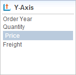
| Links in this panel allow the user to select the data available in the datalayer that will be used for the charts' Y-axis values. Chart Y-axis labels only appear in the first chart column. The developer can limit the choices available here and can also designate an initial selection. |
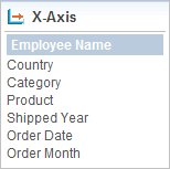
| Links in this panel allow the user to select the data available in the datalayer that will be used for the charts' X-axis values. Chart X-axis labels only appear beneath charts in the bottom table row. The developer can limit the choices available here and can also designate an initial selection. |
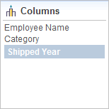
| Links in this panel allow the user to select the data column that will be used for the grid columns. Its distinct values will appear as grid column header text. |
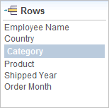
| Links in this panel allow the user to select the data column that will be used for the grid rows. Its distinct values will appear as grid row title text. |
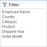
| Links in this panel allow the user to filter the complete dataset by selecting values to be included from a popup list of data values. Note that this works by inclusion, not exclusion, so to have no filtering, all values must be selected. |
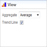
| This panel contains dynamic content. When X-axis chart data is text-type data, it's automatically grouped and the Y-axis values aggregated before a chart is generated. The user may select the aggregating function in this panel. Options include Sum, Average, Count, Minimum, and Maximum. When X-axis chart data is numeric- or date-type data, the Aggregate select list is replaced with a Chart Type select list, allowing users to select between Line or Scatter
charts. This panel also allows the user to include a trend line on the charts. |
The report definition for a Chart Grid, with all its panel elements, looks like the example below:
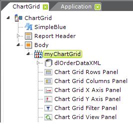
Note that, regardless of the arrangement of the elements, the panels will always be displayed in the browser above the grid.
Chart Grid Panel elements are not required. By default, if you leave them out, all panels will be displayed. To hide a panel, include its grid panel element and set its Show Panel attribute to False. This value can also be set using @Request and @Session tokens.
Each Chart Grid Panel element has an Allow ChartGrid Columns attribute, which specifies one or more Chart Grid Columns to be displayed in this panel. If no columns are specified, then all columns of the matching data type are displayed; multiple columns can be enumerated using a comma-separated list of Chart Grid Column element IDs.
Chart Grid Panel elements also have an Initial ChartGrid Column ID attribute, which specifies which Chart Grid Column will be selected when the grid is first displayed.
Configure the Data
The Chart Grid requires only one datalayer element to retrieve data for it and it produces different views of the data for each chart automatically.
Chart Grid Column elements are used to map datalayer columns to grid columns, defining which columns may be displayed and manipulated in the Chart Grid. The element's Data Type attribute effects how columns are presented in the grid. Text-type columns are available for use in the Columns, Rows, and X-axis panels, and produce Bar charts; number- and date-type columns are available for use in the X- and Y-axis panels, and produce Line or Scatter charts when selected for the X
-axis.

In the example above, the left image shows a typical date-type Chart Grid Column which, when used in the X-axis will produce a Line or Scatter Chart. However, if you wish to use a date in the X-axis of a Bar chart, you can do so by adding a Time Period Column element ("tpcOrderMonth") to your datalayer, naming it in a Chart Grid Column element as shown above, right, setting the data type to Text, and providing a format for the date.
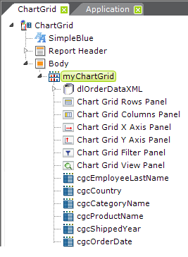
So now our report definition includes Chart Grid Column elements for each data column we want to work with, as shown above, and we have a basic functional Chart Grid that can be run.
Chart Zoom and Drill-through
An optional feature, described earlier, is the ability to click a chart to view it in a larger scale in a separate window, and from there to drill down into the detail data used to generate the chart.
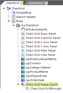
The feature is included by adding a Chart Grid Popup Zoom element, as shown above, to the definition. Its sole attribute is for optional tooltip text.
When the optional Chart Grid Drillthrough child element is included, a Drillthrough button appears in the zoomed chart. Clicking this button causes the detailed, exportable data table to be displayed. This element has an optional Caption attribute which allows you to specify a title for the data table.
Refresh, Reset, and Save Grid Settings
There are several possible actions that require links outside of the grid which you might want to make available to Chart Grid users:
| For this Action | Do This |
|---|---|
| Refresh | To refresh the data in the grid, without affecting any other settings, call the report definition again and include this Link Param: rdCgRefreshData = True The parameter name is case-sensitive. |
Reset | To clear all user settings and restore the grid to its default state, call the report definition again and include this Link Param: rdCgReset = True The parameter name is case-sensitive. |
| Save Settings | To save all user settings for future sessions, use an Action.Process element to call a process task. In the task use a Procedure.Save Chart Grid element to save the settings. The file name itself can incorporate a login name, a GUID, or another method of making it unique to the user and must end in ".xml". The file name can be preserved in a number of ways, including as a Cookie on the user's machine. |
| Restore Settings | Access the preserved file name then call the report definition again and pass the Link Param: rdCgLoadSaved = <filename> Once again, the parameter name is case-sensitive. |
The following XML source code example demonstrates the use of these special parameters:
<Division ID="divControlMenu">
<LineBreak LineCount="2" />
<Label Caption="Reset" ID="lblReset">
<Action Type="Report"
ID="actRestart">
<Target
Type="Report" ID="tgtRestart" />
<LinkParams rdCgReset="True" />
</Action>
</Label>
<Label Caption=" | " ID="bar"
/>
<Label Caption="Refresh Data"
ID="lblRefreshData">
<Action Type="Report"
ID="actRefreshData">
<Target
Type="Report" ID="tgtRefresData" />
<LinkParams rdCgRefreshData="True" />
</Action>
</Label>
<Label Caption=" | " ID="bar"
/>
<Label Caption="Save"
ID="lblSave">
<Action Type="Process"
Process="MyTasks" ConfirmMessage="Save Grid?" TaskID="SaveCG" ID="actSave"/>
</Label>
<Label Caption=" | " ID="bar"
/>
<Label Caption="Restore"
ID="lblRestore">
<Action Type="Report">
<Target Type="Report"
/>
<LinkParams
rdCgLoadSaved="@Cookie.CgFilename~" />
</Action>
</Label>
<LineBreak LineCount="2" />
</Division>
When saving the grid settings in a Process task, using the Procedure.Save Chart Grid element, you need to provide a fully-qualified file path and file name (including an .xml file extension) in the Filename attribute. For example:
C:\inetpub\wwwroot\SampleChartGrid\SavedGridData\mySettings.xml
The @Function.AppPhysicalPath~, @Session, and @Constant tokens may be useful here.
However, when restoring saved settings, two separate values are used so that you do not have to expose the file path in your query string:
- Set the Chart Grid element's Saved Chart Grid Folder attribute to the fully-qualified file path for the folder that contains the stored settings file. For example: C:\inetpub\wwwroot\SampleChartGrid\SavedGridData. The @Function.AppPhysicalPath~ and @Constant tokens may be useful here.
- In the Process task that restores the saved settings, call the report definition that contains the Chart Grid and pass the link parameter rdCgLoadSaved mentioned earlier, and set its value to the filename, with .xml extension, only. Do not include any path information here. For example: mySettings.xml
The Chart Grid will automatically combine the attribute value and the request variable to obtain the fully-qualified path and filename for the saved settings file.
