Use Studio 11
Our primary development tool, Logi Studio, is used by developers to create Logi applications. It's a powerful development tool with many useful features and this topic provides specific instructions for using it.
![]() If you're using Logi Info v12.0+, see Using Logi 12 Studio.
If you're using Logi Info v12.0+, see Using Logi 12 Studio.
- About Logi Studio
- Get Started
- The Welcome Panel
- Application Folders and Files
- Work with Elements
- Set Element Attributes
- Intelligent Token Completion Feature
- Studio Wizards
- Assign Themes and Style Sheet Classes
- Test and Debug Applications
- Deploy Logi Applications
- Ribbon Menu, Shortcuts, and Search
- The Database Browser
- The SQL Query Builder
- The MDX Query Builder
- Work with Studio Panels
- Change Application Versions
- Team Development Features
- Obfuscate Definitions
- Delete a Logi Application
Beginning with Logi Info v11.3, Studio's features and user interface were significantly updated.
About Logi Studio
Logi Studio is a stand-alone Windows .NET application that provides a comprehensive development environment for creating Logi Info and Logi Report web applications. It's capable of producing applications that run in .NET and Java environments. A typical scenario for Java developers is to use Studio on a Windows system to develop and test their applications, and then deploy them to their Linux/UNIX or Windows servers to be run under Java libraries.
Studio provides a number of features that make development easy and fast. It manages your project files and includes editors for every type of file that might be included in a web application, except images. Intelligent-completion features reduce the number of keystrokes necessary and potential typos made. You can develop and test your application right inside Studio.
This topic provides all the information necessary to become successful with Logi Studio. New users should read it carefully to get a full understanding of the tools Studio offers and how Logi applications are developed.
Get Started
When Logi Studio starts, it presents a Getting Started dialog box:
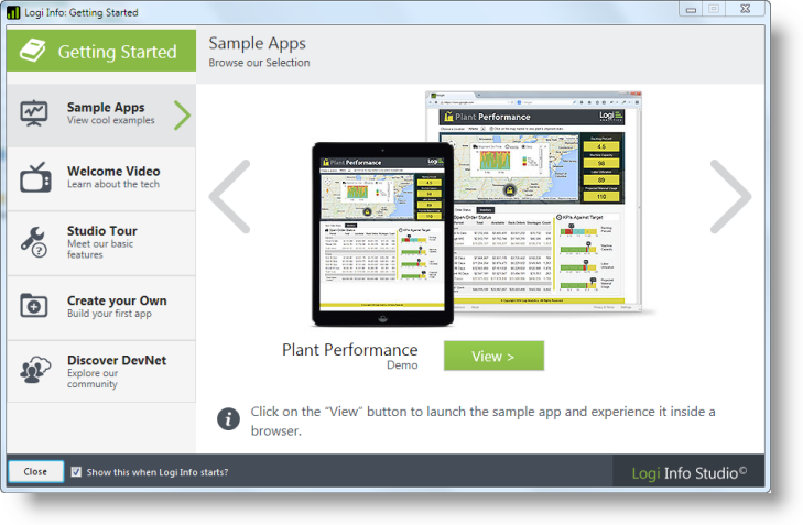
A number of features are available to introduce you to Logi Info, including:
| Sample Apps | Sample applications built with Logi Info can be launched using the View button. They'll open in your default browser and provide some interesting examples of the possiblities available. |
| Welcome Video | This short video gives you an introduction to the technology behind a Logi Info application, and shows you how they're constructed. Key concepts and features are explained. |
| Studio Tour | An interactive image of Studio helps you discover its geography, terminology, and features. Hover your cursor over the numbers in the images for descriptive text. |
| Create Your Own | This step-by-step tutorial, in conjunction with an included tutorial application, guides you through creating your first reports, including a Data Table, a Bar Chart, an Analysis Grid, and a Dashboard. |
| Discover DevNet | Links are provided into useful documents and features in our Developer Network website. |
You can disable the dialog box, so that it no longer appears when Studio starts, by unchecking the checkbox at the bottom.

You can always redisplay it by clicking the Getting Started button, shown above, at the top-right of the Studio's main menu. Its state can also be set directly in Tools![]() Options.
Options.
The Welcome Panel
When the Getting Started dialog box is hidden or moved aside, you'll see the Welcome panel when you start Studio and whenever there's no application open.
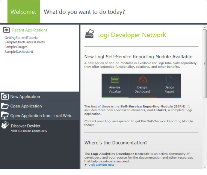
The Welcome panel provides quick links to recently-opened applications, links that open applications using a variety of methods, and a link to DevNet, our online community. In addition, you'll see some useful content, from DevNet, displayed in a scrolling area.
Application Folders and Files
A Logi application is made up of a number of files that reside in an application folder group with a specific hierarchy.
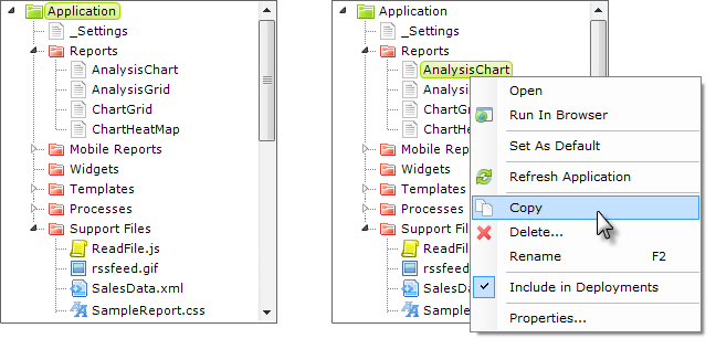
The physical folder structure that contains source files is displayed within Logi Studio in the Application panel, as shown above left. Standard folders are colored red and cannot be deleted. Files can be right-clicked and copied, renamed, and deleted, as shown above right.
![]() Files that are deleted in Studio are placed in the Recycle Bin and can be restored, if desired.
Files that are deleted in Studio are placed in the Recycle Bin and can be restored, if desired.
Report definitions can also be selected as the defaultreport for an application (it's often useful to temporarily make a report the default during development, to avoid having to navigate to it through other reports during testing).
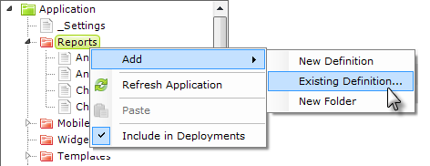
Files can be added to the application via the New File toolbar icon or, as shown above, by selecting and right-clicking the folder in the Application panel where you wish to add the file. Right-clicking the folder presents you with the option add a new file or an existing file to the application. If you select Existing Definition..., a copy of the file will be placed in your application; the original file is left untouched.
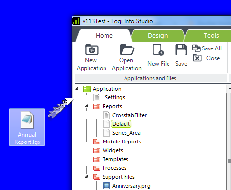
You can also drag files into, or out of, Studio from, or to, the operating system (from Windows Explorer or the Desktop, for example) or another Studio instance.
In Studio, files are dragged from or dropped onto the file/folder tree in the Application panel. When dropping files, if you don't explicitly drop them onto a folder in the tree, Studio will attempt to place them in the correct folders based on their file extensions. Files can be dragged and dropped within other folders in the file tree.
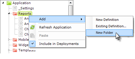
Studio also supports a hierarchy of "pseudo folders" for additional file organization purposes. Folders are created by right-clicking any folder, as shown above, and selecting Add![]() New Folder.
New Folder.

Creating folders in this manner and then creating or dragging files into them produces the kind of file names shown in the example above. No actual folders are created in the file system. In Studio, entire folders can be dragged into other folders to reorganize them.
The following types of files are found in a Logi application:
- _Settings - This XML-formatted definition file provides configuration information with application-wide scope. Paths, constants, datasource connections, diagnostic settings, etc. are all configured here.
- Reports - Report definitions are the basic source code files of a Logi application, with each report definition usually equating to one web page. Individual files, with an .LGX extension, are enumerated here; double-clicking a definition will open it in the definition editor in the Workspace panel.
- Mobile Reports - These are report definitions specifically designed for creating reports for mobile devices. Not available in Logi Report.
- Processes - Process definitions are a special category of non-presentation source files. They can contain code for conditional and unattended processing and provide flexibility and coding depth not available in Report definitions. Process definitions are not available in Logi Report.
- Support Files - These are the files that support the report and process definition files and include style sheets, images, XML data files, and external HTML files.
- Widgets, Templates - These folders contain files that are for special purposes. Templates are not available in Logi Report.
To edit most files, double-click their name and they'll open in an editor in the Workspace panel. Do not attempt to edit complex data files in proprietary formats, such Excel spreadsheets, in the Workspace panel - these should be opened and edited externally.
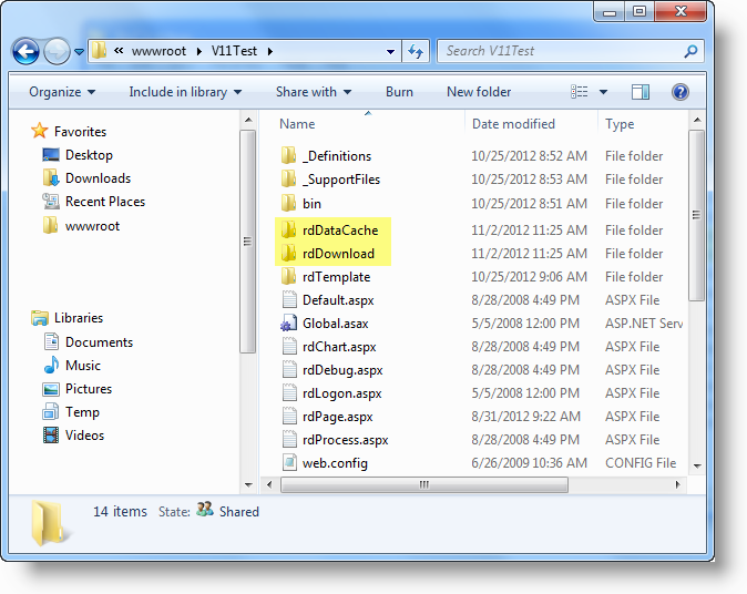
In the file system, a basic Logi application looks like the example shown above. All of the files for a single application are contained in one folder, the "Application folder", which makes deploying the app easy.
Folders beginning with "rd" are system folders and must be present. Their contents should not be directly edited. The two folders highlighted above are created automatically when the app runs, so don't be concerned if you create a brand new app and don't see them at first. Other folders may also be created, based on features in your application.
Studio does not keep track of application files in a database, so you can directly manage files in the Windows file system, copying, moving, renaming, or deleting them without causing any damage. You can always update Studio's list of files by right-clicking any folder and selecting Refresh Application.
Editing Files
Logi Studio includes file type-aware editors for viewing and editing application files.
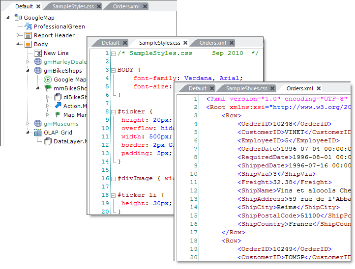
As shown above, when files are opened they're added to the Workspace panel as tabbed panels. The editor for each tab panel is appropriate for the file's type. Features include:
- The tabs themselves can be reordered by dragging them left or right.
- Editors may, depending of file format, include line numbering, color coding, and collapsible regions.
- Elements and text can easily be copied and pasted between files in different tab panels.
- Copying an element also copies all of its child elements.
- Intelligent completion of element names and HTML tags is provided when typing
- Undo-Redo (Ctrl-Z, Ctrl-Y) is available for all changes made since the last Save.
- The Preview panel for definitions includes Forward, Back, Refresh and Stop buttons.
- Multiple elements that are hierarchical peers in the element tree can be selected at once, then moved or copied as a group.
- Elements have their valid child elements available for selection directly from their (right-click) context menus and from the Element Toolbox panel.
Files are closed, and their tabbed panel removed, by clicking the X icon in the tab by the file name. You will be prompted to save any changes that have been made.
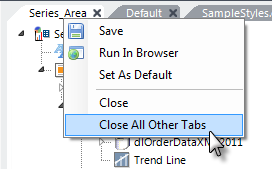
Tab context menus, available by right-clicking, are available, as shown above. The menu options vary based on the type of file being edited in the tab panel.
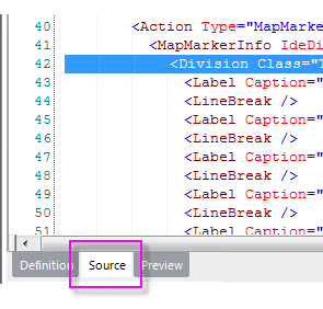
At the bottom of the Workspace panel are several tabs that appear when editing a definition. The Source tab provides a view of the definition's XML source code. If an element is selected in the definition when the Source tab is clicked, its corresponding XML tag will be highlighted in the source code, as shown above. Skilled developers can edit the source directly here, if desired, or copy and paste code here.
Copying the XML source is an easy way to send all or part of the definition to someone else; for example, another developer or to Logi Support in an email. In fact, just copying the element right in the element tree itself and then pasting it into a email or another application will result in the XML source being pasted.
Working with Elements
The primary source code files for Logi applications are report definitions. These files contain XML-formatted text and Studio allows you to create and edit this text in a graphical manner by manipulating objects, called "elements". In Studio, elements are arranged in a tree structure that mirrors the top-to-bottom structure of a web page and some elements have names that are similar to HTML tags.
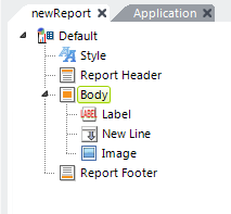
The example above shows elements in the "Element Tree" in a report definition. An element can be the "owner" of another element, creating a parent-child relationship between them. In the example above, the Label, New Line, and Image elements are children of the Body element. These relationships are governed by rules which are enforced within Studio by restricting the availability of child elements for assignment to a parent element.
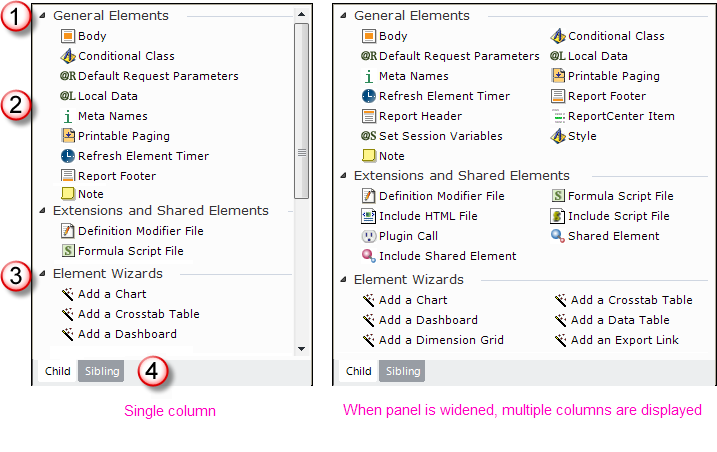
Elements can be added to the element tree by first selecting the parent element and then double-clicking the child element in the Element Toolbox panel, or by dragging-and-dropping the element. The Element Toolbox, shown above, includes:
- Elements are grouped by function, and groups can expanded or collapsed.
- Elements can be double-clicked, or dragged-and-dropped, in order to add them to a definition.
- Links to start wizards may be available.
- Tabs to specify the relationship of the displayed elements to the element selected in the definition: Child or Sibling. Only elements which apply to the specified relationship type will be displayed.
Child and sibling elements can also be added to the definition by right-clicking an element in the tree and selecting them from the context menu that appears:
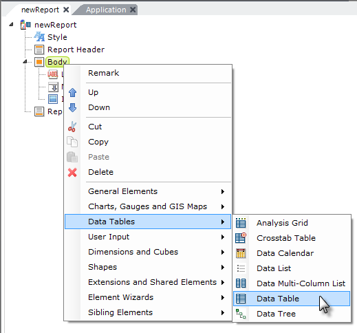
An element's context menu, shown above, includes several useful options for working with elements, such as moving, copying, cutting, or deleting them.
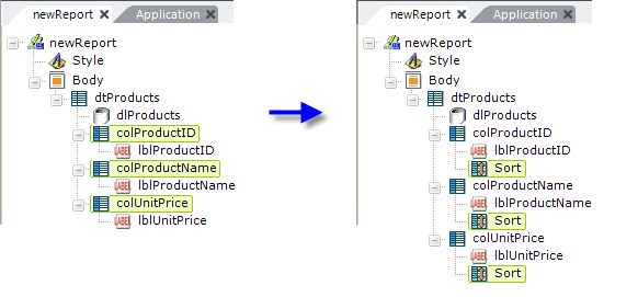
You can also select multiple parent elements (hold down the "Ctrl" key while selecting them) and then add a child element beneath all of them at once. In the example above on the left, multiple Data Table Column elements have been selected, then the Sort element was chosen from the Element Toolbox. The result, on the right, shows a Sort element added beneath each selected Data Table Column element.
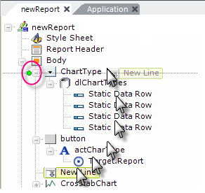
Once in the tree, elements can be moved up or down by dragging them or by using the Up and Down tool bar arrows or similar items in their context menus. The example above shows a New Line element being dragged upward in the tree; note the circled green positioning dot that helps you determine where to drop it. When an element is moved in this way, all of its child elements move with it. Even groups of elements (peers, on the same level in the tree) can be selected and moved at the same time.
Elements can also be copied and pasted, individually or in groups, back into the same definition, into another definition, or even into another Logi application in order to reuse them. All of their child elements will be copied with them.
Even XML source code, copied from the Workspace panel's Source tab, can be pasted right into the element tree and will instantly appear there as the correct elements. This is a great way to share code via email or discussion forums.
Two special elements, Shared Element and Include Shared Element, can be used to make one instance of a group of elements re-useable throughout your application. Elements placed under a Shared Element element in one definition can be referenced using the Include Shared Element element in other definitions. This is particularly useful, for example, for managing headers and footers that appear on many reports within an application. More information about these useful elements
is available in
Shared Elements.
Element Positioning
By default, Logi definitions use FlowPositioning to arrange the elements on a report page. This is a very common scheme in web applications in which each element's location is dependent on the location of the elements preceding it. This is the most flexible scheme and works best across multiple browsers, and is the scheme we recommend that you use.
However, some developers may require absolute positioning, where elements are located on the page based on pixelcoordinates. This is known as Layout Positioning and Logi Studio supports it. Layout Positioning is enabled on a report-by-report basis using a special attribute. For more information about positioning, see Position Elements.
Set Element Attributes
Elements can have a number of attributes, or "properties", that govern how they behave. The attributes for a selected element appear in the Attributes panel and the number of attributes varies depending on the nature of the element.
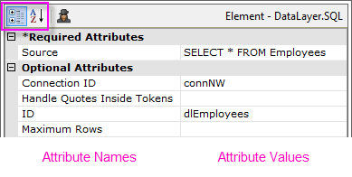
As shown above, attribute names appear in the left column and attribute values are entered in the right column. Some attributes are required while others are optional. Attributes can be sorted in two ways: by Category or Alphabetically, by clicking the highlighted icons. When sorted by category, the required attributes appear at the top.
Depending on the attribute, values can be entered in several different ways. Generally, values can always be typed-in directly.
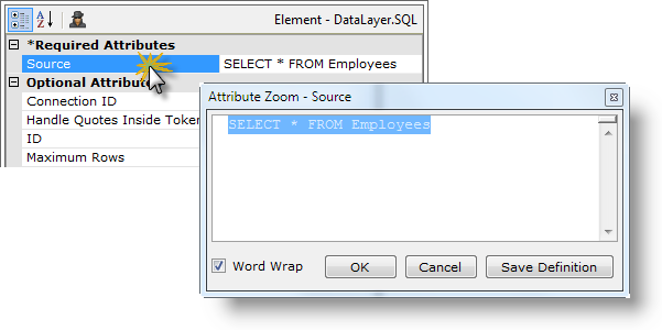
Double-click the attribute name to open the Attribute Zoom window, shown above, which contains a larger, multi-line text entry area and allows you to see longer values without scrolling.
Hovering your cursor over the value column will cause the complete value to appear in a tooltip, even multi-line SQL statements.
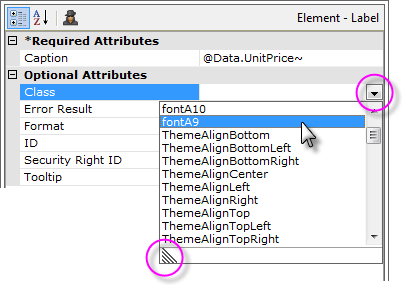
The values for some attributes consist of a specific set of validchoices and, as shown above, these are chosen by first clicking the circled down-arrow and then selecting a value from the drop-down list of choices. The length of the list can be expanded by dragging the indicated corner of the list.
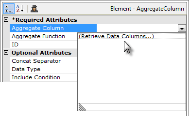
Where attributes require column names from a datasource, as shown above, a drop-down list is provided that will, first, retrieve the column names, and then, display them in a drop-down list for easy selection. This feature only works with datasources that respond to schema requests, such as databases, and so does not work with flat files. In addition, the parent data table or chart must have a valid ID for column names to be retrieved.
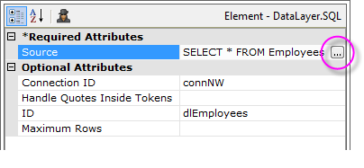
For some attributes, clicking the browse button in the value column will launch a wizard or tool. For example, when the browse button is clicked in the image above, it will open the SQL Query Builder tool, or...
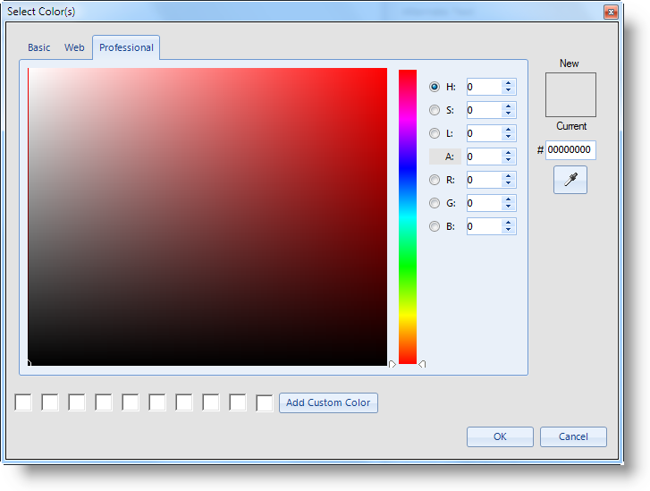
...in the case of Color attributes, clicking the browse button will cause the Color Selector dialog box, shown above, to be displayed.
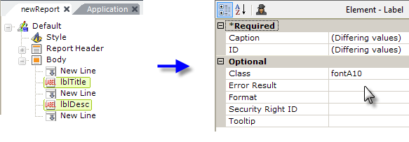
Attributes can be assigned for several elements at the same time, by selecting multiple elements (hold down the Shift or Ctrl keys while clicking elements). The Attributes panel will show all of the attributes the selected elements have in common; attributes that already have different values assigned will be indicated by the "(Differing values)" message. As shown above, assigning an attribute like Class in this state will set the individual Class attributes for each of the selected elements.
Element ID Attributes
Some elements require a unique ID attribute value, which has to be entered by the developer. Developers are encouraged to use a "naming scheme" that conveys both element type and purpose.
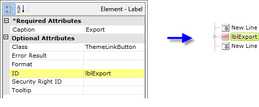
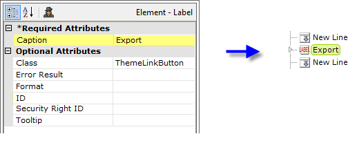
In addition, if an optional ID value is left blank, Studio will identify the element in the Element Tree by using text from another attribute value, as shown above. The attribute that Studio selects for this purpose varies, depending on the element type. The purpose of this change is to eliminate most "duplicate ID" errors (often caused when copying and pasting elements) and to relieve developers, in most cases, of the
need to provide IDs at all.
Variable and Parameter Lists
Certain elements consist of lists of "variable attributes". In this case, the Attributes panel displays an interface that allows you to enter as many attribute names and values as needed.

In the example above, a Link Parameters element has been selected and three attributes have been created.
Attributes are created by entering a name in the text box at the top of the Attribute panel and clicking the "+" icon. The new attribute then appears in the list and its value can be set by typing a value directly into the right-hand column. Values can consist of numbers, text, tokens, or formulae. Attributes can be removed by selecting their name and clicking the "-" icon.
Attribute names can be edited by selecting them and clicking the "Pencil" icon. This will place the name into the top text box, where it can be edited. The icon will change to a "Diskette" icon and clicking it again will save the edited attribute name. Attribute values can be edited directly, as usual, by placing the cursor on them.
Express Attribute Navigation
Some developers may prefer keyboard navigation to set attributes, avoiding constant switching between their keyboard and their mouse. Here are some "keyboard shortcuts" that allow this kind of mouseless navigation:
| Keys | Action |
|---|---|
Once you've entered an Attribute value, the Tab key can be used to commit the value and move to the next value down. | |
| |
|
|
The Attribute Spy
The Attribute Spy feature allows you to see all of the values assigned to a particular attribute for all elements at once. This is a very powerful tool that makes it easy to compare values, such as style sheet class assignments, or get an overall view of values without excessive navigation and mouse-clicking.
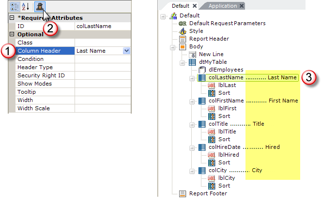
As shown above, simply select an attribute (1) and then click the
Attribute Spy button (2) at the top of the Attributes panel. Text
will appear in the Workspace panel (3) indicating the values for that
attribute for every element in the tree (excluding elements that do not have a
value assigned for that attribute). Click the Attribute Spy button again to hide the text.
Intelligent Token Completion Feature
One of the most useful features in Logi Studio is the token completion feature. It's often difficult to remember all of the token types and identifiers that are available and this feature presents them and also prevents typing errors.
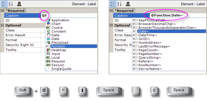
Here's how this feature works:
Type an @ sign and the first letter or two of a token type in an attribute value and a list of token types will appear, as shown above left. Use the Up and Downarrow keys to further navigate to the desired type, if necessary, and press the Space Bar to select it. The token type will be added in the attribute value. You can instead type @ + first letter, for example, @f, to navigate to the desired token.
- Type a period (.) after the token type, as shown above right, and a list of token identifiers will appear. Type a letter or two and/or use the arrow keys again to navigate and the Space Bar again to select the desired identifier. It will be appended to the token type in the value column, including the trailing tilde.
Similarly, you can use the intelligent completion feature to provide column names, for example, for @Data tokens:
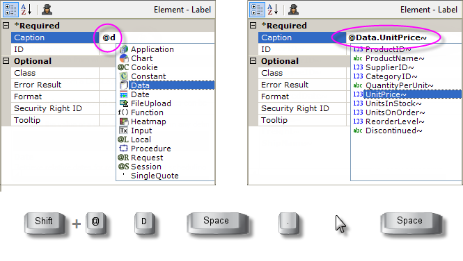
Type an @ sign and the letter "d" in an attribute value and a list of token types will appear, as shown above left. If it's not positioned there already, use the Up and Downarrow keys to navigate to the Data token item. Press the Space Bar to select it. The token type will be added in the attribute value.
- Type a period (.) after the token type, as shown above right, and a list of columns, based on the datalayer in use, will appear. Use the arrow keys and Space Bar again to selection the desired column and it will be appended to the @Data token in the value column, including the trailing tilde. Under certain circumstances, you may instead see an item named "Retrieve columns..." which will get the column names and then display them. This feature only works with datasources that respond to schema requests.
The token completion feature also appears in other places, too:
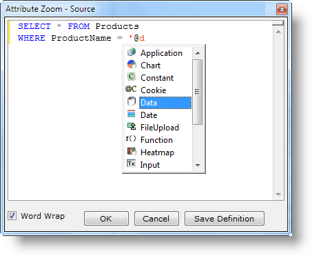
For example, when you use the Attribute Zoom window and enter tokens, as shown above. Also, in the SQL Query Builder, if you edit your query manually and use tokens, it will pop up. The Space Bar and Period keystrokes work in these instances in the same way as described earlier.
Token Validation
Studio includes a token validation feature which examines tokens as you enter them and will flag those that are incorrectly spelled.
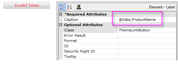
In the example shown above, the tilde ("~") has been left off of the end of the Data token. Studio responds by displaying an Invalid Token button in the current definition tab. Clicking the button will take you to the offending token. The validation routine looks for missing tildes and misspelled token types ("@Request" instead of "@Request", for example).
Studio Wizards
Studio includes "wizards", or automated procedures, which walk you, step-by-step, through complex tasks, from creating new applications to building charts. They save a lot of key strokes and mouse clicks and provide repeatable, consistent productivity. Wizards can be invoked in several ways.
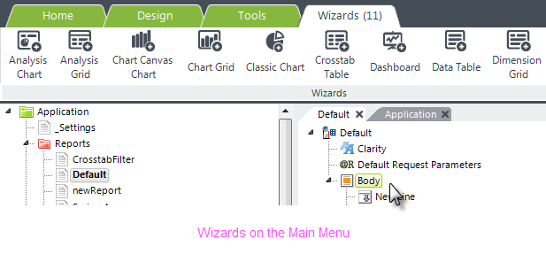
When you select an element that has wizard support in the Element Tree, a special tab will appear on the main menu, containing items for the appropriate wizards, a shown above.
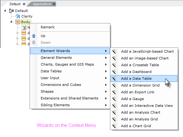
Element wizards are also available in the context menus that pop-up when you right-click an element, as shown above. As in the main menu, their availability depends on which element is selected in the definition. The wizards shown above are specific to the Body element.
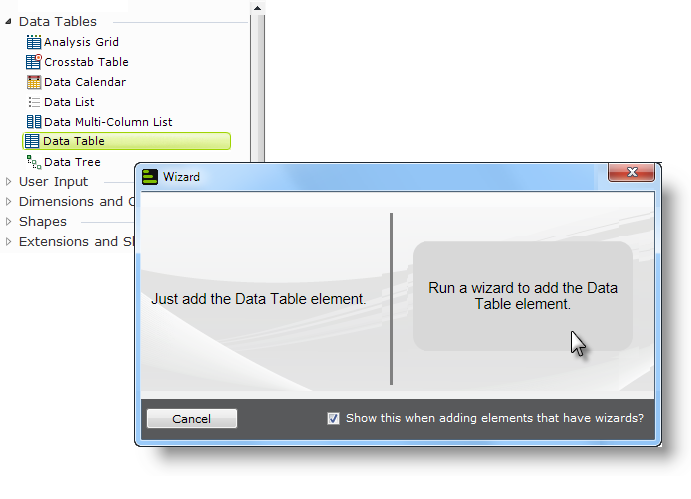
By default, if you double-click an element in the Element Toolbox that has a wizard associated with it, a dialog box like the one shown above will be displayed. It offers you the choice of inserting the element into the Element Tree or running the wizard. This behavior can be changed by unchecking the "Show this..." checkbox, in which case elements will just be inserted in the future. You can control this behavior using the Tools![]() Options menu option.
Options menu option.
Wizards are also capable of validating your definition and will let you know, for example, if you're missing an element which needs to be provided before the wizard can proceed.
Wizards in Action
Studio's wizards are too numerous to document individually (there are more than 50!) but let's look at a representative example of a wizard in action:
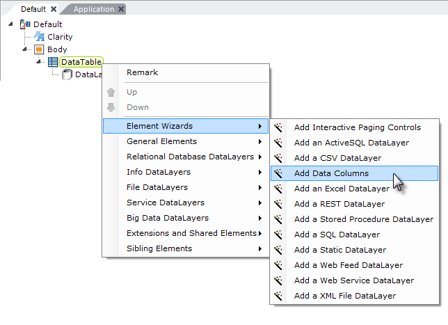
In the definition shown above, Data Table and DataLayer.SQL elements have been added beneath the Body element, and the datalayer has been configured with a valid SQL query. Right-clicking the data table displays its context menu; let's let the Element Wizard add data columns to the table by selecting the Add Data Columns wizard.
![]() If the query is invalid or contains a typo, or you try this with a datasource that can't return a schema, the wizard will fail. In such a case, the wizard will display an error message that should assist you in correcting the problem.
If the query is invalid or contains a typo, or you try this with a datasource that can't return a schema, the wizard will fail. In such a case, the wizard will display an error message that should assist you in correcting the problem.
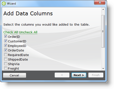
As shown above, the wizard presents a dialog box displaying all of the columns that the SQL query returned. First, we'll click the Uncheck All link, then individually check the boxes for the first four columns, so that the selections look like the example shown above. Then we'll click Next.
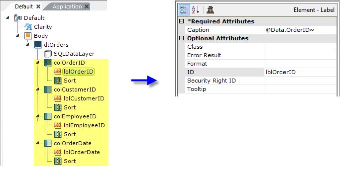
The wizard will insert, and configure, all of the elements necessary for the data table columns we selected, as shown above.
Studio's wizards are a great resource for configuring elements, such as charts, that have a large number of configuration choices. For example, you could use the Add a Chart wizard to get the basic chart set up for you and then you could customize it from there.
Assigning Themes and Style Sheet Classes
The presentation qualities of elements are set in two ways. In some cases presentation values, such as Color, may appear as element attributes that can be assigned directly. However, in most cases, this is achieved by using a Theme or by manually assigning style classes to an element's Class attribute.
Using Themes
Themes allow developers to instantly apply a consistent "look" to their applications. A theme is a collection of graphic images, a style sheet, and a template modifier file, that impart a specific appearance to a Logi application. Several standard themes are provided for your use.
Themes do the work for you, assigning style classes and setting other appearance attributes, making
it easier to produce great looking reports without an in-depth knowledge of
style classes and style sheets. You can easily switch between themes in order to
experiment with them.
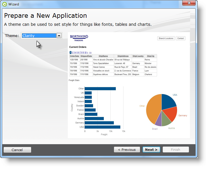
When you use the New Application wizard in Studio, one of the steps is
the selection of a theme for the new application, as shown above.
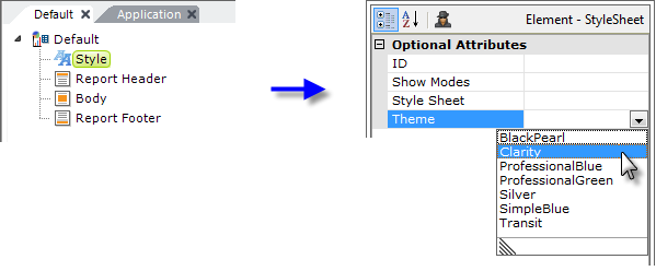
Style element to your report definition, then set its Theme attribute to the name of one of the available themes. The report will then have the theme applied to it.
For more information about themes, see Themes.
Using Style Classes
The first step in using style is to assign a style sheet. This .css file is typically placed in your application's _SupportFiles folder and assigned using the same Style element used in the previous example to assign a theme. Once the style sheet has been assigned to the report definition, its style classes are available for use.
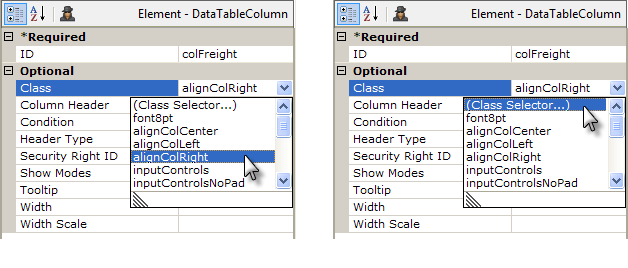
Class attribute value of an element. The classes in the list are drawn from the style sheet assigned to the report definition or the application. This is a quick way to select classes, although class names can also be typedin directly. Multiple classes can also be assigned, separated by commas. A preview of the effect of the assignment is shown in Studio's Information panel.
The list of class choices includes a (Class Selector...) item, shown above right, which opens the Class Selector tool.
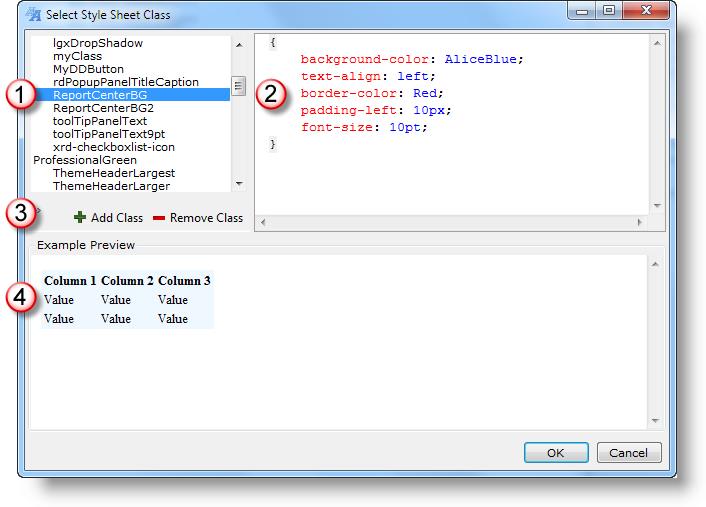
Class Selector tool, shown above, allows a class to be assigned by selecting it in the class list (1) and clicking OK. The attributes of the class are shown in the upper right panel (2) and they can be edited there. Controls (3) allow you to save, add, and delete classes and the effect of the selected class is shown in the lower preview panel (4). This tool provides pretty comprehensive class management right within Studio.
A more convenient editing option is to open the style sheet, by double-clicking it in Studio's Application panel, and it will open in a special editor in the Workspace panel. The intelligent editor will provide style selector choices and completion suggestions as you type.
Finally, you can use an external style sheet editor, if you've installed one:
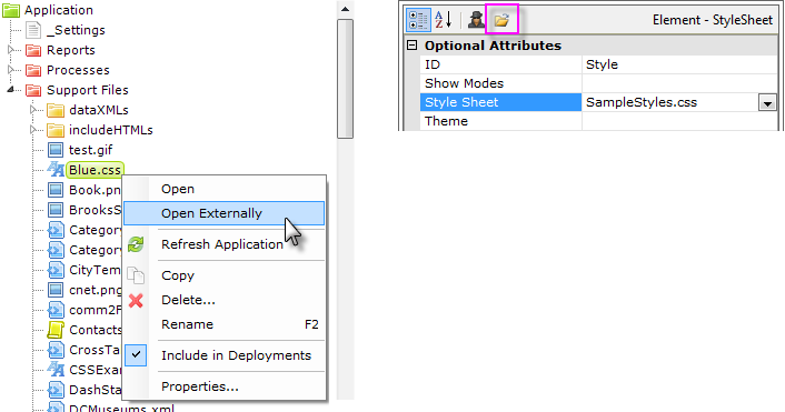
open and edit style sheets in an external style sheet editor by selecting and right-clicking the file in the Application panel, as shown above left, then selecting Open Externally from the pop-up menu. Another method is to select the Style element in the element tree, select its Style Sheet attribute, and click the Open File... icon that appears at the top of the Attributes panel, as shown above right. These actions will launch any style sheet editor application associated in the file system with the .css file extension and open the style sheet in it.
For more information about working with style classes, see Introduction to Style Sheets.
Testing and Debugging Applications
While developing a Logi application, you'll need to check your work by viewing it and Studio includes several ways to do this.
Using the Preview Tab
The Preview tab, at the bottom of the Workspace panel, provides the
developer with a fast way to view the report definition currently being edited.
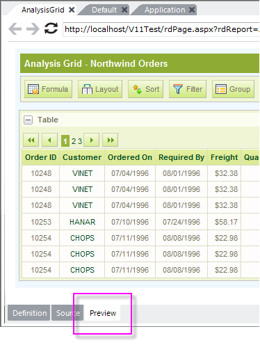
To preview a report definition that's open in the Workspace panel:
- Ensure that the desired report definition is the selected definition in the workspace.
- Click the Preview button at the bottom of the Workspace panel, as shown above.
- Browse and interact with the report definition using the toolbar at the top of the Preview panel.
Note that clicking Preview will save all open definitions before displaying the report.
Using the "Live Preview" Feature
The Live Preview feature allows you preview your work in a separate, "live" desktop window.

The Main Menu's Live Preview item is shown above. The live preview will be displayed in a separate window and any changes made to the definition will immediately be reflected in that window. You can resize and relocate the new preview window as desired; you can even drag it onto a separate display, if you have one.
You can also switch to Live Preview from regular Preview mode:
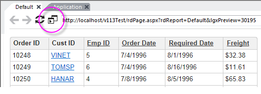
To start Live Preview, first preview the report definition, using the Preview tab, and then click the Live Preview icon, circled above.
The preview will be displayed in a separate window, and Studio will switch back to its Definition tab. You can resize and relocate the new preview window as desired; you can even drag it onto a separate display, if you have one.
Any subsequent changes you make to the definition code will immediately be reflected in the Live Preview window.

If you don't want definition changes to be updated immediately in the Live Preview window, you can pause and restart them, using the Pause and Play icons in the Live Preview window, circled above.
To exit Live Preview, just click the Live Preview window's Close (X) icon.
Browsing the Default Report Definition
In a Logi application, one of the report definitions is designated (in the _Setting definition) as the "default" report - the page that will be shown if no definition is specified in the URL. If you don't change it, this is usually the Default report definition.

You can browse the default report by clicking the Run Application menu item, shown above, in Studio's Main Menu, or by pressing the F5 key. Your computer's default browser (the one associated with .htm/.html file extensions) will be used for this.
You can change the "default" report designation using two methods:
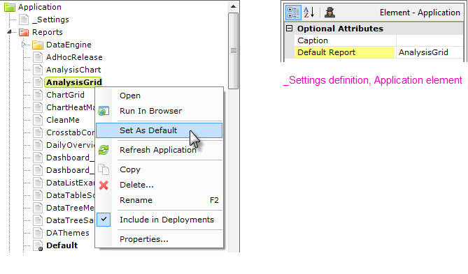
As shown above, left, in the Application panel, select the desired report definition, right-click it, and select Set As Default from its context menu. This sets the Application element's Default Report attribute, shown above, right, in the _Settings definition. You can also manually edit this attribute value directly in the _Settings definition.
Using the Run Application menu item will save all open, unsaved definitions before displaying the report.
Browsing Any Report Definition
You can also browse any report definition without opening it in the Workspace panel, or setting it as the default report:
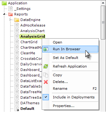
As shown above, select the desired report definition, right-click it, and select Run In Browser from the popup menu. Using this menu item will save all open definitions before displaying the report definition.
Using the Test Parameters Panel
One of Studio's least well-known panels is the Test Parameters panel. Studio makes this panel visible when the current definition expects to receive and use parameters. It provides a way for developers to supply request variable values for their definitions when previewing them in Studio, and it makes experimenting with different values very easy.
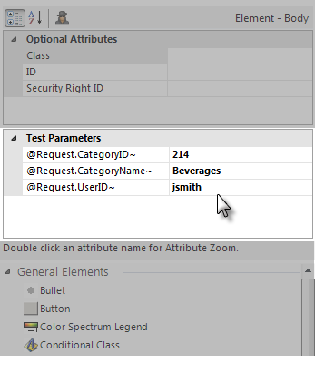
The example above shows this panel in use. Studio will automatically populate the left column with the tokens for any request variables expected by the currently selected definition in the Workspace. You can enter values for those tokens, and they'll be fed to the definition when you Preview it in the Workspace panel, or right-click it in the Application panel and select "Run in Browser".
![]() The token values in Test Parameters are not fed to the application when you click the Run Application menu item or press the F5 key.
The token values in Test Parameters are not fed to the application when you click the Run Application menu item or press the F5 key.
Using the Debugging Features
Logi Studio also provides debugging features for an application, but they have
to be enabled to work. They are not enabled by default.
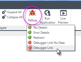
You can turn on comprehensive debugging for all your report pages by clicking the Debug menu item, shown above, and selecting Debugger Link from the selection list.
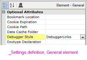
Selecting a debugger option in the menu sets an attribute value in the _Settings definition, as shown above. This value can also be set manually.
When the Debugger Style has been set to DebuggerLinks and the report is run, a Debugger Trace Report is generated. It can be accessed in
two ways: using the debug icon which will now appear in your report pages, or from a
link that appears on a runtime error page. The trace report appears either in
the Preview panel or in your browser, depending on which method you were using
to view your report.
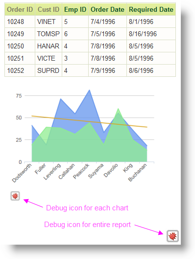
As shown in the example above, the debug icon for the report "floats" in the lower right-hand corner of the browser window, so you don't have to scroll down to use it. Any charts, which are processed separately by the Logi Engine, will have their own debug icon and trace report.
For more information about debugging, see Debug Reports.
Deploying Logi Applications
After you've developed your Logi application on your development machine, it's time to deploy it to your production server. For more information on how to do this, see Deploy a Logi Application.
The easiest of these methods is to use Studio's Application Deployment tool. Before you use it, however, ensure that:
- Logi Server is installed on your production server. On a development machine you generally install both Logi Studio and Logi Server and you may wish to install them both on a production server, but it's not required and most developers only install Logi Server there.
- The .NET framework or JDK 1.6+ has been installed on the production server.
- You have an appropriate Logi license for the production server.
- You have the appropriate security credentials for writing to the production server.
- The production server has connectivity to the database server or other datasources needed by your application, and you know the security credentials they require.
- You know any storage conventions for folder locations on the production
server that you need to observe (such as, "all applications must be installed on
the D: drive, not the C: drive")?
Studio's Application Deployment tool is capable of copying all or part of your application to the production server, using either file system copy commands to local or shared network drives, or one of three flavors of FTP (standard, SSL, and SSH). In Studio, the details of each operation are called a "deployment target" and they can be saved for later reuse.
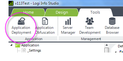
The Application Deployment tool is started in Studio by selecting it from the Main Menu Tools tab, as shown above.
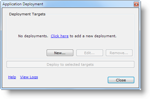
If no deployments have been defined, the dialog box shown above appears. Click the link or New... to define your first deployment target.
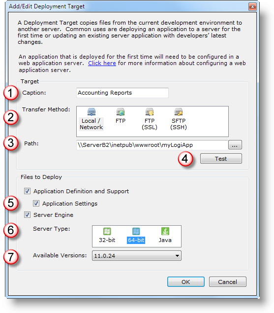
The Add/Edit Deployment Target dialog box contains the following:
- An arbitrary name you give the deployment, for future reference.
- The transfer method: Copy to Local or Network drive, FTP, FTP (SSL), or FTP (SSH).
- If Local/Network selected: the UNC file path to destination app folder on production server. Example:
\\myWebServer\myLogiApp
If FTP variant selected: the FTP protocol URL to destination app folder and arguments. Examples:
FTP & FTP SSL: ftp://myWebServer/myLogiApp, ftp://myWebServer.com:8082/projects/myLogiApp
FTP SSH: sftp://myApp@myServer.com/myLogiApp
If necessary, you will be prompted to supply a user ID and a password; do not include them in the URL.
- The Test button can be used to ensure connectivity to destination.
- Select the files that are to be transferred. Files are overwritten at destination without warning!
- If Server Engine has been selected above, the Server Type options for the deployment are shown. Select the server type.
- If Server Engine has been selected, the AvailableVersions installed on the development machine are listed.
If the destination requires a user ID and password in order to access it, when you click the Test button, you'll be prompted for login credentials. If the credentials are successfully authenticated, the user ID will automatically be saved with the deployment target details and, optionally, the password as well.
Once a deployment target has been defined, it appears in a list:
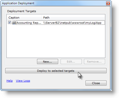
as shown above, where it can be managed and edited. To run a deployment, check its checkbox and click the Deploy button. If multiple deployments are selected, they'll run consecutively.
The connection with the destination server will be established and then the files will be deployed to it.
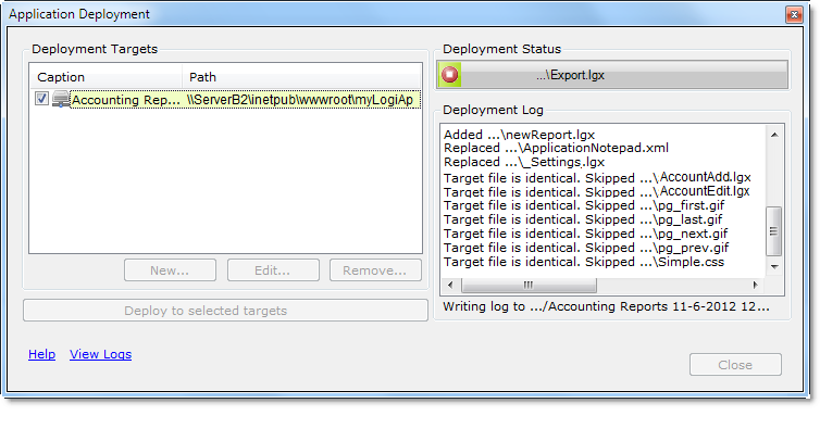
The Deployment dialog box will expand to display the results of the process, as shown above. The running log indicates which files are added, replaced, or skipped. Deployment process logs are created in the rdDeployment folder beneath each Logi application folder as text files and are accessible through the View Logs link.
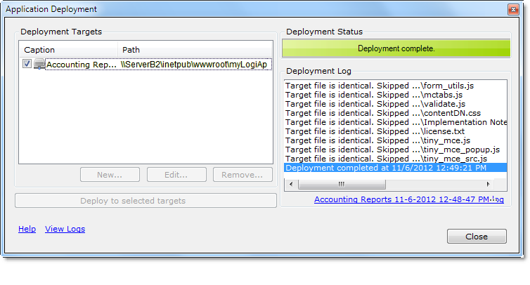
Finally, the deployment will complete and a direct link to its log file will be displayed.
![]() It's very important that you understand that copying the files, using the Deployment tool, does not register the application with a web server on the target machine. So, after the first deployment is run, this registration must be completed by the developer using Studio, Server Manager (for .NET applications only), or the web server's tools.
It's very important that you understand that copying the files, using the Deployment tool, does not register the application with a web server on the target machine. So, after the first deployment is run, this registration must be completed by the developer using Studio, Server Manager (for .NET applications only), or the web server's tools.
Controlling Which Files Are Deployed
The Add/Edit Target dialog box allows you to select the files to be deployed by category:
Category | Description |
|---|---|
Application Definition and Support | Copies all files in all folders with names beginning with an underscore, such as _Definition, _Script, _Support Files, etc. This includes folders like _Images and _Stylesheets, which are from a legacy folder scheme. Identical files will be skipped. |
Application Settings | Copies _Settings.lgx only. Identical files will be skipped. |
Server Engine (.NET app) | Copies the rdTemplate and bin folders - files are overwritten without warning. Also copies any .aspx, .asax, and .config files if they do not already exist; does not overwrite them if they do exist. |
| Server Engine (Java app) | Copies rdTemplate, Assemblies, and WEB-INF folders - files are overwritten without warning. Also copies any .aspx, .asax, and .config files if they do not already exist; does not overwrite them if they do exist. |
Why not just deploy all of the categories all of the time? You'll want to do so for your first deployment but, generally, you won't want to for subsequent deployments in order to avoid overwriting files that may have been customized for the production server, such as _Settings.lgx. And, unless you're changing engine versions, deploying the engine files with every deployment is unnecessary and a waste of time. So the tool offers you the opportunity to tailor your deployments as needed.
However, developers may want to exclude specific application definition and support files from a deployment, and Studio provides an easy way to do that:
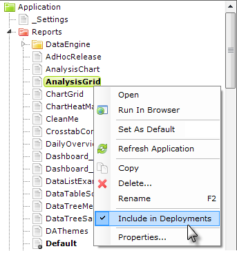
By default, all files in Studio's Application panel are included in deployments. However, if you wish to exclude a file, select it in the Application panel, right-click it, and uncheck the Include in Deployments item in the popup menu, as shown above.
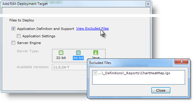
If files have been excluded in this manner, in the bottom section of the Add/Edit Deployment Target dialog box, a View Excluded Files link will be displayed, as shown above. Clicking the link will display a list of the excluded files.
License Files
License files are never included in deployments, so you will have to manually deploy your license file the first time you deploy your application, or configure it to use a centralized license file. For more information about license files, see Product Licensing.
After a First-Time Deployment
After the first time an application is deployed, you must:
- Provide a license file for the application, unless you're using a centralized license file.
- Register the application with the web server.
- Ensure that the datasource connection strings or parameters, constants, and other server-specificsettings are correct in the _Settings definition.
- For a Java app, complete any special configurations required for your web server.
For subsequent deployments, you need only run the Deployment tool to update the files on the target server.
For more information, see Deploy a Logi Application.
Ribbon Menu, Shortcuts, and Search
Studio operations can be controlled using the Ribbon Menu at the top of the screen. Here are its tabs and major items:

| Tab | Definition |
|---|---|
New Application | Create a new application with the assistance of the New Application wizard. |
Open Application | Open an existing application from the File Explorer, the recent apps list, or a list of apps registered with the local web server. |
New File | Create a new file by selecting a file category. |
Save, Save All, Close | Save the file in the current Workspace editor tab, save all edited files, and close the current application, with a prompt to save any unsaved files. |
Edit Actions, Remark, | Standard editing actions including Cut, Copy, Paste and more. Comment and uncomment elements and rearrange their order. |
| Search/Replace | Search current, or all, definitions and supporting text files, and replace text, if desired. |
Element Navigation, | Navigate to previous or next element in the Element Tree navigation history. Expand or collapse all child elements beneath the selected element. |
Test Actions | Control debugging, and preview a definition in a browser or in a separate "live" window. |

| Themes | Apply the selected Theme to the current report, or to the entire application. |

| Application Deployment | Deploy the application to other servers using the Application Deployment Tool. |
| Application Obfuscation | Render definitions unreadable by humans to prevent tampering and theft using the Application Obfuscation Tool. |
Server Manager | View registered applications and change their Logi Engine versions individually or in bulk. |
| Team Development | Manage built-in Logi source code control with file check-in/out and change history. |
| Database Browser | View schema and basic data samples from databases with connections in _Settings file. |
| Elements/Attributes Panel | Specify the arrangement and order of the Element Toolbox and Attributes panels in Studio. |
| Options | Specify Studio options including file encoding and definition editor colors. |

The Wizards tab appears when an element that has supporting wizards is selected. The number of wizards available varies depending on the selected element.
![]() Some European keyboards use a key combination that includes the Alt key to produce characters like @ and ~ which are used frequently in Logi code. By default, the Alt key will shift focus to the Ribbon Menu, making it difficult to type these characters on European keyboards. An option to disable this focus shift is available in Tools
Some European keyboards use a key combination that includes the Alt key to produce characters like @ and ~ which are used frequently in Logi code. By default, the Alt key will shift focus to the Ribbon Menu, making it difficult to type these characters on European keyboards. An option to disable this focus shift is available in Tools![]() Options.
Options.
Studio Options
Some menu items have self-explanatory drop-down lists of choices, while others open a dialog box:
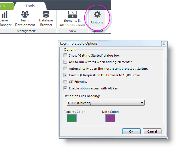
In the example shown above, the Tools![]() Options item displays the Studio Options dialog box, containing these options:
Options item displays the Studio Options dialog box, containing these options:
- Show "Getting Started" dialog box - Select this option to display the dialog box designed for new users when Studio starts.
- Ask to run wizards... - Controls whether or not a dialog box prompts you to insert an element or run its wizard when you double-click an element in the Element Toolbox.
- Automatically open... - Select this option to have Studio, at startup, reopen that last application open when Studio was closed.
- Limit SQL Requests... - Uncheck this option to allow very large result sets to be returned, but be prepared for possible delays.
- GIT Friendly -
 When checked, prevents writing of the standard SavedAt, SavedBy, and EngineVersion attributes in definition file source code, which can interfere with some code repositories like GIT. Also adds a .gitignore file in the application folder.
 - Enable ribbon access... -
 Uncheck this option to prevent shifting focus to the Ribbon Menu when the Alt key is pressed. This is useful with some European keyboards that use key combinations that include the Alt key to produce characters like @ and ~.
 - Definition File Encoding - Specifies that character encoding scheme to be used in Logi definition files.
- Remarks Color - Colored block indicates the color to be used for remarked (commented out) elements in the element tree. Click the block to open the Color Selector dialog box and choose a new color.
- Notes Color - Colored block indicates the color to be used for Note element text in the element tree. Click the block to open the Color Selector dialog box and choose a new color.
The other items on the Tools tab, Application Deployment, Application Obfuscation, Server Manager, Team Development, and the Database Browser, are discussed in separate sections in this topic.

The Ribbon Menu items can be collapsed vertically to get more screen real estate, using the arrow highlighted above. The menu can be expanded again by clicking the arrow again, or by selecting a different menu tab.

The menu's Getting Started button, shown above, will redisplay the Getting Started dialog box whenever needed.
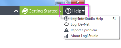
The menu's Help button, shown above, displays a drop-down list of resources for getting assistance and reporting problems.
Keyboard Shortcuts
The following keyboard shortcuts are available for those who may prefer to save mouse clicks:
Applications and Files | Editing |
|---|---|
Ctrl n = New application | Ctrl f = Find |
Ctrl o = Open application | Ctrl h = Replace |
Ctrl l = Open application from local web server | Ctrl z = Undo |
Ctrl s = Save selected file | Ctrl y = Redo |
Ctrl, Shift s = Save all open files | Ctrl r = Remark/unremark |
F1 = Studio Help | Ctrl x = Cut |
F2 = Rename selected file | Ctrl c = Copy |
F5 = Run current definition in browser | Ctrl v = Paste |
F7 = Move element up (includes children) | Ctrl + = Next navigation history item |
F8 = Move element down (includes children) | Ctrl - = Previous navigation history item |
| Ctrl |
You can download and print our handy Studio Keyboard Shortcuts quick-reference card, if desired.
Search & Replace
Logi Studio includes a Search feature, including a Search control right on the main menu:
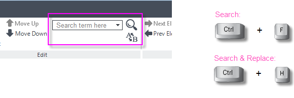
As shown above, the ribbon menu includes a text input control for entering new search terms and it keeps a historical list of terms sought during the current program session. Clicking the magnifying glass icon starts a new search using the displayed terms. Searches are not case-sensitive initially and can also be initiated using the Ctrl + F keys. Clicking the A-B icon, or using the Ctrl + H keys, will open the Search and Replace feature.
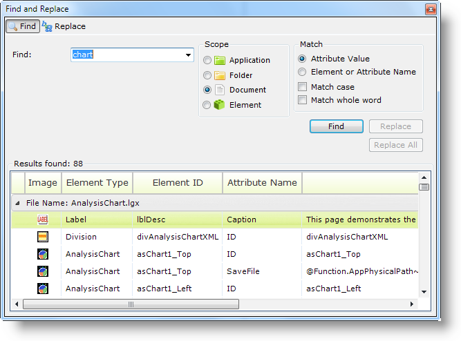
Search results are displayed in the Find and Replace dialog box, shown above. Additional searches can be launched from here with more selective scope and criteria, if desired. Results returned are listed by definition and are active links: clicking a result row will open the corresponding definition in the Workspace panel and highlight the specific occurrence in it.
Clicking the Replace tab in the dialog box reveals controls in which you can enter a replacement term and selectively make replacements.
The Database Browser
The Database Browser tool allows developers to view the objects and data in connected databases. The objects available include Tables, Columns, Views, and Stored Procedures. The database browser doesnot work with datasources that do not
return a schema when queried, such as XML data files.
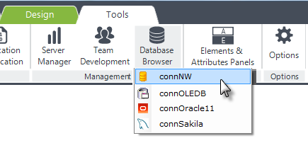
The Database Browser is launched from the main menu's Tools tab, as shown above. Select a database from the list of connections that have been configured in the _Settings definition for this application.
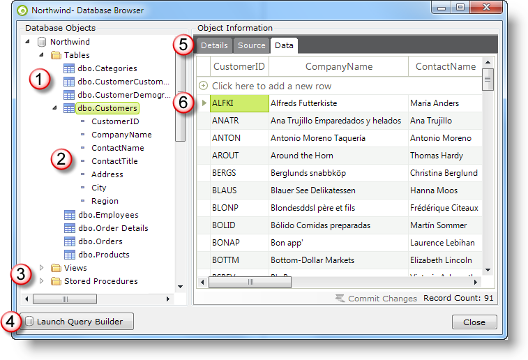
The Database Browser, shown above, provides the following features:
- A tree view of the Tables available in the database is presented, as shown above.
- Each table folder can be expanded to display its Columns.
- The database's Views and Stored Procedures, if any, are also available.
- The Query Builder tool can be launched from here with this button.
- The Details tab provides table or column properties, the Source tab allows Stored Procedure code to be viewed (but not edited), and the Data tab displays the table's actual data.
- Rows of data displayed in the Data tab can be right-clicked and edited or deleted.
![]() The Database Browser will work with the databases for which we provide "native" Connection elements, such as Oracle, MS SQL Server, and MySQL. It may work with other databases that use a connection that mimics that of a database for which we provide a native connection, such as Netezza
The Database Browser will work with the databases for which we provide "native" Connection elements, such as Oracle, MS SQL Server, and MySQL. It may work with other databases that use a connection that mimics that of a database for which we provide a native connection, such as Netezza ![]() PostgreSQL. It is notguaranteed to work with every possible database and, in that case,
we recommend
that you use tools provided with the database to examine and manipulate it outside of Studio.
PostgreSQL. It is notguaranteed to work with every possible database and, in that case,
we recommend
that you use tools provided with the database to examine and manipulate it outside of Studio.
The Database Browser may not support all of the functions and views available in Microsoft Access databases.
By default, the Database Browser will only return 10,000 rows of data. You can turn this limit off in Studio in Tools ![]() Options. The Database Browser is a non-modal dialog box and can remain open, for reference, while you work elsewhere in Studio.
Options. The Database Browser is a non-modal dialog box and can remain open, for reference, while you work elsewhere in Studio.
The SQL Query Builder
The SQL Query Builder tool allows developers to examine data and construct and test their queries from within Studio. It's launched either from the Database Browser or,
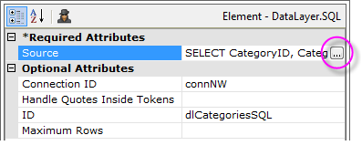
as shown above, by clicking the browse button at the end of the DataLayer.SQL element's Source attribute.
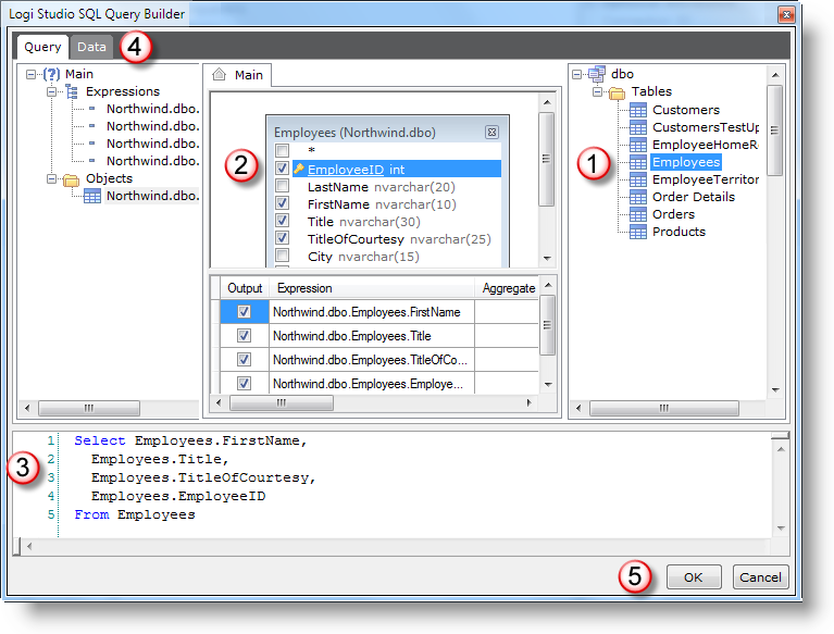
The SQL Query Builder presents database objects in a (1) tree, from which tables and views can be dragged into the (2) center work area. Manipulating the visual objects results in a SQL query being generated in the (3) bottom command area. The query can use multiple lines in the command area and can, therefore, include DECLARE statements and other more complex SQL statement constructions.
Clicking the (4) Datatab at the top of the SQL Query Builder executes the SQL statements and displays the results in that tab panel. The F5 key can also be used to execute statements; portions of statements can be highlighted and selectively executed using F5 as well. SQL statements such as INSERT and UPDATE can be used to modify the data but there is no graphical way to directly make modifications in the Data tab. By default, the SQL Query Builder will only return
10,000
rows of data. You can turn this limit off in Studio in Tools ![]() Options.
Options.
Clicking (5) OK will cause the query constructed in the command area to be copied into the datalayer's Source attribute, if the SQL Query Builder was called by clicking the attribute's browse button. Otherwise, the query text can be selected, copied, and pasted as needed.
![]() The SQL Query Builder will work with the databases for which we provide "native" Connection elements, such as Oracle, MS SQL Server, and MySQL. It may work with other databases that use a connection that mimics that of a database for which we provide a native connection, such as Netezza
The SQL Query Builder will work with the databases for which we provide "native" Connection elements, such as Oracle, MS SQL Server, and MySQL. It may work with other databases that use a connection that mimics that of a database for which we provide a native connection, such as Netezza ![]() PostgreSQL.
PostgreSQL.
![]() The SQL Query Builder will not support all of the functions and views available in Microsoft Access databases, or other non-standard SQL languages, such as Salesforce Object Query Language. It is notguaranteed to work with every possible database and, in that case,
we recommend
that you use tools provided with the database to create and test queries, and then copy and paste them into Studio.
The SQL Query Builder will not support all of the functions and views available in Microsoft Access databases, or other non-standard SQL languages, such as Salesforce Object Query Language. It is notguaranteed to work with every possible database and, in that case,
we recommend
that you use tools provided with the database to create and test queries, and then copy and paste them into Studio.
When a Query Has Been Entered Manually
Note that if you have already entered a query manually in the Source attribute and you then open it in SQL Query Builder, the tool will try to "reverse-engineer" the query into its graphical representation. It succeeds at this most of the time but, if the query includes tokens or is created using a non-standard SQL language, the SQL Query Builder may fail and display an error message. This is especially likely when Logi tokens have been used outside of a SELECT statement.
Use with Oracle and Multiple Schemas
Due to Oracle's potential for use of multiple schemas, each potentially with many objects, prior to v10.1.59 it was possible for SQL Query Builder to crash when trying to retrieve thousands of schemas and objects. Subsequent versions of the SQL Query Builder do not have this issue; when connecting to an Oracle DB, the updated SQL Query Builder will retrieve a list of schemas, prompt you to select one, and then retrieve the related objects.
The MDX Query Builder
The MDX Query Builder provides an easy way to construct MDX queries, which are essentially two-dimensional queries against three-dimensional (cube) data. The notation used to select cube data has strict formatting requirements and the MDX Query Builder helps developers build valid queries.
You can invoke the MDX Query Builder from two datalayer elements: DataLayer.MDX and DataLayer.SQL.
DataLayer.MDX is used to retrieve data for the OLAP Grid and OLAP Table elements, exclusively, and DataLayer.SQL is used to retrieve data for a variety of other elements, including standard data tables and charts. The datalayers must reference a valid Connection.OLAP element to access the server.

As shown above, the MDX Query Builder is invoked by clicking the browse button at the end of the datalayer's MDX Source or Source attribute.
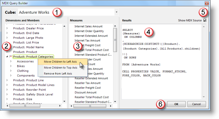
When the MDX Query Builder is displayed, as shown above, you must first select a (1) Cube. Based on that selection, the MDX Query Builder presents lists of (2) Dimensions and Members, and (3) Measures. These can be moved to an axis or added and removed by selecting and right-clicking them, as shown above. The (4) results of these actions can be seen in the Results panel, in tabular or (5) source code form.
Clicking (6) OK will cause the query constructed in the Results panel to be copied into the datalayer's MDX Source or Source attribute, if the MDX Query Builder was called by clicking the attribute's browse button. Otherwise, the query text can be selected, copied, and pasted elsewhere as needed.
When a Query Has Been Entered Manually
Note that if you have already entered a query manually in the MDX Source or Source attributes and you then open it in the MDX Query Builder, the tool will try to "reverse-engineer" the query. It succeeds at this most of the time but, if the query includes tokens or is created using a non-standard SQL language, the MDX Query Builder may fail and display an error message. This is especially likely when Logi tokens have been used outside of a SELECT statement.
Working with Studio Panels
Studio provides a intelligent and dynamic development environment for the creation of Logi applications. Though almost all of the source files used in an application are text files and can therefore be edited with something as simple as Notepad, the wizards, editors, and other tools within Studio make the development process faster and easier.
The primary visual feature of Studio is its set of panels. These are used to manage, organize, and edit the files that make up a Logi application. The panels are flexible and can be sized to suit personal tastes.
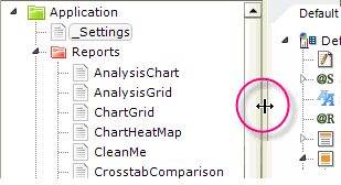
To resize a panel, simply position your cursor over the panel separator bar (where it will change to the resizing cursor, as shown above) and drag it in the desired direction. This applies to both vertical and horizontal separators.
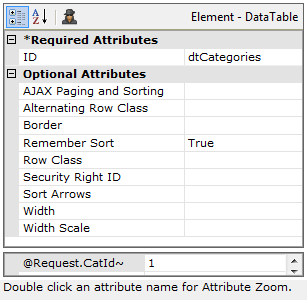
If you prefer to add elements to the Element Tree using the "right-click and context menu" method, you may not want to see the Element Toolbox panel at all; similarly, you may not use the Test Parameters panel. You can effectively hide these two by reducing their heights, as shown above. Just drag their separator bars downward completely.
The Test Parameters panel is displayed only if the application accepts parameters.
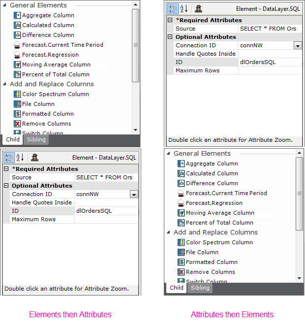
If desired, the vertical positions of the Element Toolbox and Attributes/Test Parameters panels combination can be swapped, as shown above, using the Tools![]() Elements and Attributes main menu item.
Elements and Attributes main menu item.
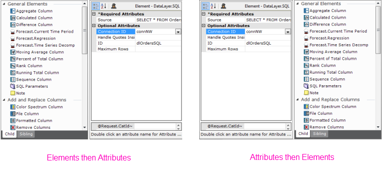
The two panels can also be arranged side-by-side, as shown above.
Changing Application Versions
A Logi application includes files and settings installed on the web server and version-specific binary files included in each Logi application project folder. This allows each Logi application to maintain its own version identity and allows backward compatibility from new versions of Logi products.
Applications can be upgraded and downgraded to different versions and, when a new version of Logi Info or Logi Report is installed, applications must be upgraded before they'll have the benefits of the new version.
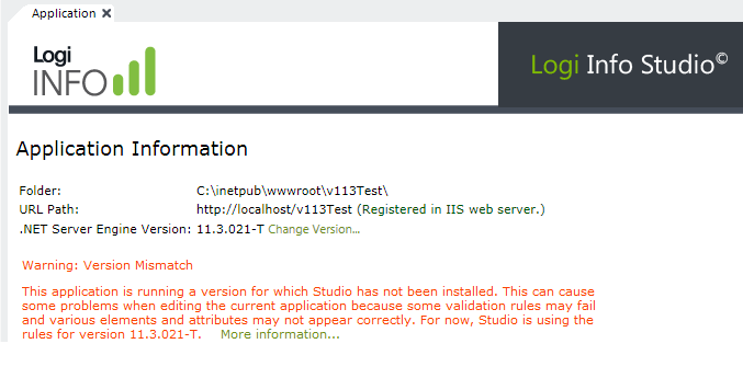
When you open an application, Studio displays a warning in its Application tab, as shown above, if the application's version does not match the version of Studio being used. Applications will continue to run correctly with this mismatch but, as the warning says, the rules governing element relationships and attributes may be incorrect when editing definitions.
For existing Logi .NET and Java applications, v10 and later, Studio provides a quick and easy way to change versions:
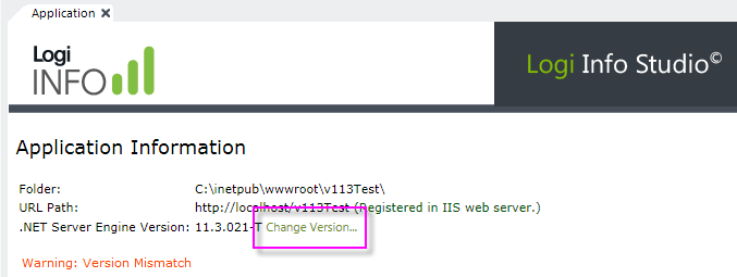
To change versions, click the Change Version... link, shown above. This will display a wizard with a list of the installed versions and, after you select one, will replace the application's version-specific binary files with the files of the selected version. The replacement may take several minutes. This will not affect any definitions or support files you have created and you can revert the change.
For .NET applications, the Server Manager, which can be launched from Studio's Tools menu, can also be used to change application versions. This is a tool that allows you to examine all of the .NET Logi applications on the local web server and manage them.
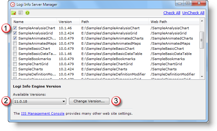
The Server Manager dialog box, shown above, displays a list of the applications installed on the local web server. Select one or more applications (1) and the desired product versions (2), and click Change Version... (3). The process usually takes less than a minute for each application selected.
![]() Server Manager is intended for use only with .NET applications, using the IIS or Cassini web servers; if neither one of these servers is installed, Server Manager will prompt you to install them.
Server Manager is intended for use only with .NET applications, using the IIS or Cassini web servers; if neither one of these servers is installed, Server Manager will prompt you to install them.
For additional important information about changing application versions, see Upgrade Logi Products and Apps.
Team Development Features
Logi Studio includes two features for use in a team development environment, where multiple developers are working on the same Logi application. File Locking prevents multiple developers from inadvertently working on the same file at the same time and blocking or overwriting each other's modifications. File History retains a copy of each file revision and current versions can be "rolled back" to earlier versions.

As shown above, these features are enabled by adding a Team Development element to the application's _Settings definition. The two features, File History and File Locking, are enabled by setting their respective attributes.

When you Save the _Settings definition, the Team Development features will become enabled. Definitions in the Application panel, including the _Settings definition, will be shown with a "padlocked" icon, indicating that the files have been locked. Hovering your mouse over the definitions will cause a "File Locked" tooltip to appear. Attributes and their values for elements in those definitions will be shown with gray text, indicating that they cannot be edited.
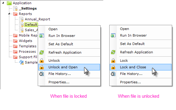
Individual files can be unlocked, opened, closed, or locked using the pop-up menu options, shown above, that are now available when a file is right-clicked. The file icons will change to reflect a file's locked or unlocked state. Locking applies to text-based support files as well as definition files.
Team Development uses a source control system approach, where to unlock a file is to "check it out" and to lock it is to "check it in". This means:
- When no one is working on any file, they are all locked (checked-in) and available to be unlocked (checked-out) by anyone.
- When you unlock (check-out) and open a file, you can edit it, but everyone else is prevented from working with it.
- When you save and/or re-lock (check-in) the file, then it's available to be unlocked by anyone again.
When a file has been unlocked by a user, other users attempting to unlock it will see an "in-use" icon next to the entry in Studio and a tooltip that indicates who's working with this file, when they hover their mouse over it.
Note that the initial locked state is also applied to the _Settings definition, and you must now unlock it if you want to modify it.
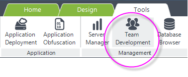
If they've been enabled in the _Settings definition, File Locking and File History information can be viewed by clicking the Team Development menu item, shown above, in the Tools tab.
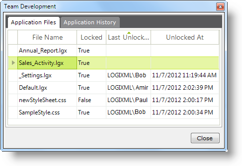
When the toolbar icon is clicked, the Team Development dialog box opens, as shown above. File Locking details are displayed in the first tab, allowing development team members to determine which files are locked, who locked them, and when.
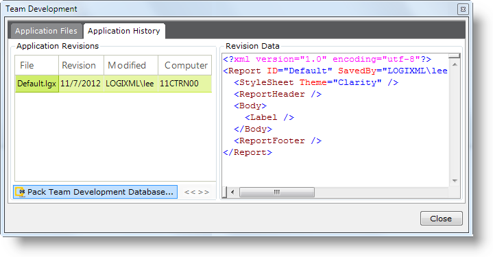
File History details are displayed in the second tab. Revision information and the actual revised data are presented. If a particular file is double-clicked, an individual file history dialog box is displayed and it includes a Rollback... button, which can be used to replace the current file contents with the selected version's contents.
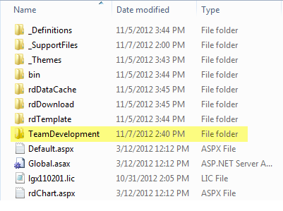
The Team Development features use a localdatabase file located under the folder "TeamDevelopment", shown above, in the Logi application folder. The folder and database file are automatically created when the Team Development features are enabled
The Pack Team Development Database feature helps to maintain performance. Clicking the appropriate button in the Application History tab will present a prompt for confirmation. Clicking Yes will start a process that makes a backup of the Team Development database and then packs and shrinks it. All developers should close the application in Studio before a packing operation is started. You should pack the database whenever you feel that File History retrieval is taking a long time.
These features allow team developers to work together on an application, without getting in each other's way, and provide a useful audit trail of modifications.
System Configuration
A commonly-used approach for team development is to set up a centralized "development server" where the Logi application files can be accessed, using a shared network folder, by all members of the development team. Logi Info Server is installed on that server, along with a web server and all necessary supporting files. A Logi Info license is required for that server.
Developers who can "map" a local drive to the shared folder on the development server must be given Read, Write, Modify, and Delete file access permissions. Developers must also have Logi Info or, at the very least, Logi Studio installed and licensed on their own machines. They then "open" the Logi application on the development server and apply the Team Development settings as outlined above.
In the _Settings definition, the Path element's Application Path attribute should be set to the URL of the Logi app on the development server, rather than to the usual http://localhost/yourApp. Do not set the Alternative Definition Folder attribute, which is not relevant for this situation.
Third-Party Source Control Products
The choice of a source control system is highly dependent on the complexity of the source control functionality required. For smaller, simple applications, the use of the Team Development functionality within Logi Studio is often enough. Logi Team Development allows you to maintain version control, based on file saves, and provides file-locking/sharing capabilities for multiple developers.
If you require more sophisticated source control, then a third-party product will be necessary. Examples of popular products include Microsoft TFS, GIT, and SVN. The files that make up a Logi Info application are used directly from the file system; they're not stored in, or controlled by, a database or other constraining mechanisms, so third-party source control products can be used directly on them without concern.
To benefit from a third-party product, however, you should keep your Logi application's source code folders (_Definitions, _SupportFiles, _Templates, _Scripts, _Plugins), and all the root folder .aspx files under source control. Keeping the bin, rdTemplate, and other "rd*" system folders outside of source control will allow you to easily move between different versions of the Logi engine without interfering with your source control functionality.
Given the large number of, and different types of, source control products available, there are no plans to provide tighter integration between them and Logi products.
Obfuscating Definitions
Obfuscation is a common technique used by developers to protect their software products from theft, tampering, and reverse-engineering. The code obfuscation feature in Studio for .NET is a mechanism that allows Logi developers to make their _Settings, Report and Process definitions unreadable by humans. Definitions that have been obfuscated can be de-obfuscated, making them readable again. At runtime, both .NET and Java Logi applications automatically decode and use obfuscated files.
OEMs who embed Logi products within their own applications should use obfuscation to aid in securing their products before distribution, but there may be little need for obfuscation in an enterprise setting where all Logi report consumers are internal corporate employees.
The Obfuscation tool is available via the Studio Tools tab on the main menu:
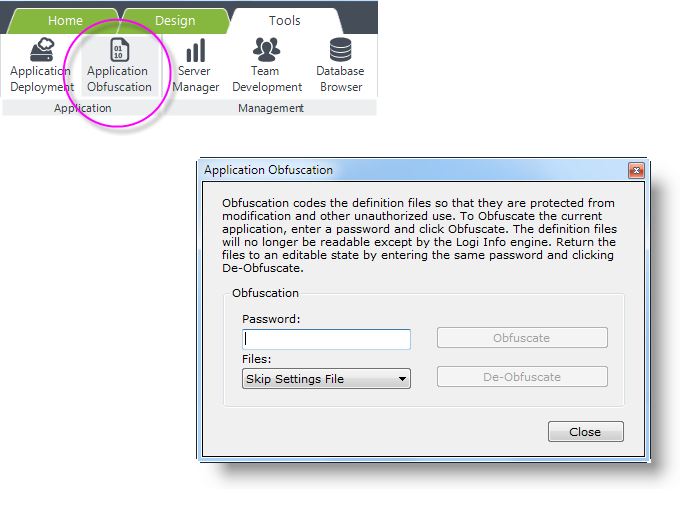
Obfuscation is based on a password, which is entered in the tool, shown above. There are three file choices available in the process:
- Skip Settings File - All process and report definitions will be obfuscated but the _Settings.lgx file will not be included. This can be useful if certain settings, such as Connection Strings, need to be manually edited after deployment or if there is a chance that debugging may be needed.
- Settings File Only - This is useful when settings need to be hidden, such as Connection String passwords, but there is little concern about securing other kinds of definitions. In particular, OEMs with deployed solutions should use this option to shield their license key data from view.
- All Files - Includes all .lgx files in the operation.
Other than the _Settings.lgx file, there is no way to select individual files within an application for obfuscation. In general, we do not recommend that you obfuscate files as a routine practice if you have no security concerns.
When obfuscating files, record and store your password carefully. Logi Analytics is not able to decipher passwords for the purpose of de-obfuscation if your password is lost or forgotten.
Batch Obfuscation Tool
Developers may want to include obfuscation as part of an unattended build process and the Obfuscation Tool can be run as a console application for this purpose.
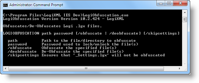
As shown above, if the default product installation is used, the tools can be found at:
C:\Program Files\LogiXML IES Dev\LogiObfuscation.exe
Running the tool without any arguments will display the help information shown above. These arguments are the same as the settings available through Studio's interface and are discussed in the previous section.
Deleting a Logi Application
If you want to delete an entire Logi application, you can do so by using your file system tools, such as Windows Explorer, to delete the entire application folder.
First, in IIS Manager or other web server management tool, delete the virtual directory or web application entry for the app.
Then, delete the application folder. On a typical Windows server platform, for example, you would delete:
C:\inetpub\wwwroot\yourAppFolder
and all its subfolders and files.
Note that your web server may hold some application files open to improve performance and you may receive an "Access Denied" type error when you try the folder deletion. If this happens, try stopping and restarting the web server. For IIS, this can be done very easily by running iisreset.exe from the Start Menu ![]() Run option or
from a
command line window. Once the web server is restarted, try deleting the application folder again.
Run option or
from a
command line window. Once the web server is restarted, try deleting the application folder again.
Afterwards, in Studio, your application will still appear in the Recent Applications panel of the Welcome tab. Click its entry, as if to open it, and Studio will display a warning that it no longer exists and remove it from its list of recent applications.