Design a Logi Report
This topic introduces developers to the basic concepts involved in designing a typical Logi report. Its intended audience is the developer who's new to Logi applications and is just beginning to work with the product.
- Purpose and Prerequisites
- About HTML Containers
- Report Layout
- Add Live Data
- Finish Up
Purpose and Prerequisites
As mentioned above, the purpose of this topic is to give developers who are new to Logi Analytics technology and "Elemental Development" an introduction to designing a Logi report.
Ideally, developers who are going to work with Logi products should have a good understanding of:
- HTML and XML
- CSS
- SQL (or whatever it takes to access the datasource they're working with)
- JavaScript
- "Stateless" web application concepts and web server technology
The Logi Server Engine, running at the web server, combines page definitions with data and returns the report as a complete web page to the requesting browser. The returned page consists of HTML, XHMTL, and JavaScript, which the browser processes and displays.
![]() For a developer, understanding the potential, and limitations, of these technologies is the key to a satisfactory development experience with Logi products.
For a developer, understanding the potential, and limitations, of these technologies is the key to a satisfactory development experience with Logi products.
Standards? What Standards?
The HTML and browser paradigm was conceived with the idea of universal and generic presentation of information. Despite the efforts of international standards organizations, this lovely idea has morphed over time into something a bit different and sometimes it seems as if there are no standards. In reality, browsers vary by manufacturer and version in their presentation of web pages, providing a challenge for those developers whose target audience uses a variety of browsers.
Logi Info and Logi Report make a serious effort to ensure that their page output is generic HTML, CSS, and script, in order to promote cross-browser compatibility. However, there's no way to predict what changes the browser manufacturers will uncork with their next release, so developers shouldfrequentlytest their Logi apps against the range of browsers and browser versions that could be used to view their applications to ensure compatibility.
There are a number of online testing sites that make it easy to see what your Logi app will look like in different browsers. Some, like Adobe BrowserLab, display images of your app in different browses, while others, like Browserling, show your app in a specific browser in an iFrame.
HTML5
The ever-evolving HMTL5 standard is another moving target for developers. Different browsers support different sets of HTML5 features, and sites like HTML5 Test that can help you discover the related capabilities of your specific browser make and version. Another useful site, Can I Use, indicates which HTML5 features are available in various browsers on an feature-by-feature basis. Logi Analytics is working to include more HTML5 features in our products with each release.
About HTML Containers
A key concept in the design process is the container. A container is an HTML entity, defined in the code with starting and ending tags, that contains or surrounds other entities on the page. Sometimes they actually appear on the page and sometimes they don't. Containers can be used to limit the size of parts of the report page, to apply style to their contents, to isolate
part of the page from other parts, etc. A variety of Logi elements are containers, and the parent-child element relationships found in Logi Studio often identify them.
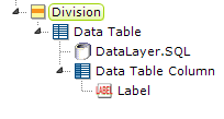
In the example above, the Division element is the outer container for all of the other elements; the Data Table contains the datalayer and the Data Table Column, and the Data Table Column contains the Label element. As mentioned earlier, through inheritance CSS style applied to a container is generally applied to all the items it contains.
In a Logi app page, containers are the geographic building blocks of the page. Successful Logi developers begin report development by visualizing the desired end result and breaking it down into these building blocks, which then dictate the report layout.
Report Layout
Desktop application developers are used to working with "absolute positioning", where each item on the screen can be accurately positioned with X-Y coordinates. This works because of the tight relationship between the OS, the video hardware, and the application. On a web page, things are a little looser: the browser doesn't know about the web server OS and adjusts to whatever screen it's being viewed on; absolute positioning generally lacks the flexibility needed for this situation.
Therefore, when developing a Logi report, "flow positioning" is typically used*. With it, page components are positioned in relation to other components, rather than at fixed points on the screen,. When working with it, developers have to keep in mind how information on the page will flow to, in, and even around, containers. In particular, spacing and alignment work differently in flow positioning, as we'll see.
It's a good design practice to start by envisioning the endresult: we want a professional-looking report, with a data table and some data selection filters in it. OK, now let's give that vision some substance by drawing on paper the large regions that will be the report's top-level containers.
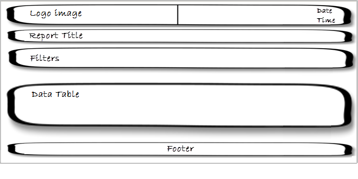
Our rough drawing of the containers is shown above. It gives us an idea of the number and the order of the containers needed. We can also start thinking about alignment at this point; notice that the top container is divided into left and right halves - this is because its contents will be left- and right-justified, respectively.
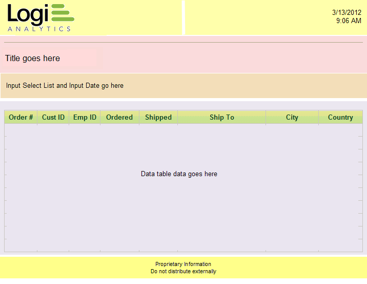
Now let's imagine that the five containers we drew on paper are overlaid on our report page in different colors, so we can see how the rough drawing correlates to the real page. We'll use this page in the following discussion to understand how to achieve the desired layout using elements and CSS.

Looking at the top container in the page, it's easy to see that it can be displayed as one "row" in a table, with two "columns".
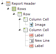
The elements shown above (Rows, Row, Column Cell) provide the HTML table (see HTML Tables) components needed to create this effect. The Width attribute of the Rows element is set to 100% and the width of each Column Cell is set to 50%. The Class attributes of the Column Cells are set to AlignLeft or AlignRight to get their contents to justify properly (an example of container contents being affected by CSS). Use of an HTML table like this is a very common technique for aligning content.
You may also notice that the image and input text items are not "flush" with the outer edges of the row columns; there's a little bit of space there. This is achieved by adding CSS padding to the styling of the Column Cell elements.
At this point we should recognize that this container, the "report header", could be used for other reports, too. That's a hint that this set of elements is a good candidate to be made into a shared element so it can be included, rather than redefined, in every report. For more information, see Shared Elements.

The next two containers in our plan are similar but no justification is involved, so let's use Division elements as containers, rather than an HTML table, and we'll place them in the BODY of the report.
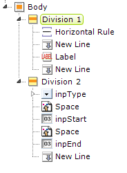
The elements needed for this are shown above. Division elements produce either SPAN or DIV tags in the final HTML and are very handy. They don't have a physical appearance in the report page but can be used to apply style to their contents and they have a Condition attribute which lets you show or hide them dynamically. They're also a great way to group elements in the definition, making it easier to copy them, and for plain old visual organization purposes.
Tables or Divs?
The use of HTML tables is considered a bit "old school" these days, with many developers preferring to use Divisions and CSS to arrange and align content. For example, Divs can be assigned classes with the float property, in order to left-, center-, or right-align their content. There's some evidence that this approach also works better for mobile devices but, ultimately, the approach you choose for your Logi application depends on what works best for you.
Responsive Design Elements
![]() Responsive Design elements, including Responsive Row and Responsive Column, were introduced in v11.4.046. These row and column elements may provide an improved viewing experience; they can dynamically re-arrange their change their size and arrangement depending on the viewport size. For more information, see Responsive Design Elements.
Responsive Design elements, including Responsive Row and Responsive Column, were introduced in v11.4.046. These row and column elements may provide an improved viewing experience; they can dynamically re-arrange their change their size and arrangement depending on the viewport size. For more information, see Responsive Design Elements.
![]() If you've ever heard the acronym KISS ("Keep It Simple, Stupid") then this is a great place to keep it in mind. A layout that involves a lot of nesting, spanning, and other convolutions is very likely to stand up poorly when delivered to a variety of browsers. Overly-complicated layouts often suffer from incomplete or unexpected CSS inheritance and spell display disaster! You should always
look for the least-complicated way, using the fewest number of elements, of implementing your report.
If you've ever heard the acronym KISS ("Keep It Simple, Stupid") then this is a great place to keep it in mind. A layout that involves a lot of nesting, spanning, and other convolutions is very likely to stand up poorly when delivered to a variety of browsers. Overly-complicated layouts often suffer from incomplete or unexpected CSS inheritance and spell display disaster! You should always
look for the least-complicated way, using the fewest number of elements, of implementing your report.
So far, our definition is simple and straightforward. Now we're ready to look at the next container, the one where there's some actual data displayed.
* Note that Logi Studio supports absolute positioning as an option but we generally do not recommend that Logi apps be developed using it.
Add Live Data
There are multiple techniques available in Logi products for displaying data; in our example, we're displaying it as text in a tabular format. We'll also see how we can display it in an alternate "form-style" format.

Like the previous containers, this one uses a Division element. However, it includes a Data Table within the container and, as you'll see later, some of its Data Table Columns can be containers themselves.
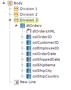
The elements for the third division and the data table are shown above. The Division element has another useful characteristic that makes it a good choice as a container for data tables and charts: it can be refreshed using an AJAX call. This is usually done with an Action.Refresh Element (see Action Elements), and when the action occurs, only the Division's contents will be refreshed, not the entire page.
This is usually faster than a full page refresh, and cleaner - the user doesn't see the entire page "blink".
Present Data in a Form
Suppose you want to display the data from just one record at a time, in which case embedding a data table in your container may be overkill. You'd like to display it in a traditional form-style arrangement, like this:

This can be done by using just one data table column, as a container, and putting an HTML table inside it.
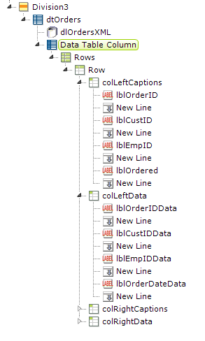
The necessary elements are shown above. It takes a bit of work to get all the elements configured but Studio's element copy 'n' paste feature helps a lot. An HTML table is used so that captions and data can be formatted into justified columns, and it's located beneath a data table column so that it will be "in scope" for the datalayer and have access to the data as @Data tokens.
There is another way to use an HTML table to display data in a form, without it being contained by a data table column. This is accomplished by using a Local Data element at the top of the definition; it's particularly well-suited for this purpose because it will only retrieve one record of data and its datalayer's scope is the entire report. So, if your data query is going to retrieve just one record, you can use @Local tokens to access the retrieved data anywhere in the report, freeing you to put your HTML table wherever you'd like. For more information, see our document Introducing Datalayers.
Finish Up
The final container in our report is the "proprietary information" warning at the bottom.

This container can be another Division element and is another opportunity to create a shared element. Traditionally, you'd place it beneath the Report Footer element.
The Report Header and Report Footer elements provide convenient places to put that kind of information, but they're not special in any way. If you prefer, you can place your header and footer container elements right in the BODY of the report instead, and they'll look and behave in the same way.
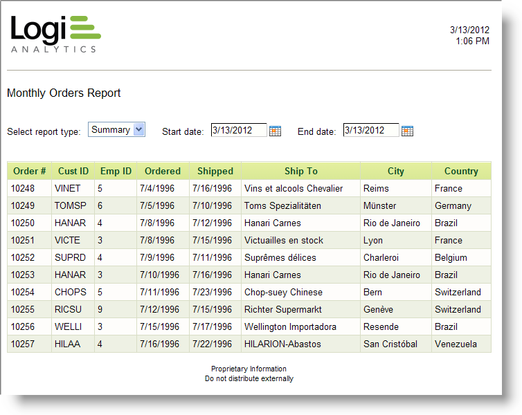
And, at last, we can see what our finished report looks like in the example shown above.
In summary, we've seen the correlation between laying out a report design in terms of geographic containers and how those containers, in the form of either an HTML table, a Division, or a data table column, are realized using Logi elements. You should now have a good foundation for designing your own reports.