Mailing Label Wizard Dialog Box
You can use the Mailing Label Wizard dialog box to create a page report with a cross banded object in it, which is in the form of a mailing label layout. This topic describes the options in the dialog box.
Designer displays the Mailing Label Wizard dialog box when you select the Mailing Label layout in the Select Component for Page Report dialog box or Select Component for Page Report Tab dialog box and select OK.
The dialog box contains the following screens:
- Data Screen
- Display Screen
- Group Screen
- Summary Screen
- Chart Screen
- Filter Screen
- Layout Screen
- Style Screen
Designer displays these buttons in all the screens:
Back
Select to go back to the previous screen.
Next
Select to go to the next screen.
Finish
Select to finish your work and close the dialog box.
Cancel
Select to close the dialog box without saving any changes.
Help
Select to view information about the dialog box.
Data Screen
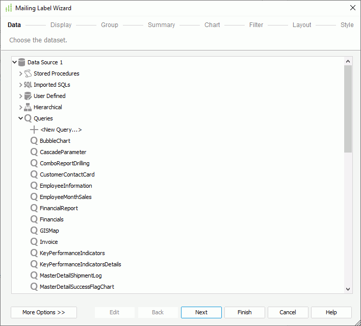
Use this screen to specify the dataset for the banded object.
Data resource box
This box lists the predefined data resources in the current catalog. Select one and Designer automatically creates a dataset based on it for the banded object.
- <New XXX...>/<Add XXX...>
Select to create or add a data resource of the same type in the catalog.
More Options/Less Options
Select to show or hide the options for specifying the dataset you want to use.
- New Dataset
Select to create a dataset based on a data resource in the current catalog. - Existing Dataset
Select to use a dataset from the ones that you have created in the current report.- <New Dataset...>
Select to create a dataset using the New Dataset dialog box.
- <New Dataset...>
- Current Dataset
Designer disables this option because a banded object in a new page report tab cannot use inherited dataset.
Edit
Select to edit the specified query in the Query Editor dialog box or dataset in the Dataset Editor dialog box.
Display Screen
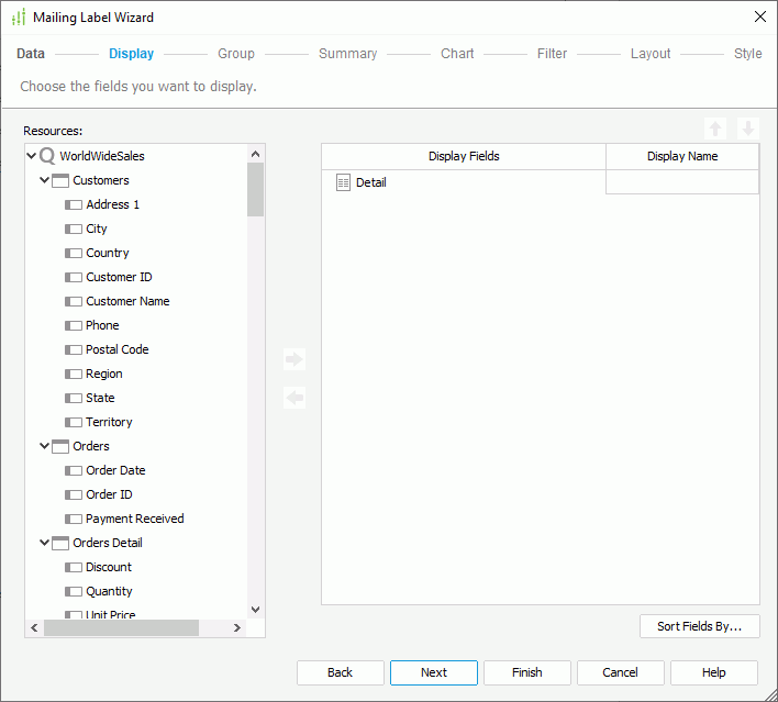
Use this screen to specify the detail fields you want to display in the banded object.
Resources
This box lists the available data fields that you can use as detail fields in the banded object.
 Add button
Select to add the specified field in the Resources box to the banded object.
 Remove button
Select to remove the specified field from the banded object.
 Move Up button
Select to move the specified field higher in the display order.
 Move Down button
Select to move the specified field lower in the display order.
Display Fields
This column shows the detail fields that you add to display in the banded object.
Display Name
This column shows the labels of the detail fields in the banded object, which by default are the display names of the added fields. You can select in the text boxes to edit the labels.
Sort Fields By
Select to open the Sort Fields By dialog box to specify how to sort the detail data in the banded object.
Group Screen
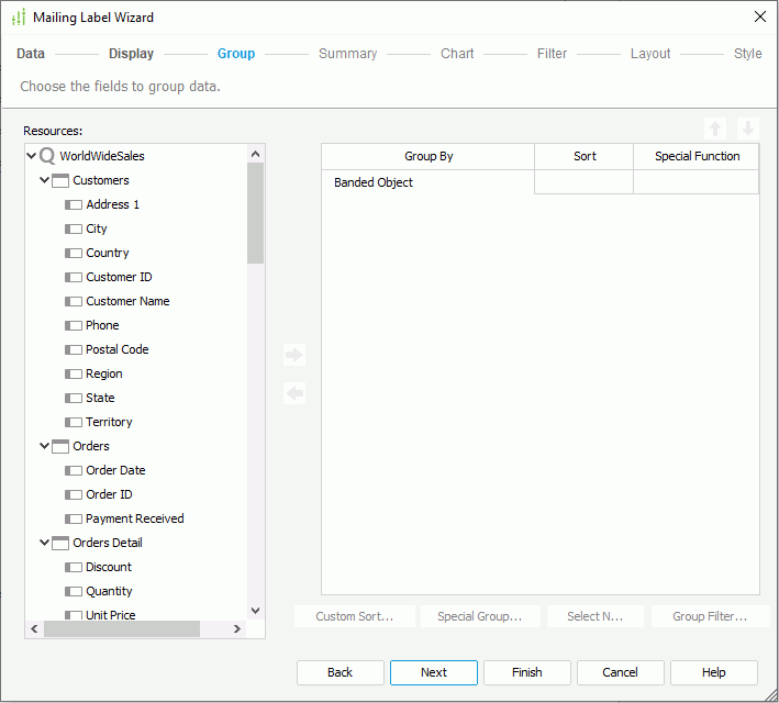
Use this screen to specify the criteria for grouping data in the banded object.
Resources
This box lists the available data fields that you can use as group-by fields in the banded object.
 Add button
Select to add the specified field in the Resources box as a group-by field in the banded object.
 Remove button
Select to remove the specified group-by field from the banded object.
 Move Up button
Select to move the specified group to a higher group level.
 Move Down button
Select to move the specified group to a lower group level.
Group By
This column shows the group-by fields on which you select to group data in the banded object.
Sort
This column shows how you want to sort groups at each group level. You can select from the following options:
- Ascend
Select to sort groups at the specified group level in an ascending order (A, B, C). - Descend
Select to sort groups at the specified group level in a descending order (C, B, A). - No Sort
Select to sort groups at the specified group level in their original order in database. - Special Group
Select to open the User Defined Group dialog box to define grouping information. - Custom Sort
Select to open the Custom Sort dialog box to set how to sort the groups at the specified group level.
Special Function
This column shows the special functions that you select for the group-by fields of the Numeric, String, Date, and Time data types. Select a special function from the drop-down list to specify to which level to group the data of the specified field, or select Customize to set the function in the Customized Function dialog box.
Custom Sort
Designer enables this button after you have selected Custom Sort from the Sort column to define the sort manner of groups for the specified group level. Select it to specify how to sort the groups.
Special Group
Designer enables this button after you have selected Special Group from the Sort column to define a special group. Select it to specify how to group your information.
Select N
Select to open the Select N dialog box to specify the Select N condition for the specified group level.
Group Filter
Select to open the Group Filter dialog box to specify the group filter condition.
Summary Screen
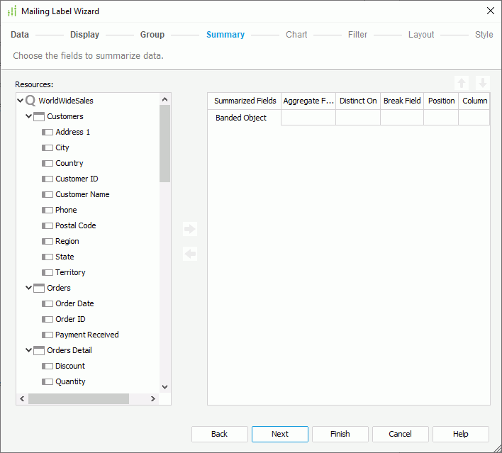
Use this screen to specify the fields on which to create summaries in the banded object.
Resources
This box lists the available data fields that you can use to create summaries in the banded object.
 Add button
Select to add the specified field in the Resources box based on which to create a summary in the banded object.
 Remove button
Select to remove the specified summary from the banded object.
 Move Up button
Select to move the specified summary higher in the display order.
 Move Down button
Select to move the specified summary lower in the display order.
Summarized Fields
This column shows the fields that you add to create summaries in the banded object.
Aggregate Function
This column shows the aggregate functions that you select to use for the summaries.
Distinct On
Designer enables this option and you should set it when you select DistinctSum as the aggregate function. Select the ellipsis  to select the fields according to whose unique values to calculate DistinctSum in the Select Fields dialog box.
Break Field
This column shows the groups on which to calculate the summaries. If you add a summary for the Banded Object level, the break field is null and Designer calculates the summary based on the whole dataset.
Position
You can use this option together with the Column option to specify the location where to place a summary.
- Header
Select to place the summary in the header panel. When you add the summary for a specific group, Designer places it in the group's header panel; if you add the summary for the Banded Object level, Designer places it in the banded header panel. - Footer
Select to place the summary in the footer panel. When you add the summary for a specific group, Designer places it in the group's footer panel; if you add the summary for the Banded Object level, Designer places it in the banded footer panel.
Column
You can use this option together with the Position option to specify the location where to place a summary.
- Detail
Select to place the summary and its name label in the first two detail columns. - Summary
Select to place the summary in a separate summary column.
Chart Screen
Designer enables the options in the Chart screen when you have added at least one group and one summary for this group in the banded object. You can use the screen to create a chart together with the banded object, which Designer places in the banded header panel.
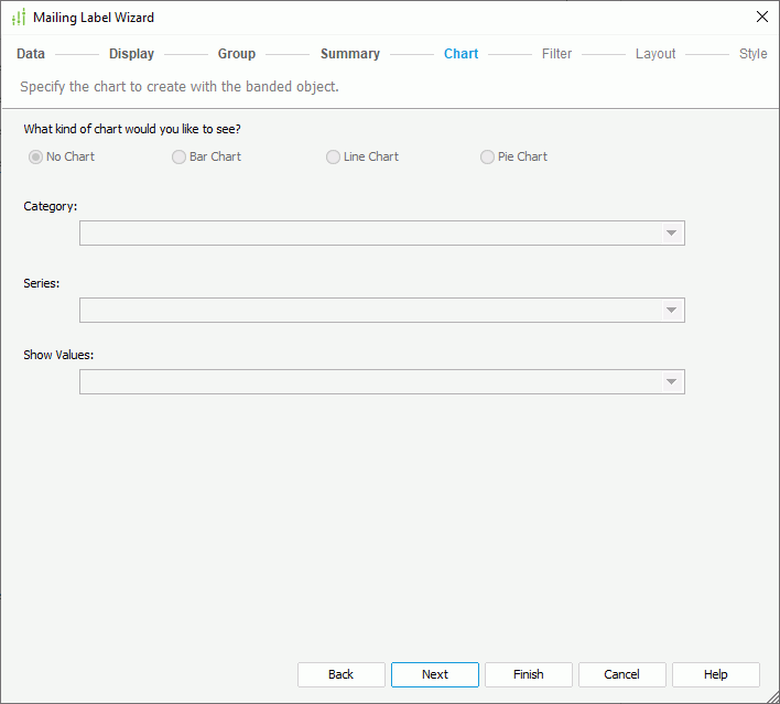
No Chart
Select if you do not want to create the chart.
Bar Chart
Select to create a Clustered Bar 2-D chart together with the banded object.
Line Chart
Select to create a Line 2-D chart together with the banded object.
Pie Chart
Select to create a Clustered Pie chart together with the banded object.
Category
This drop-down list contains the group-by fields of the banded object on which you have added summaries. Select the field you want to display on the category (X) axis of the chart.
Series
This drop-down list contains the fields that you add as the group-by fields of the banded object. Select the field you want to display on the series (Z) axis of the chart.
Show Values
This drop-down list contains the summaries which are calculated based on the field you choose to display on the category axis of the chart. Select the value you want to display in the chart.
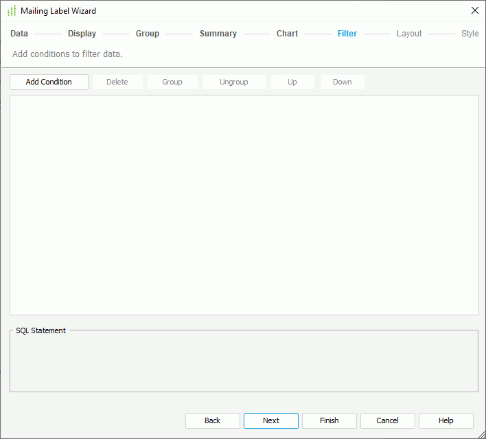
Filter Screen
Use this screen to narrow down the data to display in the banded object.
Designer displays the same options in the Filter screen as those in the Edit Filter dialog box.
Layout Screen
Use this screen to specify the layout of the banded object.
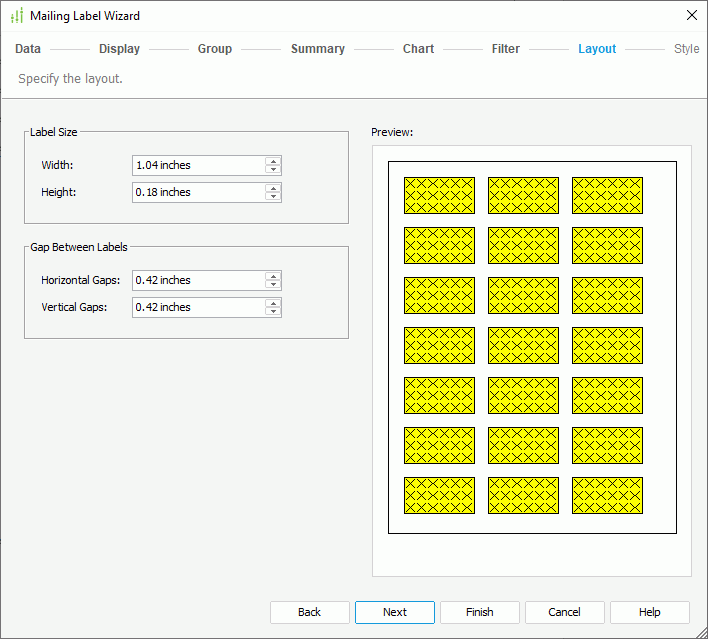
Label Size
You can specify the size for the labels in the banded object in this box.
- Width
Specify the width of the labels. - Height
Specify the height of the labels.
Gap Between Labels
You can specify the gap between each two labels in this box.
- Horizontal Gap
Specify the horizontal gap between two labels. - Vertical Gap
Specify the vertical gap between two labels.
Preview
This box displays a preview sample of the specified layout for the labels.
Style Screen
Use this screen to specify the style of the banded object.
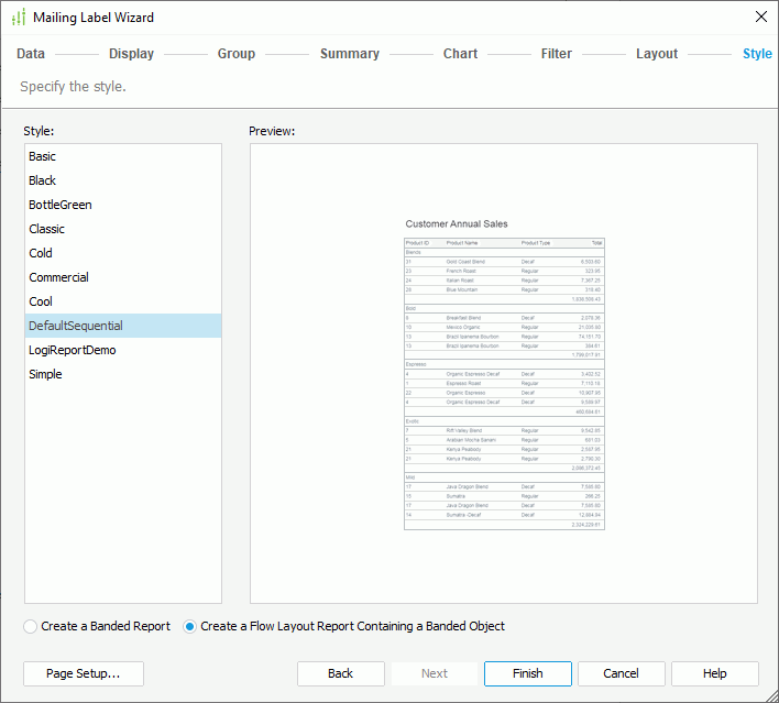
Style
This box lists the styles you can apply. Select the style for the banded object.
Preview
This box displays a diagram illustrating the effect of the selected style on the banded object.
Create a Banded Report
Select to create a restricted version of a flow layout report, one that can contain a single banded object only. This layout option is intended to provide compatibility with Logi Report Version 7 report templates.
Create a Flow Layout Report Containing a Banded Object
Select to create a report that contains a banded object mapped to the specified dataset.
Page Setup
Select to open the Page Setup dialog box to specify page properties for the report tab.
 Previous Topic