Setting Element Attributes
Elements can have a number of properties, or "attributes" in Logi-speak, that govern how they behave. The attributes of a selected element appear in Studio's Attributes panel and the number of attributes varies depending on the nature of the element.
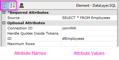
As shown above, attribute names are displayed in the left column and attribute values are entered in the right column. Some attributes are required while others are optional. Attributes can be sorted in two ways: by Category or Alphabetically, by clicking the highlighted icons. When sorted by category, the required attributes appear at the top.
Hovering your cursor over an attribute value will cause the complete value to appear in a tooltip, even multi-line SQL statements.
Depending on the attribute, values can be entered in several different ways. Generally, values can always be typed-in directly.
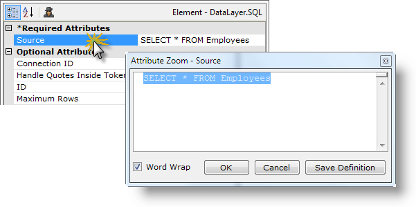
Double-click an attribute name to open its Attribute Zoom window, shown above, which contains a larger, multi-line text entry area and allows you to see longer values without scrolling.
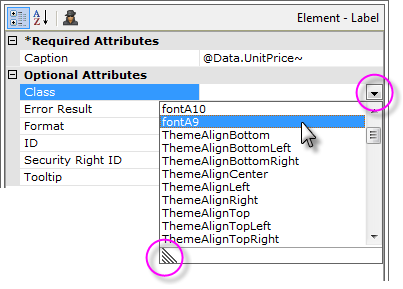
The values for some attributes consist of a specific set of valid choices and, as shown above, these are chosen by first clicking the circled down-arrow and then selecting a value from the drop-down list of choices. The length of the list can be expanded by dragging the indicated corner of the list.
After selecting a value from the drop-down list, you can hold down the Ctrl key and selected additional values in the list, creating a comma-separated list of attribute values.
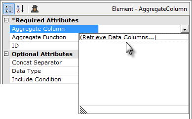
Where attributes require column names from a datasource, as shown above, a drop-down list is provided that will, first, retrieve the column names, and then, display them in a drop-down list for easy selection.
![]() This feature only works with datasources that respond to schema requests, such as databases, and so does not work with flat files. In addition, the parent Data Table or chart must have a valid ID for column names to be retrieved.
This feature only works with datasources that respond to schema requests, such as databases, and so does not work with flat files. In addition, the parent Data Table or chart must have a valid ID for column names to be retrieved.
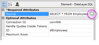
For some attributes, clicking the browse button in the value column will launch a wizard or tool. For example, when the browse button is clicked in the image above, it will open the SQL Query Builder tool, or...
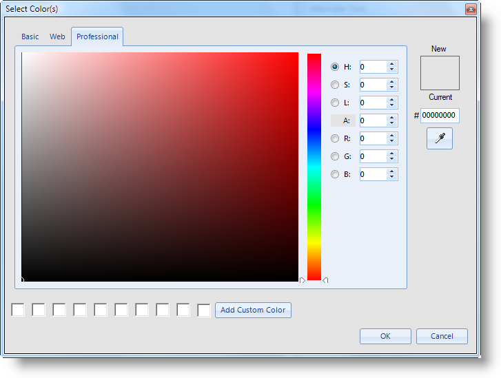
...in the case of Color attributes, clicking the browse button will cause the Color Selector dialog box, shown above, to be displayed.
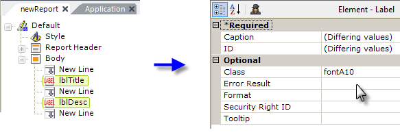
Attributes can be assigned for several elements at the same time, by selecting multiple elements (hold down the Shift or Ctrl keys while clicking elements). The Attributes panel will show all of the attributes the selected elements have in common; attributes that already have different values assigned will be indicated by the "(Differing values)" message. As shown above, assigning an attribute like Class in this state will set the individual Class attributes
for each of the selected elements.
Elements that have a value in their Condition or Include Condition attributes are now indicated by a diamond icon:

The diamond icon, shown circled above, appears in both the Element Tree (left) and in the Attributes Panel.
Element ID Attributes
Some elements require a unique ID attribute value, which has to be entered by the developer. Developers are encouraged to use a "naming scheme" that conveys both element type and purpose.
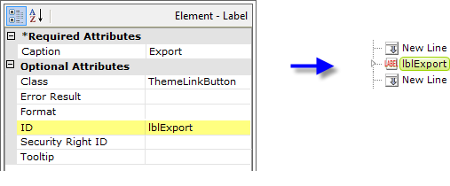
However, most ID attributes are optional.
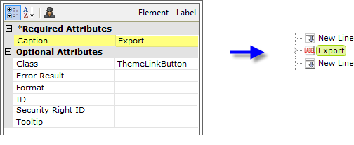
In addition, if an optional ID value is left blank, Studio will identify the element in the Element Tree by using text from another attribute value, as shown above. The attribute that Studio selects for this purpose varies, depending on the element type. This generally eliminates "duplicate ID" errors (often caused when copying and pasting elements) and to relieves you, in most cases, of the
need to provide IDs at all.
Variable and Parameter Lists
Certain elements represent lists of name-value pairs. In this case, the Attributes panel displays an interface that allows you to enter as many arbitrary attribute names and values as needed.

In the example above, a Link Parameters element has been selected and three attributes have been created.
Attributes are created by entering a name in the text box at the top of the Attribute panel and clicking the "+" icon. The new attribute then appears in the list and its value can be set by typing a value directly into the right-hand value column. Values can consist of numbers, text, tokens, and, in some cases, formulae.
Attribute names can be edited by selecting them and clicking the "Pencil" icon. This will place the name into the top text box, where it can be edited. The icon will change to a "Diskette" icon and clicking it will save the edited attribute name. Attribute values can be edited directly, as usual, by placing the cursor on them.
Attributes can be removed entirely by selecting their name and clicking the red "-" icon.
Express Attribute Navigation
Some developers may prefer keyboard navigation to set attributes, avoiding constant switching between their keyboard and their mouse. Here are some "keyboard shortcuts" that allow this kind of mouseless navigation:
| Keys | Action |
Once you've entered an Attribute value, the Tab key can be used to commit the value and move to the next value down. | |
| |
|
|
The Attribute Spy
The Attribute Spy feature allows you to see all of the values assigned to a particular attribute for all elements at once. This is a very powerful tool that makes it easy to compare values, such as style sheet class assignments, or to get an overall view of values without excessive navigation and mouse-clicking.
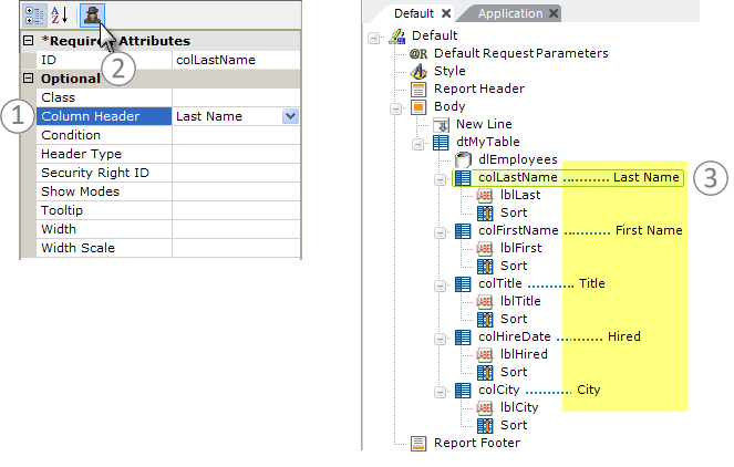
As shown above, (1) simply select an attribute and then (2) click the
Attribute Spy button at the top of the Attributes panel. Text
will appear in the Workspace panel (3) indicating the values for that
attribute for every element in the tree (excluding elements that do not have a
value assigned for that attribute). Click the Attribute Spy button again to hide the text.