Report Layout
Desktop application developers are used to working with "absolute positioning", where each item on the screen can be accurately positioned with X-Y coordinates. This works because of the tight relationship between the OS, the video hardware, and the application.
However, on a web page, things are a little looser: the browser doesn't know about the web server OS and adjusts to whatever screen it's being viewed on; absolute positioning generally lacks the flexibility needed for this situation.
Therefore, when developing a Logi report, "flow positioning" is typically used*. With it, page components are positioned in relation to other components, rather than at fixed points on the screen. As a developer, youhave to keep in mind how information on the page will flow to, in, and even around, containers. In particular, spacing and alignment work differently in flow positioning, as we'll see.
It's a good design practice to start by envisioning the endresult: for example, we want a professional-looking report, with a
data table and some data selection filters in it. Let's give that vision
some substance by drawing on paper the large regions that will be the
report's top-level containers.

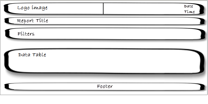
Our rough drawing of the containers is shown above. It gives us an idea of
the number and the order of the containers needed. We can also start
thinking about alignment at this point; notice that the top
container is divided into left and right halves- this is because its
contents will be left- and right-justified, respectively.

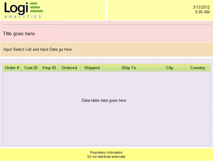
Now let's imagine that the five containers we drew on paper are overlaid
on our report page in different colors, so we can see how the rough
drawing correlates to the real page. We'll use this page in the following
discussion to understand how to achieve the desired layout using elements
and CSS.

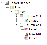
Looking at the top container in the page, it's easy to see that it can be
displayed as one"row" in a table, with two
"columns".

The elements shown above (Rows, Row, Column Cell) provide the HTML table components needed to create this effect, see HTML Tables. The Width attribute of the Rows element is set to 100% and the width of each Column Cell is set to 50%. The Class attributes of the Column Cells are set to AlignLeft or AlignRight to get their contents to justify properly (an example of container contents being affected by CSS). Use of an HTML table like this is a very common technique for aligning content.
You may also notice that the image and input text items are not "flush" with the outer edges of the row columns; there's a little bit of space there. This is achieved by adding CSS padding to the styling of the Column Cell elements.
At this point we should recognize that this container, the "report
header", could be used for other reports, too. That's a hint that
this set of elements is a good candidate to be made into
Shared Elements
so it can be included, rather than redefined, in every report.
Shared elements are a powerful Logi Info feature.

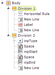
The next two containers in our plan are similar but no justification is
involved, so let's use Division elements as containers, rather than
an HTML table, and we'll place them in the BODY of the report.

The elements needed for this are shown above. Division elements produce
either SPAN or DIV tags in the final HTML and are very handy. They don't
have a physical appearance in the report page but can be used to apply
style to their contents and they have a Condition attribute
which lets you show or hide them dynamically. They're also a great way to
group elements in the definition, making it easier to copy them, and for
plain old visual organization purposes.
Tables or Divs?
The use of HTML tables is considered a bit "old school" these days, with many developers preferring to use Divisions and CSS to arrange and align content. For example, Divs can be assigned classes with the float property, in order to left-, center-, or right-align their content. There's some evidence that this approach also works better for mobile devices but, ultimately, the approach you choose for your Logi application depends on what works best for you.
![]() If you've ever heard the acronym KISS ("Keep It Simple,
Stupid") then this is a great place to keep it in mind. A layout that
involves a lot of nesting, spanning, and other convolutions is very likely
to stand up poorly when delivered to a variety of browsers.
Overly-complicated layouts often suffer from incomplete or unexpected CSS
inheritance and spell display disaster! You should always look for the
least-complicated way, using the fewestnumber of elements, of
implementing your report.
If you've ever heard the acronym KISS ("Keep It Simple,
Stupid") then this is a great place to keep it in mind. A layout that
involves a lot of nesting, spanning, and other convolutions is very likely
to stand up poorly when delivered to a variety of browsers.
Overly-complicated layouts often suffer from incomplete or unexpected CSS
inheritance and spell display disaster! You should always look for the
least-complicated way, using the fewestnumber of elements, of
implementing your report.
So far, our definition is simple and straightforward. Now we're ready to
look at the next container, the one where there's some actual data
displayed.
What About Menus?
Our example doesn't require a menu, but many Logi applications do. We're
not going to discuss them here but Logi Info provides several ways to
implement different menus, depending on your needs. Menu Tree
elements are used in Master Reports and, with or without them, offer
a quick and easy way to build a menu, while Pop-up menus display a panel with menu options, and the
Report Center Menu
is useful for displaying a menu based on the available reports. See Menu Tree Menus, Popup Menus, and ReportCenter Menu respectively, for more information. ![]() Logi Studio supports absolute positioning as an option but we
generally do not recommend that Logi apps be developed using it.
Logi Studio supports absolute positioning as an option but we
generally do not recommend that Logi apps be developed using it.