Design Mode
At the top of the Report Author report, you can see the Design and View links, which let users switch modes.
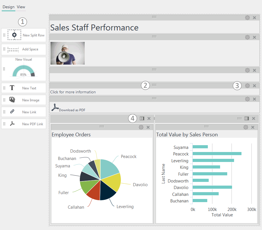
In Design mode, users can work with components to create or edit a report. Components in the report will appear in a series of rows or panels:

Design mode, shown above, let's users build or modify a report at runtime.
- Drag components from the Component Toolbox on the left onto the report canvas to add them.
- Re-arrange components on the canvas by clicking on their Drag icon -
 - and dragging them into a new location.
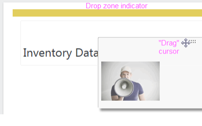
When you do this, the cursor changes to a Drag cursor and a "Drop Zone" indicator (a yellow bar) will appear as you drag the component toward a new location. If the drop zone is above or between other components, they'll move when the component is dropped. - Configure component settings or delete them by clicking the gear or Xicons.
- Add/Remove columns for the Split Row component by clicking the Columns icon.
When you add a Visual component to the canvas, your visual gallery will be displayed and you can select one or more visuals to be inserted into your report, as shown in Adding Visuals. Chart animation, resizing, hover highlighting, and quicktips will all be active in the report. Each selected visual will be inserted into its own separate panel.

Components can be re-arranged by dragging their drag icon. As shown above, the cursor changes to a drag cursor
and a "drop zone indicator" bar will appear as you drag the component
toward a new location. If the drop zone is above or between other
components, they'll move when the component is dropped.

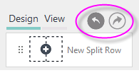
If an Auto Bookmark element is used as a child of the Report Author to automatically record changes, the Undo/Redo icons, shown above, will appear.
An optional Report Author attribute setting, discussed later, allows you to control the default mode, View or Design, and whether editing is allowed.
![]() Tokens used to configure the Report Author are not resolved in Design mode.
Tokens used to configure the Report Author are not resolved in Design mode.