HTML Tables
Basic HTML Table structures are one method of organizing and laying out content in Logi application report pages. These tables provide a consistent arrangement of rows and columns that can contain text, data, charts, etc.
The following topics discuss the use of HTML tables:
About HTML Tables
An HTML table consists of a collection of rows and columns; the intersection of a row and a column is called a "cell". A single row contains one cell for each column. HTML tables in Logi applications follow the HTML standard specifications: rows must contain at least one column cell to display content within the table.
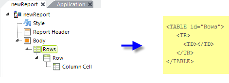
HTML tables in Logi Studio are created using one or more Rows, Row, and Column Cell elements.
![]() Don't confuse HTML tables with Logi Data Tables. They're different structures, created using different sets of elements.
Don't confuse HTML tables with Logi Data Tables. They're different structures, created using different sets of elements.

At runtime, as shown above, the Rows element produces an HTML <TABLE> tag set in the report output, the Row element produces a child <TR> tag set, and the Column Cell element produces a child <TD> tag set.
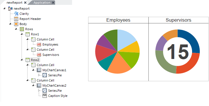
HTMLtables are very useful for spacing report content horizontally. Report content can be added to any Column Cell element and any number of Column Cell elements can exist in a single row.

In the example shown above, a basic table structure creates a 2 x 2 layout that aligns two charts with their titles.
Generally, all rows must have the same number of columns in them and the first, or top, row sets the number and sizes of columns for the rest of the table. For special situations about merging and spanning cells, see Merging Table Cells

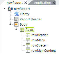
Tables can also be used to provide overall formatting for an entire report page. In the example shown above, the definition includes four rows: one each for header, menu, a spacer, and the main page content.
Responsive Design Elements
Responsive Design elements, including Responsive Row and Responsive Column, are available. These row and column elements may provide an improved viewing experience; they can dynamically re-arrange their change their size and arrangement depending on the viewport size. For more information, see Responsive Design Elements.