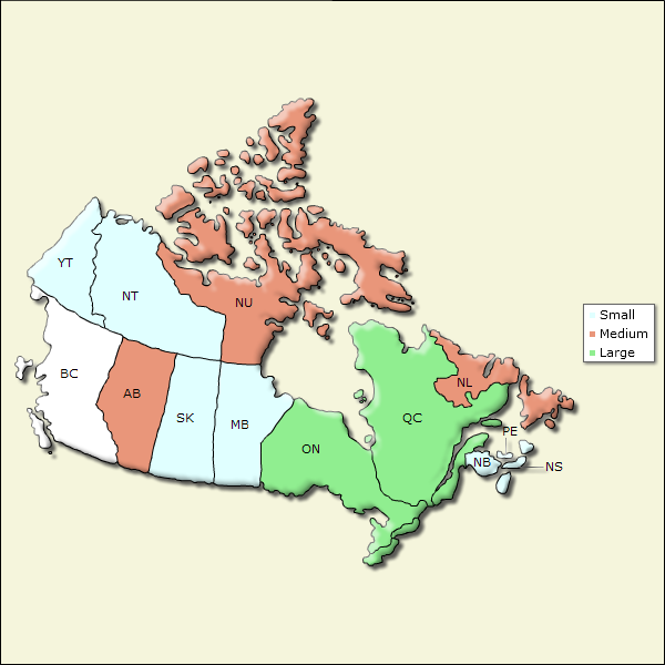
Adding Color Ranges
Once data values have been associated with them, individual regions in an Animated Map can be color-coded based on those values.

This is accomplished, as shown above, by adding one or more Map Color Range elements beneath the Animated Map element. Each element represents one color, which is set in its Color attribute. The value of this attribute can be set using @Session, @Request, and @Local tokens, but not @Data or @Chart tokens. A legend is automatically generated for the map and the text in the DisplayValue attribute is used in it. The assignment of a color to a particular map region is controlled by the Max Value and Min Value attributes; the color will be assigned if the data value is within this range. These values correspond to the data value identified in the Animated Map element's Region Value Column attribute.
![]() Note this important distinction: in order to prevent overlapping ranges, the color is assigned if the data is equal to or greater than the Min Value attribute value, and less than the Max Value attribute value, and you need to provide your range values accordingly. For example,
Note this important distinction: in order to prevent overlapping ranges, the color is assigned if the data is equal to or greater than the Min Value attribute value, and less than the Max Value attribute value, and you need to provide your range values accordingly. For example,
| Data Value | Min Value ( = > ) | Max Value ( < ) |
|---|---|---|
| 1 - 5 | 1 | 6 |
| 6 - 10 | 6 | 11 |
| 11 - n | 11 |
will accurately handle a data value of 10.5

And the results can be seen in the example shown above. If no text is entered in the Display Value attributes, the numeric minimum and maximum values will be displayed in the legend instead.