Work with Analysis Charts
This topic introduces developers to the Analysis Chart element. The Analysis Chart is a dynamic chart set that offers users interactive data analysis capabilities. While viewing a report in their browser, users can select chart types and chart data.
- About Analysis Charts
- Analysis Chart Attributes
- Add Analysis Chart Columns
- Add Forecasting
- Save Individual User Settings
- Customize Analysis Charts
About Analysis Charts
Analysis Charts allow users to display non-animated charts, based on a discrete data set and limited to chart types the developer chooses to include, at runtime.
![]() Chart Canvas charts, introduced in v11.2.040, are used by default by the Analysis Chart, in all new applications started in v11.2.040 and later. Older Logi applications that are upgraded to v11.2.040+ will use the classic static charts for their Analysis Charts. To force upgraded apps to use Chart Canvas charts, add the constant rdFavorChartCanvas
= True
to your _Settings definition.
Chart Canvas charts, introduced in v11.2.040, are used by default by the Analysis Chart, in all new applications started in v11.2.040 and later. Older Logi applications that are upgraded to v11.2.040+ will use the classic static charts for their Analysis Charts. To force upgraded apps to use Chart Canvas charts, add the constant rdFavorChartCanvas
= True
to your _Settings definition.
Like data tables, the Analysis Chart uses child column elements to include data for display.
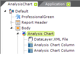
The example above shows a typical set of Analysis Chart elements:
- An Analysis Chart element
- A DataLayer element to retrieve the data
- One or more Analysis Chart Column elements to make data available for analysis
Analysis Chart Column elements do not require any child elements, such as a Label element, in order to make data visible. The element's Data Type attribute determines how each column can be used. "Text"-type columns can be used as Label Columns for Pie and Bar charts. "Number"-type columns may be used in the X- and Y-axis of Line and Scatter charts. "Date" columns may be used in the X-axis. In addition, the Format attribute can be used to format the values
that appear in tooltips displayed when the cursor is hovered over various chart areas.
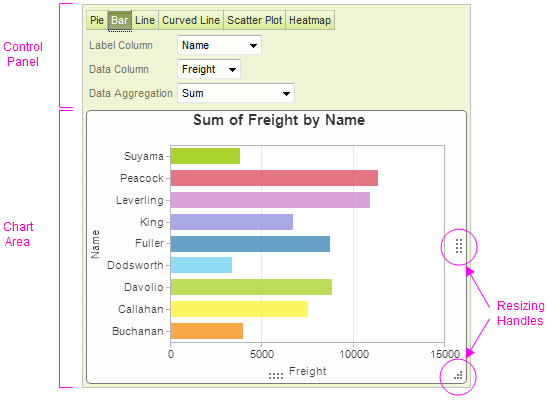
As shown above, the display produced by this element consists of a Control Panel and a Chart Area. By default, the Control Panel will appear above the Chart Area, as shown. However, the Analysis Chart can be configured to display the Control Panel to the left of the Chart Area instead.
Resizing handles are also provided so that the user can resize the chart at runtime (but they may not be visible until the mouse is hovered over them).
![]()
Menu buttons, shown above, allow different chart types to be displayed; the element has an Analysis Chart Types attribute that allows the developer to determine which menu buttons, and chart types, will be available at runtime. The buttons shown above identify all of the chart types that are available in the element. The "Curved Line" chart is a Spline chart.
Pie and Bar chart options are only available when there is at least one Analysis Chart Column with its Data Type attribute set to Text.
The chart title changes dynamically based on the selections the user makes; it cannot be set independently.
In v10.0.117, the Zero Rows Message element was made available as a child element of the Analysis Chart. This element allows developers to display a customized message if the datasource returns no data. The message text and its font type, size, and color can be set using the Zero Rows Message element attributes.
In v10.0.479, a built-in group filter was added for X-axis (Label) values:

If a column of DateTime type is selected, the filter appears in the control panel, as shown above. It allows users to group data by Day, Month, Quarter, or Year time periods.
In v10.1.46, the Quicktip feature was added to the Analysis Chart:

As shown above, this feature automatically displays a pop-up "balloon", containing detail data, when the mouse is hovered over a data point. This feature is available for all chart types and no action on the developer's part is required to enable it.
In v10.2.314, the default orientation of bar charts that are not based on a time series was changed to horizontal, to make it easier to read x-axis label data values.
Beginning in v11, another performance-enhancing alternative is available if you're working with an Oracle, MySQL, or Microsoft SQL Server 2005+ database server and large data sets. In that case, you can use a new, special-purpose datalayer, DataLayer.ActiveSQL, to improve performance. In v11.0.519+, PostgreSQL was added to the list of supported database servers. Note that these database servers may support data object names that are case-sensitive, so the spelling of things like table names in queries may be case-sensitive.
This datalayer provides the basic SQL query needed to retrieve data but doesn't initially retrieve and cache
all of the result set. Instead, in response to runtime
manipulations of the Analysis Chart interface, it dynamically modifies
its own SQL query and retrieves the minimum required amount of data with
each request. This increases the number and frequency of SQL queries
the database server must handle (and, generally, does not prove to be a
burden on the database server) but improves performance for the user.
Retaining User Settings
With all these possibilities, it may be important for users to be able to save their settings between sessions. Settings can be automatically saved on the web server and made available to users during their next session (this is discussed in more detail below).
Embedded Sub-Report Caveat
We do not recommend that you use this element within an embedded sub-report.
Analysis Chart Attributes
The Analysis Chart element can be quickly configured and has the following attributes:
| Attribute | Description |
|---|---|
| ID | Required: a unique identifier for this element. |
| Analysis Chart Types | A comma-separated list of the chart types that will be available at runtime. Menu buttons for each chart type named here appear in the Control Panel. Types include Pie, Bar, Line, Spline, Scatter, and Heatmap (v10.0.366+) charts. Default: if left blank, all types. |
| Color | The color for bars, lines, or points in all chart types except the Pie chart. Pie chart wedges are automatically assigned colors. Default: Blue. |
| Control Panel Location | Specifies whether the Control Panel appears above (Top) or beside (Left) the Chart Area. Default: Top |
| Save File | Fully-qualified file path and name of the file to which runtime configuration changes will be saved. Must include .xml file extension and can use @Function token. Example: |
| Template Modifier File | Identifies a custom XML file developers can create containing elements that will override the same elements in the template file, for language- and culture-customization of captions. |
| Height, Width | Sets dimensions, in pixels, of the chart image. Does not include the Control Panel. |
Add Analysis Chart Columns
The columns available for use with an Analysis Chart consist of one or more columns from the datalayer. To use them, developers add Analysis Chart Column elements to an Analysis Chart.
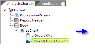

To add an Analysis Chart Column:
- In Studio, select the parent Analysis Chart element and add the Analysis Chart Column element.
- Set the Column Header and ID attributes.
- Set the Data Column attribute to the name of a column returned by the datalayer. Tokens are not necessary here; just providing the column name is sufficient.
- Set the Data Type attribute to Text, Number, or Date.
There is no way to make the appearance of an individual Analysis Chart Column conditional.
Studio includes a wizard to assist in adding Analysis Chart Columns:
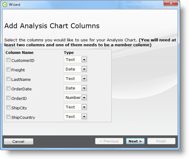
As shown above, the wizard lets you select the columns in the datalayer to use with the chart and to set their data types. The wizard can be launched by selecting the Analysis Chart element and then either clicking the wizard link in the Element Toolbox panel or right-clicking and selecting it from the element's Element Wizards pop-up menu.
Add Forecasting
Beginning in v10.0.479, forecasting features were added to the Analysis Chart. These features use a variety of techniques to produce projected values by analyzing existing values. Forecasting is available for Bar, Line, and Curved Line chart types.
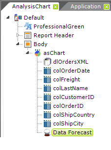
Forecasting is enabled in an Analysis Chart by including a Data Forecast element beneath it, as shown above. This element has no attributes.
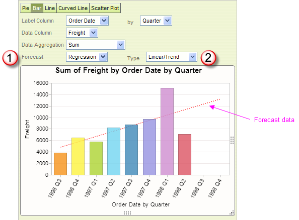
When the Data Forecast element is present and an appropriate X-axis column is selected, a special selection list (1) of forecasting options will become visible in the control panel, as shown above. When an option is selected, the forecast data is displayed in the chart as a dotted line.
If the X-axis column is of DateTime type, the data may be analyzed using either Time Period Decomposition or Regression analysis; columns of Numeric type are analyzed using Regression analysis. An additional option list (2) allows selection of a time span for Time Period Decomposition analysis, or a regression method for Regression analysis. Available regression methods include:
- Linear/Trend
- Autoregressive (using "Burg's" formula)
- Exponential
- Logarithmic
- Polynomial (orders 2 - 5)
- Power
The Studio wizard for creating an Analysis Chart also includes forecasting options.
Save Individual User Settings
A described earlier, the Analysis Chart will automatically save a user's runtime configuration changes during their session, if the Save File attribute is set. The file specified will be created if it does not exist but its containing folder is not automatically created. You must ensure that the ASPNET process has "Write" permission to the folder.
You can also save separate configurations for each user that survive their session. If Logi Security is being used, include the @Function.UserName~ token as part of the save file name. If not, use @Function.GUID~ to generate a unique file name for the user and save the file name as a cookie in the user's browser.
Users' settings can be cleared by calling the Analysis Chart report with the rdAcReset parameter set to True. To get fresh data from the datasource while maintaining the user's settings, call the report with the rdAcRefreshData parameter set to True.


In the example above, a Label has been added to an Analysis Report as a link that clears the user's settings. The Target.Report element is set to Current Report and the Link Parameters element is used to pass the rdAcReset parameter.
Customize Analysis Charts
The Analysis Chart element uses a "template file" to define certain element properties that are not otherwise available as attributes to the developer for modification. These include language- and culture-specific Caption attributes that you may want to change for locale-based reasons (or you may simply want to change the captions to better suit your application).
The Analysis Chart element's Template Modifier File attribute identifies a custom XML file developers can create containing elements that will override the same elements in the template file.
For example, the Analysis Chart template file:
<yourAppFolder>\rdTemplate\rdAnalysisChart\rdAcTemplate.lgx
contains several Label elements. One of them has an ID of "lblChartXLabelColumn_rdAcID"; this controls the caption text that appears beside the Label Column input select list. This text can be modified by changing the Caption associated with that Label element.
To change the text from its default "Label Column" to "X-axis Data Column", create your own XML file, identify it in the Template Modifier File attribute, and add this code to it:
<?xml version="1.0" encoding="UTF-8"?>
<TemplateModifier>
<SetAttribute ID="lblChartXLabelColumn_rdAcID" Caption="X-axis Data Column" />
</TemplateModifier>
You can set the attributes for any number of elements in this file; examine the rdAcTemplate.lgx file to learn the ID and Caption attributes available. The template modifier file can be in any folder accessible to the web application; if a fully-qualified file path is not provided in the Template Modifier File attribute value, then the application expects it to be is your project's _DataXMLs folder.
More detailed information about template modifier files can be found in Template Modifier Files.